This is a poster I produced for our 'End is Nigh' exhibition, based on the idea of what would seem apocalyptic to ancient Irish monks; i.e the Vikings. I thought it would be interesting to try something different with this project, and use it as an opportunity to showcase my working process from start to finish.
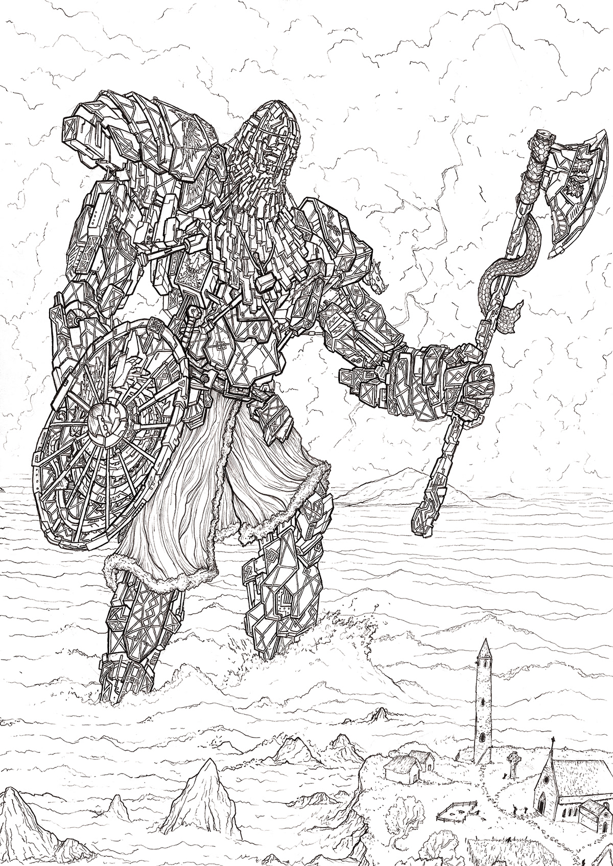
The first stage of any primarily line-based piece is to do the lines themselves. Shown above is the finished linework cleaned up, scanned and ready to be coloured digitally.
To get to this stage I roughed up the drawing in pencil, gradually defining areas of detail before inking over top with fine-line pens. Details like the cloth texture and the gilding on the armor are added last, once the main 3d shapes are defined.
The original artwork was done at A3 size and then scanned at 600 dpi. I then cleaned up any extemely obvious marks/ mistakes and then set the layer to multiply. This prevents any noise around the lines from showing up on the finished image later on.

The main area of the figure is filled in. Blocking out colours in this way allows use of this layer to quickly restrict shading/ highlights etc. to just the viking, without tedious adherance to the lines over and over again. I avoid using selection tools to fill in the block colours as they often leave fuzziness around the edges. Instead I just treat it rather like a colouring book, using my tablet to fill in the colour.

Picking out more areas of colour, in this case the electronic displays in red, skin in cream and his beard in brown. Note that each of these colours is on a seperate layer for convenience later on.
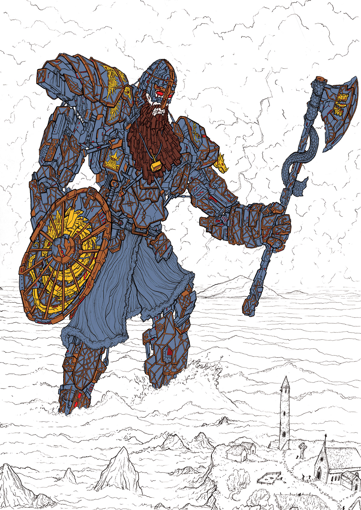
Possibly one of the most labourious parts of this poster was filling in the detailing on the armor. Trust me, it took a while. It really breaks up the flat areas though, and adds a lot of detail to the outer armor plates, creating depth. The animals/ mythical beasts are intended to serve a similar purpose; breaking up otherwise flat areas like the shield and axe-head. The Thor's hammer reference is a nod to Techno-Viking, a meme introduced to me by a friend while I was finishing the linework.

Filling in the fur, cloth and belt.

The colours of the monastery and the islands are added, this time seperated into two layers, the terrain and the objects on top.

Blocking in the sea and the sky.

Using a dark purple brush set to ~ 10% opacity I layer on some general shading to seperate surfaces and emphasise depth.

Shading continues on the monastery and islands.

Layering up clouds with purples and blacks, and beginning to blend the sky into the sea.

Lightning bolt added to create a dramatic light source.

Added some blue glow to the lightning, and using a similar technique to the shading highlights are added to the areas lit by the bolt.

Using a solid ~15% opacity navy brush the waves are layered from dark to light. Horizon line is finished.

Seafoam is added using a 50% opacity off-white brush. Seagulls are added.

The viking is given a more dramatic global shading layer, to add drama. This layer is then deleted from the red areas to make them stand out more.

Minor fixes to clouds and other nitpicky details. This is the poster as presented at the exhibition.

Since the exhibition I have revisited it; in paticular the monastery and islands are darker, and the viking has been shaded to make his upper half lighter to contrast with the sky, and his legs darker to contrast the sea.

Gif animating the process.


