


ZDOROVO BURO
brand IDENTITY, logo design, printed materials design, website design
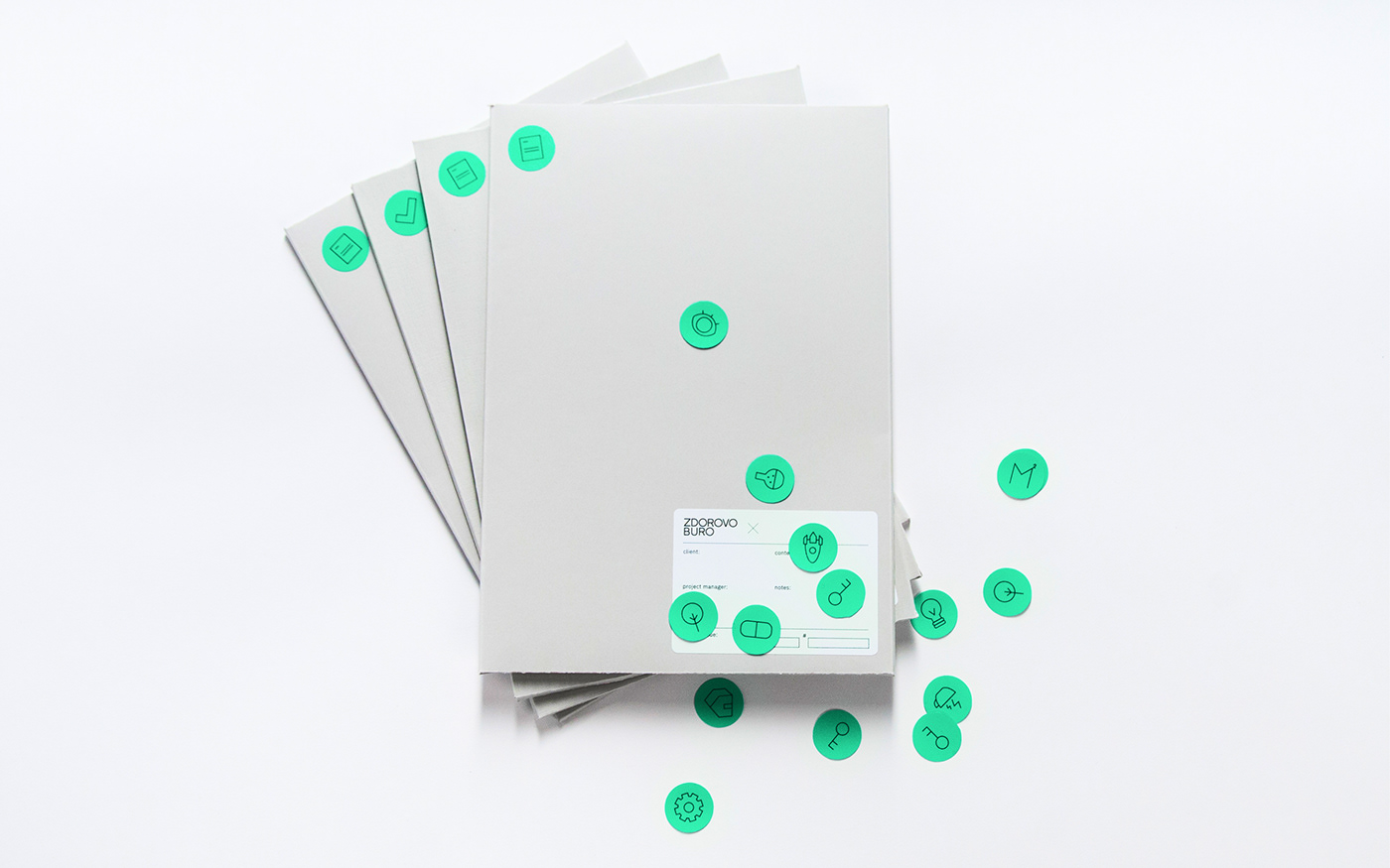
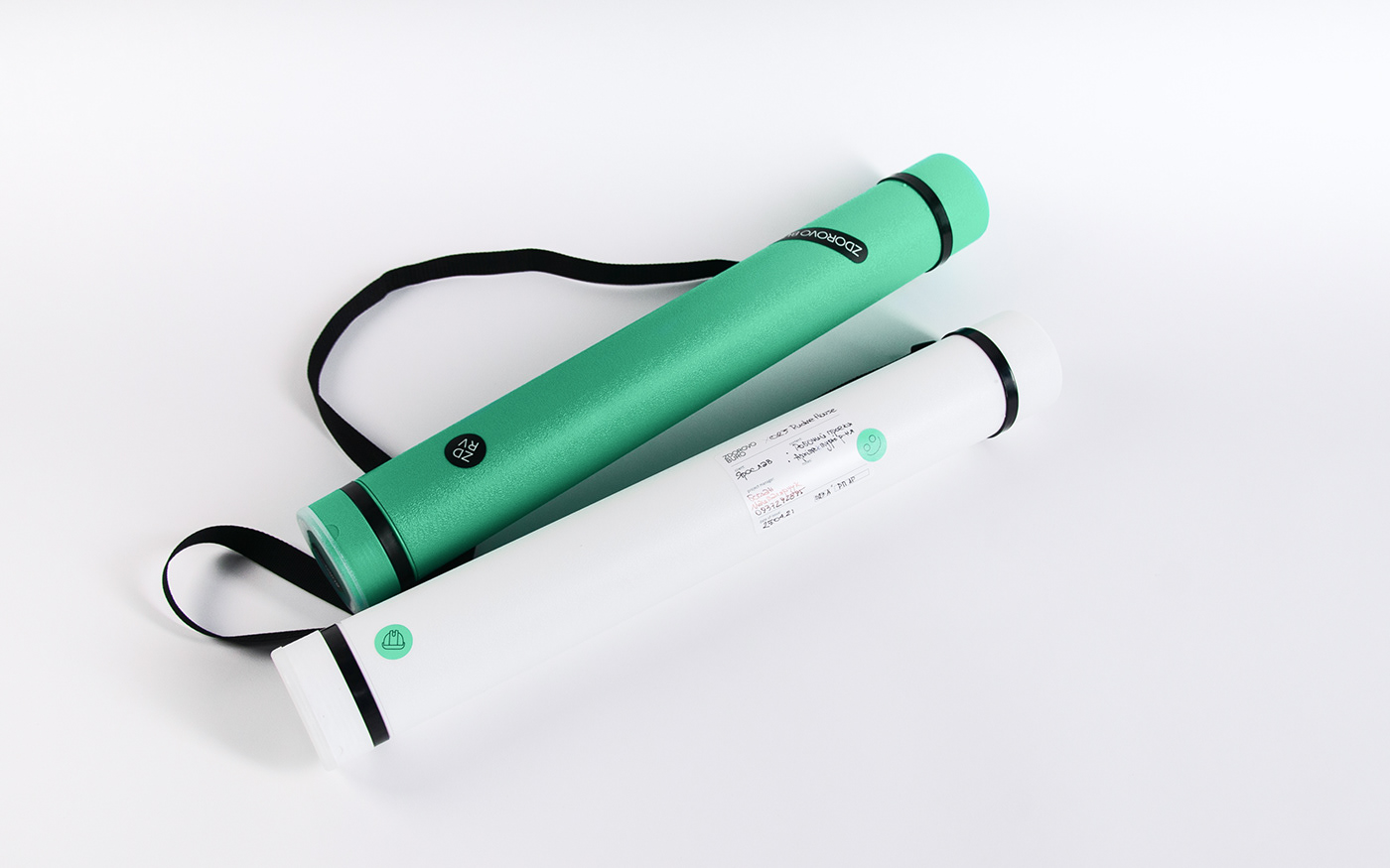
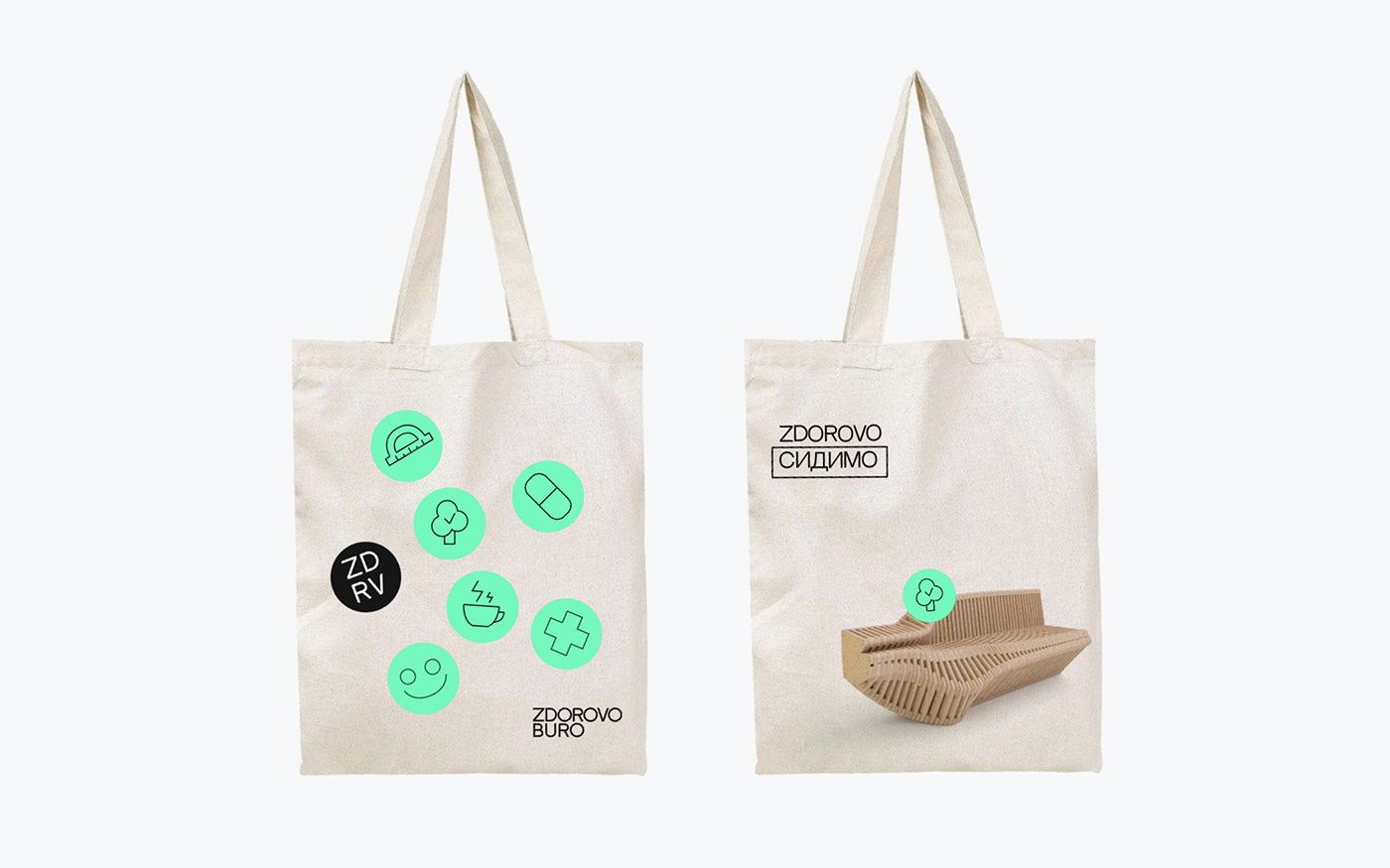
Zdorovo buro is an architectural studio, founded by three architects in 2019. The main values of the studio is to create clean, understandable & simple design and emphasize on the important details within interior & exterior. Word zdorovo (from Ukrainian) means healthy (being healthy), become a key aspect in our further concept development. We were inspired by pharmacy packaging design & aesthetics, international style, and full simplicity. As a result, we develop our design system around the medical aesthetics, picked up bright green color and play with materials & textures in collateral design. One of the key element of this design is stickers, that tells “you’re healthy”, which we use all over the design system.
LVIV.UKRAINE 2021


interested?
let’s work on your next big thing! cONTACT US
let’s work on your next big thing! cONTACT US

thanks for watching!


