


Charles Fraser-Smith AKA Quatermaster
Does 'Quatermaster' ring a bell? Yes, the Q in Ian Fleming's James Bond movies. The fun part is that Charles Fraser Smith is the inspiration behind that character as he was known as the Quartermaster by his colleagues in his missionary time. During World War II, he worked for the Ministry of Supply and fabricated many equipments known as "Q-Devices".
BRIEF : The project brief required us to design a brand for an upcoming exhibition for Charles Fraser Smith.
BRIEF : The project brief required us to design a brand for an upcoming exhibition for Charles Fraser Smith.
INSIGHT : The decided theme of the exhibition is "Layers". The theme has been choosen on the basis of CF-S's journey of being an espionage. It has been secretive, simple, exciting and dangerous and these are the different facets that the theme of layers hold.
SOLUTION : Following is the logo that has been designed based on the theme. The different colours of the logo gives a three dimensional look portraying that the exhibition allows people to go deeper into his life. The choice of palette is to relate to the camouflage of his professional and personal world.
The exhibition title is "DECLASSIFIED", as we are unravelling the various layers and phases of espionage’s life. In addition, the strapline gives a little information about what and who is it all about i.e. "Anecdotes from Charles Fraser Smith".


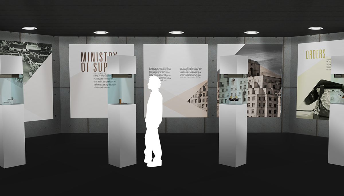
PANELS
The anecdotes of Charles Fraser Smith’s life have been visually portrayed in such a way that the audience blends in with the feeling of having a dual life, personal and undercover. Following displayed are the panels that will be exhibited in the exhibition space. They have been designed upon a grid derived from the hexagonal logo which gives them a flow and rhythm along the story.


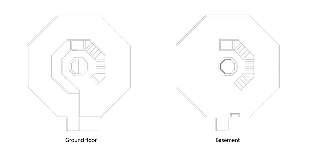
SPATIAL DESIGN
Declassified is a temporary exhibition therefore the space design is derived from the hexagonal logo itself. The idea of having a hexagonal shape to the space is to give the story piece by piece to the audience and maintain the mystery. The whole exhibition is distributed in two floors, connected with a lift in the centre, ground floor for his personal life and the other one will be in the basement for his professional life. The lighting of the basement floor is dim to signify the hidden aspect of his professional life.

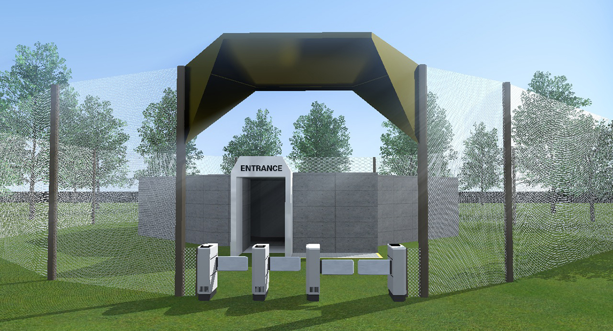
EXHIBITION
Following are the images of how the audience is going to perceive the exhibition in the actual space with the help of display lights above the panels on all floors. Besides the personal and professional part of Charles Fraser Smith's life, there is a section which displays his most important gadgets of his time while working for the military. That has also been shown in actual space.


POSTERS
The idea of the posters were to deliberately gain the interest and curiosity of the public by using Charles's most knownable gadget(s). Following the use of the logo grid theme, the look and colour of the poster is very subtle focussing on the interesting forms of the gadgets used during World War II.


STREET BANNERS
The street banners are another media that has been created for the promotion of the exhibition. They unlike the posters have multiple colours which compliment the illustrations and theme overall and makes Declassified look interesting.


INVITATION & PLAYBUTTON
The vintage looking invitations have been created with a seperate band inside them which acts as the tickets for the entry of the exhibition. The Playbutton(s) are a mini mp3-like player in a form of a small badge that is provided (to buy) within the exhibition that serve as the 'guide' for the guest(s).


