
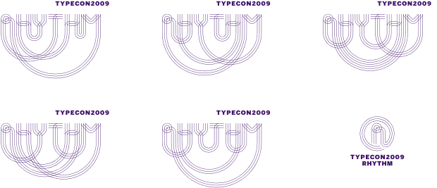
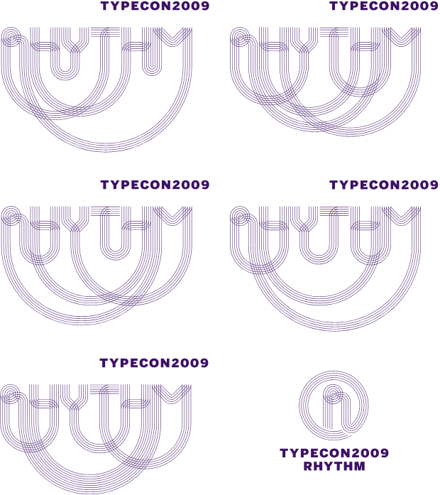
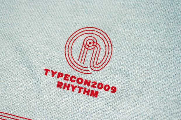
The logo doesn’t feel static and allows for a variety of executions while maintaining its consistent visual language. We also created a smaller “R” badge that requires less real estate and can be used as a kind of official seal for all things rhythmic. And typographic. The supporting typeface is the indefatigable Benton Sans by Font Bureau.
Because much of the promotion for the conference happens online, through like-minded web sites, the logo had to work at small sizes. Simply shrinking the logo was unacceptable as it became hard to read and lost the pleasant rhythm of its concentric lines, so we drew an alternative set of logos using only three lines for small applications. The same concept applies for print-based logos that need to reproduced at small sizes.
Print Ads
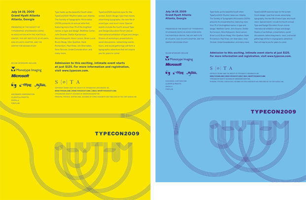
A few industry publications were kind enough to donate advertising space for the conference and in these first few applications we decided that we did not want to simply repeat the logo in every use but, rather, extend the sense of connectivity and fluidity that attracted us all to the proposed identity in the first place.
A few industry publications were kind enough to donate advertising space for the conference and in these first few applications we decided that we did not want to simply repeat the logo in every use but, rather, extend the sense of connectivity and fluidity that attracted us all to the proposed identity in the first place.
Commemorative Poster
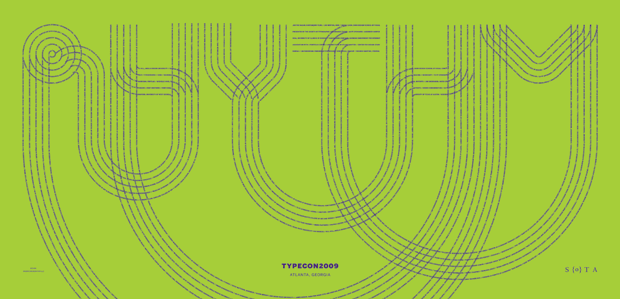
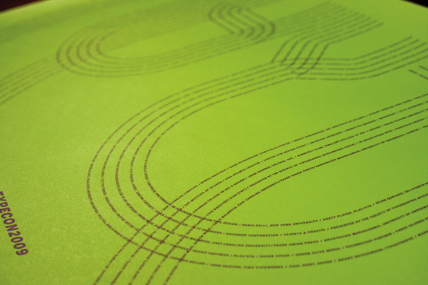
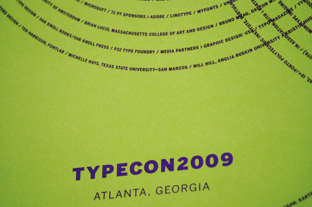
Following the unspoken rule that posters must be striking from a distance but revealing and surprising once seen up close, we decided to use a simple crop of the logo that, when seen from afar, looks, well, just like the logo but upon closer inspection reveals that the concentric lines of the logo have been constructed from the speakers’ names and sponsors’ organizations. Yes, it took a long time to do.
Following the unspoken rule that posters must be striking from a distance but revealing and surprising once seen up close, we decided to use a simple crop of the logo that, when seen from afar, looks, well, just like the logo but upon closer inspection reveals that the concentric lines of the logo have been constructed from the speakers’ names and sponsors’ organizations. Yes, it took a long time to do.

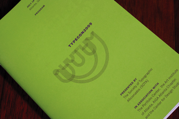
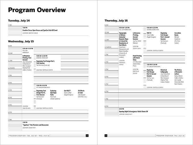

Conference Program
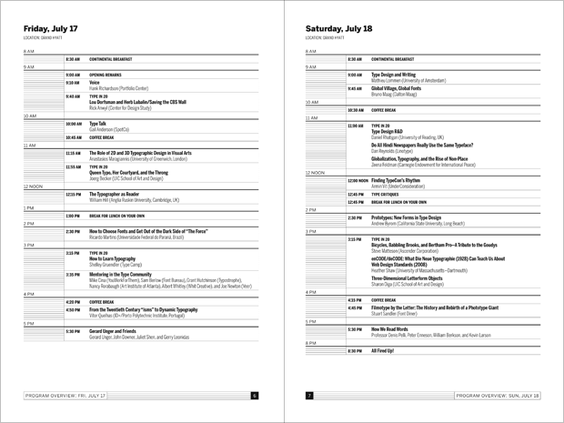
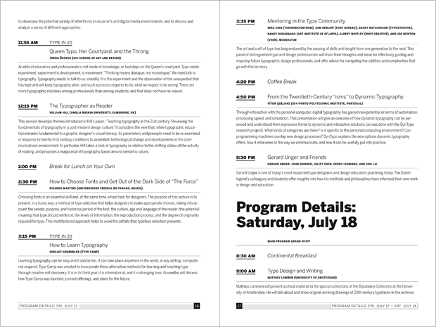
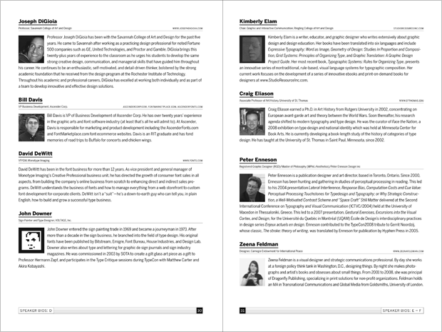
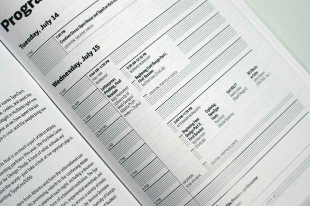
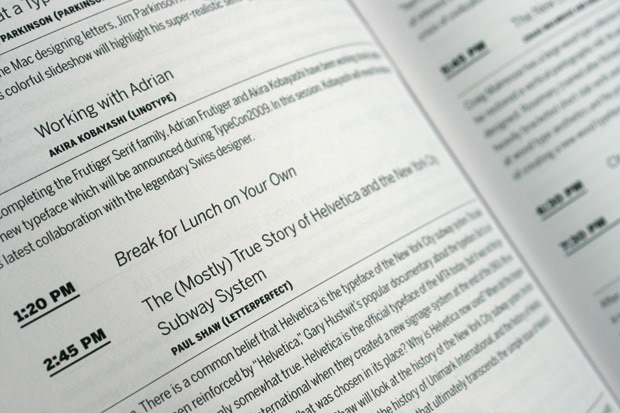
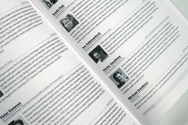
One of the most arduous tasks was putting together the 70-page program containing the schedule, session descriptions, speaker bios and sponsor advertisements. The broad styles and weight of the selected type family, Benton Sans, proved invaluable in the development of the program. Consciously formatted with typographic details the program strives to be as clear and easy to follow as possible.
One of the most arduous tasks was putting together the 70-page program containing the schedule, session descriptions, speaker bios and sponsor advertisements. The broad styles and weight of the selected type family, Benton Sans, proved invaluable in the development of the program. Consciously formatted with typographic details the program strives to be as clear and easy to follow as possible.
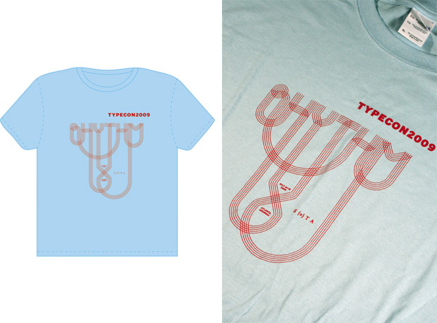
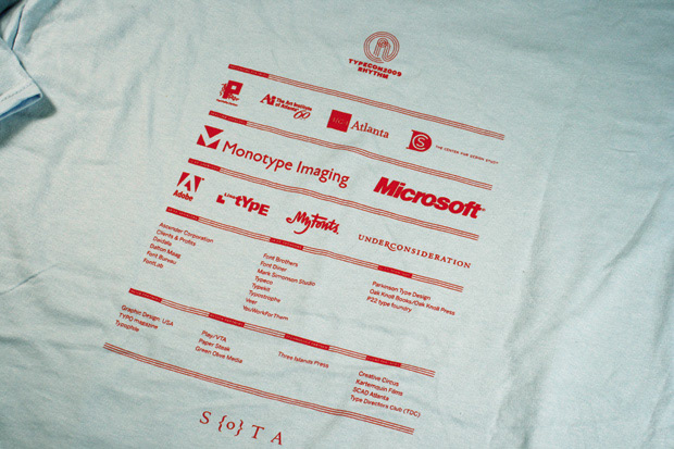
T-shirt
Another manipulation of the original logo to fill the t-shirt’s space better. On the back, the always-challenging wall of sponsor logos was deployed following the look of the program, rather than just scattering logos on the poor t-shirt wearer’s back.
Another manipulation of the original logo to fill the t-shirt’s space better. On the back, the always-challenging wall of sponsor logos was deployed following the look of the program, rather than just scattering logos on the poor t-shirt wearer’s back.
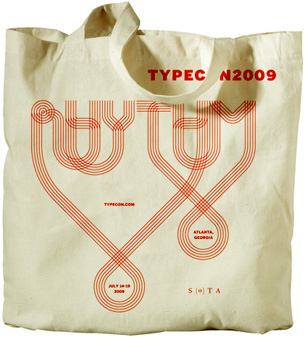
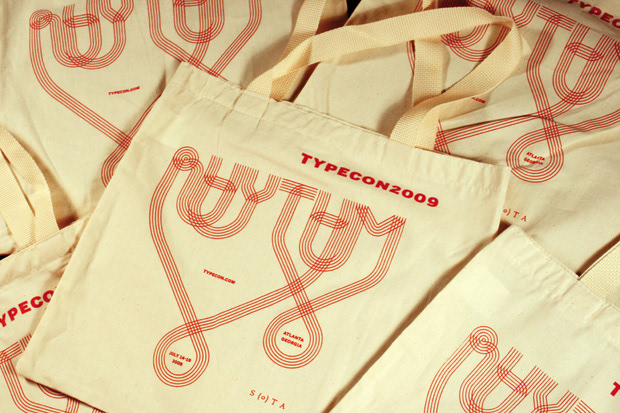
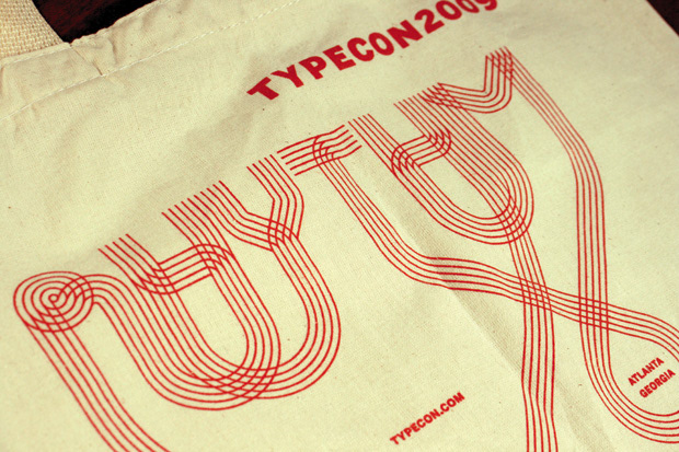
Tote Bag
Perhaps our favorite manipulation of the logo’s loops was for this modest tote bag, which help frame important information about the conference. The canvas bag was purposefully as frugal as possible.
Perhaps our favorite manipulation of the logo’s loops was for this modest tote bag, which help frame important information about the conference. The canvas bag was purposefully as frugal as possible.


