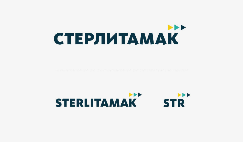
STERLITAMAK
City-branding
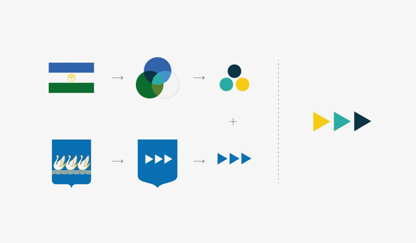
Number «three» – brand value «Three silver goose swimming in the blue field – sign plenty of these birds. Authors description Sterlitamak emblem used number «three» as sense of abundance, completeness. Number three underlines the wholeness, the independence, the harmony of the city. Three – sends the meaning of choose value, freedom action, alternative Three elements first only can create the space, completeness, stability Number «three» meaning – valuable as it is, multifaceted, richly, that’s why it is mentioned in religion different nations, fairy tales, bylinas, uses in architecture, worldwide literature and in our city Sterlitamak emblem.
Ценность бренда: число «три». : «…три плавающих серебряных гуся в голубом поле, в знак великого изобилия оных птиц». В вышеприведенном описание герба Стерлитамака авторы неслучайно упомянули именно число три в значении изобилия. полноты. Число «три» подчеркивает целостность и независимость, гармонию самого города. «Три» — ассоциируется с ценностью большего выбора, свободы действия, альтернативы. Только начиная с трех элементов уже формируется пространство, завершенность, устойчивость. Значение числа «Три» — ценно само по себе, многогранно, содержательно, именно поэтому наиболее часто упоминается в религиях разных стран, в сказках и былях разных народов мира, используется в архитектуре и мировой художественной литературе и на гербе нашего города Стерлитамак.
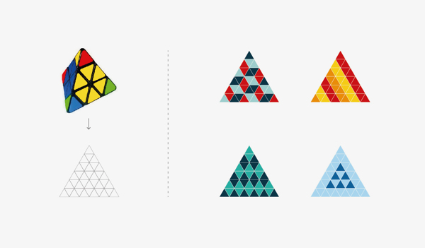
Pyraminx (Mefferts pyramid) – express the idea of Sterlitamak city in the best way The Volume of city. The Harmony of city. The Tripartite of city. Logic Pyramonx’s work – was taken as the brand basis of Sterlitamak.
Пирамидка Мефферта – идеальная модель Стерлитамака. Город в объеме. Город гармонии. Город, умноженный на три. В качестве основы была взята ее модульная система.


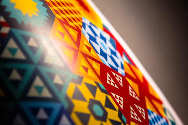
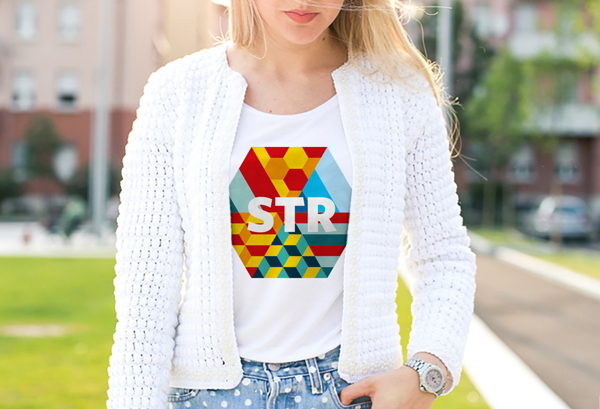
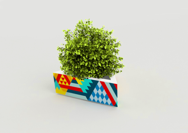
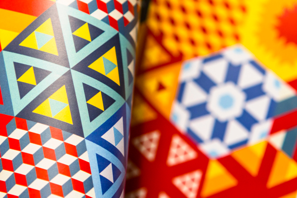
Formed Pyramonx graphic elements can be colored, collected and designed any pattern you want. The Special pattern shows the special city brand element despite of its different colors and forms. Special pattern means unique of logic formation in color and graphic.
Из получившихся графических элементов можно собирать любые узоры и паттерны. Несмотря на разнообразие цветов и форм, узоры однозначно указывают на принадлежность к городу любого забрендированого предмета. Это происходит благодаря стандартным цветовым и графическим схемам и единой логики построения.
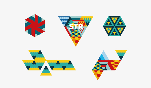
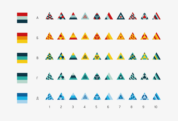
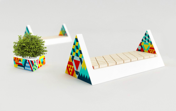
We created 10 optimal patterns and 5 color combinations, so we formed 50 moduls types as a result.
Мы выбрали 10 оптимальных паттернов и 5 схем цветовых сочетаний. В итоге получилось 50 вариантов модулей.


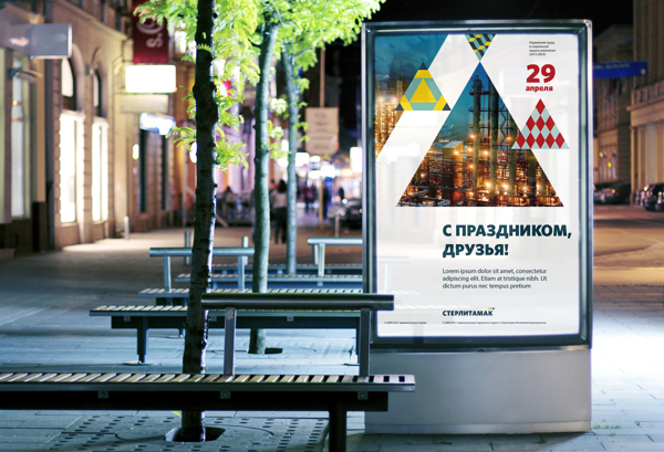
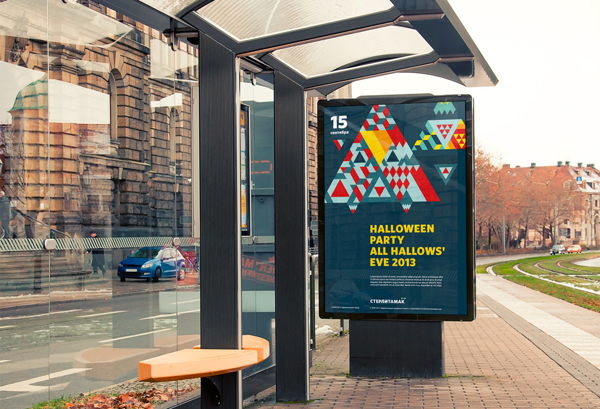
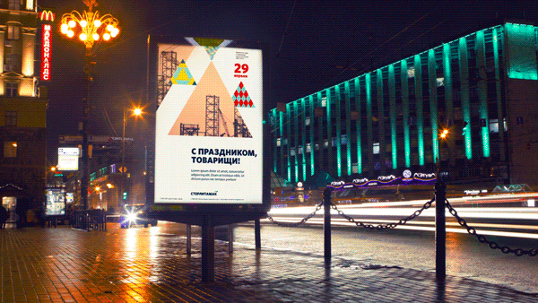
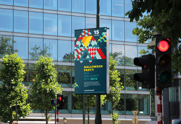
Triangular forms and patterns adjusted in print and outdoor production in the best way The main brand color could be used as the background of patterns also.
Треугольные формы и паттерны могут отлично работать в печатной продукции и аутдорах.
В качестве подложки может быть использован подходящий фирменный цвет.