AC Prime
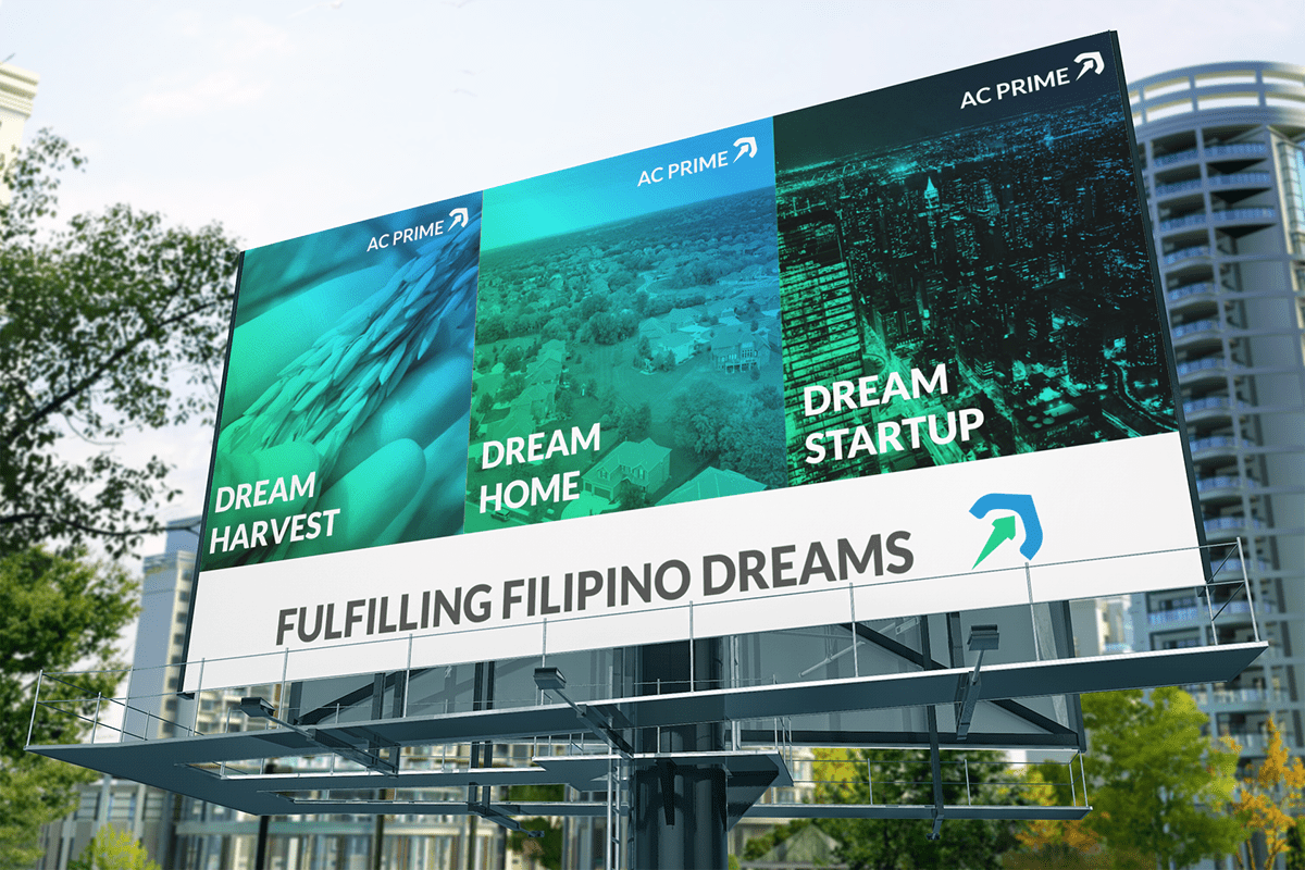
Fulfilling Filipino Dream
One of the largest conglomerate companies in the Cagayan Valley Region, AC Prime Holdings Asia, Inc. is one of the top distributors of agricultural products in the region. The company started its business operation in 1987 to hold its major subsidiaries the ALJAY Group of companies.
Its core businesses are engaging in the agriculture sector: ALJAY Agri-Solutions specializes in crops and ALJAY Feeds specializes in livestock. Its headquarters is strategically located in Santiago City, Isabela, and have branch offices across the country.

The company recalibrated its business strategy and will be expanding its portfolio to Real Estate and Venture Capital.
This pivotal change needs a fresh look at the company's corporate identity to reflect its promise to the Filipino people.
“It envisions building wealth thru its versatile and substantial portfolio. Its mission is to invest in sustainable and valuable ventures that will create superior shareholder value while upholding ethical, environmental, and social responsibilities.”
We agreed on a certain design direction that revolves around these objectives:
* It should evoke security for the investors.
* It should exude growth or investment.
* It should reflect their value for integrity & innovation.

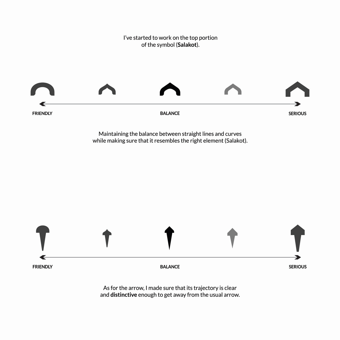
The new icon is composed of two meaningful elements. The arrow represents the company’s growth. The hat or salakot, on the other hand, represents its mission to create superior shareholder value and its promise to the Filipino People in fulfilling their dreams.
Overall, it resembles an umbrella that symbolizes secured investment (for the investors) and protected businesses (for its subsidiaries). Rotated to 45 degrees clockwise signifying its value for Integrity (doing the "right" thing) as the company grows.

Keeping the design objective we set, the colors reflect their value for innovation and growth.
Inspired by the color of the sky and renewed leaves or a sprout that starting to grow.

The symbol was complemented by the versatile Lato typeface, which balances professionalism and playfulness.
It works well with most designs (marketing collaterals) and websites (online platforms) due to its clean lines, good legibility, and modern look and feels.


The pattern resembles the market trend (ups & downs) and the demand curve.
It can be used in Marketing Collaterals and Stationery as added texture.

THE LOGO DESIGN PROCESS
The company approached me to re-imagine the pre-approved redesign logo they already have.


The initial redesign I came up with was a Rocket.
But the concept wasn't strong enough to represent the company as per client feedback.
So I continue exploring...

They love the concept of an umbrella.
However, the look and feel is too friendly and resembles a woman's breast.
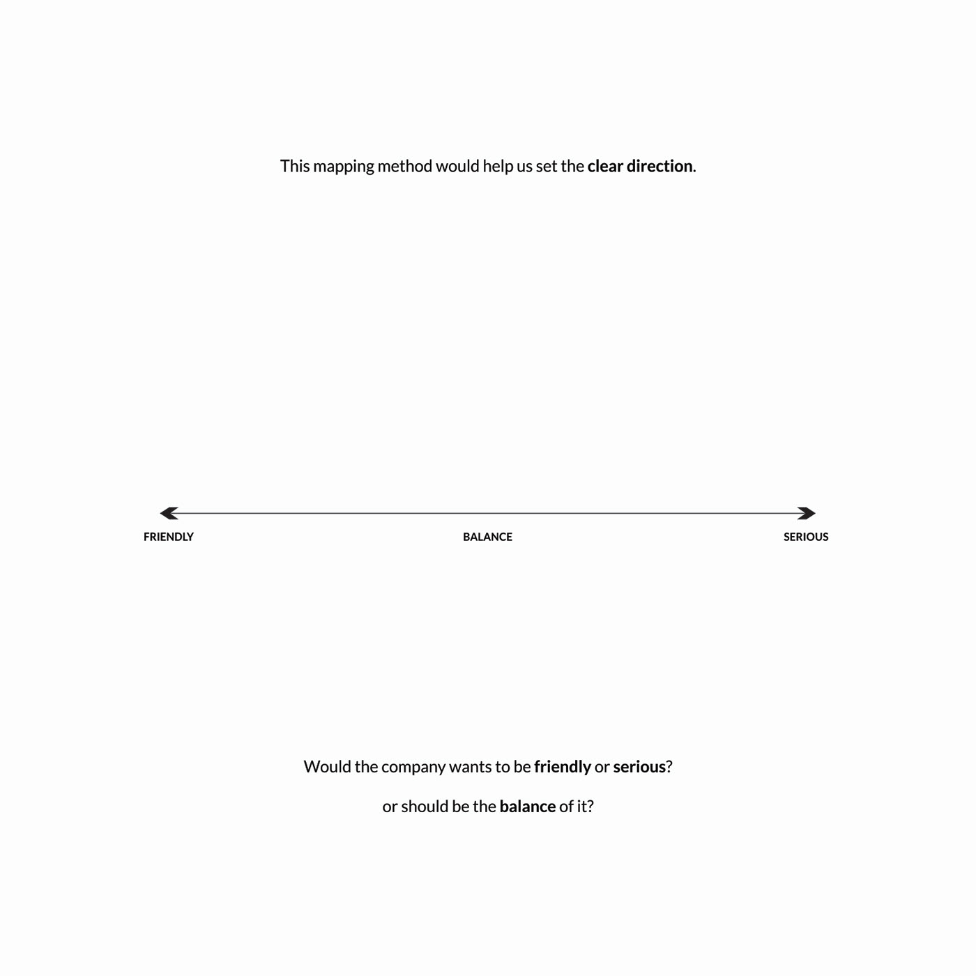
So I conducted a further study to decide which direction we should take.
Would it be "being friendly" or "being serious"?


We settled for this design and proceed for the final refinement.

This is the primary logo lock-up for the company.


What's next?
Watch out for another logo redesign with one of its subsidiaries, ALJAY Agri-Solutions, soon!
Follow me for more!
Follow me for more!
I would love to hear your thoughts in the comment section and would be grateful for your appreciation.
Thank you for viewing!

Know more about my Service & Process
by downloading my personal profile thru the link below:
https://drive.google.com/file/d/12lcoqDvtdJZV9_5i-3hPm_VszbDpQuNt/view?usp=share_link
https://drive.google.com/file/d/12lcoqDvtdJZV9_5i-3hPm_VszbDpQuNt/view?usp=share_link


