Final Thesis Statement
Considering their function, pro-audio plugins have a very dominant visual component. The quality of the user interface can add definite value to the UX and win customers away from a competitor. Waves Audio Ltd. makes great quality audio plugins that lack visually. They hint at skeuomorphism but are visually scattered across the spectrum from photo-realistic to a basic gradient.
Considering their function, pro-audio plugins have a very dominant visual component. The quality of the user interface can add definite value to the UX and win customers away from a competitor. Waves Audio Ltd. makes great quality audio plugins that lack visually. They hint at skeuomorphism but are visually scattered across the spectrum from photo-realistic to a basic gradient.
A unified UI would greatly improve the UX and add to the boutique quality of the Waves plugin suites. Improving the quality of the visual design can help with legibility, streamline a workflow, and make the end user more comfortable. This would lead to better reviews, more referrals, more tutorials and all around more hype. By utilizing iconography, keeping things simple as well as utilizing modern UI practices in addition to the traditional audio UI elements I will be able to reimagine the Waves Audio plugins in a new and fresh way.

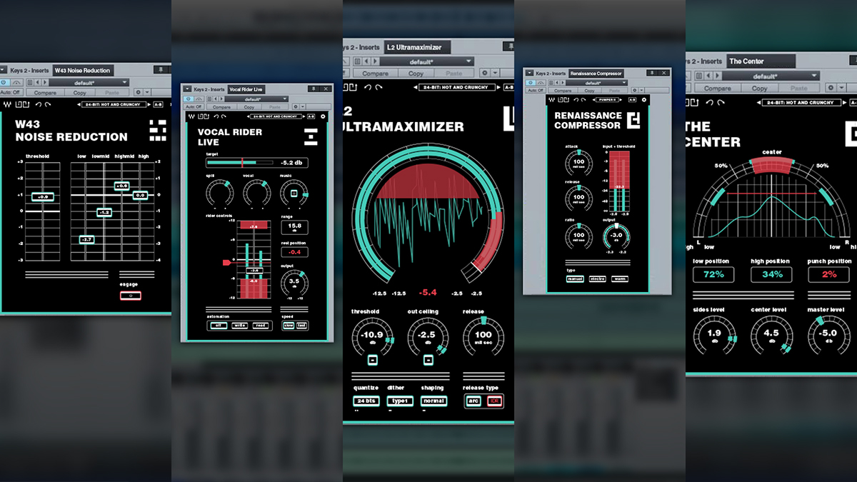


High contrast colour layouts adhere to AA and AAA standards for luminance to enhance readability for low vision and different types of colour blindness. The minimum luminance contrast for small text to achieve AA is a contrast ratio of 4.5:1. The font Helvetica Heavy set in lowercase (where possible) was chosen for its outstanding legibility at small sizes. The red and green hues were chosen as they are audio industry standard colours. The hues are almost directly oposite to eachother on the colour wheel, this further improves the visual contrast of the UI elements even for someone who is completely color blind.

Common UI Elements:
Buttons: Commonly representing binary commands (on and off). Dropdowns are signified by a double dot below the button graphic. If the buttons are encircled then they are related commands to the plug-in. Inactive plugins lack a coloured border.
Sliders: Often vertically orientated, these are often used to control the volume of the signal in whole or in part. Sliders are found representing input/output levels to mimic a analog mixing board. By listing the numeric value on the face of the slider the user can easily find that sweet spot manually or type in values.

Why Circles?
Music and audio in general is based on patterns which—in theory—are non-terminating. The clearest examples of this are tones and scales that can be expressed as the linear sequence ABCDEFG but start again at A or G. This can also be seen mathematically where 440Hz, the A note, is the same note but an octave lower when halved to 220Hz or an octave higher when doubled to 880Hz.
Circular knobs are also an extremely efficient UI mechanism, often found on audio equipment like guitar effect pedals and rack mounted units. In theory, one may fit three knobs with padding in the same area that a track from a slider would take if the width of the slider's track and the circumfrence of the knob are the same. (C = 2 π r)
In addition, the perceived gradual nature of audio (many of the numbers are perceived to ease in and out when listening) the visual of a circle provides a convenient vehicle.
By using a grid the UI elements are easier to get acquainted with across the effect suite and are easily identified.
The interface elements are also designed in a way to allow function in a touch input based environment. This may be more relevant in the future as more tablets are equipped with full operating system distributions and touch panels become more affordable for desktop and laptop workstations.
The interface elements are also designed in a way to allow function in a touch input based environment. This may be more relevant in the future as more tablets are equipped with full operating system distributions and touch panels become more affordable for desktop and laptop workstations.
Any sliders have a text field companion where the user can input a desired number directly into the program. In addition to making the suite more accessible it is a value added feature for advanced users that will calculate various measurements relating to their sound like delay/reverb timings, compression settings or phasing based on their signal’s input metrics and various equations.

This plugin was an experiment to display the information in three different ways: the ring, waveform and knob/dials.


equalizer


The Center plugin makes use of graduated panning by using the equation y = 0.006*x^2+0.3*x to redistribute the values where y is the adjusted angle and x is the desired perceived percent toward a side from the center. This will allow the end user to accurately place and isolate the “fringe” frequencies in the signal as perceived by the listener. This will help in giving the user a wider sounding mix that is true to the placement of the markers in the UI.
Simple Explanation:
When stereo audio is panned (a process of splitting the signal more to the left or right bus by a set amount) it is often split along a curve as opposed to a linear one. For example, 30° is interpreted as half way, 50%, to a side as opposed to the linear interpretation of 45°.
When stereo audio is panned (a process of splitting the signal more to the left or right bus by a set amount) it is often split along a curve as opposed to a linear one. For example, 30° is interpreted as half way, 50%, to a side as opposed to the linear interpretation of 45°.
PROCESS BOOK: