

Leasy
Brand Identity / Logo Design / Art Direction
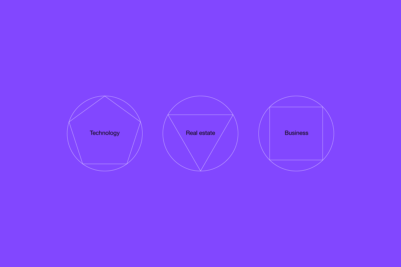
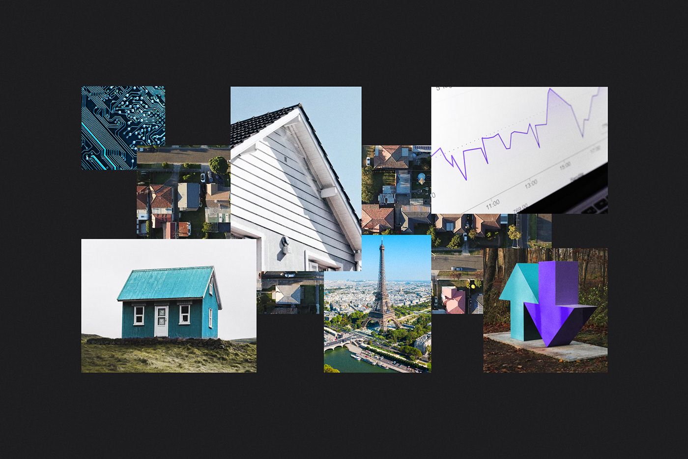
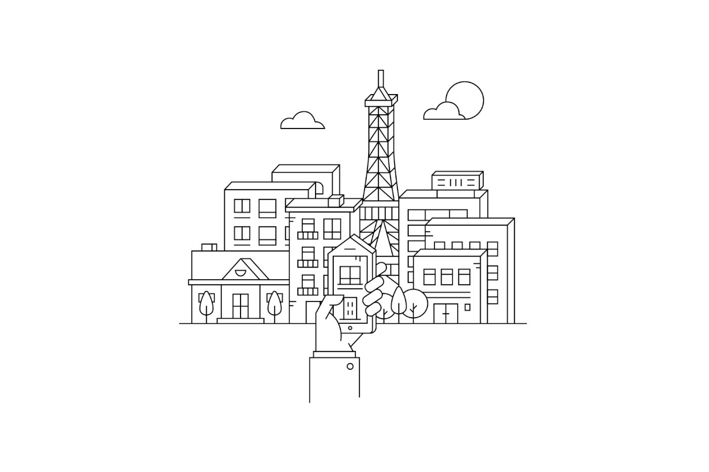
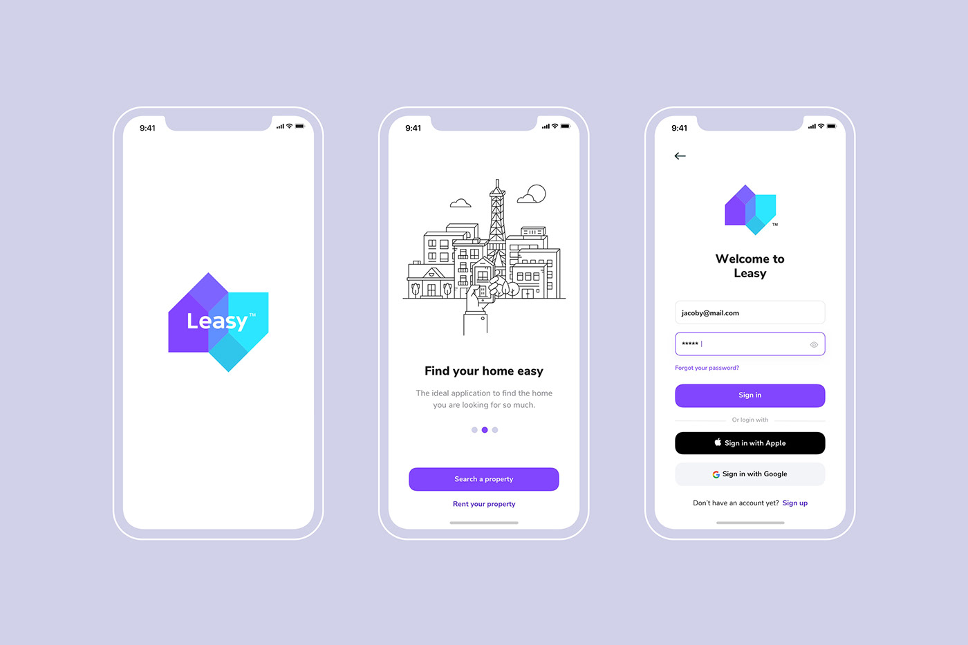
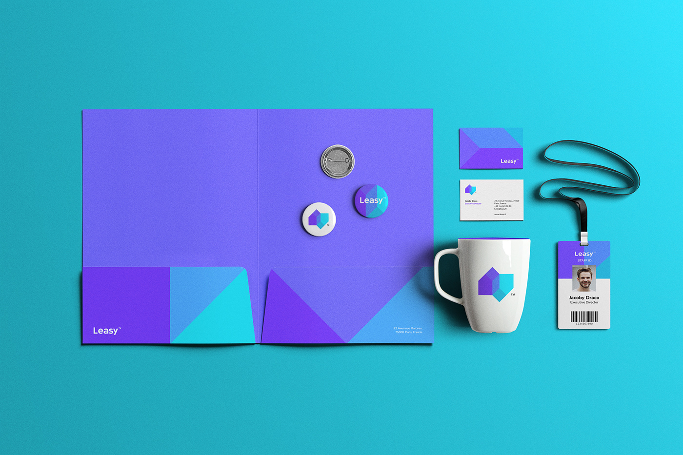
Leasy™ is a new technology app from France, offering a very interesting alternative in the real state sector, is a competitive and creative proposal that seeks to facilitate and improve the interaction and experience in which business are done in the real state market.
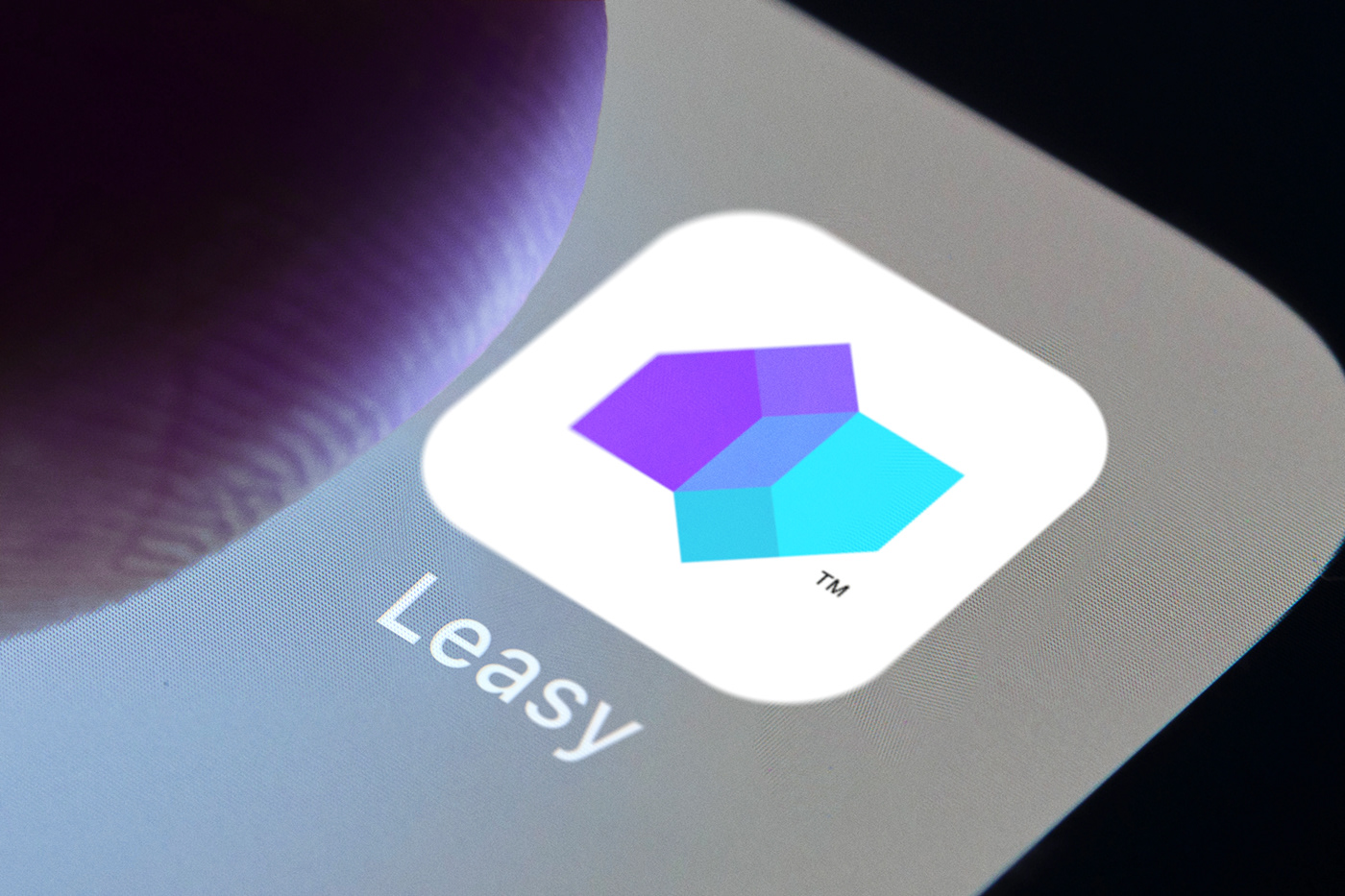
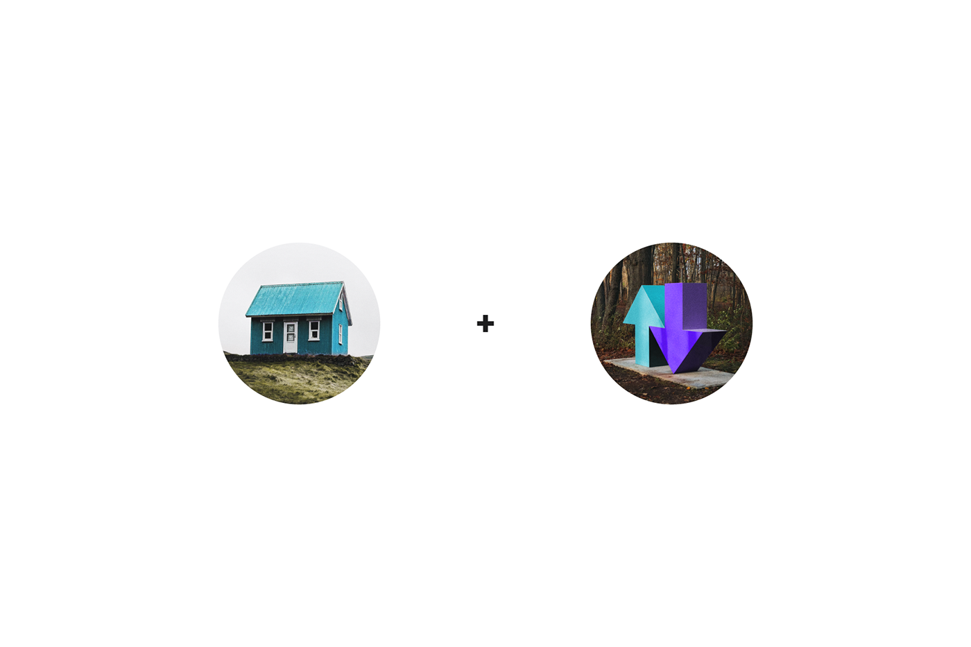
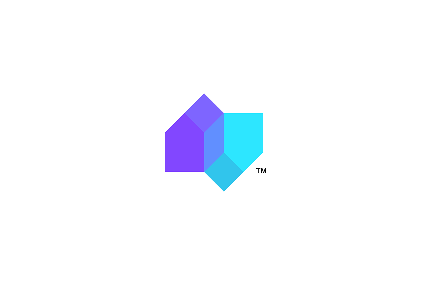
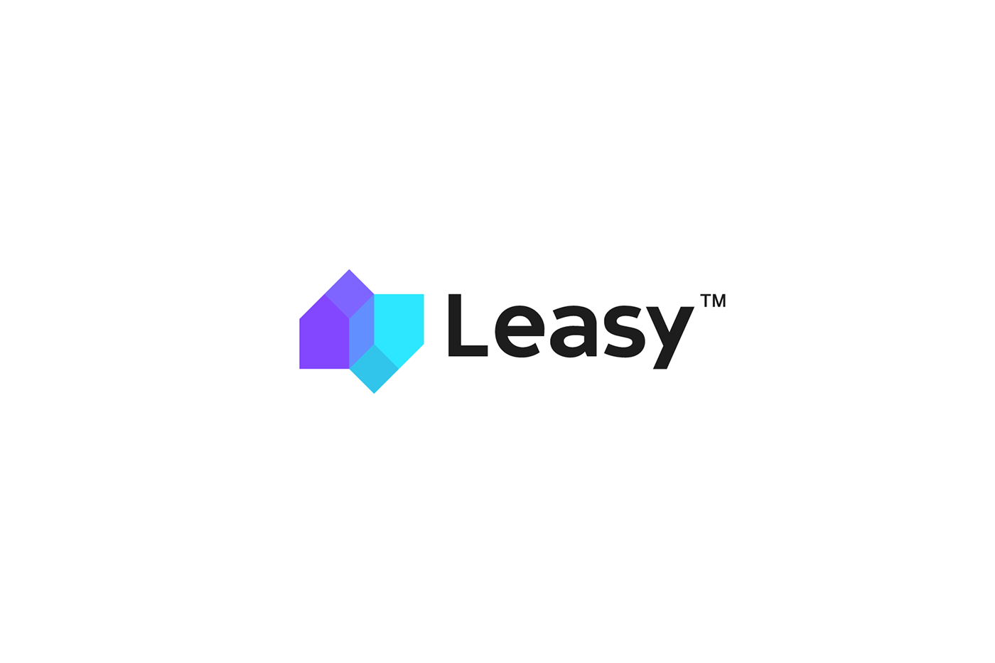
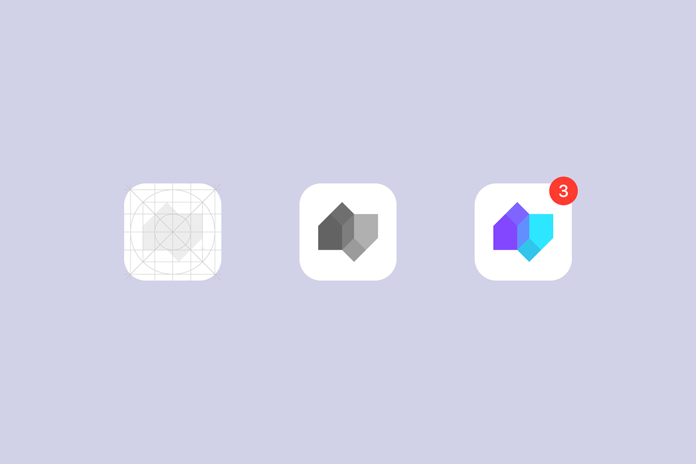
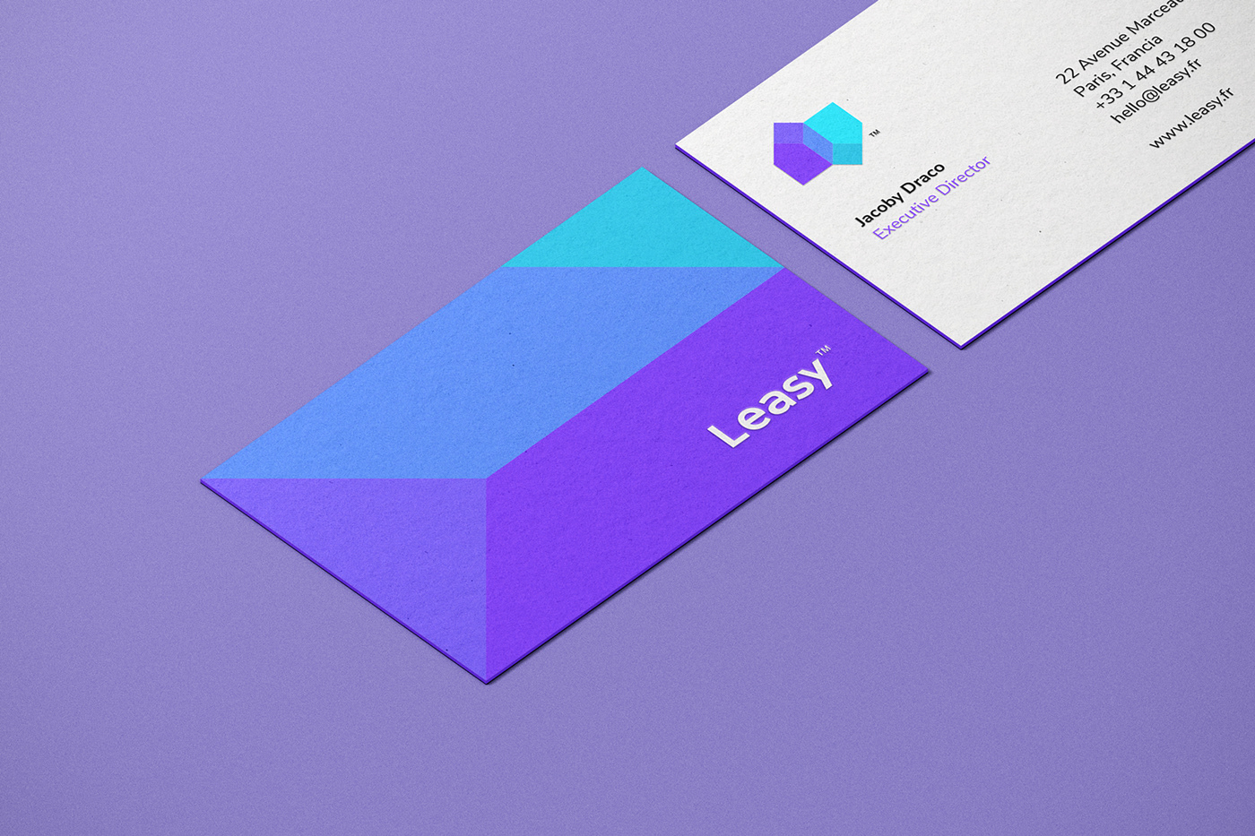
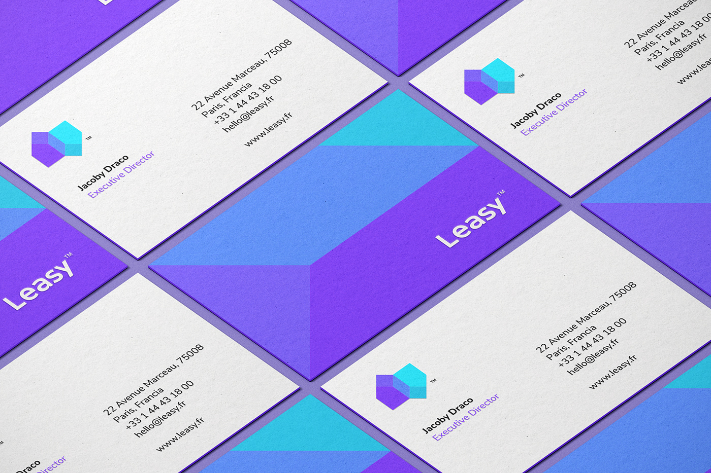
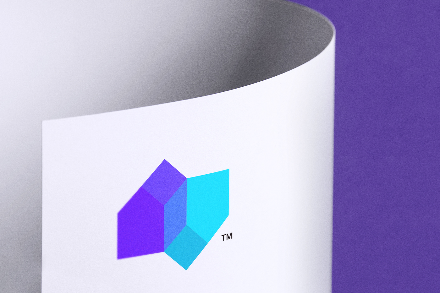
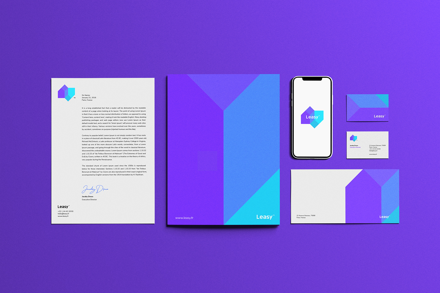
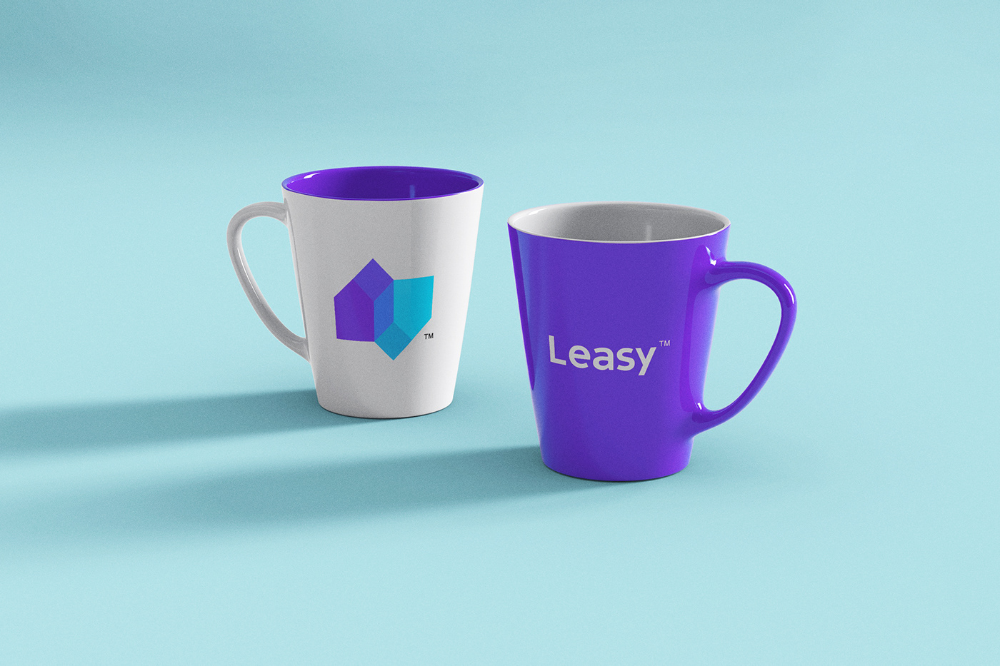
For the creation of the brand, I have created a logo under the concept of housing and the symbols of up/down. We tried to represent a house more easily, we linked both elements and we gave a slight 3D aspect. In addition the forms of the houses have the appearance of two directional symbols, which represents the search for alternatives and variety of proposals, a feature of the app.
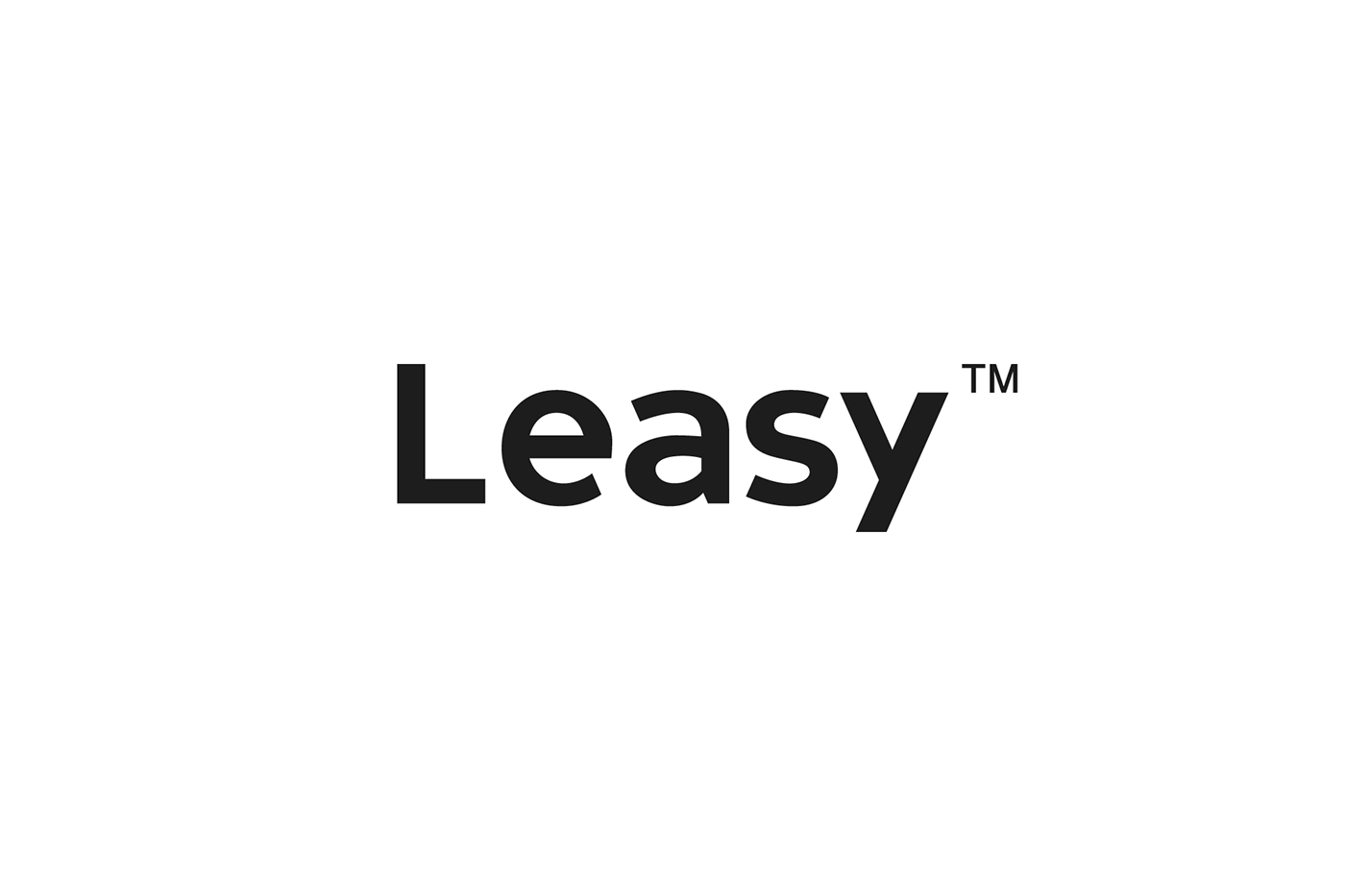
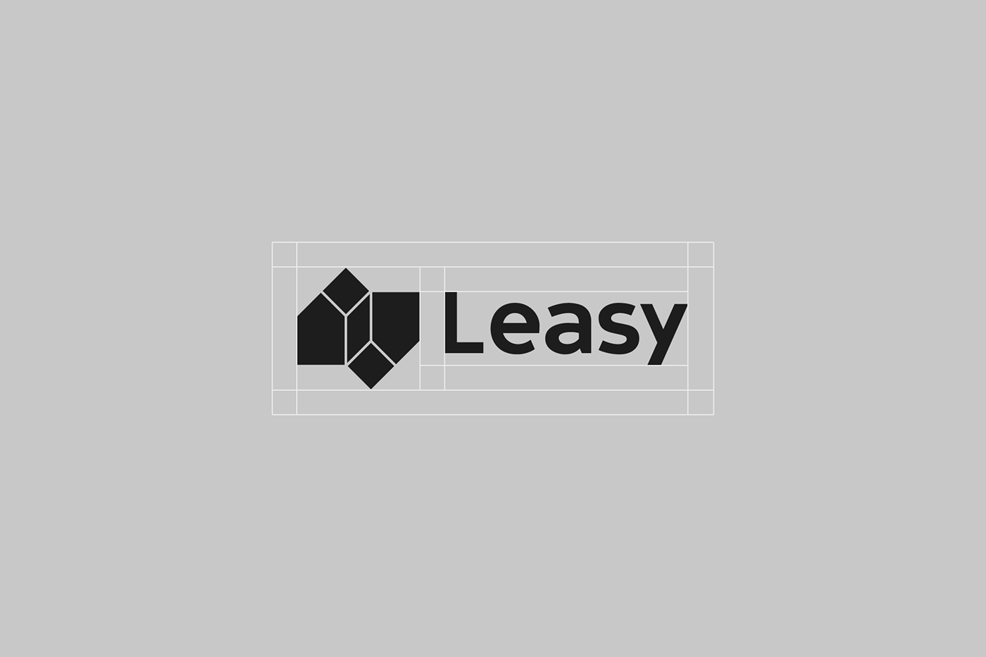
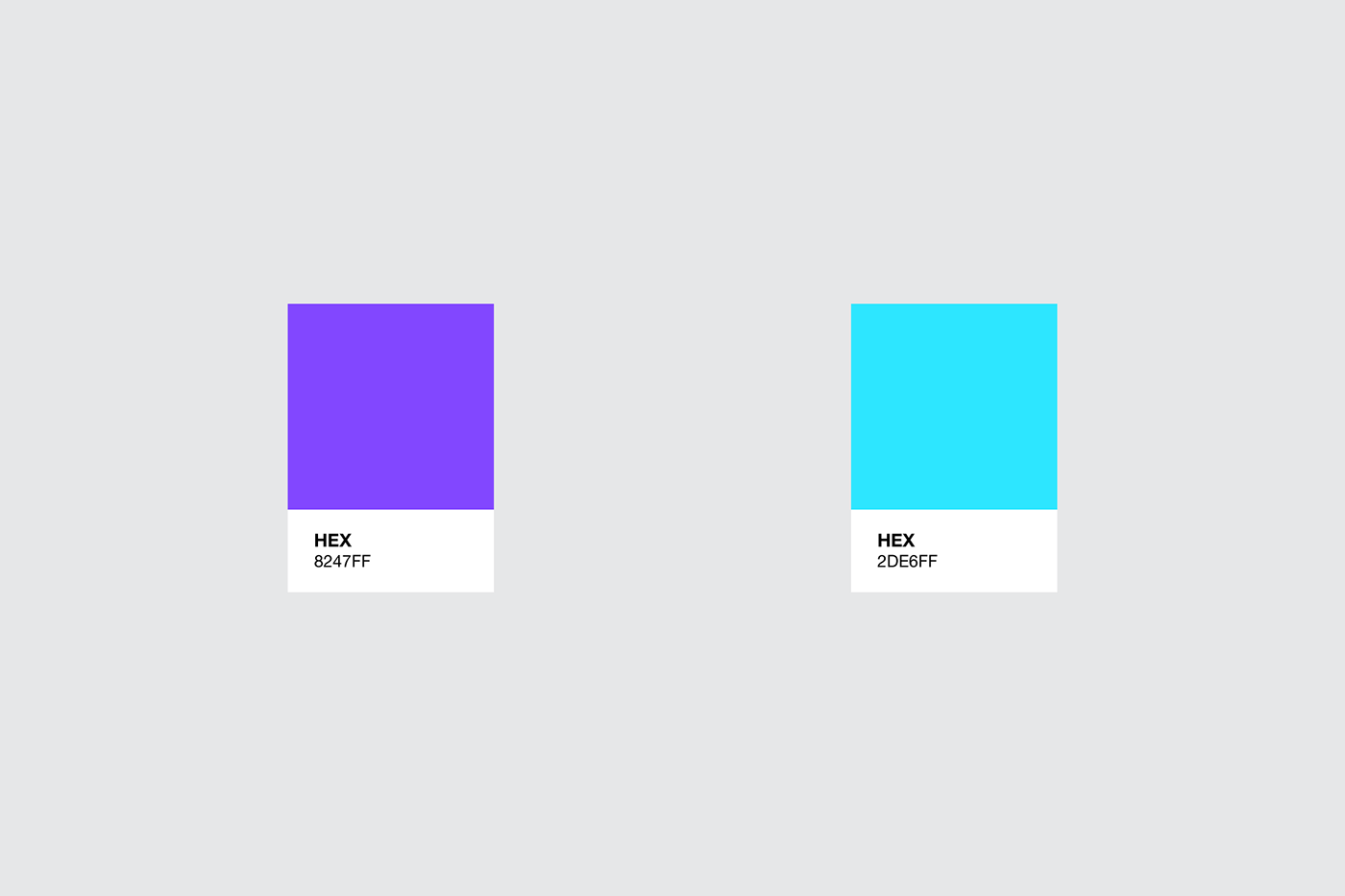
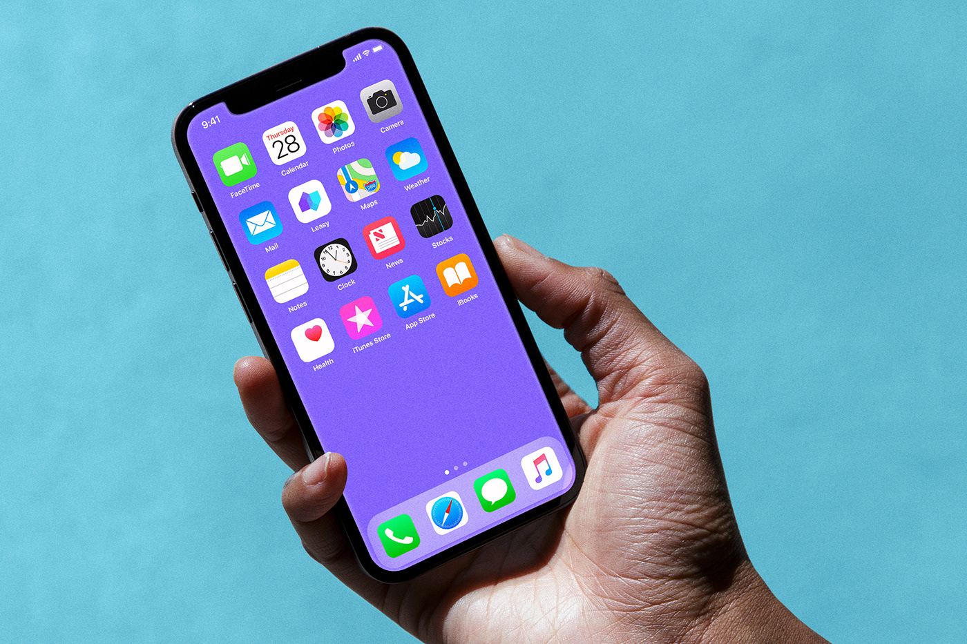
The logo is a modern and minimalist symbol, which allows the easy recall of the mark thanks to its simple form. The typography built to accompany the symbol shares the personality. The selected colors of the brand is a combination of two colors, purple and turquoise, this blend gives a technological and modern approach, in addition to the great contrast between these colors.


*All of the photos used in the designs belong to their respective owners.
Thanks for
WATCHING & APPRECIATION
Contact:
Follow:


