Sierra Nevada Brewing Pitch
Here's some pitch work I did last year for Sierra Nevada Brewing. They were exploring a possible rebrand for their Torpedo IPA product line that would lead with a more illustration-focused set of designs, featuring a little submarine getting into various misadventures.

Vehicle Designs
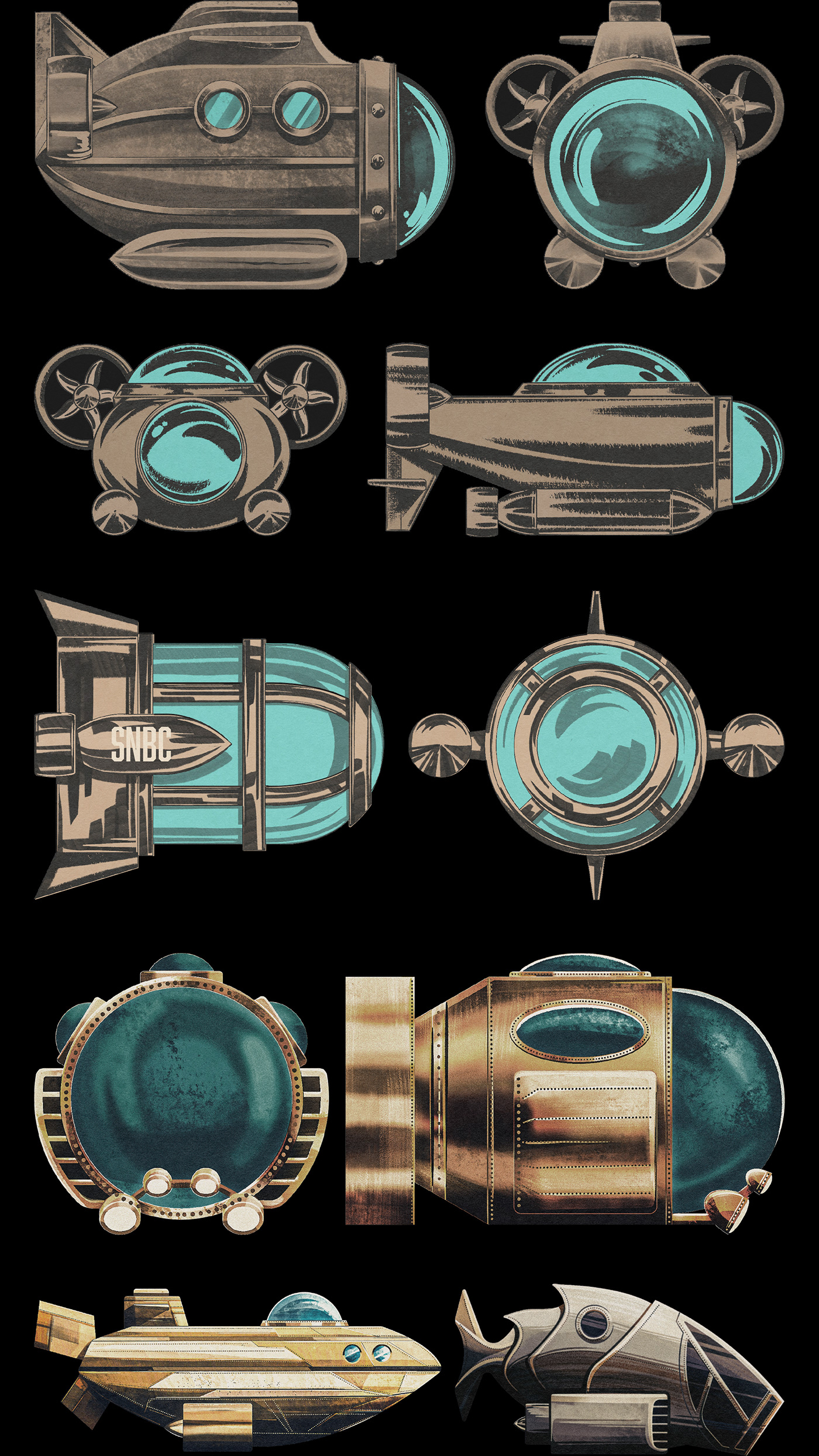
The project kicked off with some exploration into designs for the submarine. This submarine would hypothetically show up in all the different Torpedo packaging designs, each time navigating a different scenario pertaining to the name or characteristics of that specific Torpedo beer.
Here's an assortment of the rough sketches I put together. The second row ended up being the design we broadly went with, but it underwent a few tweaks before it was finished.
I also used this phase of the project to pitch various styles of rendering for the submarines and you may notice that the brushwork on each submarine differs a bit.
Concept Sketches
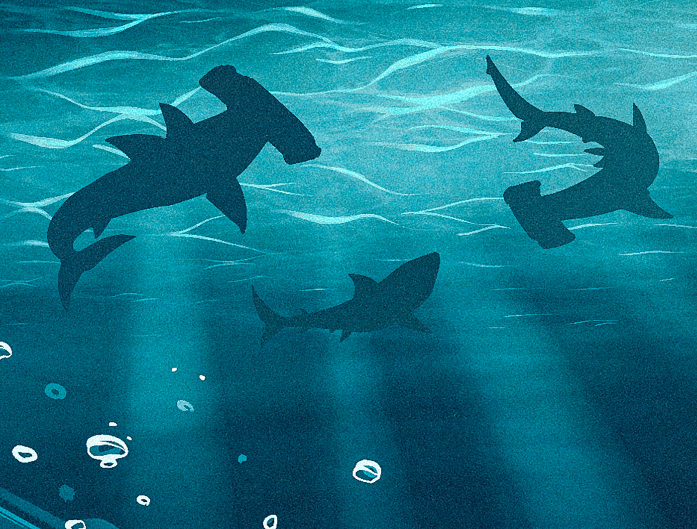
The next phase involved coming up with some composition sketches for the can artwork. We felt that one way to make things interesting would be to feature the submarine narrowly escaping danger of some kind, so that motif shows up here a lot.

3D Model
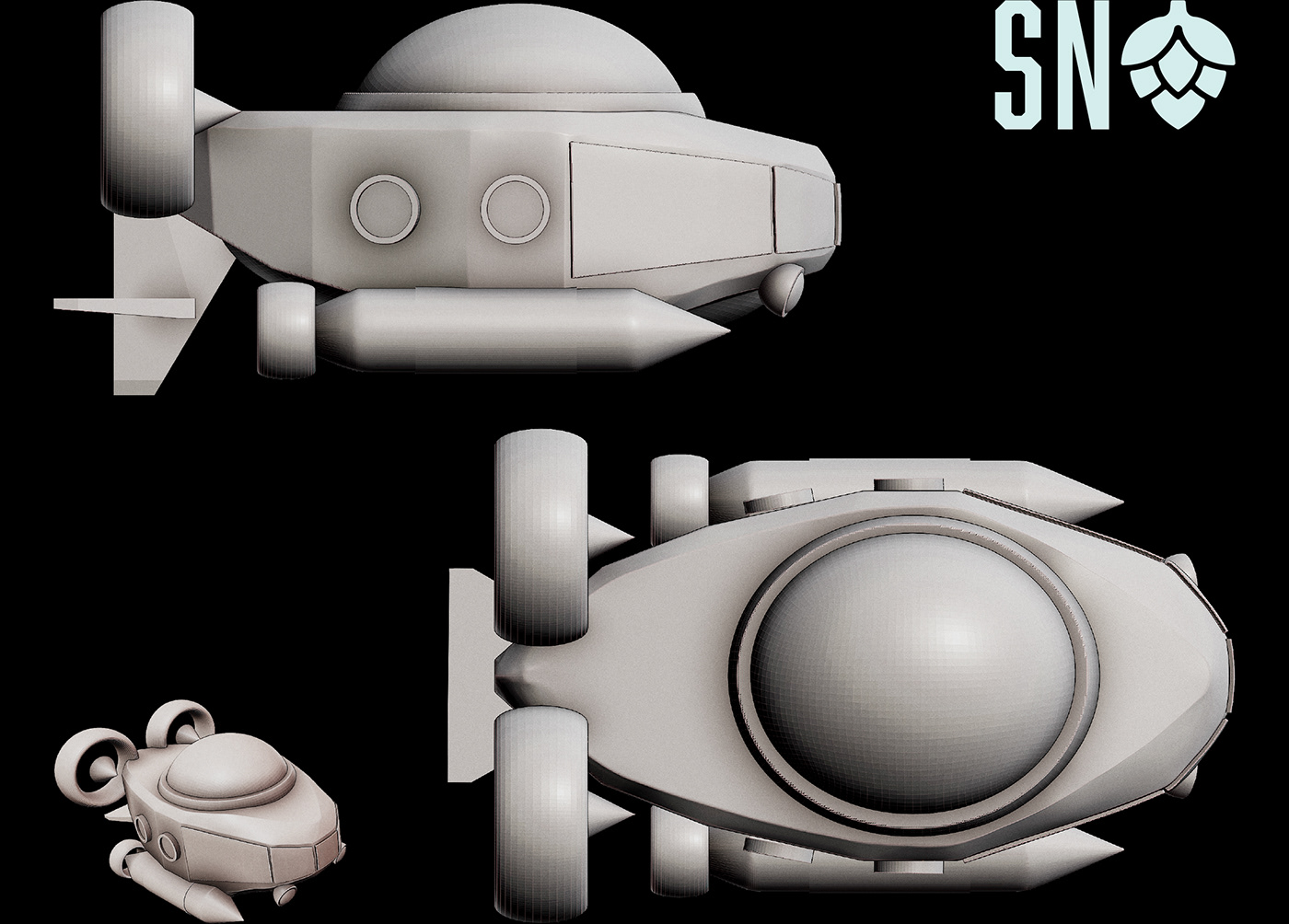
I'm not a 3D modeling wiz but I do enjoy dabbling for fun in a program called Nomad Sculpt on my iPad. I realized that if we were going to keep featuring this same submarine in future designs, having a 3D model I could reposition as a drawing reference would save a ton of time.
So I took the client-selected design from earlier in the project and made a basic 3D model of it. It worked out great!
Final Artwork
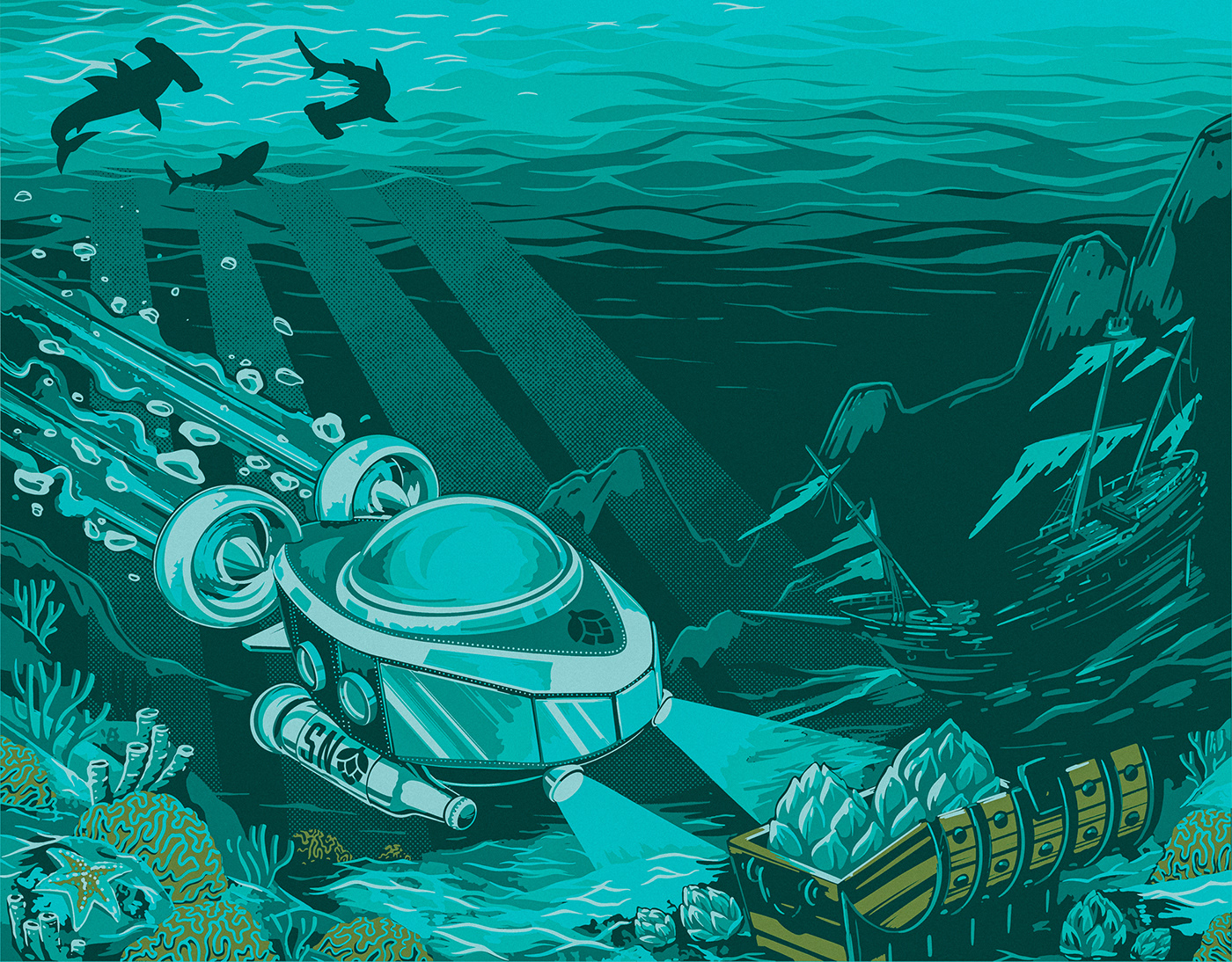
After landing on a rough composition and submarine design the Sierra Nevada people liked, it was time to dive into artwork.
This first image is an early in progress shot. You'll notice it features an early iteration of the submarine model I was using for reference.
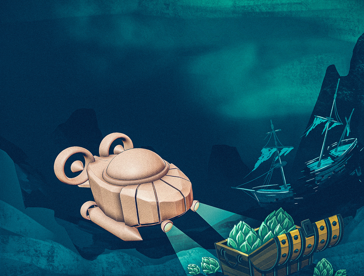
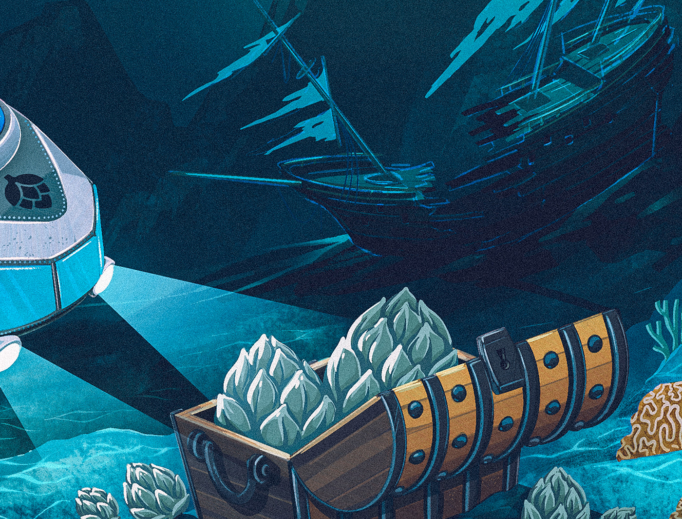
Here's a first pass on finished artwork. We decided it needed some tweaking and that it might be cool to make the submarine pontoons look like beer bottles, rather than missiles.

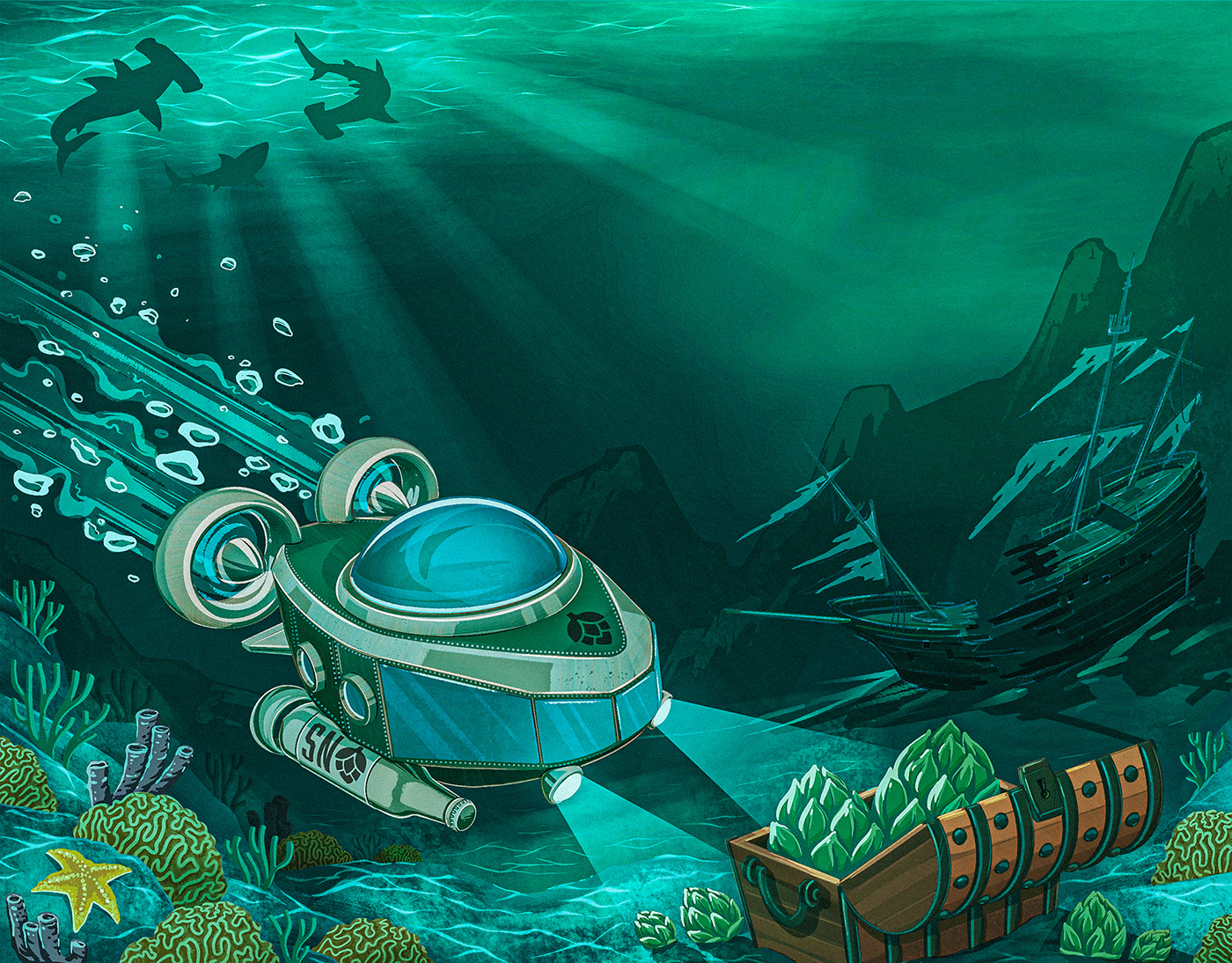
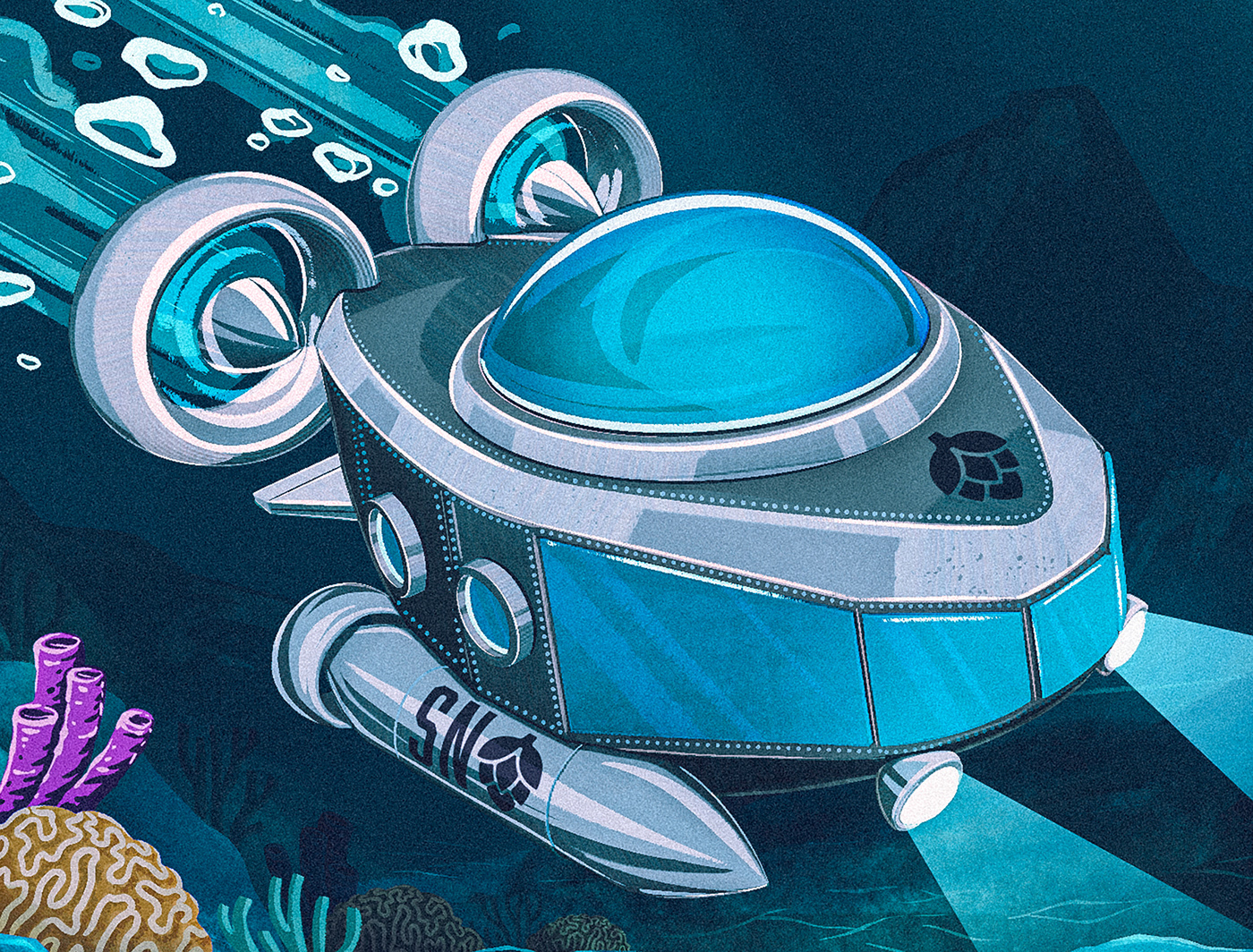
And here's and updated version with the adjustments to the pontoons. We were also exploring different color options at this phase of things so you may notice that some of these images are tinted more green or blue.
Color Reduction
Direct-to-can printing requires a reduced color palette because you are working with a limited number of inks per design. This next phase required adjusting the art for that print process. This version would be used on-can and the higher quality artwork could be used digitally or anywhere full color printing is possible such as bottle labels or 6, 12, and 24 unit casepacks.
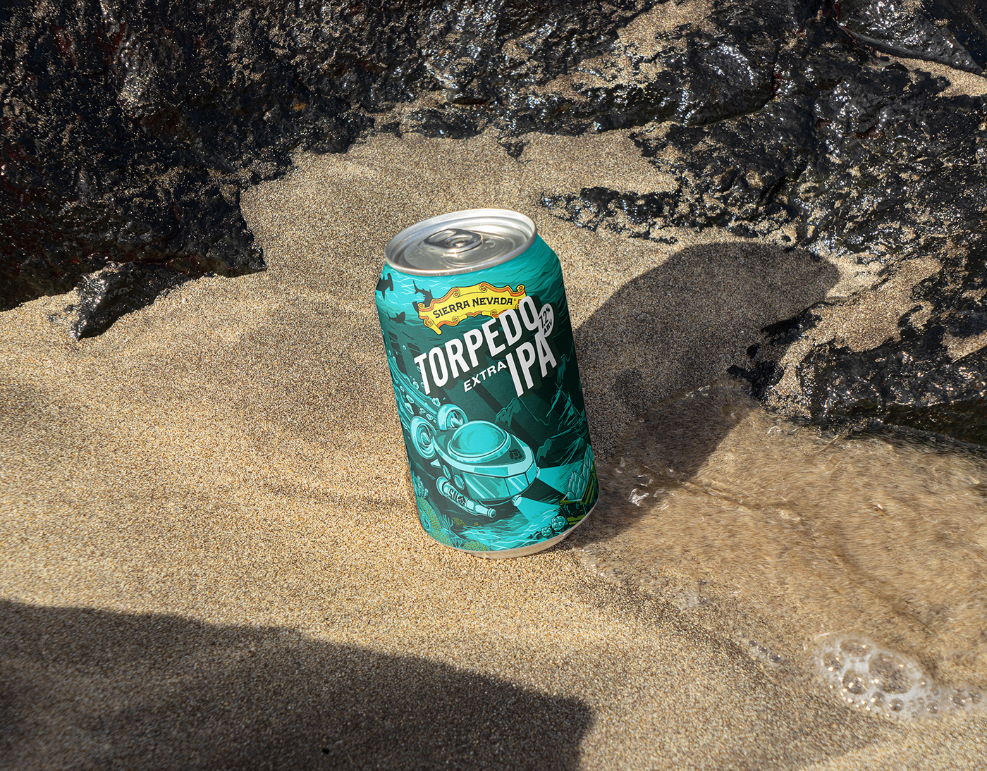
Mockups and Final Thoughts
With the artwork complete, I was given a rough template for the logos and text content for the can artwork. Now was a good time to throw everything into a mockup to see how it'd look on-can. I'm really proud of the final result.
Unfortunately these designs never made it to market, but that's non uncommon when you're pitching a major shift in the brand language for an established product line. In the long run it was decided this was too dramatic of a departure in look and feel for Torpedo at this time.
That said, it was an absolute pleasure to work with the Sierra Nevada people and there's a good chance we might tackle something else together in the future. I also really appreciate that they gave me the OK to show this work online. A lot of the time pitch work like this is kept under wraps.