THIS PROJECT IS BEING KICKSTARTED RIGHT NOW
TO BECOME A FREE FONT FOR NON COMMERCIAL USES
YOU CAN READ MORE INFO AND SUPPORT THE PROJECT HERE
SHARING IT THROUGH SOCIAL MEDIA IS EXTREMELY APRECIATED :D
TO BECOME A FREE FONT FOR NON COMMERCIAL USES
YOU CAN READ MORE INFO AND SUPPORT THE PROJECT HERE
SHARING IT THROUGH SOCIAL MEDIA IS EXTREMELY APRECIATED :D
(until MAY 12)
The Tiananmen Font Project
The Tiananmen Font Project is a set of five typefaces to express opposition to the Status Quo. They cover a wide spectrum of potential voices and feelings involved over the lifetime of a protest. The entire project is inspired by the terrible recession that Spain has been suffering recently. However, the name is taken from the Chinese square where more than 2000 protestors were killed by the Chinese government in 1989.
The image of “the man of Tienanmen” made a huge impact on me when I was a child. I think there is no greater symbol of opposition to oppression, so I wanted my typeface to carry that name.
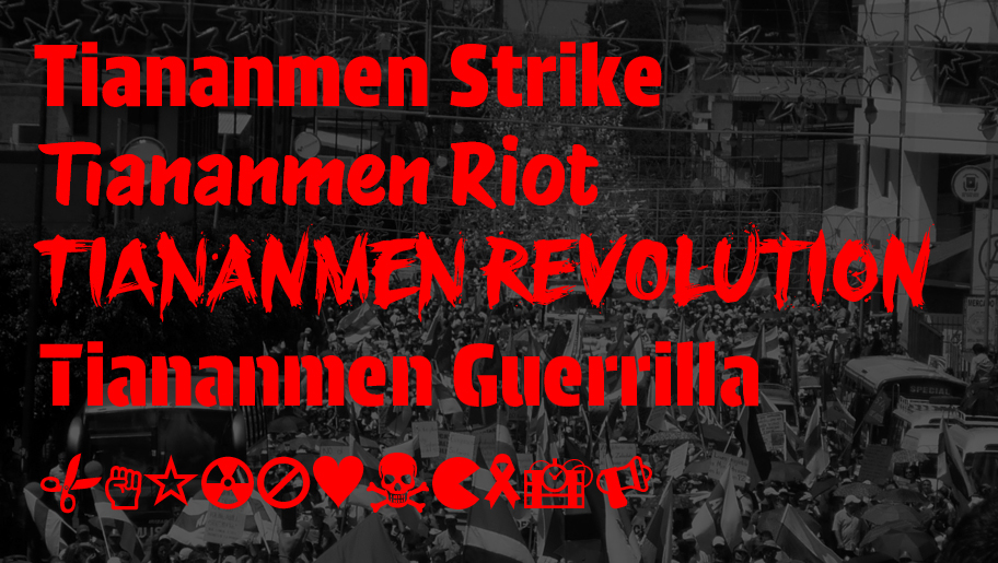
The five Tiananmen Fonts
The Fonts
The five typefaces are Strike, Riot, Revolution, Guerrilla & Symbols. Each references a different degree of protest
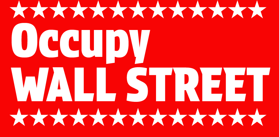
Strike + Symbols (Occupy Wall Street is a global movement)
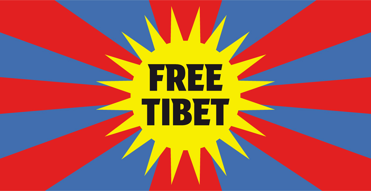
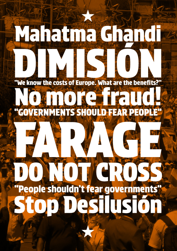
Strike is a solid sans serif with open counters. This makes it more readable from a distance. It is strong and solid.
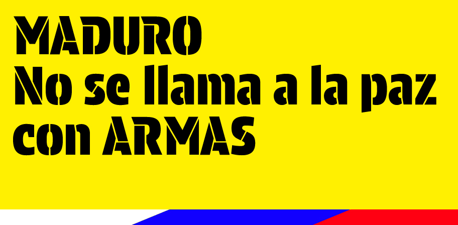
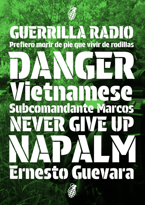
Guerrilla is a stencil version of Strike, for when you cannot print and must spray your message (or want to play with a different effect in print).
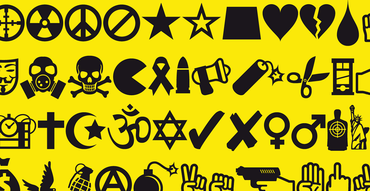
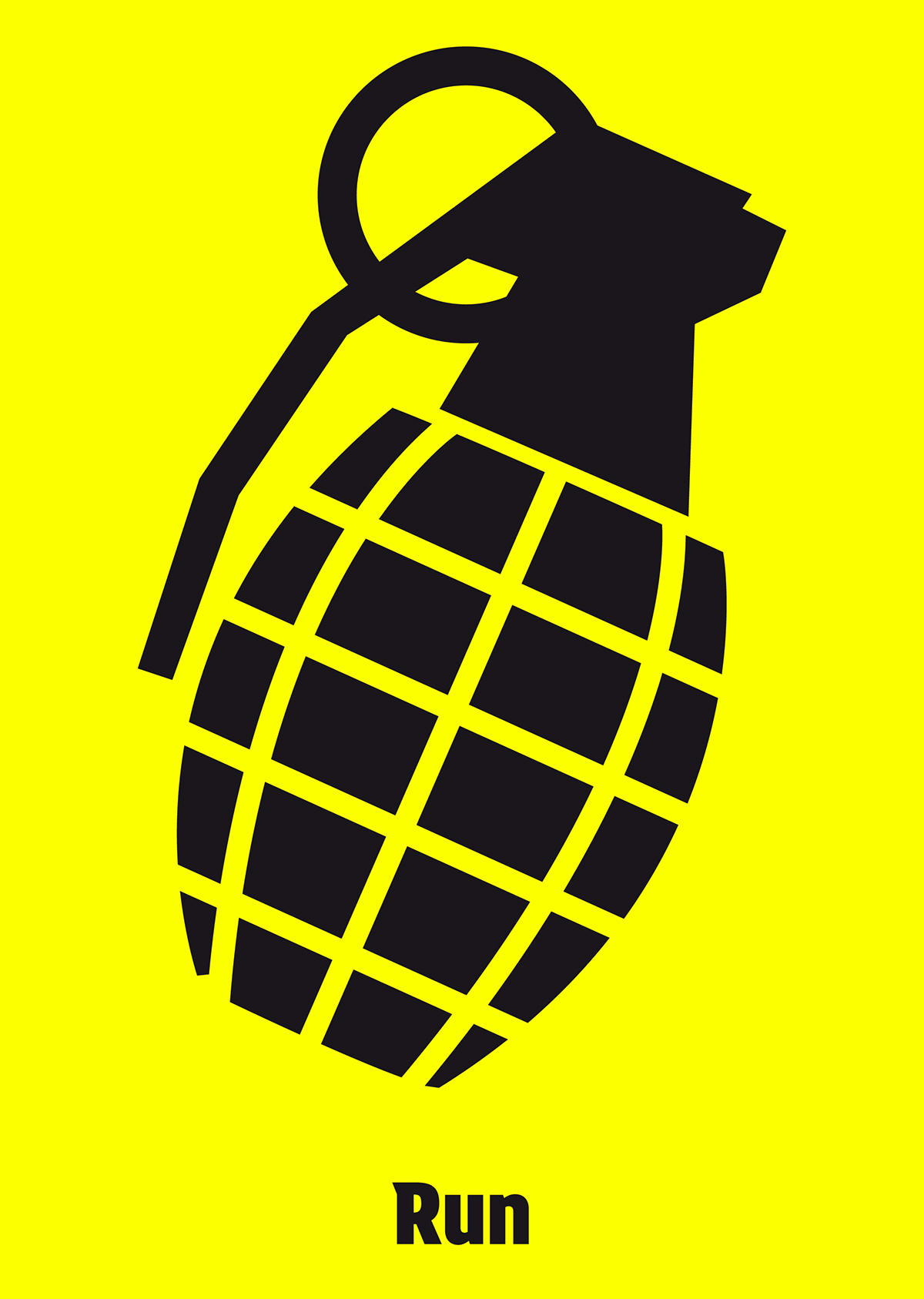
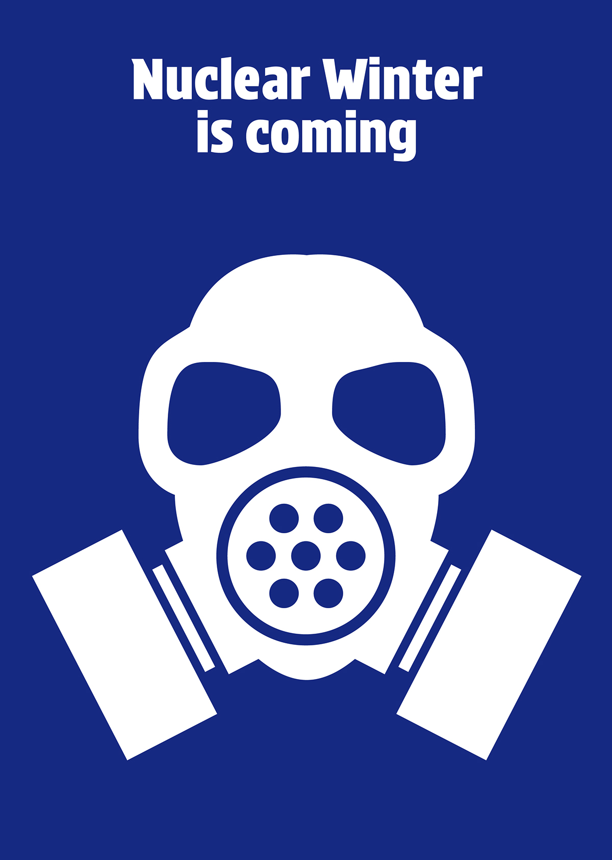
Symbols is a set of dingbats to empower the message.

Riot + Symbols (from a protest in Toronto)
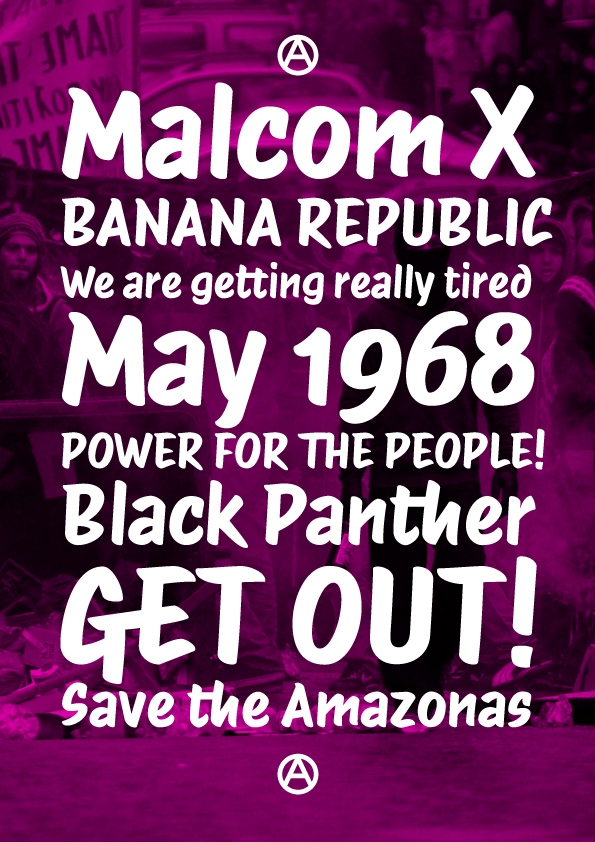
Riot is a quite unconventionally constructed script font, with a reverse stress, and the letters are less angular than expected for the style. It is suitable for more informal messages.
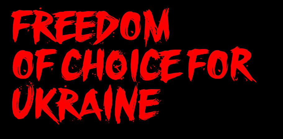
Revolution (translated from a protest in Kiev)
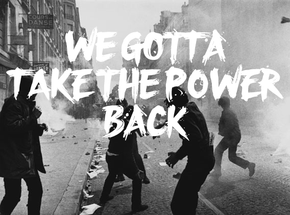
Revolution is a more complex design. It simulates rapid brush-script lettering. Several versions of each glyph are designed and automatically substituted to avoid unrealistic repetition. This special "OpenType" code is carefully crafted for you to control the amount of spatter.
Going Technical
Tiananmen challenges the regular composition of a type family. A study of history of typography reveals that the usual structure of regular, italic, bold, bold italic it has developed in an arbitrary way. The Tiananmen Font Family is related in two different ways which are also equally arbitrary:
1. Spacing: The four fonts share the same metrics. In that way the user can compose his message and then decide his level of anger without altering the layout.
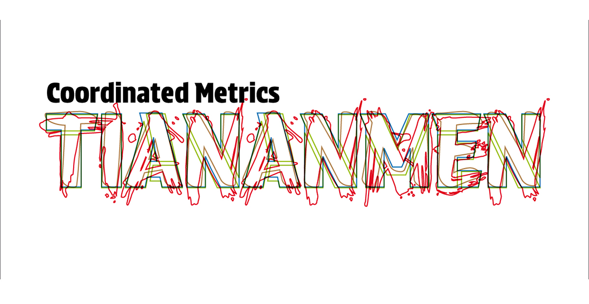
Because of the coordinated spacing, you can write your message and then change your “tone” without altering the layout
2. Construction: the letters have a common construction core inspired mainly by both Riot and Revolution. In the case of Strike some of these features stand out as idiosyncratic. However, when you think of the font as part of a system, the connections are obvious.
THANKS FOR YOUR SUPPORT
(until MAY 12)

