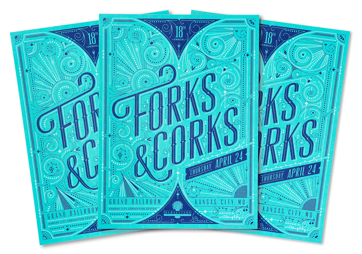
Forks & Corks 2014 | LIMITED-EDITION SILKSCREEN POSTERS
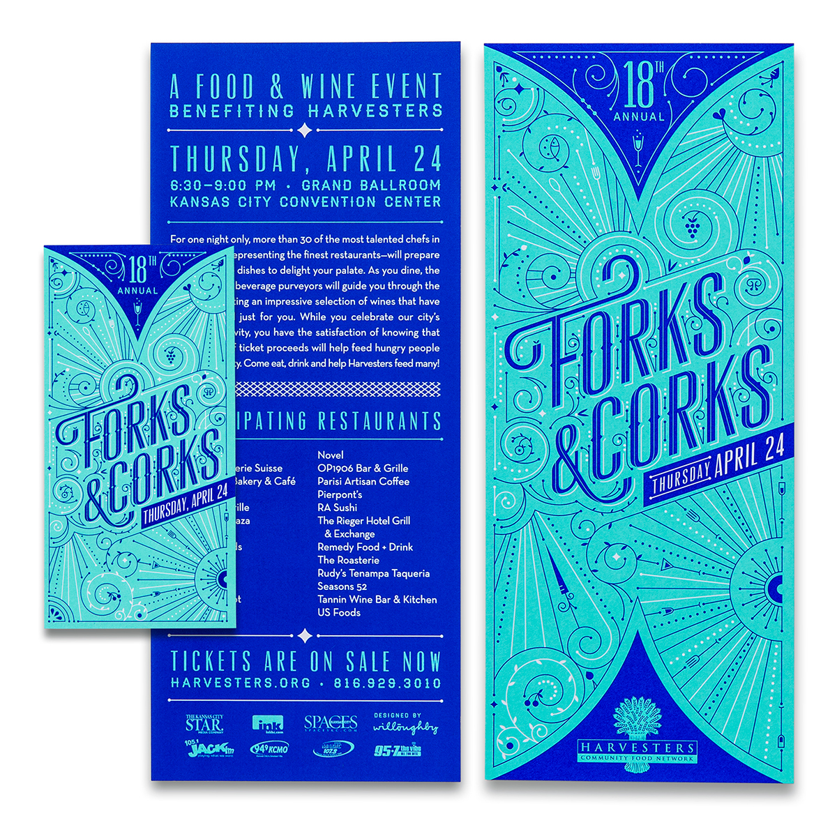
Forks & Corks is an annual food and wine tasting event benefitting Harvesters Food Bank. The event attracts restaurant enthusiasts, Harvesters supporters and foodies alike. Each year, Willoughby designs the visual identity for Forks & Corks. This includes invitations, tickets, programs, promotional ads & limited-edition silkscreen posters to auction off at the event.
Forks & Corks is an annual food and wine tasting event benefitting Harvesters Food Bank. The event attracts restaurant enthusiasts, Harvesters supporters and foodies alike. Each year, Willoughby designs the visual identity for Forks & Corks. This includes invitations, tickets, programs, promotional ads & limited-edition silkscreen posters to auction off at the event.
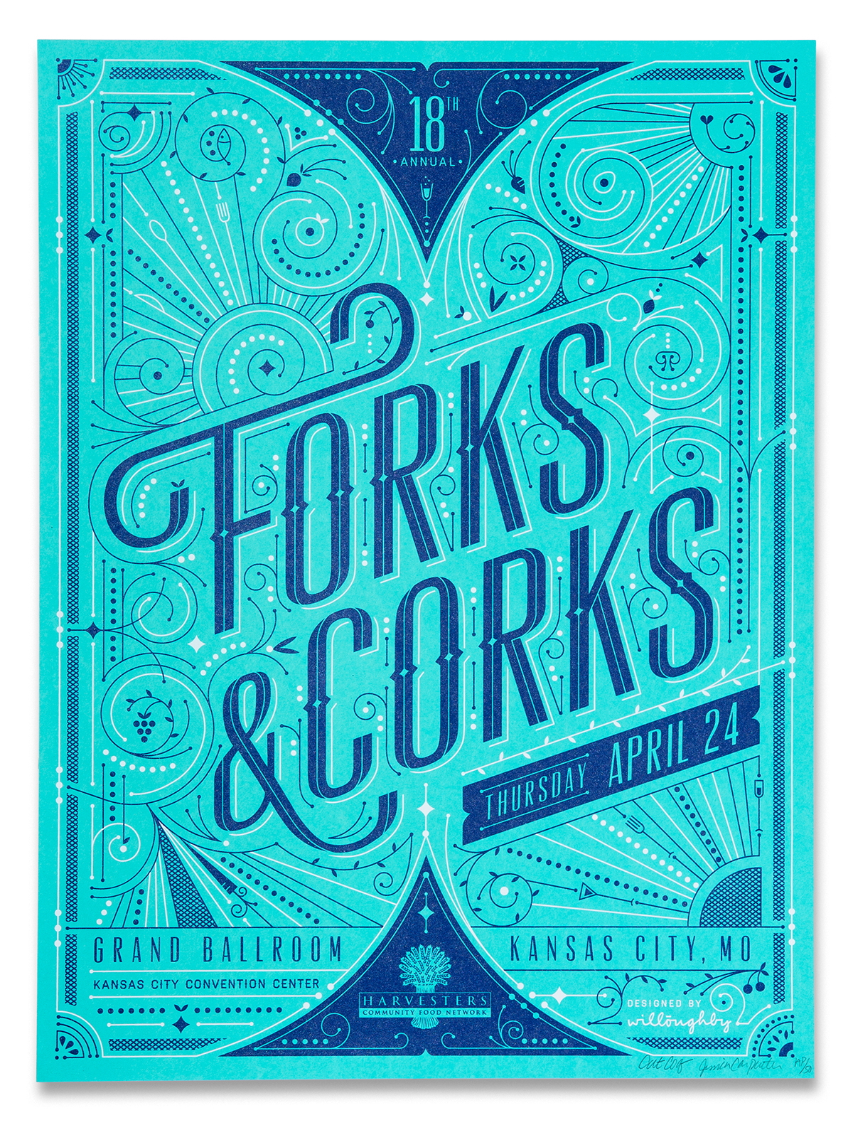
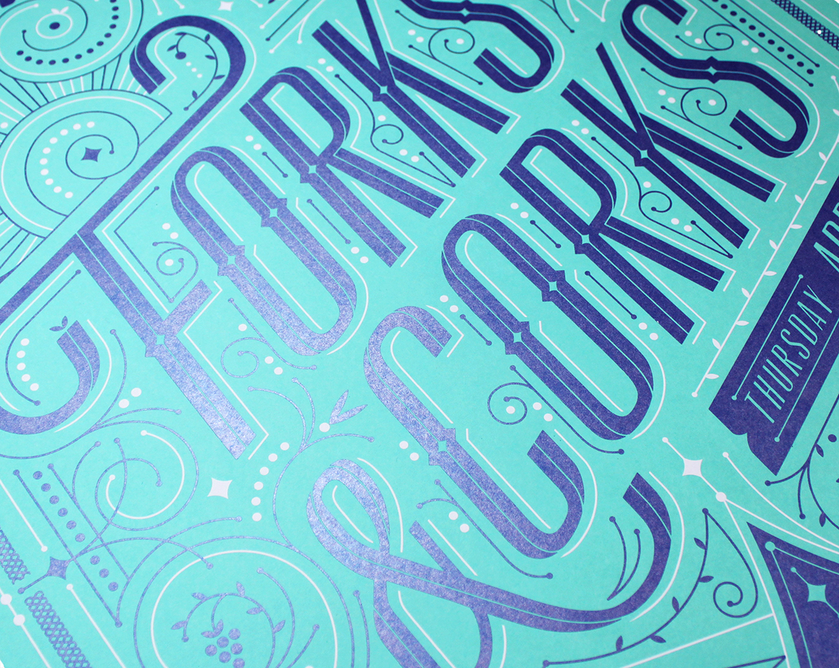
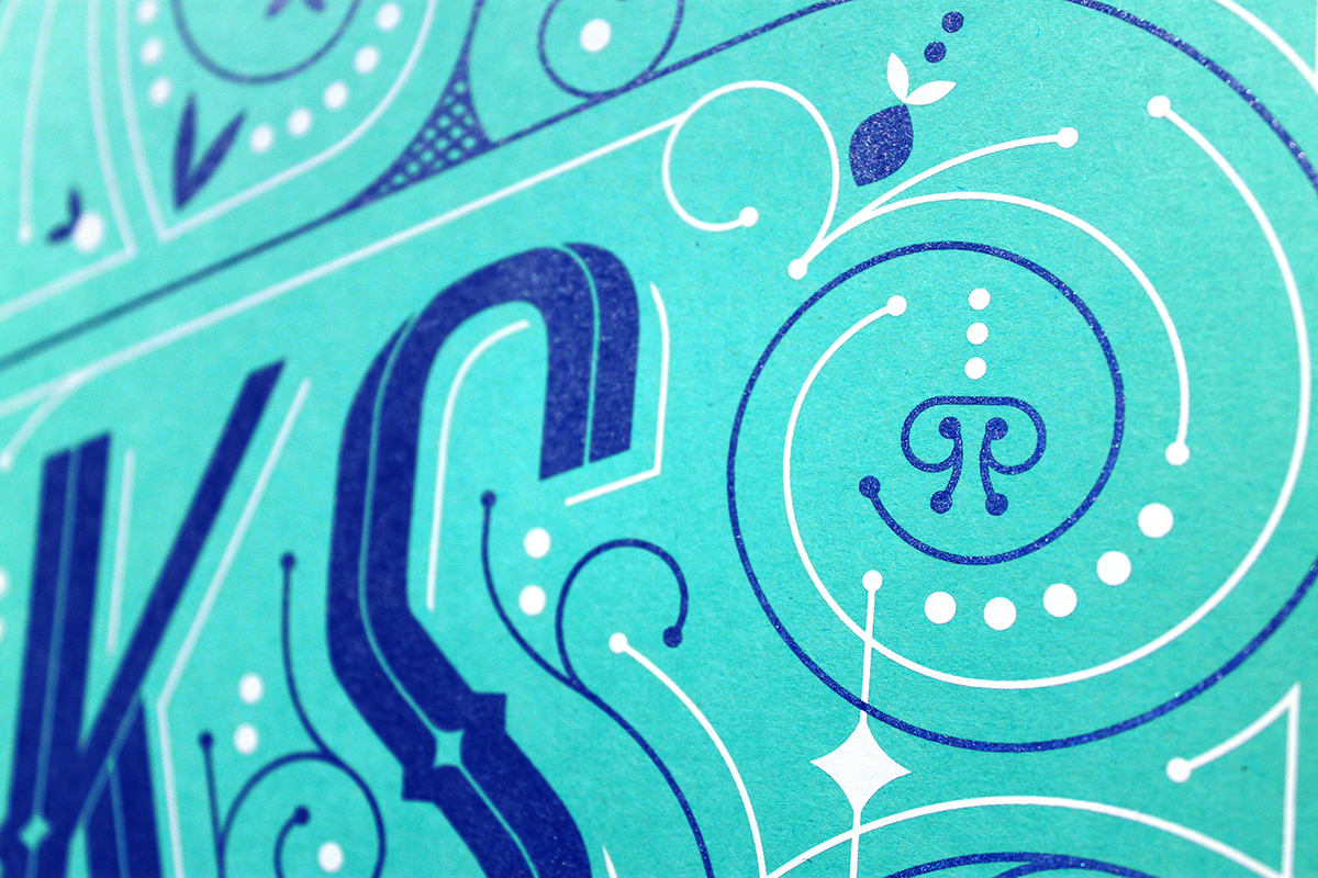
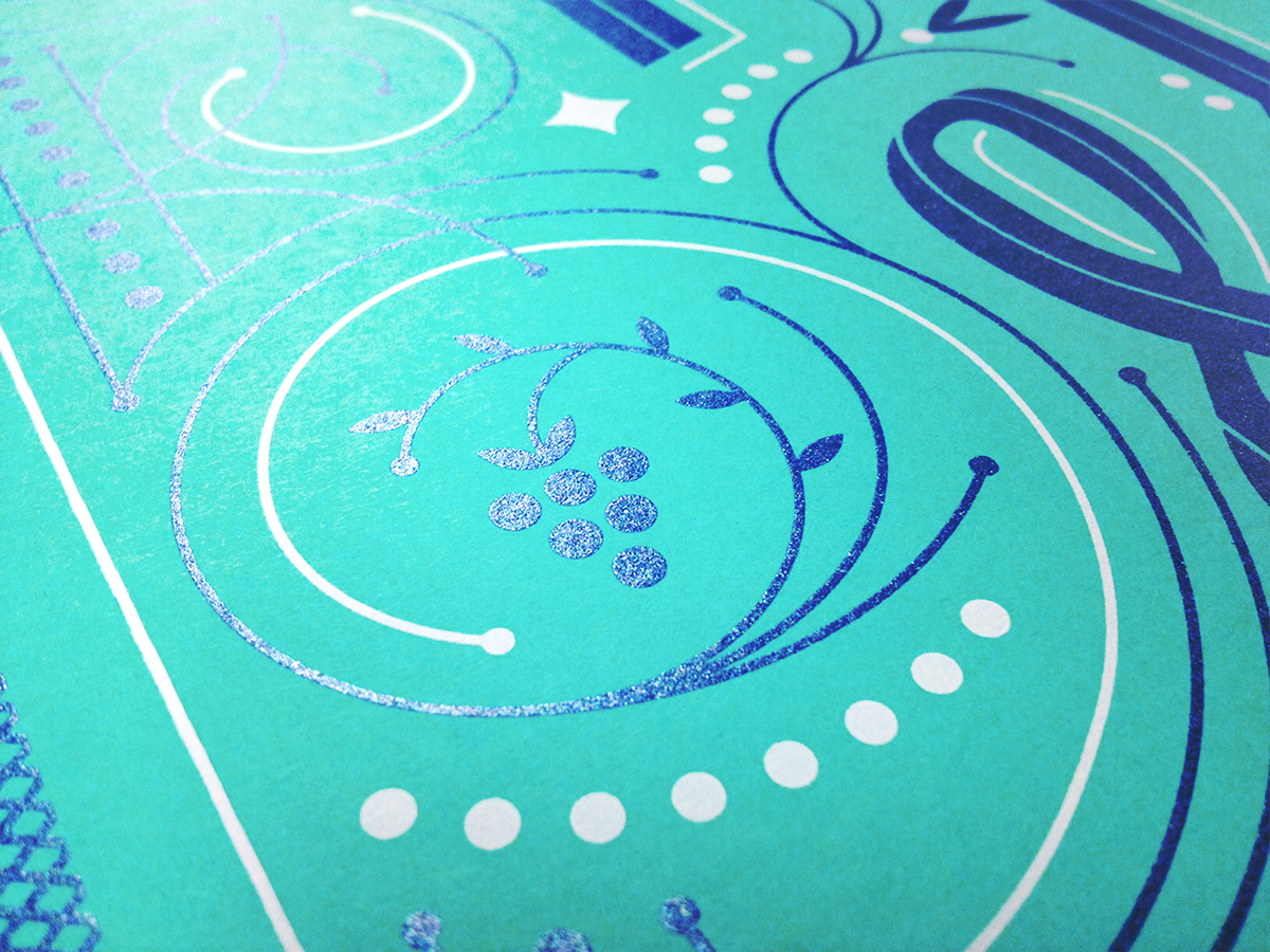
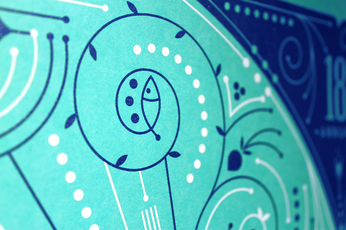
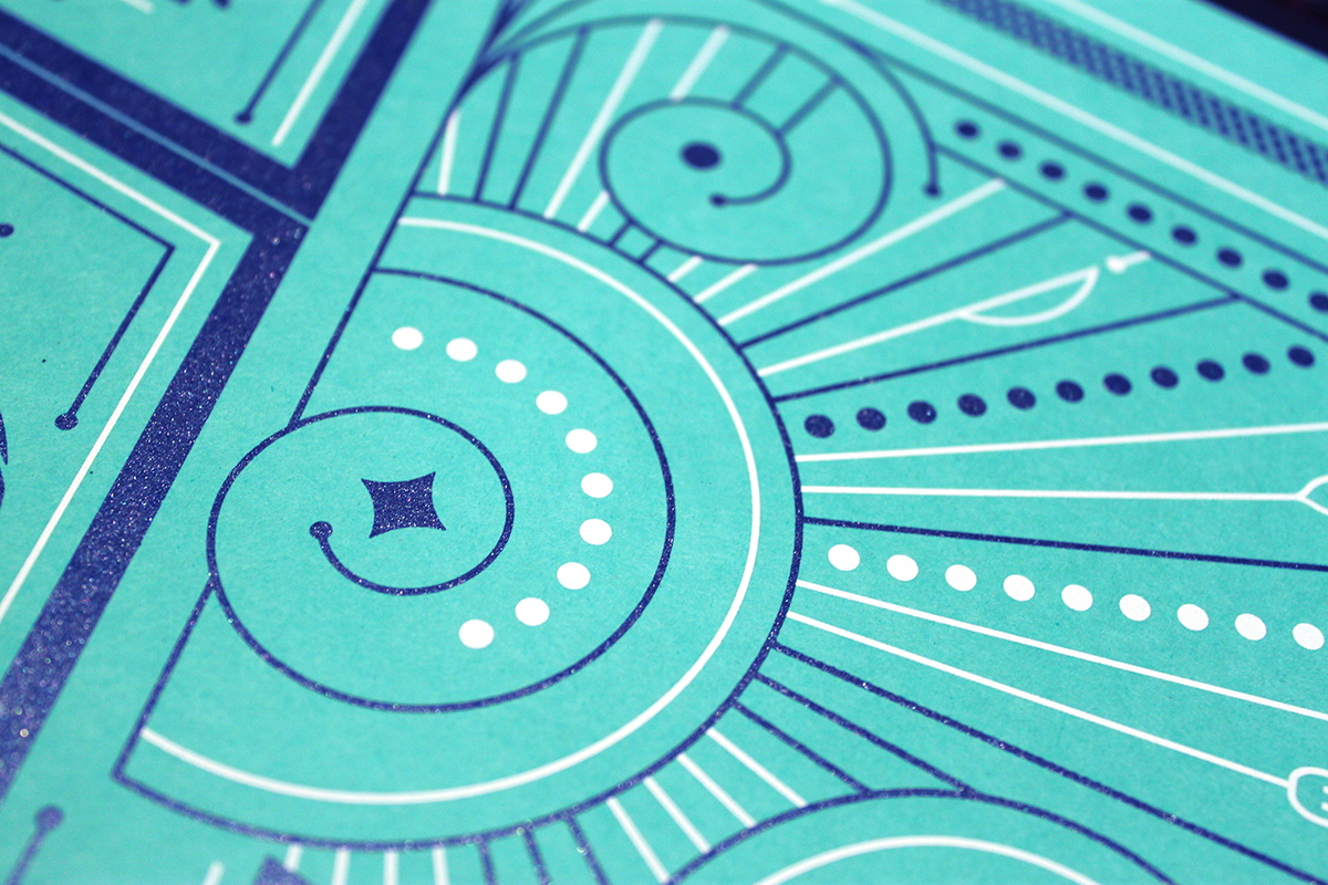
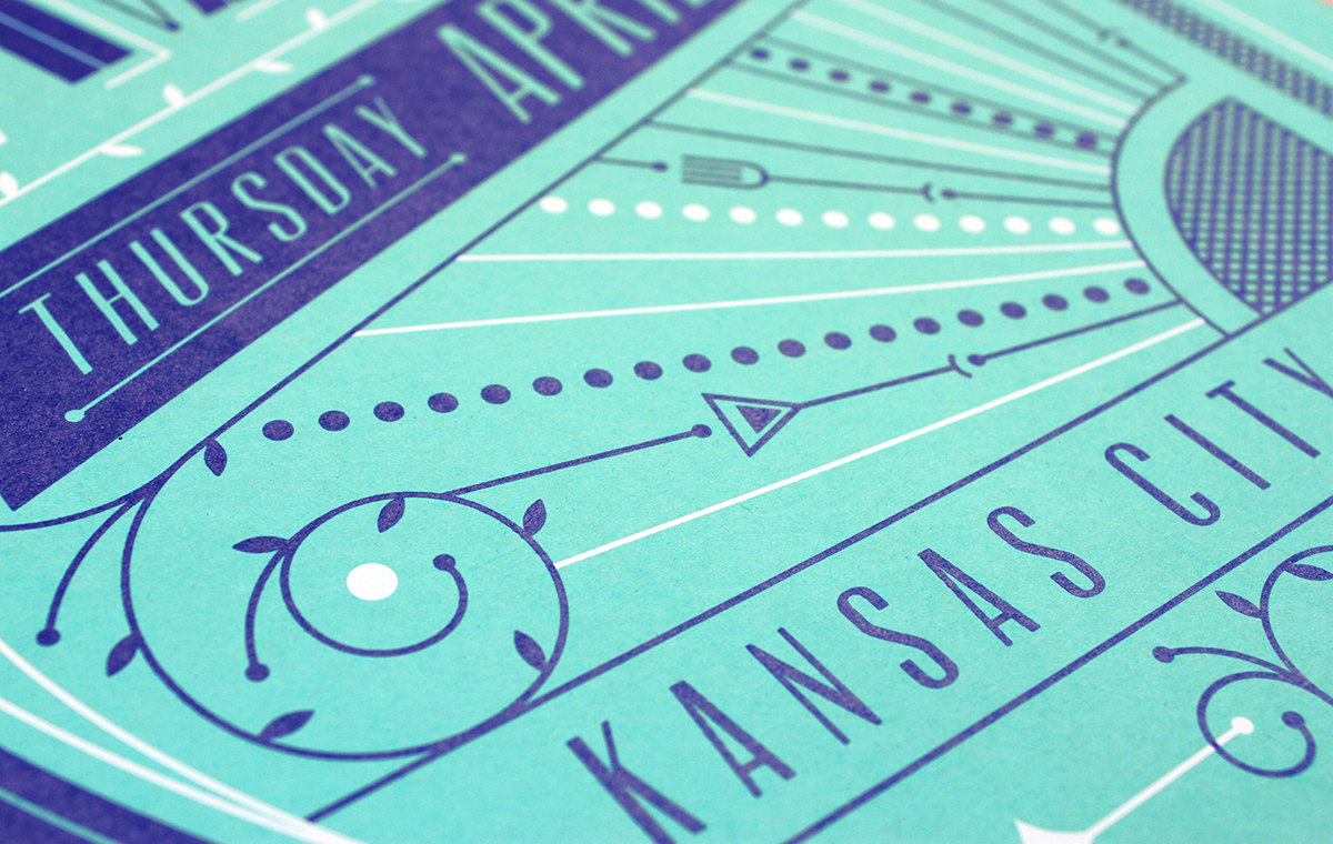
Our goal this year was to capture the elegance & liveliness of the event with a poster that could double as an art print. The intricacy of the design, laden with meticulous embellishments, is stabilized with monoweight lines & a restricted color palette. Food elements are woven into the design; discover the citrus wedge cornerstones or silverware worked into radiating beams.
We worked with Vahalla Studios to screenprint a set of limited-edition posters. The metallic navy ink pops off the paper & elevates the design into a striking print.
See all Forks & Corks posters from the past 17 years here.


Our Printing Process | WORKING WITH VAHALLA STUDIOS

We spent the morning on press at Vahalla Studios with Dan Padavic & his assistants.

Preparing to burn the screen.
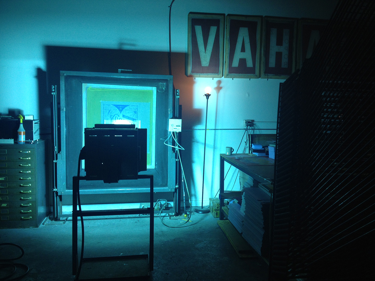
The exposure.
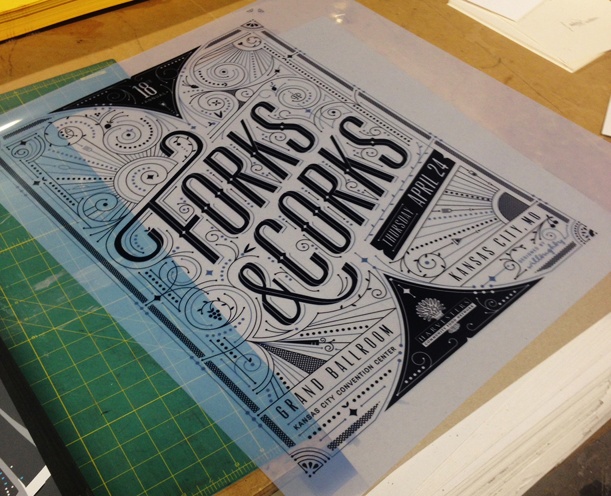
The two films: one for metallic blue & the other for white ink.

Dan mixed up the perfect metallic navy ink.
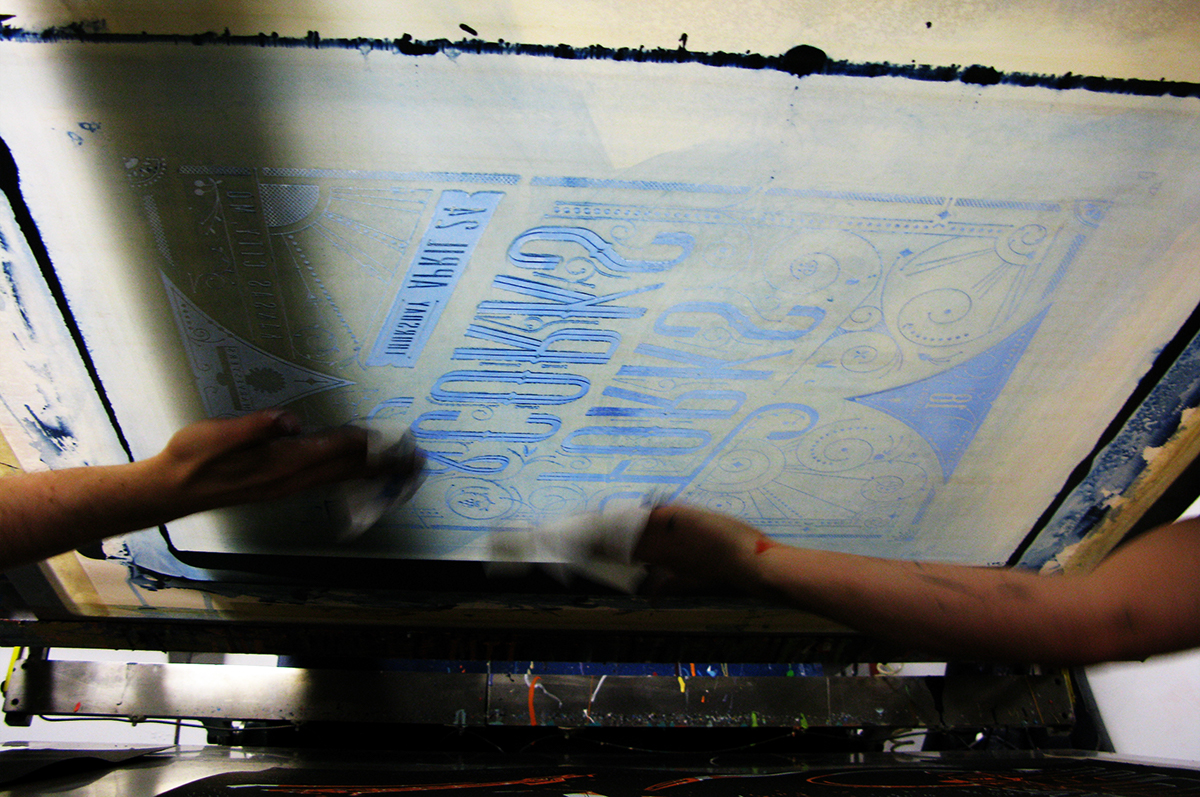
Wiping down the screen between test runs.
One of many test prints. This one was our favorite.

Laying out the first layer to dry. The white ink was the easy part.
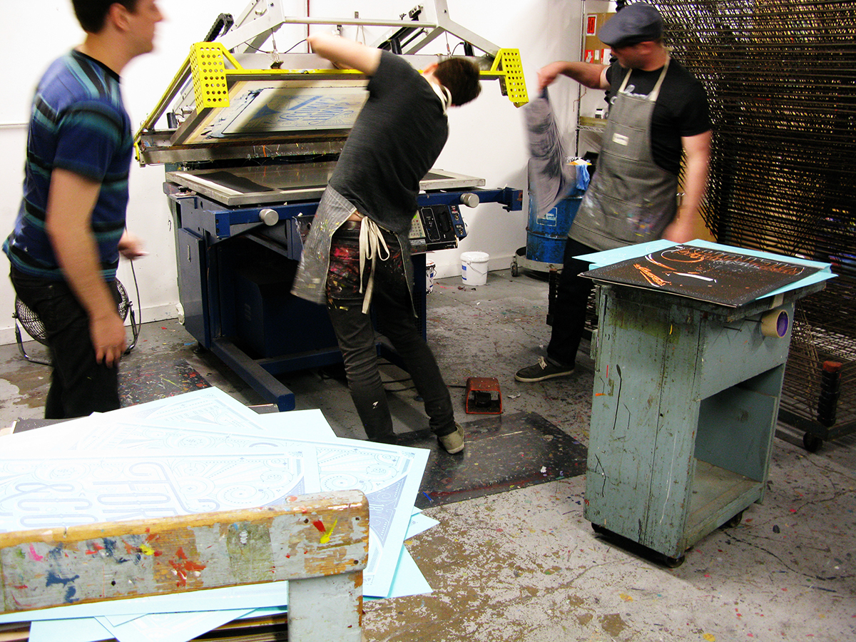
Dustin & Dan working on the second screen: the metallic navy.

Waiting for the ink to dry. This method actually worked pretty well!

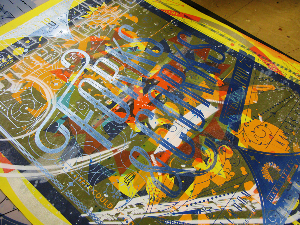
After four pulls (altering the ink a bit each time) we finally hit the perfect color!
The final prints.


