
Flexiplan is an app that helps mobile users to explore and buy different types of mobile internet/data packages, talk-time & SMS with a validity of 1 day, 7 days, 30 days, etc. It’s a pretty simple app with limited functionalities and a straightforward user experience.
Note: Any official team of Grameenphone does not do this, or I wasn’t hired for this project. This is a concept project, designed by me to improve and exercise my UI & UX skill.
Pain Points
It is noticeable that the Flexiplan app's current look and feel can be improved with a better user interface and experience design. Along with the market competition, cost & user demands, the following pain points are the reasons for my redesign of this app.
Lackness of visual hierarchy (Pretty bad User Interface)
Boring user experience.
Cluttered content.
Goal
Improve the user interface considering all the limitations we have.
Provide a better user experience.
Better interaction, if possible add some micro-interactions.
To help them gain some long-term loyalty from the users.
Reduce boredom as much as possible.
User Flow
Based on the information architecture (which is already established) and my research, it was clear that the user wants a fast and effective way of exploring their data plans and buying a suitable plan for them.

There are 3 main stages:
Exploring Plans/Entry Point: Users will try to combine different internet packages, talk times, and SMS bundles with validity, to find a suitable and affordable plan for them.
Decision Making: In this stage, a user is satisfied with a plan he/she chose and is ready for the next stage to achieve their goal.
Buy Plan/Exit Point: User reviews and check the plan they chose, fills up the related forms and completes their whole process of buying a plan.
Ideation & Wireframes
I started prototyping with paper sketching and tried out different screens, and layouts to find a better way to declutter the content and improve the whole user experience. After a couple of iterations I developed the following wireframes for its user flow:

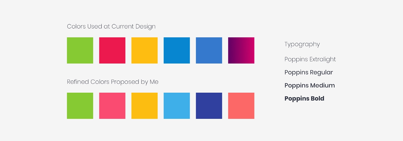
Colour Palette and Typeface:
Our key target users are the young stars. So the need for vibrancy in the color was a must for us, to help bring a lively vibe to the app. The vibrant colors were already established in the current app design, so I picked the colors and polished it a bit to improve the visual hierarchy.
To complement this, the typeface I chose was Poppins — Google font because of its versatile font weights and it is easy to read. Also, the fact is Poppins, is a round-type font which makes it more friendly and inviting.
What can be better?
• Collect the full brand identity if possible and follow it strictly.
• Usability test of the prototype with real users.
• Add some advanced way of interactive prototype or use different micro-interactions.

Thank You!


