HOROVOD.SPACE
Horovod.Space is an ecosystem for territorial and real estate development offering modern strategies and solutions in marketing, technology, and architecture. To highlight their fresh approach to development, we’ve created a visual language that builds on the meaning behind the brand's name.
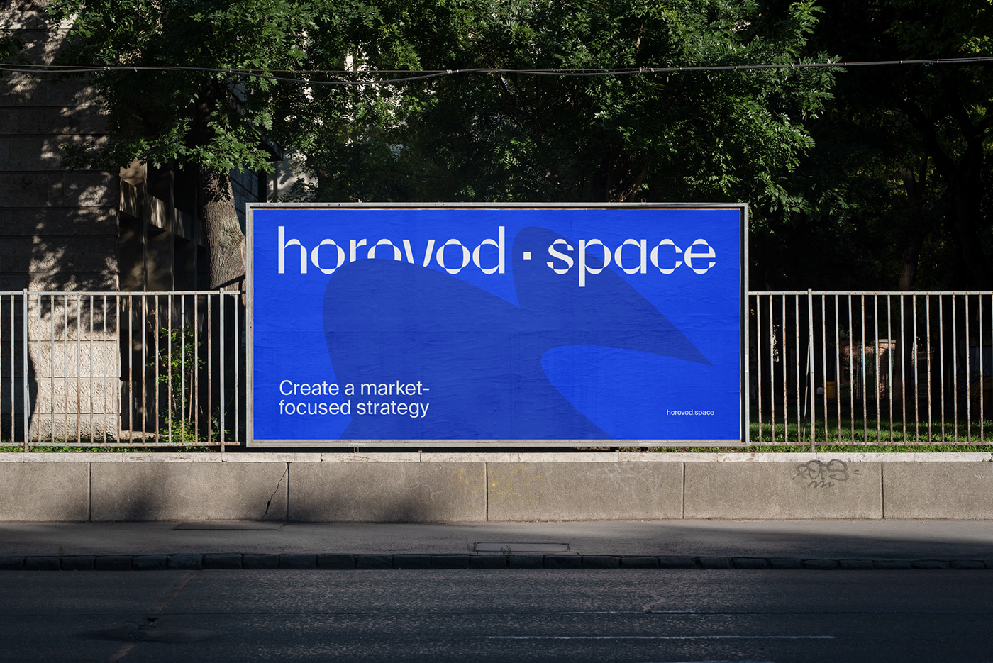
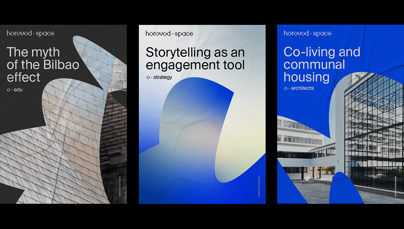
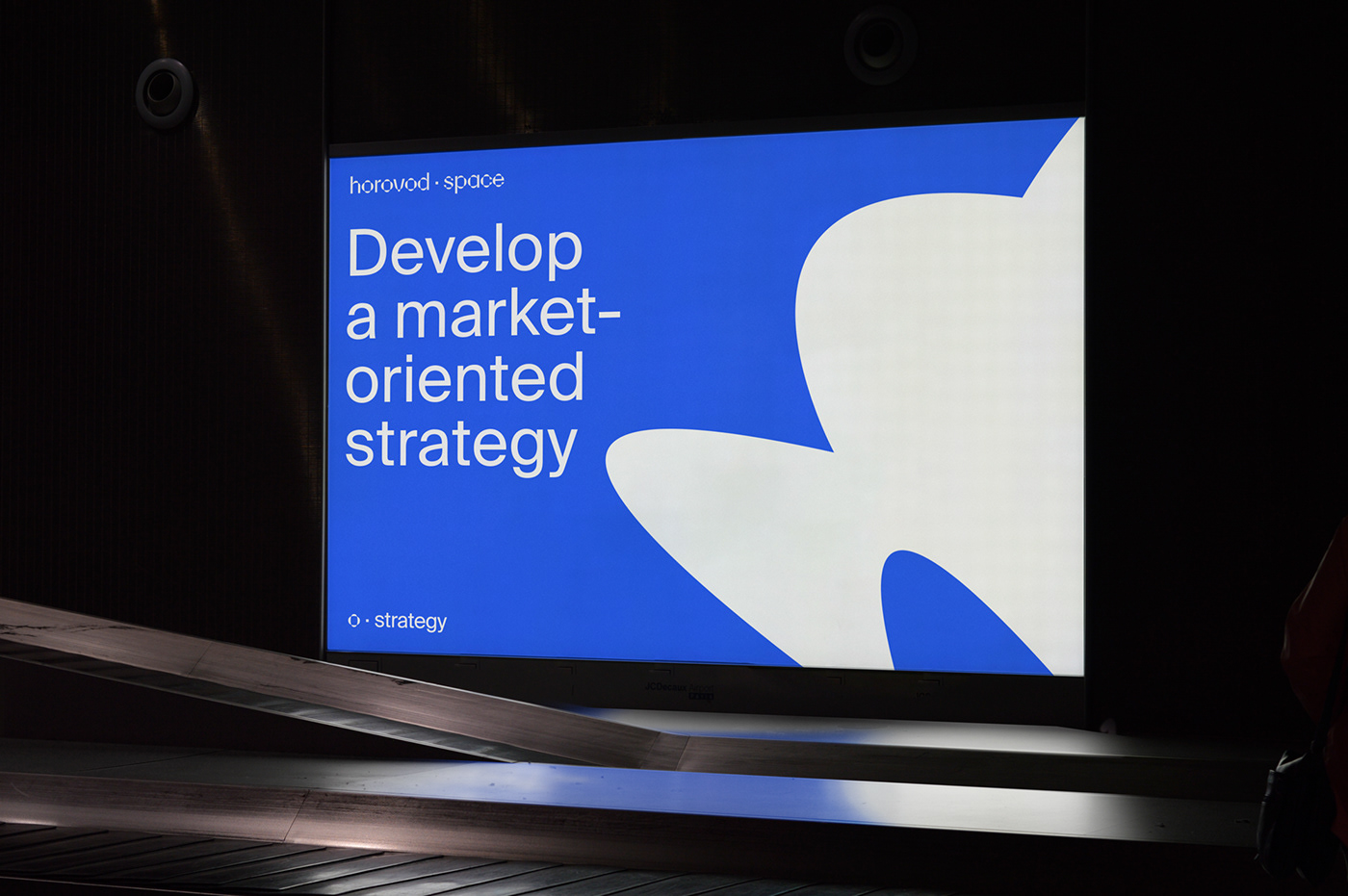
“Horovod” is a traditional art form that combines music, singing, and a circle dance. People engage in this ritual to generate communal energy. We wanted to capture these waves of energy and incorporate them into our design concept. The name has a distinct rhythm. It also serves as a metaphor for constant movement, change, and the search for new meanings and forms. To represent this in the brand's graphics, we make a visual comparison between the areas transformed by the company and the dance's invisible internal space.
Horovod.Space is an ecosystem for territorial and real estate development offering modern strategies and solutions in marketing, technology, and architecture. To highlight their fresh approach to development, we’ve created a visual language that builds on the meaning behind the brand's name.
“Horovod” is a traditional art form that combines music, singing, and a circle dance. People engage in this ritual to generate communal energy. We wanted to capture these waves of energy and incorporate them into our design concept. The name has a distinct rhythm. It also serves as a metaphor for constant movement, change, and the search for new meanings and forms. To represent this in the brand's graphics, we make a visual comparison between the areas transformed by the company and the dance's invisible internal space.
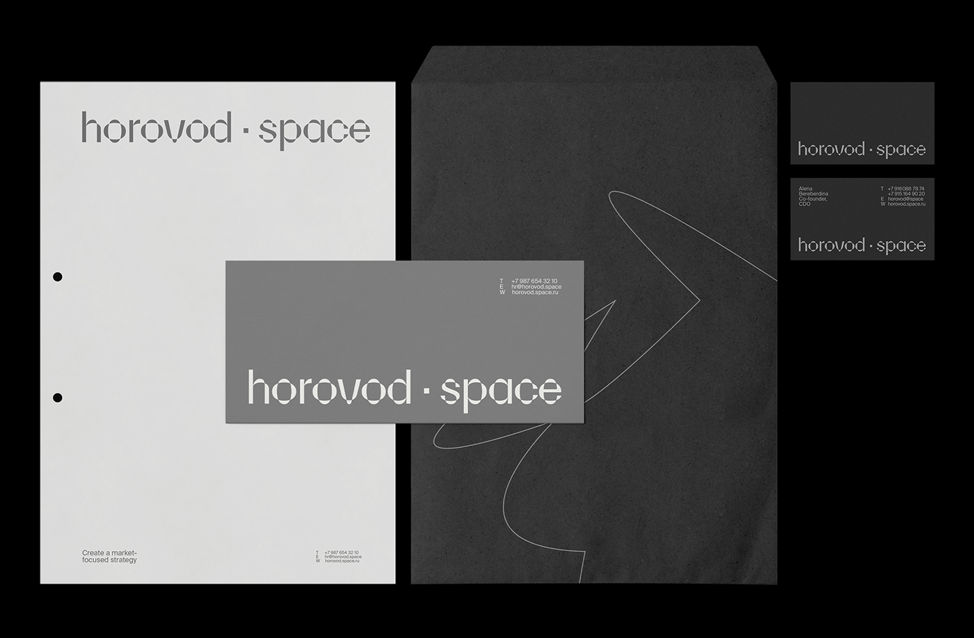
On each medium, a new “horovod” is formed from several points that are dynamically spun to create unique shapes within a single visual system. We use typography and colour coding to make each of the brand's many projects and directions stand out. To keep the brand identity consistent across mediums, we adapted horovod.space's new visual language to their logo, website, social media templates, and merchandise.