


Proptivity is a leading-edge technology company that is transforming the way that real estate owners, operators and tenants connect in the Nordics and Baltics. With a vision to become a global leader in the industry, Proptivity has developed a 5G indoor connectivity solution, called Gigabit 5G, that is disrupting the traditional telecom model.
Unlike conventional approaches where operators install their own networks, Proptivity offers a neutral 5G network that all operators can share, providing significant energy savings, reduced cabling, streamlined administration, and better control for property owners.


The symbol is a combination of the icons for signal strength and Wi-Fi — interconnected by an arrow — symbolizing forward-thinking and the connection between real estate owners, operators, and tenants.
The three L squares in the symbol can be interpreted in multiple ways. They can be seen as three buildings, representing the real estate industry that Proptivity serves. At the same time, they can also be seen as a form of expansion, symbolizing Proptivity's growth aspirations and its focus on new technologies such as 5G and beyond.


The graphic element is both flexible and versatile, capable of being used in both flat and animated forms, including as animated transitions. This makes it an ideal design element for presentations, videos, and other marketing materials.


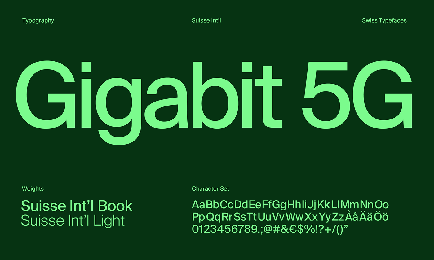
©2022—2023 Folke Patron. Fonts in use: Suisse Int'l by Swiss Typefaces


