
Having worked in the Airline industry I have seen a lot of ugly boarding passes which half of the time are hard to read / understand and can cause a lot of confusion for the traveller.
This is my attempt at making the Boarding Pass more easy to understand as well as more visually appealing. When working on this concept I had to keep in mind that the thermal printers Airlines use for printing the boarding passes can only print black.
This is a Personal Project and has no affiliation with any Airline mentioned.
** Virgin Australia is used as an example only. The Virgin Australia logo is © Virgin Australia Airlines **
RESEARCH & INSPIRATION

Just some samples that I have collected while flying domestically
MY VERSION

THE BOARDING PASS - FEATURES
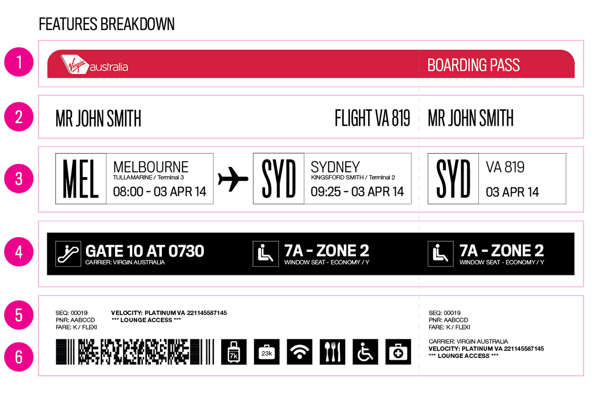
Features
1. Header - Used as a placeholder for the Airline's Logo (Can be customised in anyway)
2. Guest Name & Flight Number - The design uses a narrow font for the Guests name allowing for a longer name field so Airlines wont have to truncate the guests names
3. Origin & Destination Details - Including the Airport, City, Date & Time Details. The information in the Stub section has been slightly changed to display only the necessary details for Airline Staff.
4. Boarding and Seating Details, Including the Class / Cabin type.
5. Airline Information including the Check in Sequence, the PNR and the Fare Type (Showing the fare name as the fare code/letter.) This section also shows the Frequent Flyer Number and Airline Code (helps identify partner airlines) and shows whether or not the guests have lounge access
6. Barcode & Icon Section
- The most important information is highligted with the black background and white text. The guest already knows where they are travelling to, so the next most important information is for them to know what time to be at the gate for boarding and their seat during the flight.
- The stub has less information as this is used mainly for the Airline and has only the crucial information.
ORIGIN & DESTINATION DETAILS

Origin & Destination Details
1. The Airport code is highlighted using a large font size. This allows quick identification by Airline staff if guest is seeking assistance.
2. As the Airport codes are not always the same as a City's Name, the City Name is also displayed next to the Airport code.
3. The Airport name and Terminal number are also displayed underneath the City name to reduce confusion for cities with multiple Airports.
4. The flight departure time and date is printed in a larger size font to stand out
BOARDING & SEAT DETAILS

Boarding & Seat Details
- This information is highlighed using the black background and white text to stand out when the Traveler looks at the boarding pass.
1. The Gate Number and Boarding Time being the most important is displayed first
2. Seat Number with Boarding Zone
3. The Operating Carrier of the Flight
4. Seat Type, and Class / Cabin Type
ICONS

Icons for Special Service Requests (SSR), Inflight Services & Luggage
- Universal SSR Icons (Special Service Requests) Helps Airline Staff easily and quickly identify the needs of a guest without having to go into the booking/reservation
- The Luggage & In Flight Service icons help the guests to understand what services are being provided with their fare
- Universal SSR Icons (Special Service Requests) Helps Airline Staff easily and quickly identify the needs of a guest without having to go into the booking/reservation
- The Luggage & In Flight Service icons help the guests to understand what services are being provided with their fare
FINAL - MOCK UP

Mock Up


Square edge version with other Airlines (I know the boarding passes dont have the correct flight numbers but these are just used as an example)

Making Mock Ups


Just a couple of photos I have taken to finish off :)
Thanks for viewing
:)
Click the button below ;)


