


Introduction
The following solo project was undertaken as part of the Professional Diploma in UX Design issued by the UX Design Institute in Dublin and accredited by Glasgow Caledonian University.
The Project
Client
The client was Ambassador Hotels - a fictitious company that owns a series of hotels across Europe.
Role
UX Research
UX Design
UI Design
UX Design
UI Design
Date
August - November 2022
Problem
Despite being of paramount importance to both hotels and their guests, the process of booking a hotel room online is often confusing, frustrating and poorly designed.
For these reasons, the main focus of the project was to examine existing booking processes before designing a new process that is significantly simpler and smoother than those currently in use.
Assignment
The task was to design a new desktop website for the client focussing on the entire booking process from the home page through to booking confirmation.
The end goal was to produce a high fidelity interactive prototype illustrating the newly designed booking process with accompanying annotations for developers.


UX Design Process
1. Research
2. Analysis
3. Design
4. Prototype
5. Test
6. Finalise
1. Research


Competitor Benchmarking
I began the project by analysing a series of existing websites in order to discover any industry best practices and conventions that should be followed as well as any pain points or difficulties users may have when trying to book a hotel room online.
Analysis was carried out on the booking process for three websites - 2 hotel chains (Citizen M and Radisson Hotel Group) and one hotel aggregator website (booking.com).
Main Findings
- Hero section should be entirely focussed on booking widget.
- Map view should be available and show hotels in the area as well as relevant points of interest
- Hotel card should include images, a succinct description, third party reviews, highlight key features and have a clear call-to-action.
- Room card should show plenty of images including wide angle shots of each room.
- Users shouldn’t have to scroll a long time to see each available room, add on et cetera.


Usability Testing
To gain a deeper understanding of the hotel booking experience, I observed 2 users completing a usability test on existing hotel websites and conducted a third usability test myself.
All 3 users each went through the booking process on 2 different sites. A total of 4 websites were tested overall; namely the sites for Barcelo Hotel Group, The Doyle Collection, NH Hotels and IHG Hotels.
Main Findings
- Booking widget should list destinations before hotels and allow users to change months/years quickly
- Hotel/room amenities should be grouped with icons for each category
- Rates calendar should be available to show prices for each given night for a certain room
- Wording around Add Ons should be unambiguous
- Reservation details should remain prominent during booking process and user should have the ability to go back a step
2. Analysis


Affinity Diagram
By creating an Affinity Diagram, I was able to gather all of the insights and observations made throughout the research phase of the project in one place.
All observations were written on post-it notes and grouped in order of when they occurred in the booking process. Individual notes were then categorised as either being a Best Practice, Pain Point or Observation. Tally marks were also added to any observations that appeared more than once and placed at the top of their category.

Customer Journey Map
The data from the Affinity Diagram was then used to create a single, common journey that a customer would take through a typical existing site.
This journey details all of the steps a user would take from planning their trip all the way through to payment. At each stage I noted their goals, behaviours, any pain points they experience, industry best practices and also potential opportunities for improvement.
Analysis Summary
The key findings identified were as follows:
- Options in the search dropdown should be categorised with destinations before hotels
- Changing the year/month on the datepicker should be made simpler
- Filter options on hotel list page should be prioritised on the basis of those most frequently used/relevant
- Hotel & room cards should show multiple images for each hotel/room
- Information such as hotel facilities and room amenities should be displayed as bullet points where possible
- Categories and icons should be used to make lists easier to scan
- Accordions and jump inks should be used to minimise page length
- List of available Add Ons should be shown on the hotel page
- Wording around Add Ons should be unambiguous
- Price should be clearly explained and displayed throughout the booking process
3. Design

Flow Diagram
The aim of a Flow Diagram is to take what I had learned from the Customer Journey Map and use it plot out an ideal route a user might take through a new hotel booking website.
This route will have resolved any pain points users experienced on other sites as well as implementing some of the opportunities I have identified previously while also adhering to industry best practices.


Low Fidelity Wireframe Sketches
Having defined a user path through our website, I could now begin to design the interaction and interface that will facilitate this journey. I did this by sketching the pages the user will visit at each stage, paying special attention to the interactive components that will move them through the booking process.
4. Prototype


Mid Fidelity Interactive Wireframe
With the low fidelity sketches complete, I then moved on to creating a medium fidelity interactive wireframe. This basic representation of the initial design contained all the pages and screen states required for a user to complete a booking using the previously identified user flow.
5. Test
Usability Test On Mid Fidelity Interactive Wireframe
A usability test was then carried out on version 1 of the wireframe to identify any issues before moving on to the handover stage of the project.
Issues Identified
- Key Amenities heading in hotel/room card should be changed to Top 3 Amenities
- Greyed out Members Rates should show a tooltip on hover/click urging users to login or sign up
- Add Ons which don’t require a quantity to be specified should be selected with a radio button and not an on/off slider
- Add Ons which don’t require a quantity to be specified should be selected with a radio button and not an on/off slider
6. Finalise


Improved Mid Fidelity Interactive Wireframe
The feedback from this test was subsequently used to further improve and refine the design before being finalised.


Annotations
With the prototype having been tested and refined, it was time to consider what information developers would need to begin the build phase of the process. This included notes on links, buttons and input fields as well as details of any error messages the user may encounter.


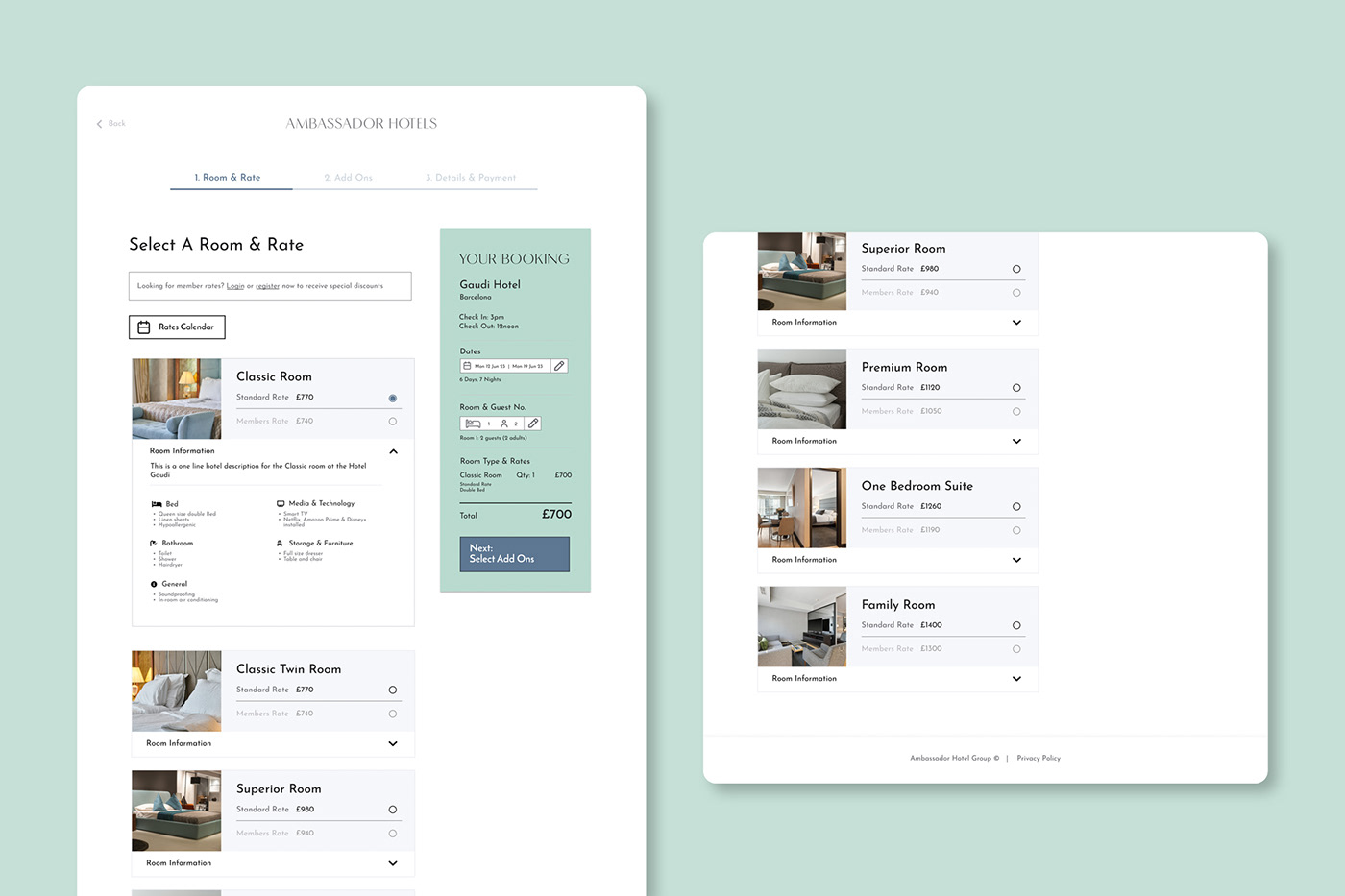
High Fidelity Interactive Wireframe
With the design finalised, I created an interactive high fidelity prototype. This final work shows the website as fully intended with images, brand colours & fonts, icons and all other aspects of the user interface included. From this, the site’s developers could create all the necessary styles to give the website the look and feel that I’m after.
Conclusion
Given how common online hotel booking is, I was quite surprised by how difficult and frustrating the process can be for users. For me, it really underlined the importance of the UX design process especially around research and user testing. Hopefully the design I’ve created here shows that there are better ways for hotels to accept booking online while also highlighting the value of UX design as a discipline.


