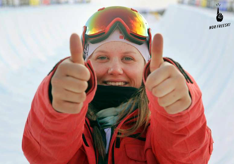
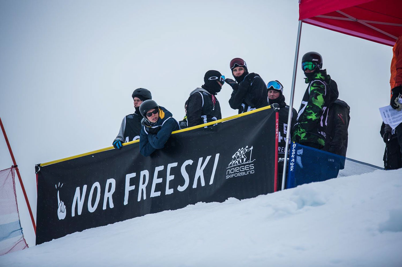
Nor Freeski
The Norwegian Ski Federation
2013/14
The Norwegian Ski Federation wanted one of their departments “Freeskiing” to have its own identity different from NSF, reaching an altogether different demographic than the other departments, but still tightly connected to The Norwegian Ski Federation’s own identity.
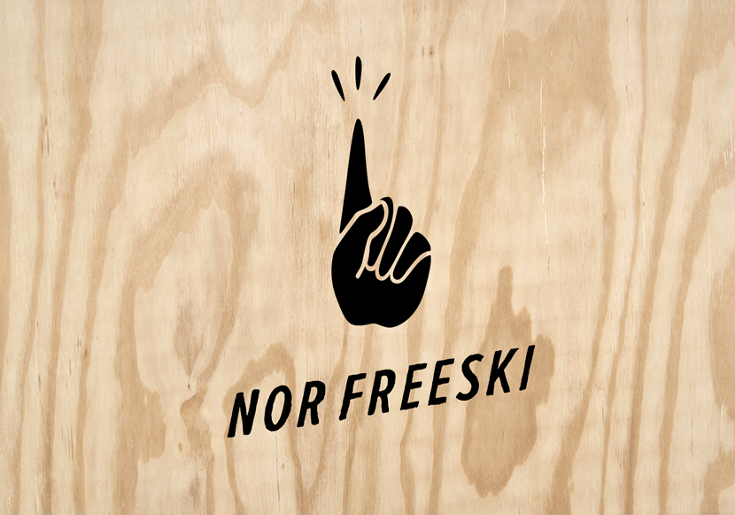
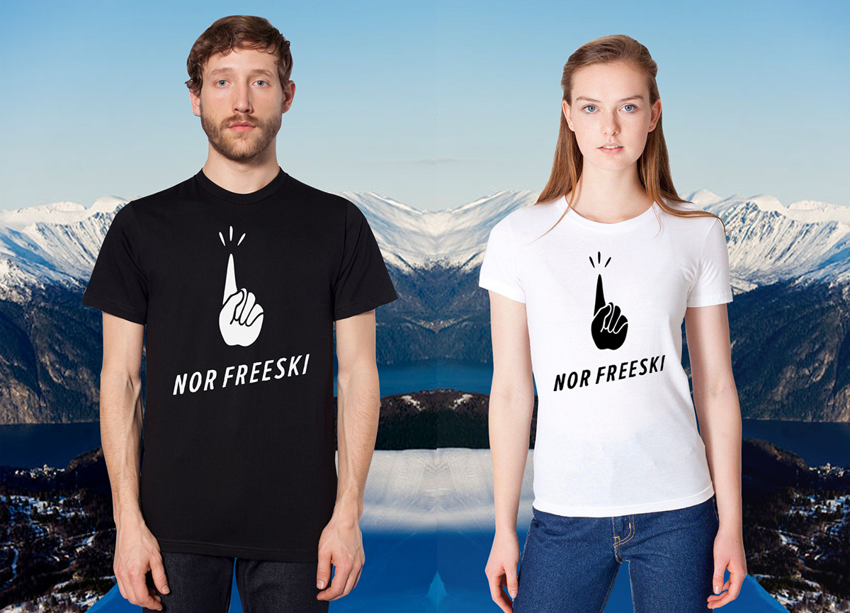
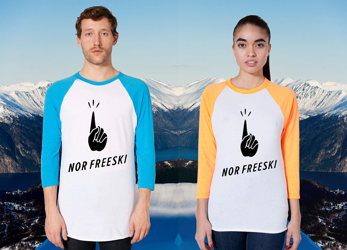
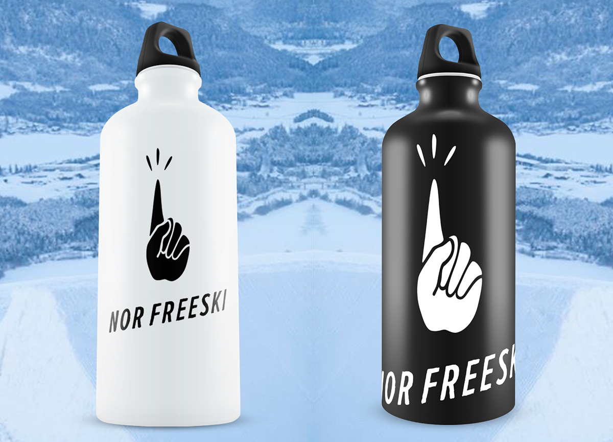
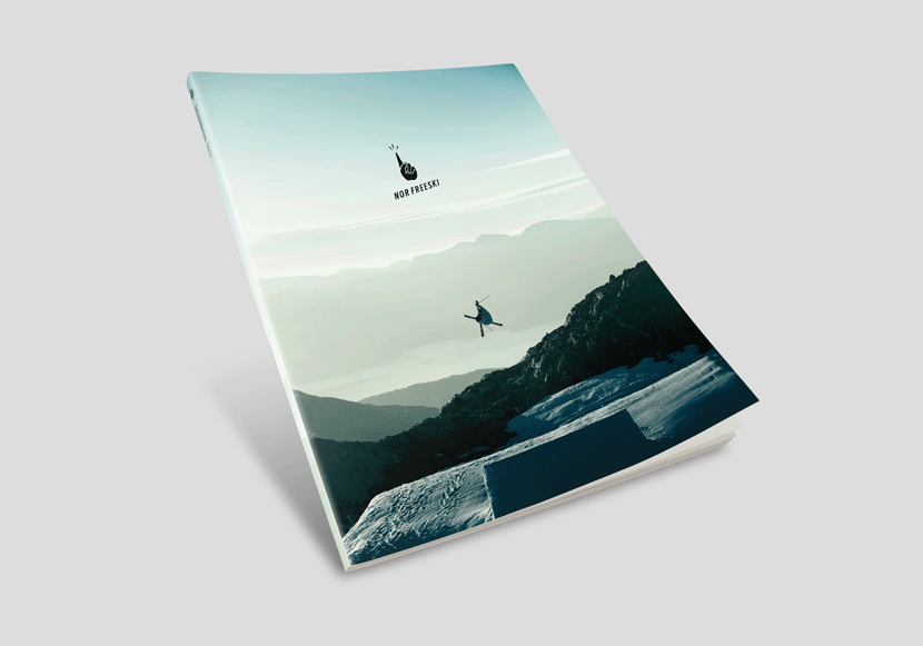
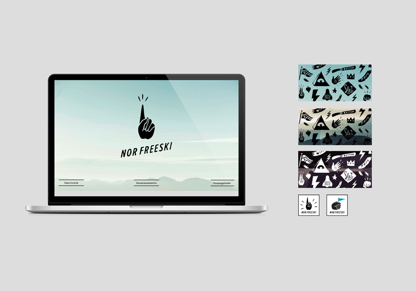
The Nor Freeski logo depicts the hand gesture “Claiming it” and was created with the skiers in mind. “Claiming it” is something you do after successfully landing a trick or winning a competition. The typography is hand drawn to have an organic and unpretentious feel, it is loosely drawn after Neuzeit Grotesk Oblique and tilted.
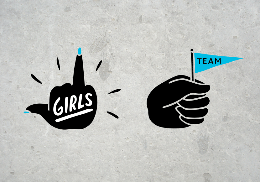
The Sublogos depict two of Nor Freeski’s areas of focus; The Girls Team and The Norwegian Freeskiing Team. The logos are all built on different hand gestures you'd normally see young freeskiers doing.
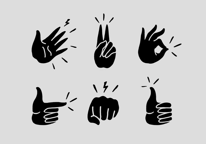
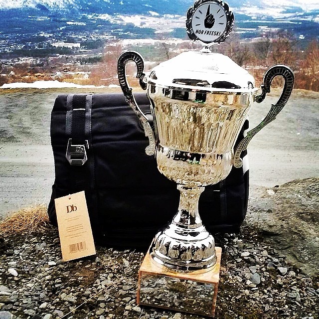
Other hand gestures was created as a part of the identity to identify different aspects of Nor Freeski. The "pound-it" symbol for instance is used as a symbol for competitions.

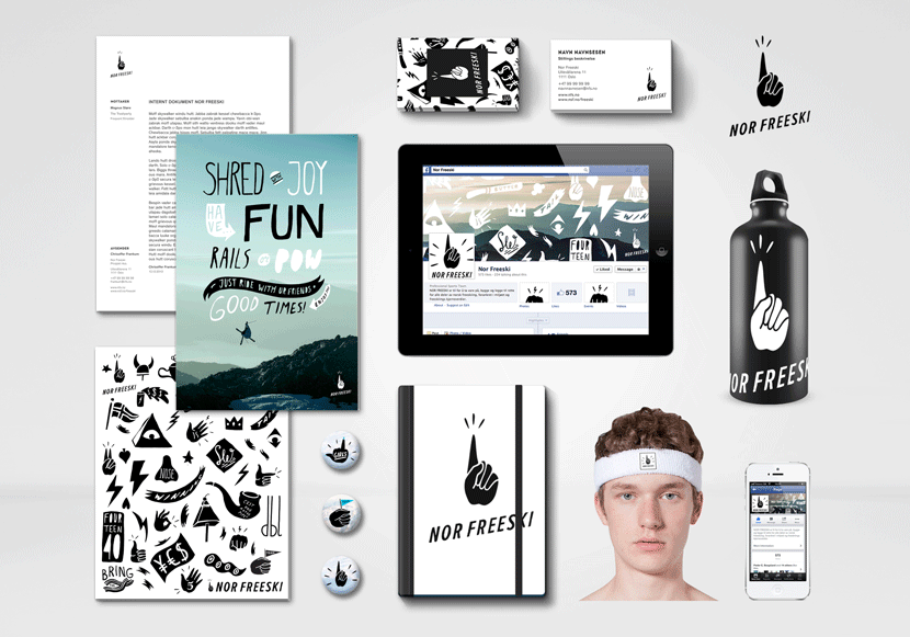
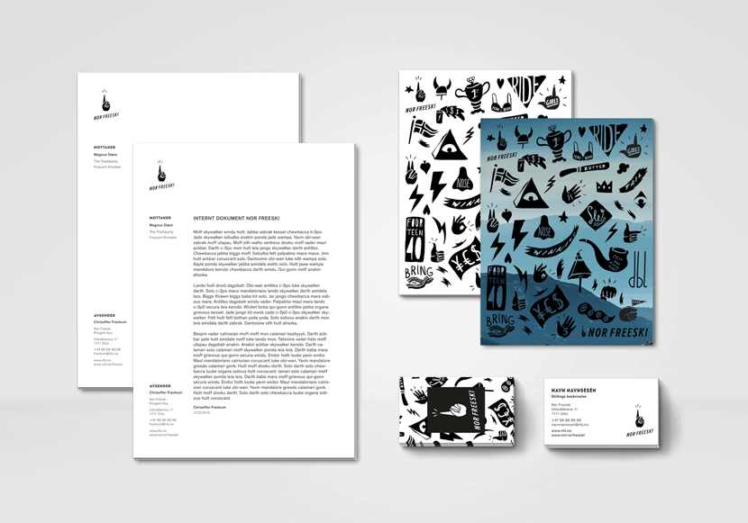
As a part of the identity there was created a pattern that is used on suitable applications. Because of a tight budget the business cards were made with the black and white pattern. Easily identified as Nor Freeski and playful enough to give away to a fourteen year old kid.
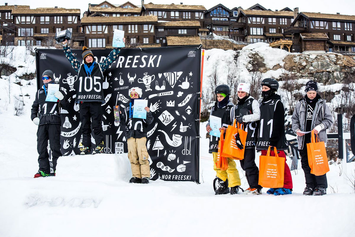


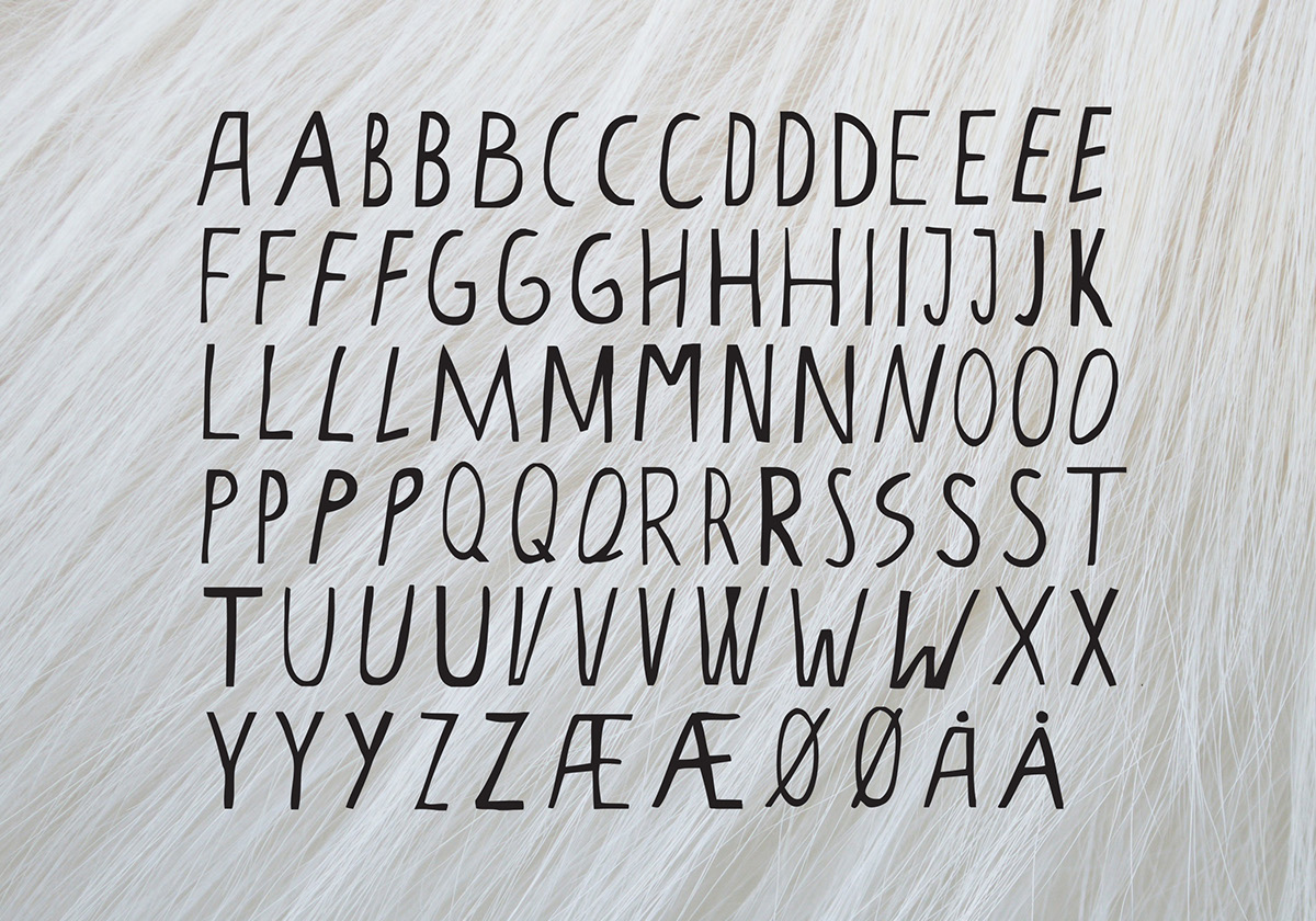
"Aktuelt" was created as the Nor Freeski Display Font. It is used on posters, Bibs, Banners and print material. The font includes a variety of dingbats, words and expressions that is frequently used in the sport. These can easily be put together to make new phrases and illustrations.