


context
Founded in 2016 Baltic Challenge Cup (BCC) is an international Ice Hockey competition contested by the men's & U20 national teams of Baltic region. In October 2022 I got approached to design a logo for the event.
However, with multiple touch-points and different countries talking about the event, the task extended far beyond creating a logo. A complete visual identity and design system was necessary. So we took the opportunity to fix the current problems and at the same time lay the foundation for the future identity of the competition.
Problems and OPPORTUNITIES: Lack of consistency & continuity
Not having visual identity for the tournament creates same problems every year:
1. A new logo (and design assets) has to be created which is inefficient both time-wise and financially
2. Lack of visual identity makes the tournament look unprofessional and hard to recognise for the target audience(s)
3. Increasing the level of the tournament financially by pitching it to sponsors, partners or suppliers is difficult.
Solution
Instead of looking at the BCC as 3-4 day event which is organised by different federation every year from scratch – work with one creative team and create a cohesive design system for the tournament. By doing so solve the following problems:
1. Save time by only updating style, communication concept and key-visuals instead of the entire identity every year.
2. Cohesive identity makes the event look more professional & recognisable for the target audience(s).
3. Using a consistent and thought out design system makes the process of finding sponsors, partners & suppliers easier.
Samples of old identities:


concept
Although there was less than a month between the original email (09.13) and the launch of the advertising campaign (10.10), when we needed to have the full visual identity finalised, we were all on the same page. We didn't want to make a rash decision and go with the safe choice.
Sure, it would have been fine if we had crossed two hockey sticks, put a puck, and surrounded it with flags. However, we sought to design something that was not only practical, adaptable, and simple to use across all touch-points, but also contemporary and would stand the test of time.
We raised the question is there something all of us (the Baltic region) have in common, that is unique yet mutual? The answer (not only because of ridiculous timeline reasons) was pretty obvious – patterns & ornaments.

Moodboard & references © Inga Skripka, Parėdzymai, EgyBoy, Baltai ir slavai: dvasinių kultūrų sankirtos (leidykla Versmės)

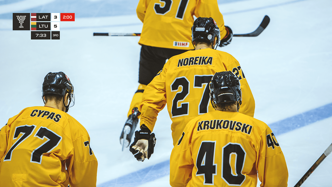

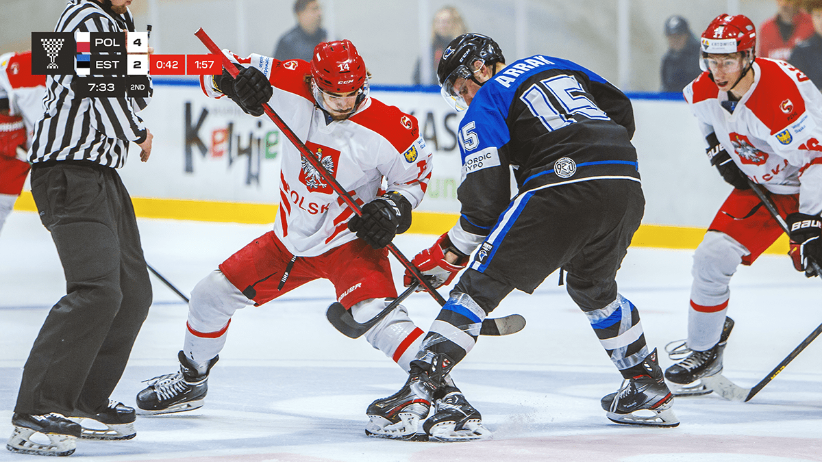

LAYOUT GRID
Grid structure inspired by flags. This systematic approach allowed to lay out elements in an organised and consistent manner for multiple formats and layouts.


Client: Hockey lietuva Project Manager: Kęstutis lingys
design: Andrius vaškevičius photography: Evaldas Šemiotas
special thanks to: Kotryna Lingienė, Adelė žilinskaitė-vaškevičė,
justė vaškevičiūtė, Hajar Thomé & Erik Arve


