


Client Description
ALIASYS™ has been operating in the field of information and communication technology (ICT) since 2005. Having over a decade experience in distribution and providing engineering and after sale services in ICT industry to all large, mid and small scale businesses can be categorized in to 3 main following areas:
- Providing Specialized Network Hardware
- Providing consulting, design, implementation, support, training and after-sales services in local and wide area networks, network security, data center and unified communications.
- Providing comprehensive solutions based on computer networks
Project Description
Due to the numerous brand touch-points, redesigning ALIASYS' identity was a huge and time-consuming project. From the initial meeting until the day the project was fully delivered over to the company, it took roughly 6 months. In the meantime, the client was shown various stages of the job, and different viewpoints regarding its different areas were expressed.

Logo Exploration
Due to the numerous brand touch-points, redesigning ALIASYS' identity was a huge and time-consuming project. From the initial meeting until the day the project was fully delivered over to the company, it took roughly 6 months. In the meantime, the client was shown various stages of the job, and different viewpoints regarding its different areas were expressed.

Versatility in Color: Logo's Adaptive Nature
ALIASYS™ logo boasts a versatile color palette, designed to adapt seamlessly to various backgrounds and contexts. We explored the logo's multiple color variations and their strategic usage in different situations, ensuring that the brand's visual identity remains impactful and consistent across all platforms.
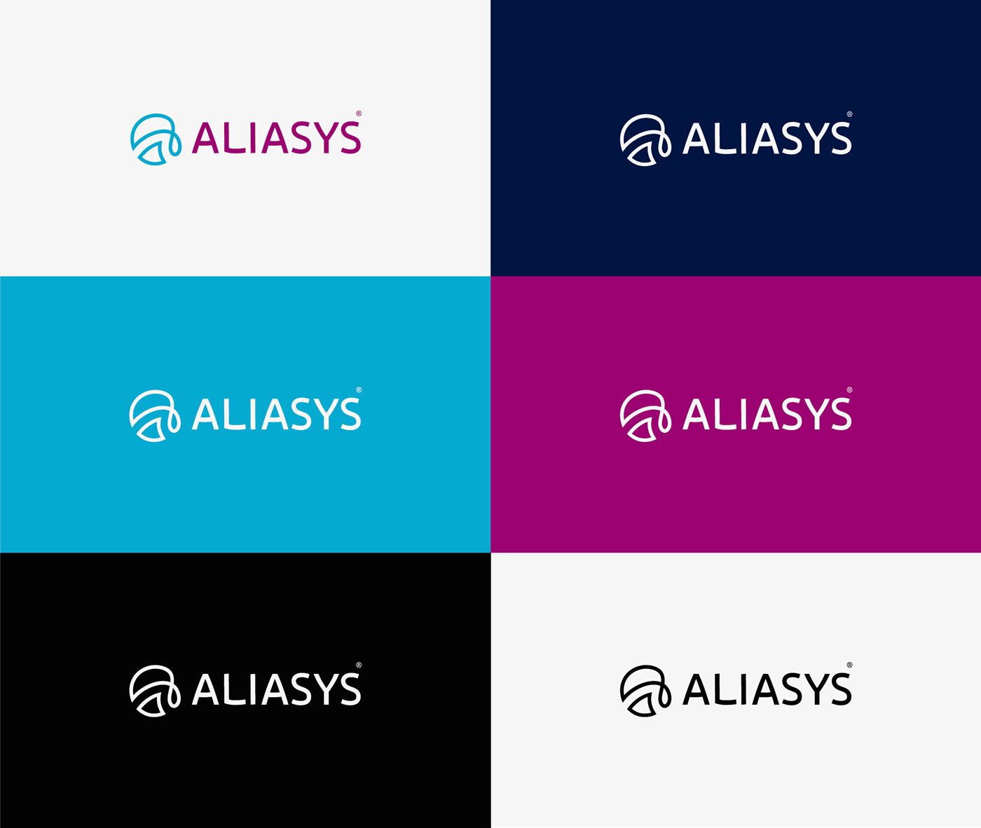
Mark: Globalization, Making a Difference, and Unlimitedness
The mark is a representation of the brand's values and aspirations, encapsulating the concepts of globalization, making a difference, and unlimitedness in a captivating and abstract form. With its powerful symbolism and unique design, the mark serves as the visual anchor of the brand, leaving a profound impact on its audience. Due to its striking and distinctive form, the mark possesses the remarkable potential to be etched into the minds of those who encounter it, ensuring a lasting memory of the brand's essence and promise.

Logotype: Timeless Simplicity with Subtle Curvature
The logotype exudes an air of timeless simplicity, setting the stage for a sophisticated brand identity. Rendered in a clean and elegant sans-serif font, each letter stands confidently, embodying the brand's commitment to professionalism and modernity. What sets this logotype apart is its subtle curvature in the anatomy of the letters, adding a touch of fluidity and grace to an otherwise crisp design. This delicate curvature creates a harmonious balance, infusing the logotype with a sense of approachability and warmth. The logotype's seamless blend of simplicity and gentle curvature not only reflects the brand's dedication to clarity and precision but also lends a touch of uniqueness that leaves a lasting impression on the brand's audience. This logotype serves as the foundation of the brand's visual identity, symbolizing the brand's essence with an understated yet impactful charm.


Color Palette: Evoking Emotion and Harmonizing Identity
The carefully curated color palette serves as a visual symphony, evoking emotion and harmonizing the brand's identity across all touchpoints. With two primary colors, "Magenta" and "Persian Blue," alongside a distinguished "Silver Grey" secondary color, this palette embodies the essence of the brand's dynamic personality, innovation, and trustworthiness.

Typography: A Harmonious Blend of Modernity and Visual Appeal
In the vibrant world of visual identity, the typography takes center stage, elevating the brand's message with its carefully chosen sans serif typeface, "Exo 2." A true epitome of modernity, compatibility, and eye-catching appeal, this font emerges as a perfect companion to ALIASYS's brand identity, reinforcing the brand's commitment to excellence and innovation.

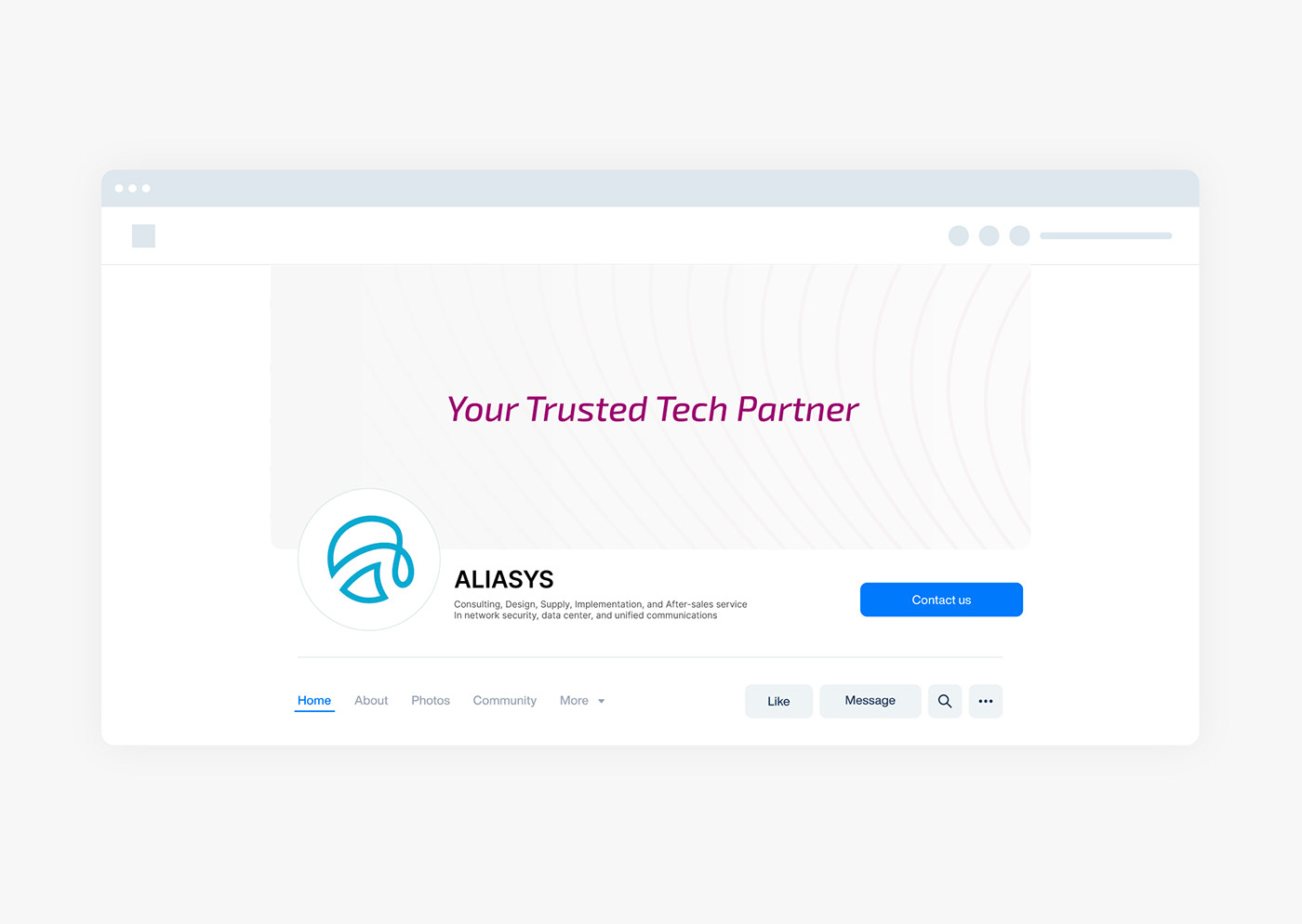
Social Media
The ALIASYS™ brand extends its captivating visual identity into the digital realm through meticulously crafted social media designs. From eye-catching header and avatar photos to engaging post templates, each element is strategically designed to create a cohesive and impactful brand presence on social media platforms.

Iconography
In the vibrant world of ALIASYS, every design element serves a purpose to communicate the brand's essence, and the carefully crafted icons stand at the forefront of this visual storytelling. The iconography of the ALIASYS branding project is a harmonious blend of simplicity, modernity, and symbolism, reflecting the brand's values and services in a visually compelling manner.

A Unified Visual Language
Creating a cohesive visual language is pivotal to establishing a strong brand identity. The iconography is characterized by a consistent style and grid, ensuring that each icon relates harmoniously with the others, forming a unified family. This consistent approach fosters recognition and builds trust among users, allowing them to associate specific icons with corresponding services and features.

Versatility and Adaptability
Versatility played a significant role in shaping the iconography. The icons were designed to be adaptable across various platforms and sizes, from mobile apps to print media. This adaptability ensures that the brand remains consistent and recognizable regardless of the context, reinforcing its presence in the minds of its audience.


ALIASYS Brand Book: Unveiling the Essence of Identity
Brand Book is a comprehensive journey into the heart and soul of the brand, meticulously crafted to uncover its identity, strategy, and visual personality. It serves as a guiding light, defining the brand's mission, values, and culture while establishing a powerful visual style that resonates with its audience.

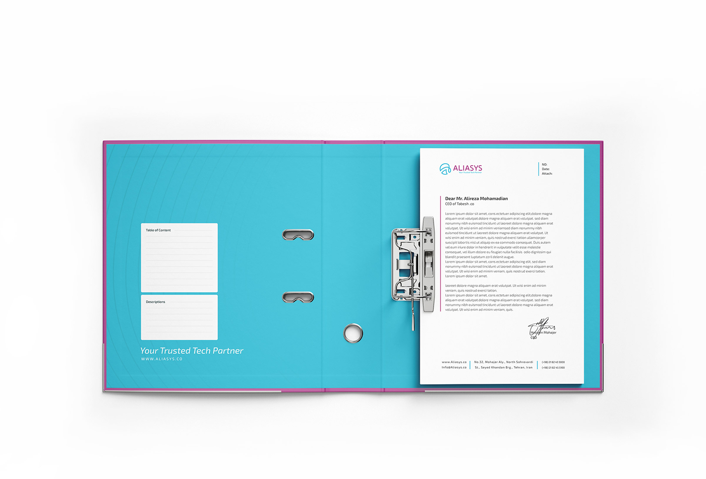
Collaterals: Bringing the ALIASYS Brand to Life
The brand comes to life through a meticulously designed set of collaterals, each crafted to reinforce the brand's identity and deliver a cohesive visual experience. From business cards to stationery, each collateral piece embodies the essence of ALIASYS, creating a lasting impression on clients and stakeholders.


Business Cards: A Gateway to Connection
The business cards serve as a gateway to meaningful connections. They showcase the brand's logo prominently, acting as a memorable introduction to the brand's visual identity. With the brand's signature colors and typography, each card becomes a tangible representation of professionalism and reliability, leaving a lasting impact on those who receive them.

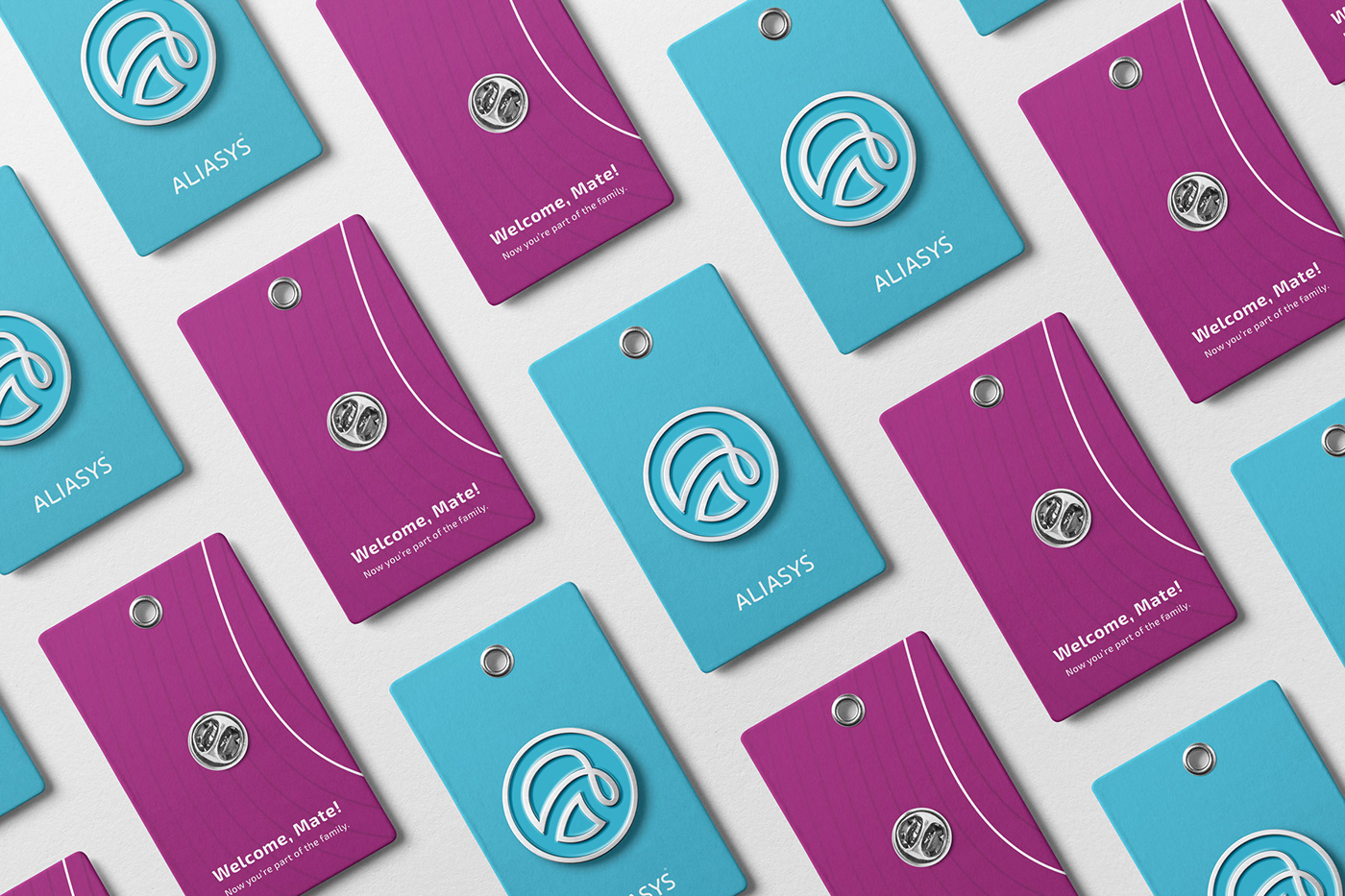
Craftsmanship with Purpose
Every metal badge is a result of meticulous craftsmanship and attention to detail. The ALIASYS logo is etched precisely onto the metal surface, ensuring that each badge reflects the brand's visual identity flawlessly. The badges are thoughtfully sized to be both noticeable and wearable, serving as a constant reminder of the team's collective purpose and dedication.
Billboards: Monumental Brand Messaging
Brand's billboards command attention with their monumental presence. Rising high above the urban landscape, these large-format designs showcase the brand's powerful visuals and key messages. Strategic placement ensures that the brand's core values and services are communicated to a broad audience, leaving an indelible mark in the minds of passersby.


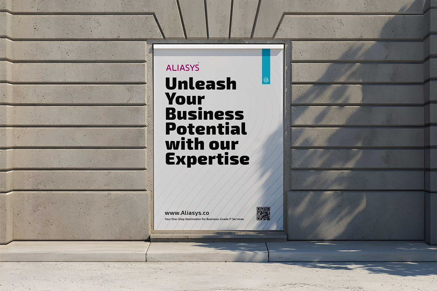
Posters: Stories Unfolding in Public Spaces
Posters breathe life into public spaces, engaging audiences with stories that unfold through artful design. Each poster is a visual narrative, capturing the essence of the brand's services and achievements. The blend of compelling imagery, bold typography, and vibrant colors makes these posters impossible to ignore, leaving onlookers captivated by the brand's offerings.
Tagline: Building Confidence Through Collaboration
The tagline "Your Trusted Tech Partner" stands as the heart and soul of ALIASYS™, encapsulating its core promise and the essence of its services. With just a few carefully chosen words, this tagline communicates the brand's commitment to building meaningful relationships with clients and serving as a reliable partner on their technological journey.

Credits
Client: ALIASYS .CO
Project Manager: Reza Afroozan (Marketing Manager at ALIASYS)
Brand Strategist: Reza Moradi, Selma Makui
Brand Identity Designers: Reza Moradi, Milad Rezaee
Agency: Obtic Studio


