Branding ___ 2022
Madonna ©
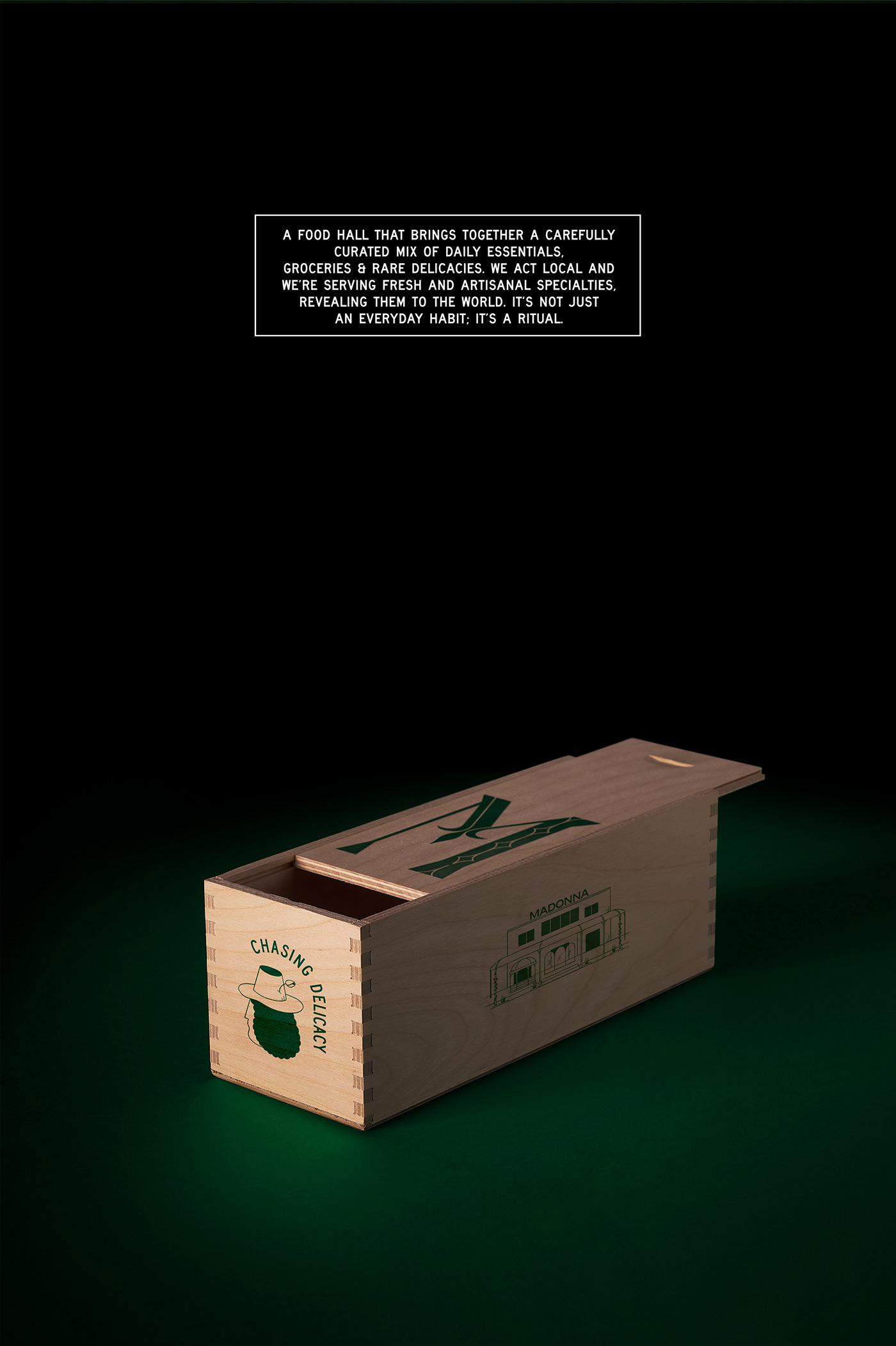
Everyday treasures
We were asked to design the visual identity for a new culinary multiplex in the northern suburbs of Athens with contemporary aesthetics and an authentic Tuscan aura, placing it beyond the culture of an everyday supermarket.
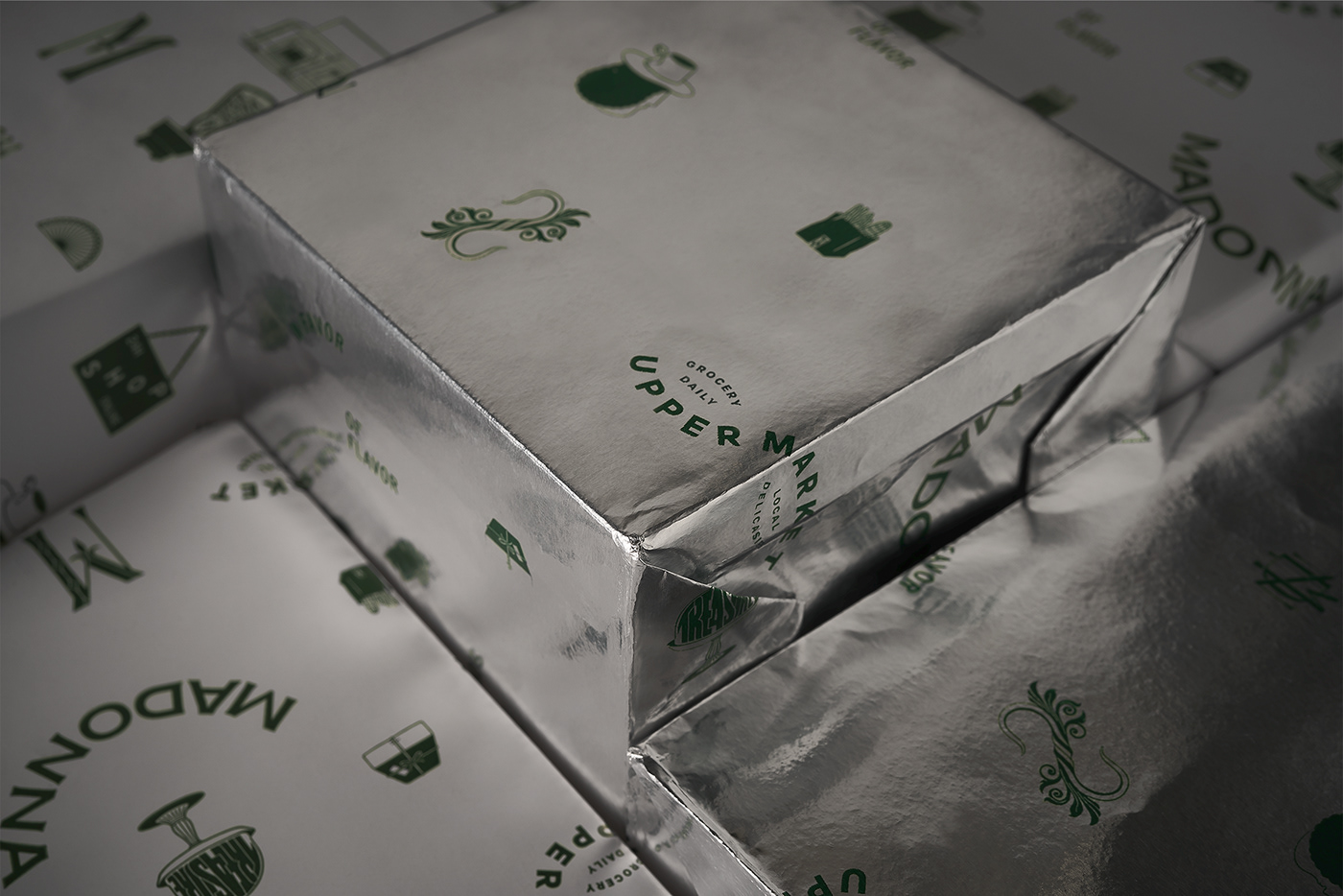
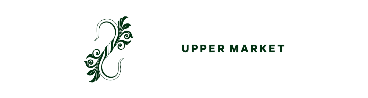
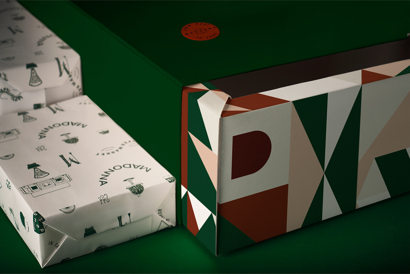
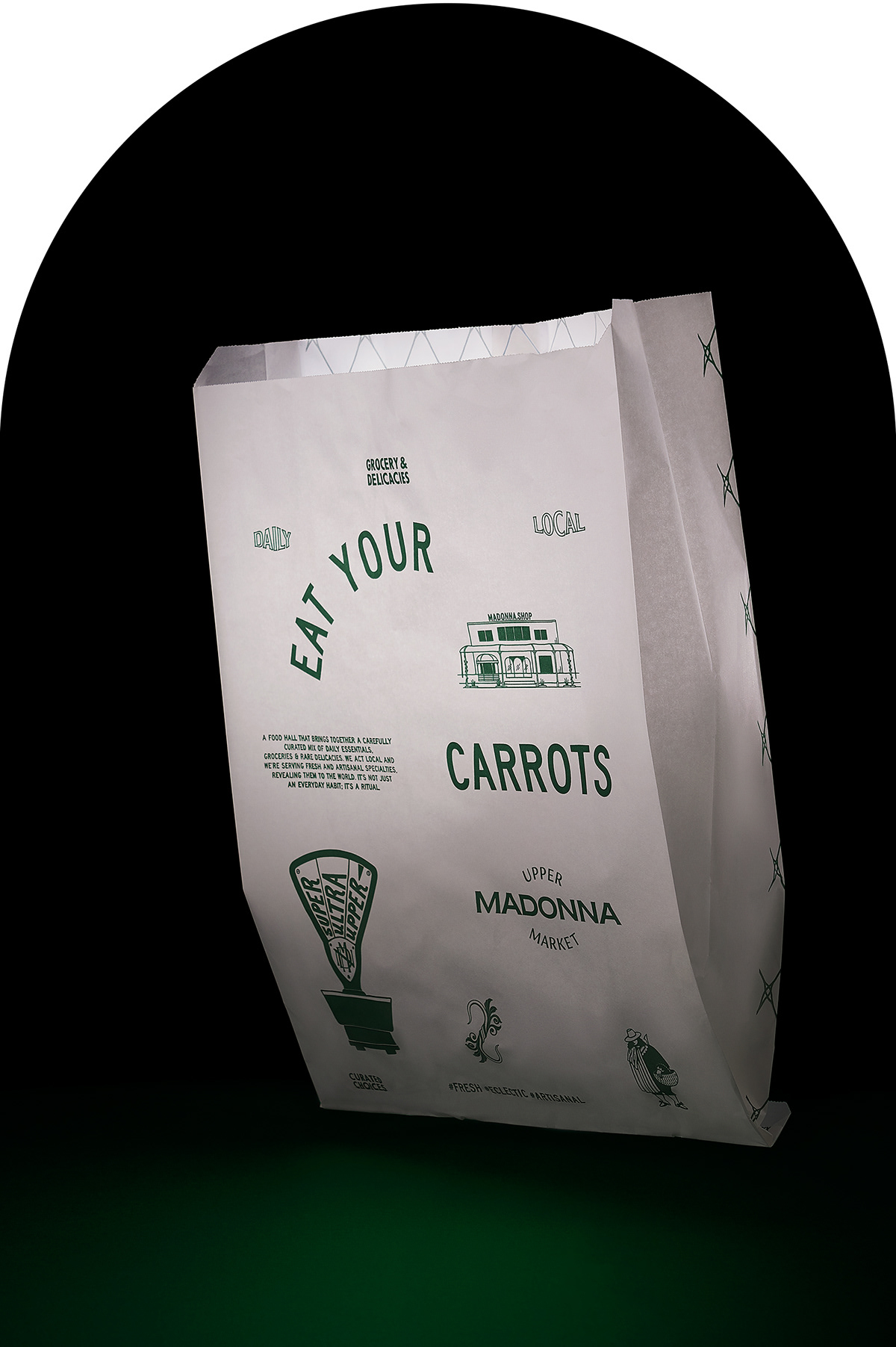
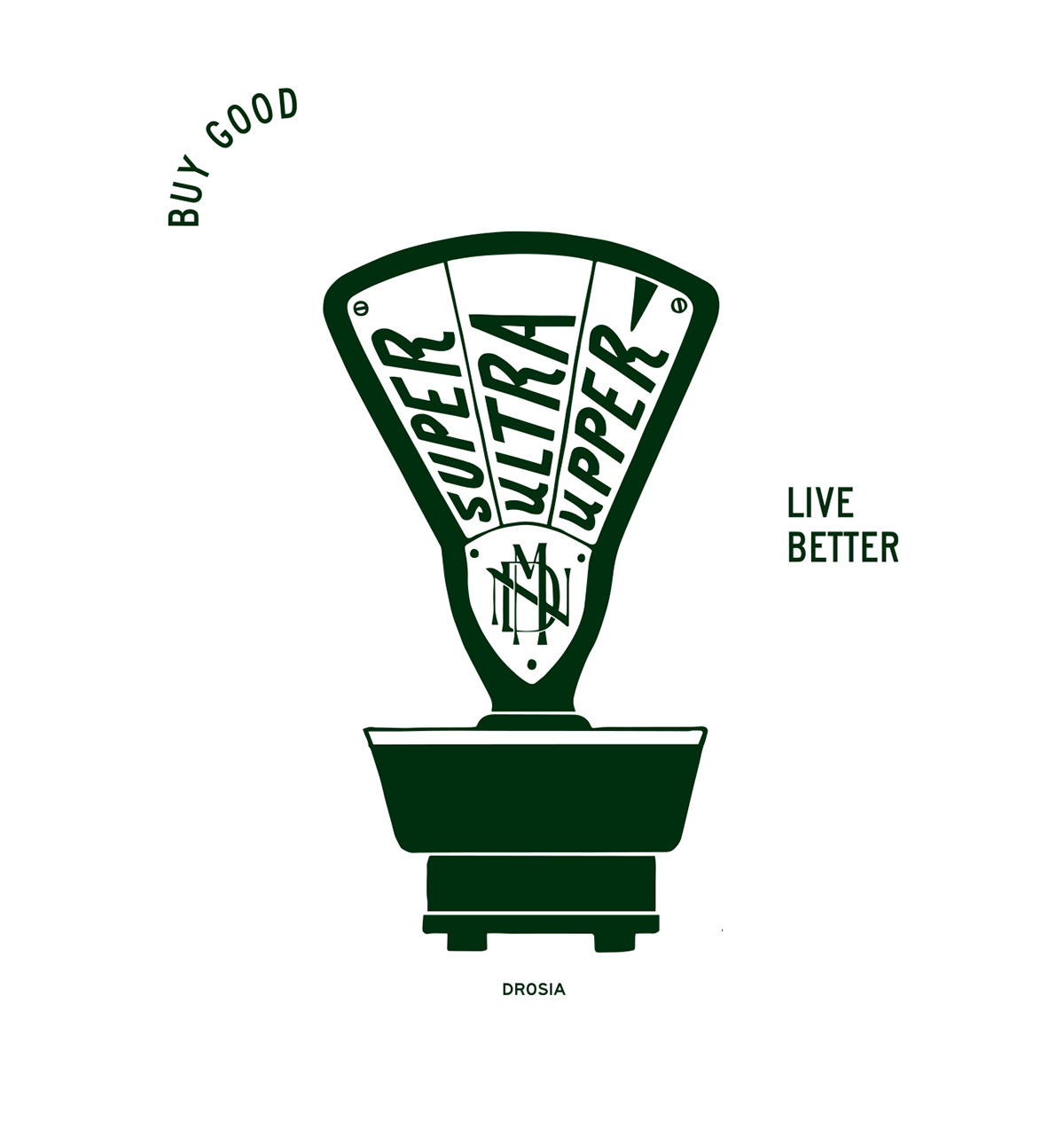
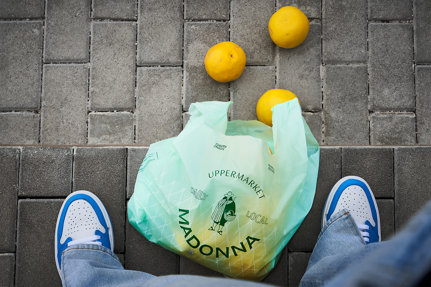
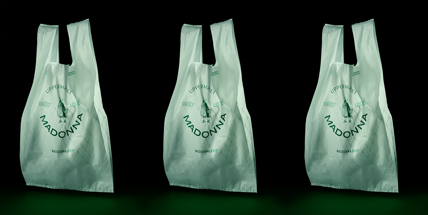
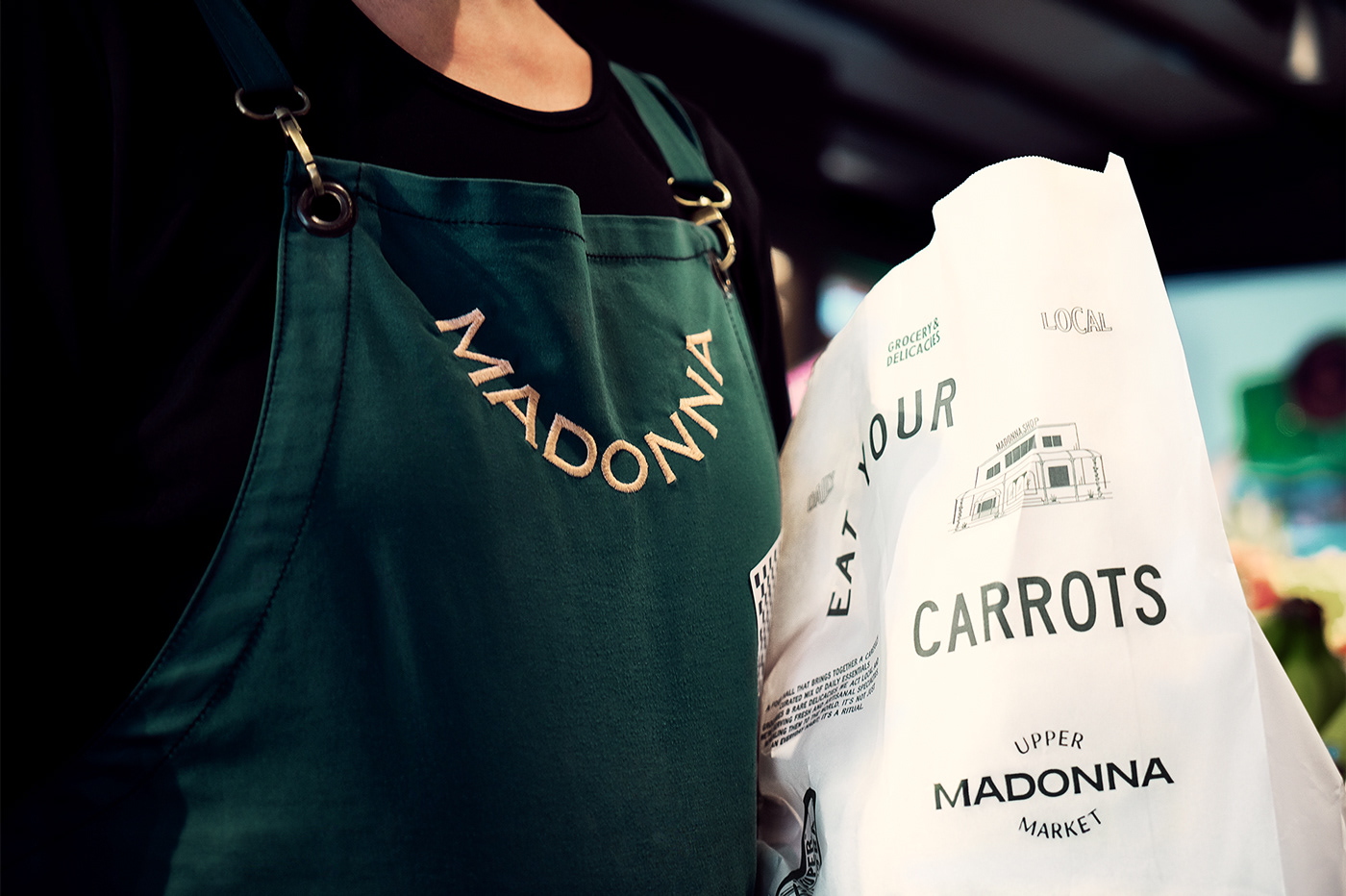
Following its gourmet, sophisticated nature, we developed the name “Madonna”. A name referring to the 'trifola d'Alba Madonna' white truffle, a rare, almost sacred, high-quality delicacy of the Italian North, but also a reference to Troufa Bread & Chocolate its “sibling” bakery that stands right next to it ("troufa" stands for truffle in Greek). Responding to the concept of a premium marketplace and given the superior quality of the products offered we created the tagline "uppermarket".
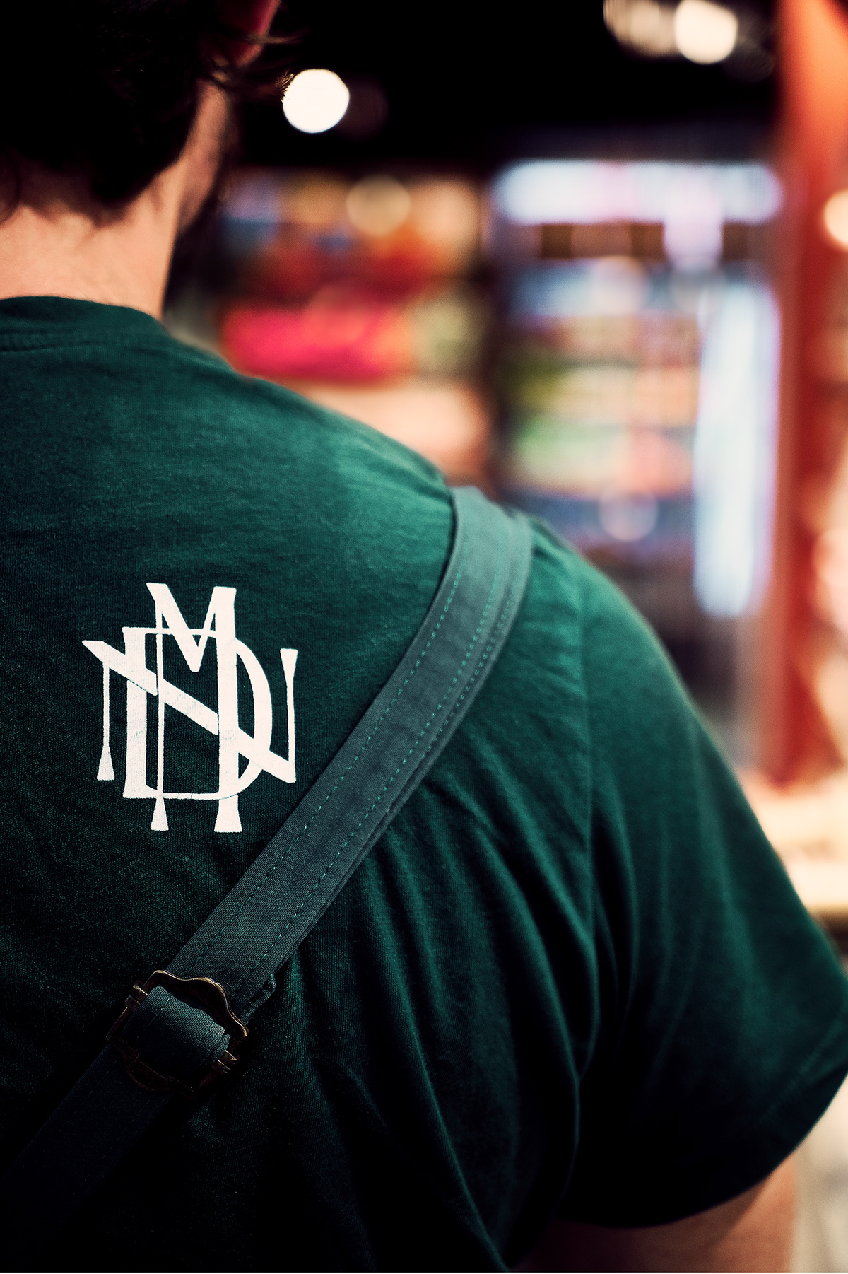
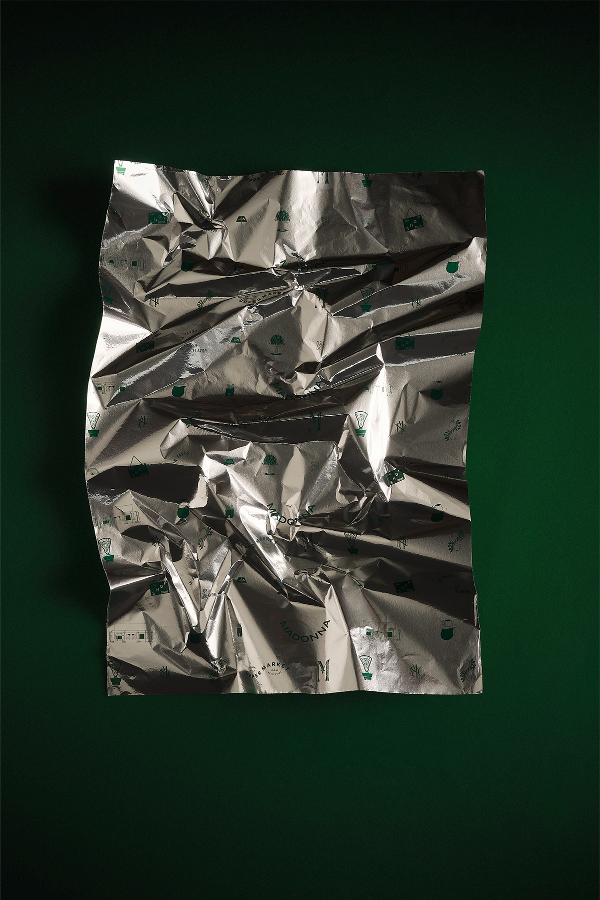
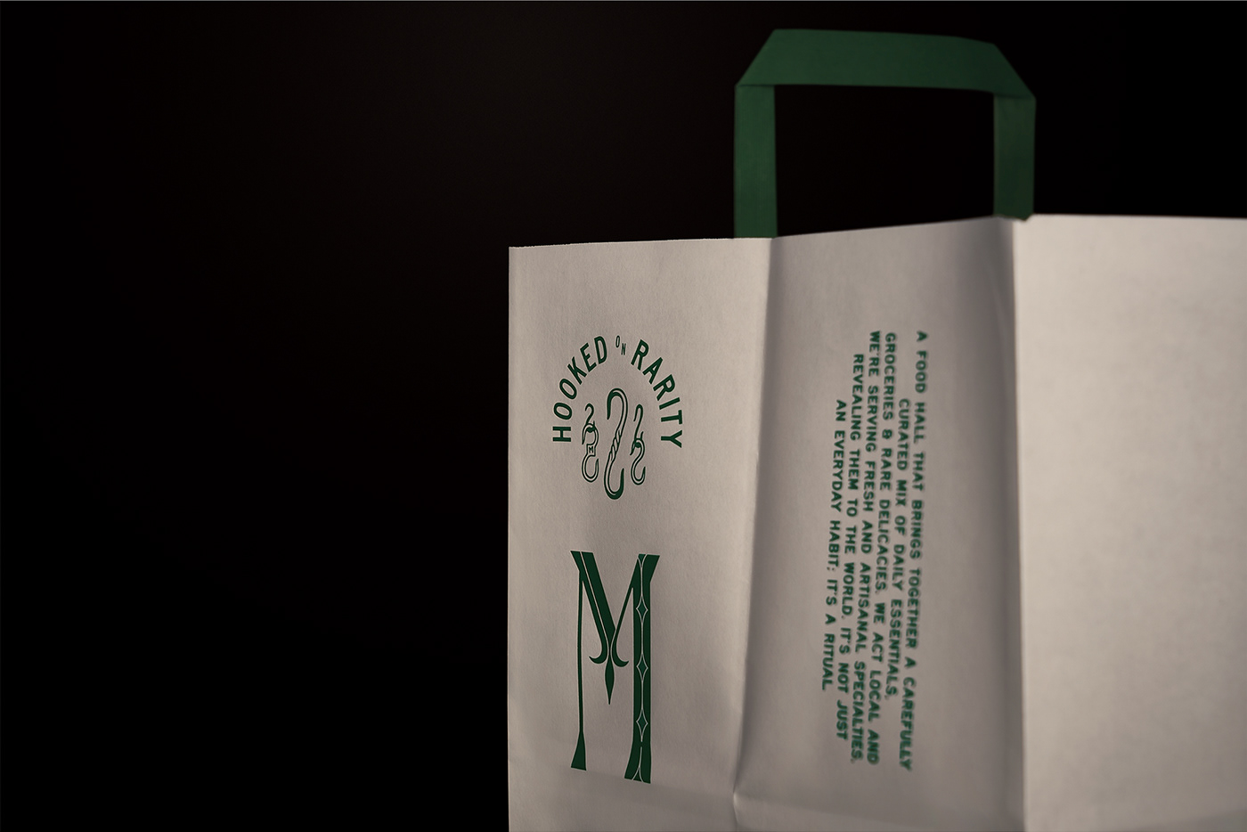
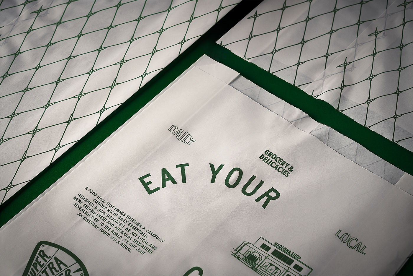
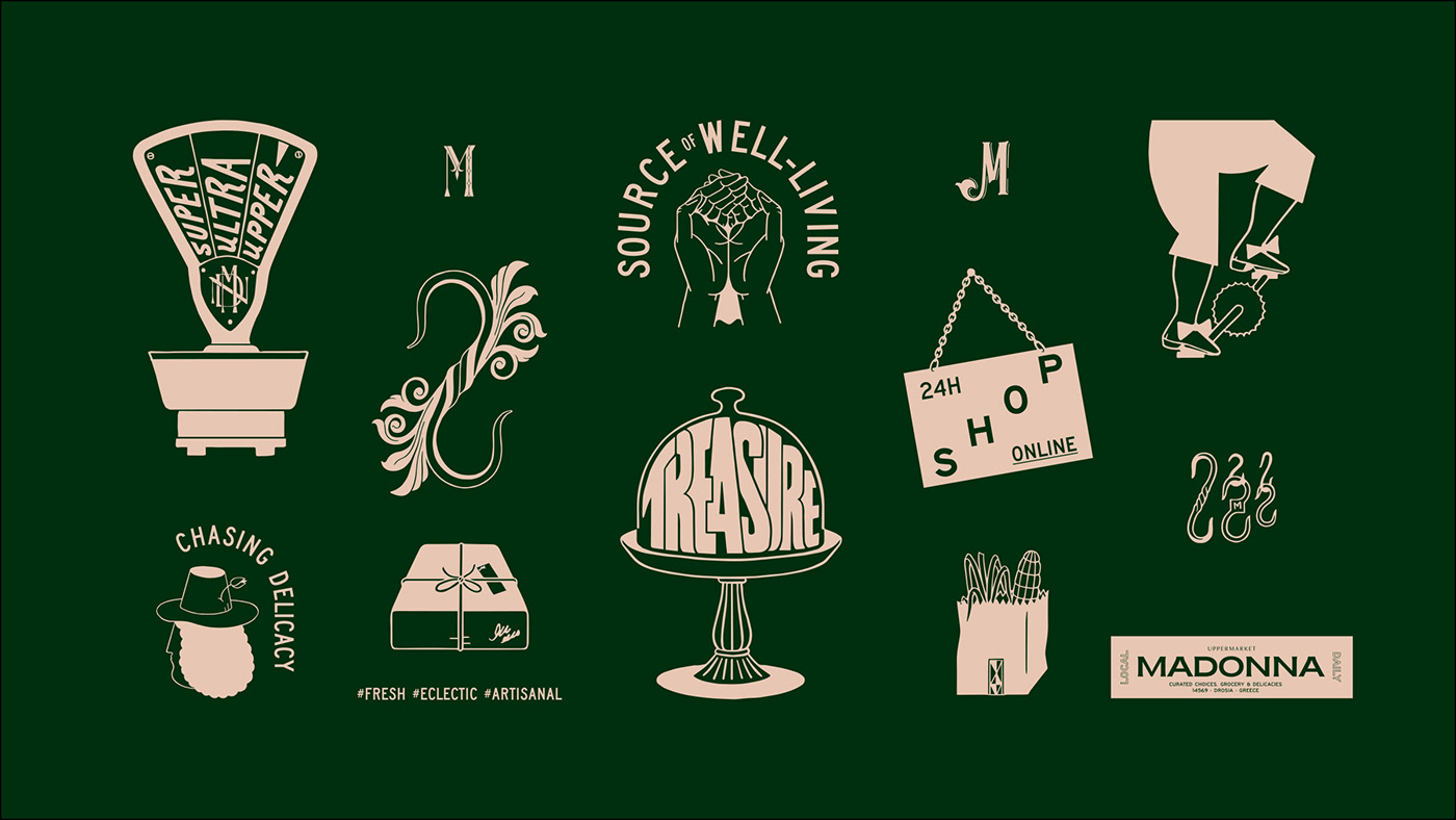
The representation of a truffle hunter on the logotype system continues the naming storytelling acting as a necessary metaphor for the brand story, i.e. the careful selection of culinary treasures offered by Madonna while the typographic system is a straight reference to the typography that can be found in old grocery stores.
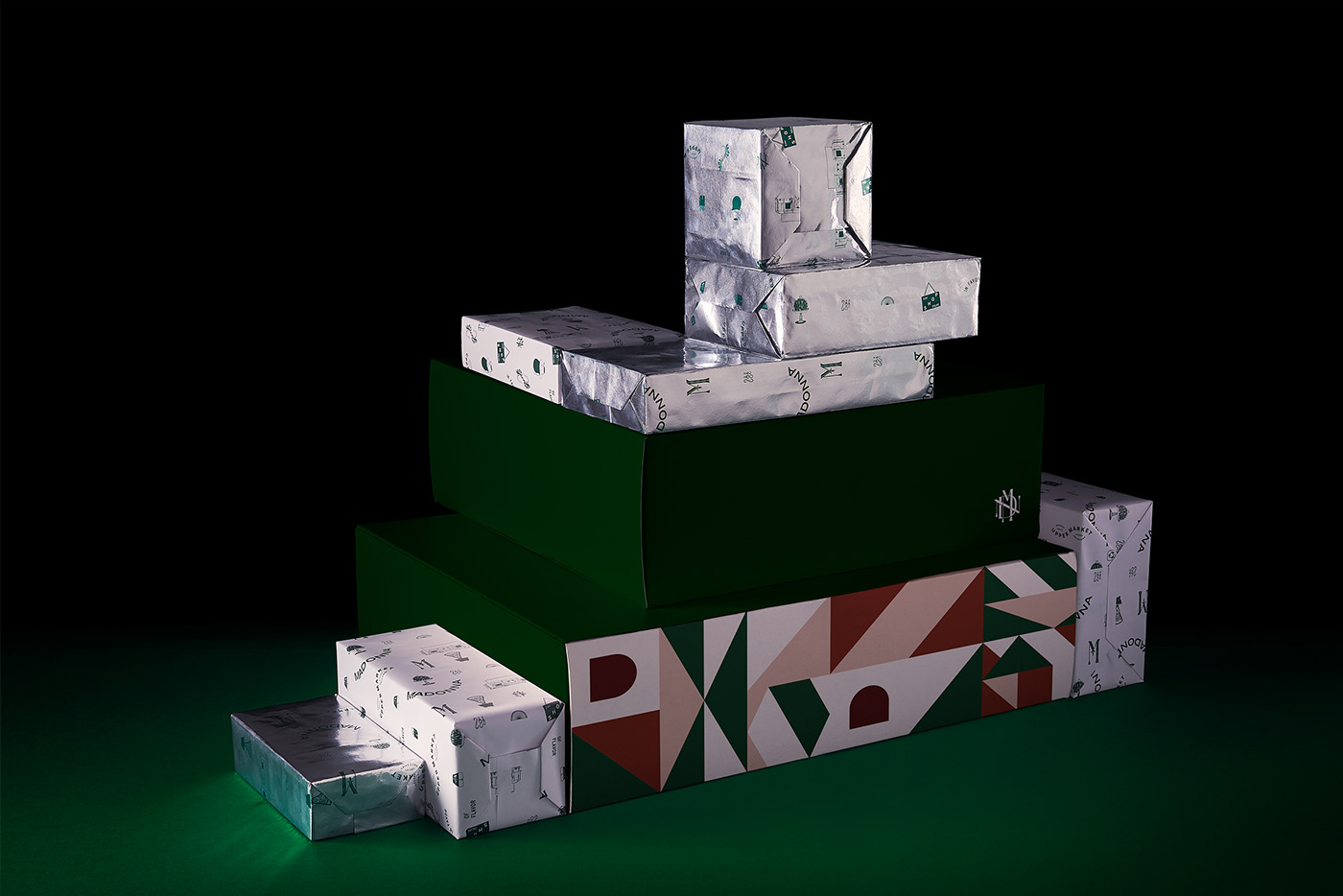
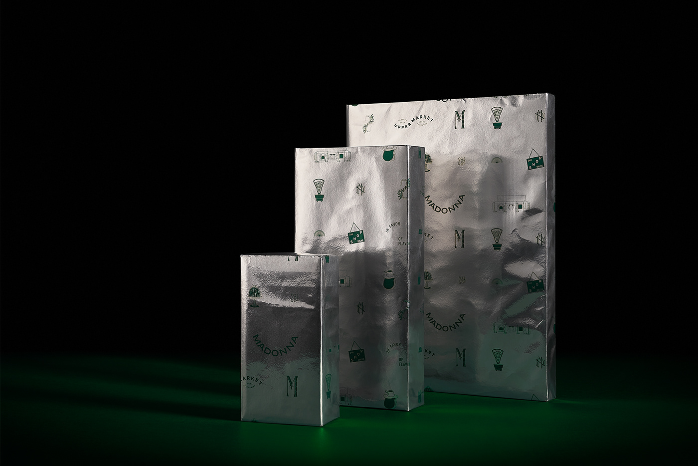
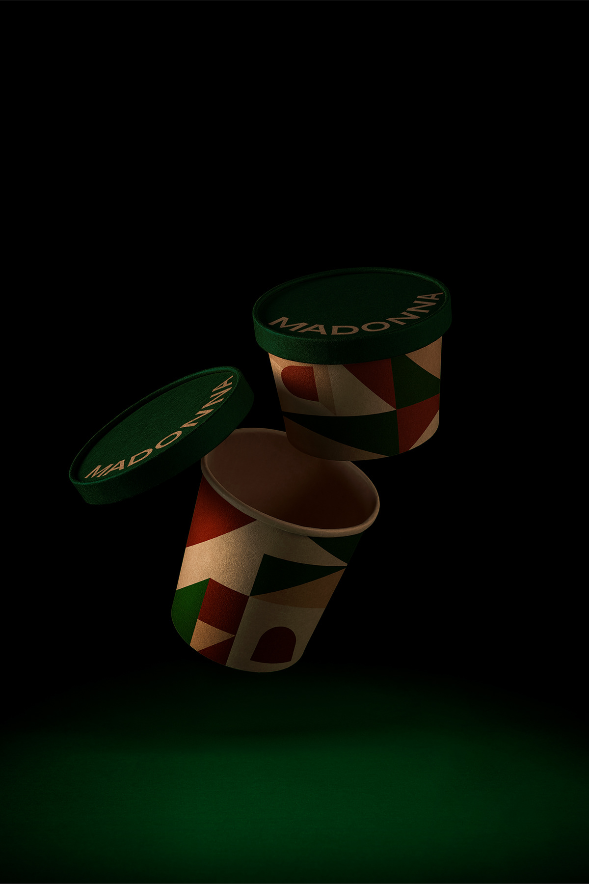
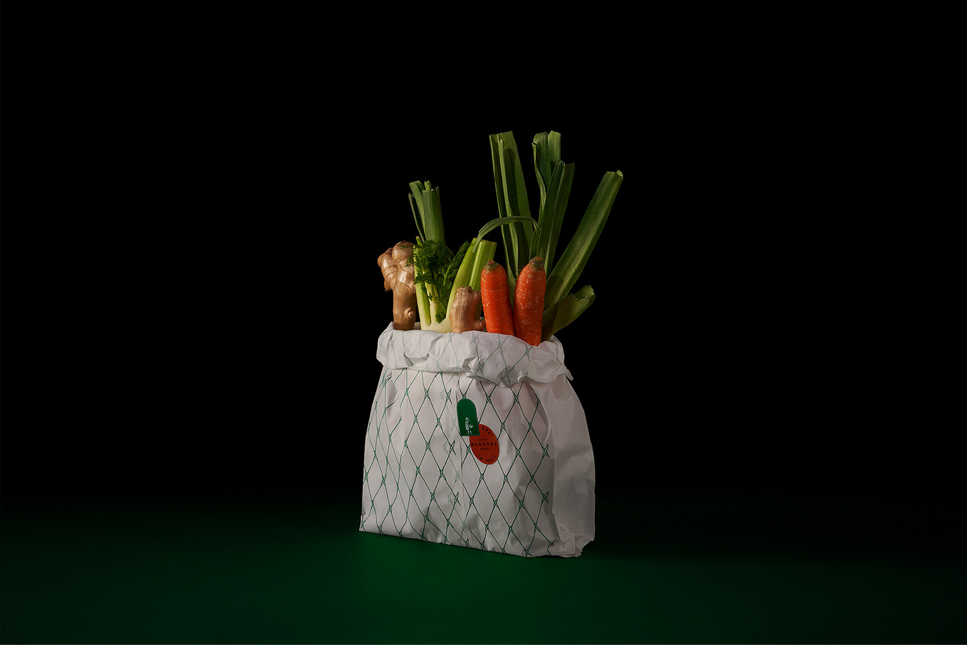
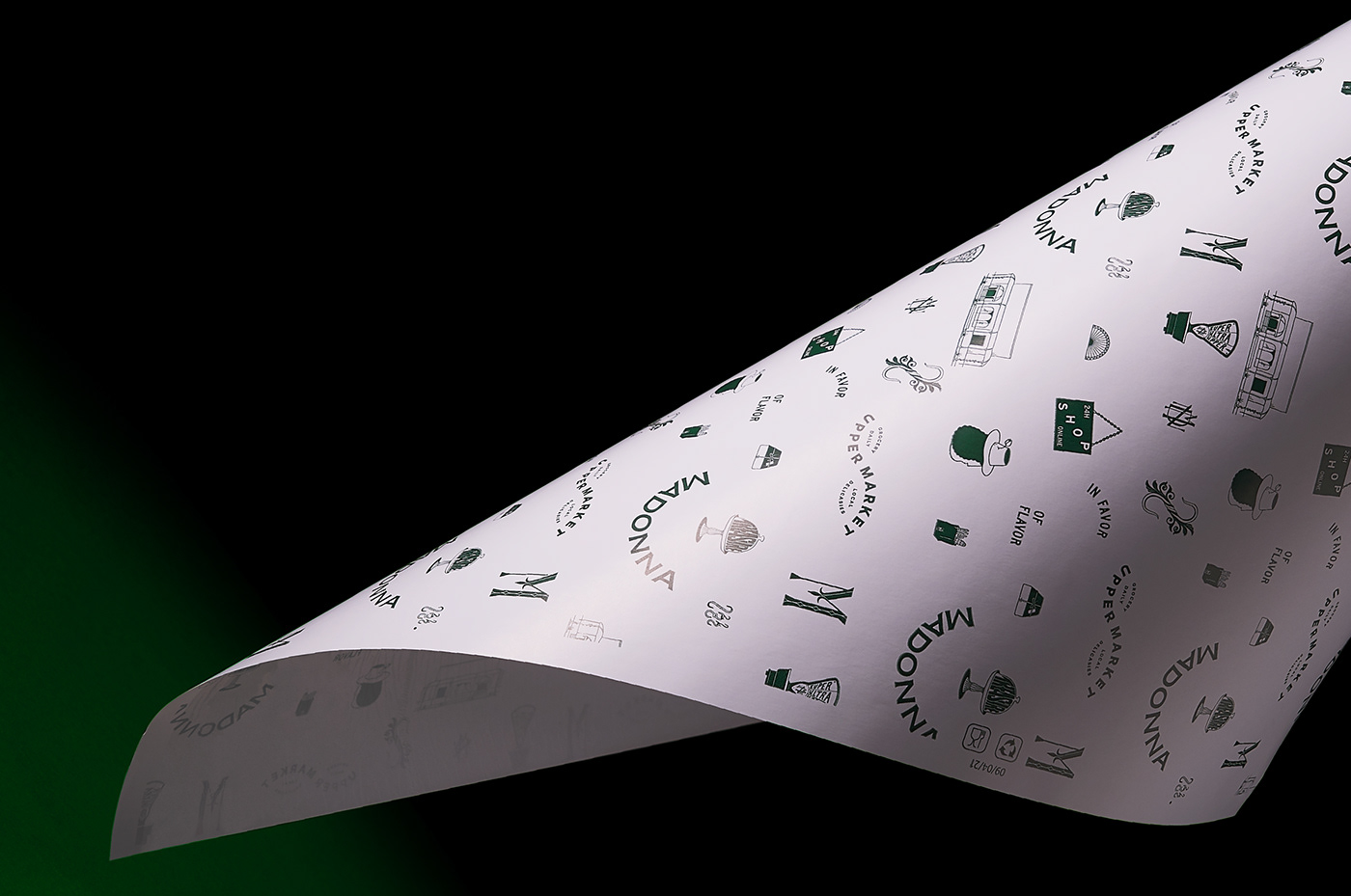
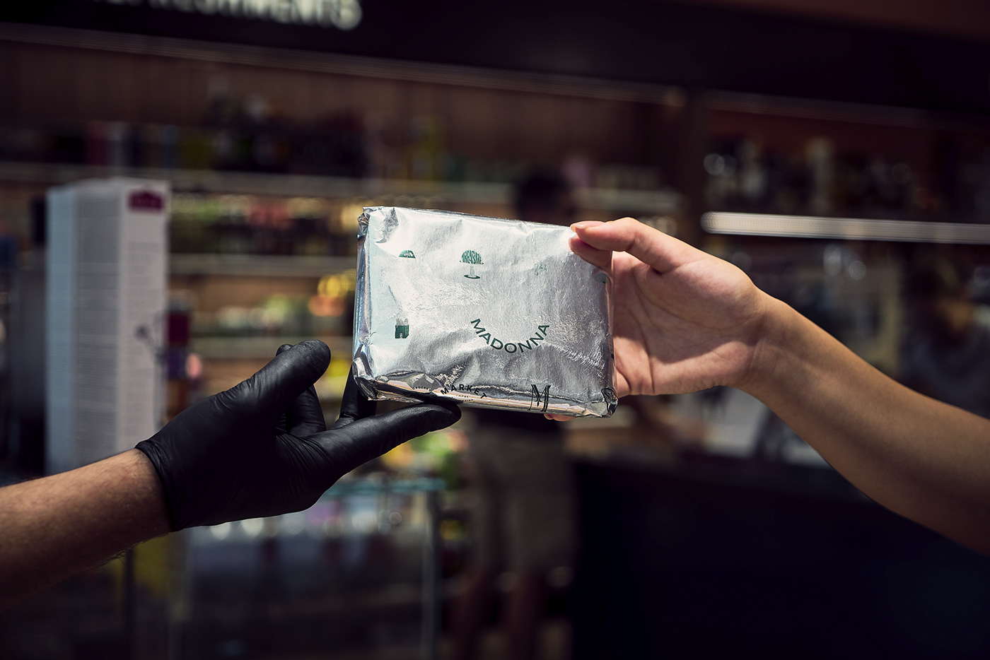
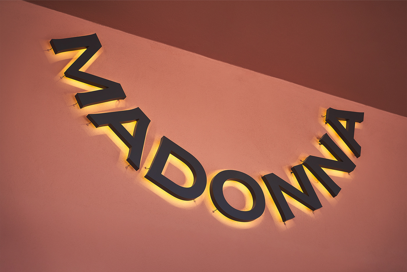
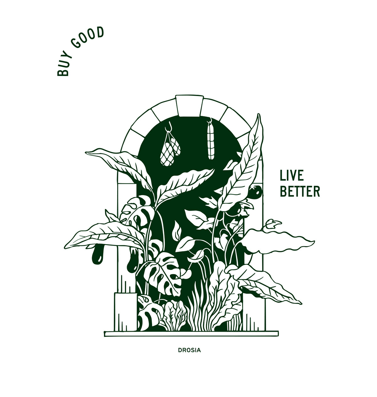
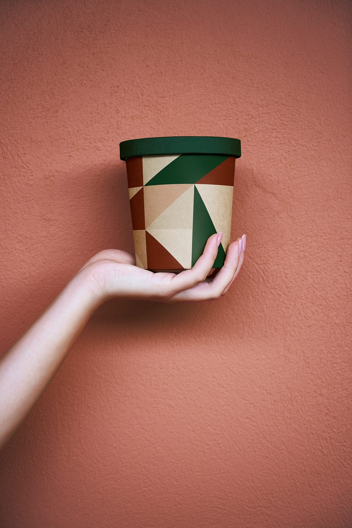
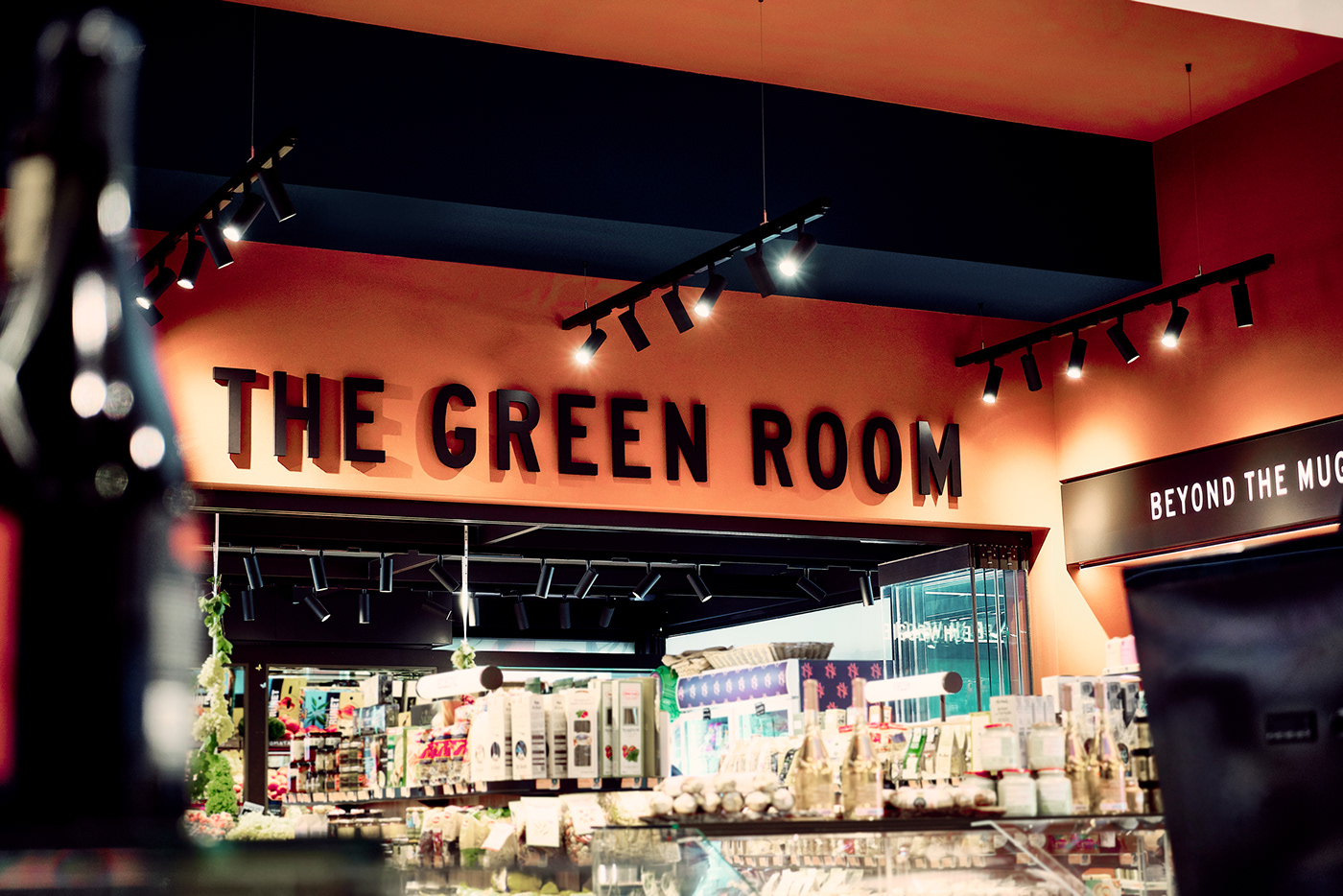
We also designed the exterior signage of the store, alongside the directional system for the interior, consisting of autonomous and different interest spaces. Combining illustrations, ideas, and words we created a visual system that adapts to each segment's packages communicating the brand’s values.
Athens _______ Greece