


A12 Project this year has an anniversary, a half decade of the company's operation. In the last years, A12 Project has successfully implemented more than 160 projects of various types of buildings and interiors.


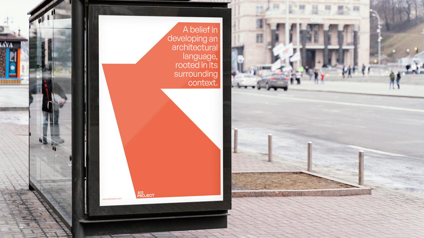
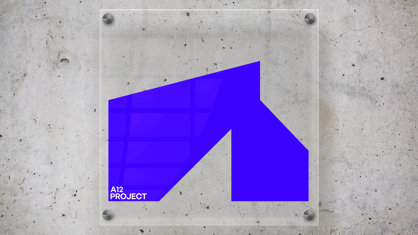
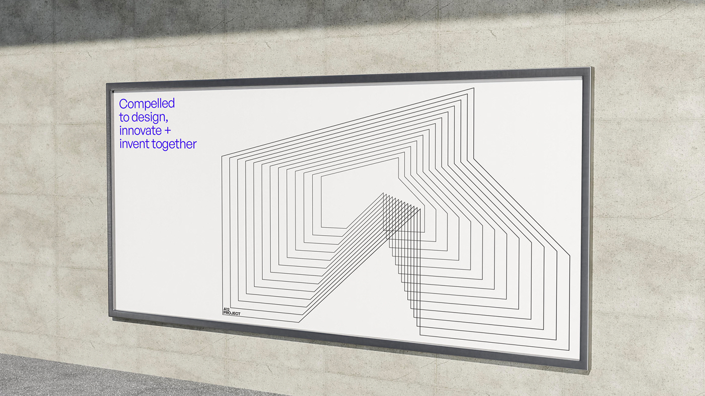
Shapes in the logo interact and make a recognisable form with the typography's unique construction. The new identity extends to a comprehensive system that will allow more flexible communication through all channels, print, and media.


The identity is part of an ongoing initiative to align the aesthetic of A12 Project various entities with the rich modernist tradition.

Flexible grid for layouts. Grey area represent position of the image.


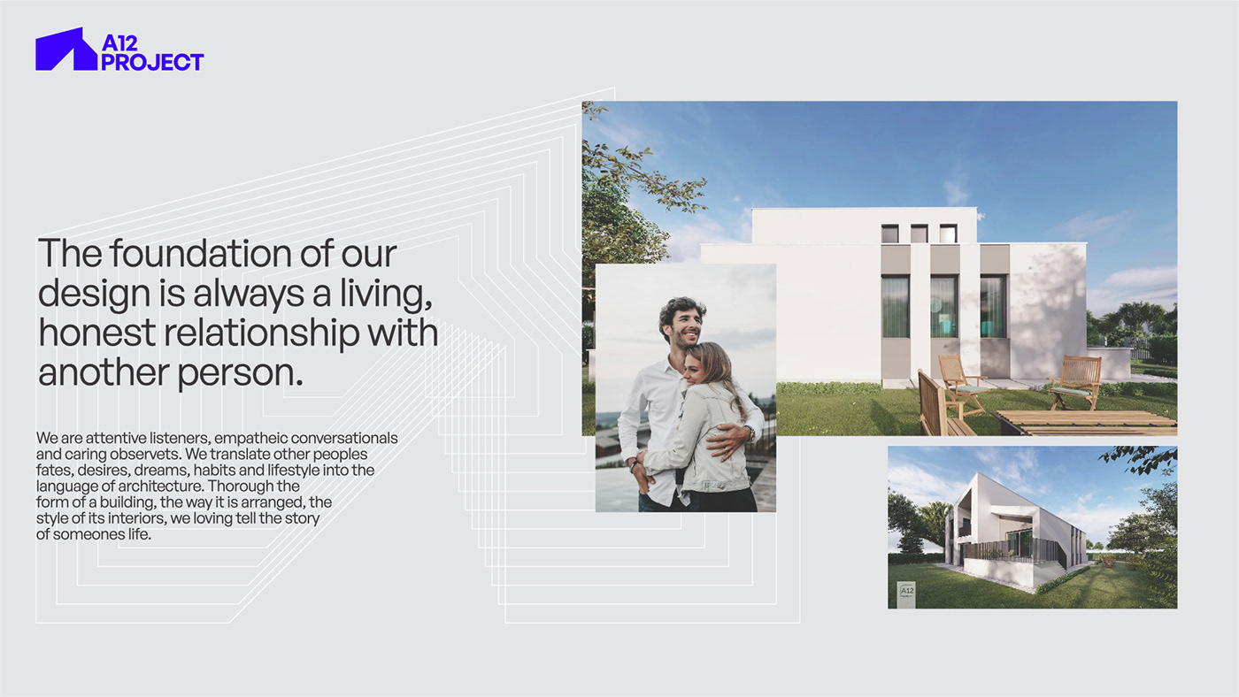
During our collaboration, we realised that A12 Project brand truth was also a universal one. Architecture is not just a drawing or project, it is an understanding of space, light, shapes, people, and nature.

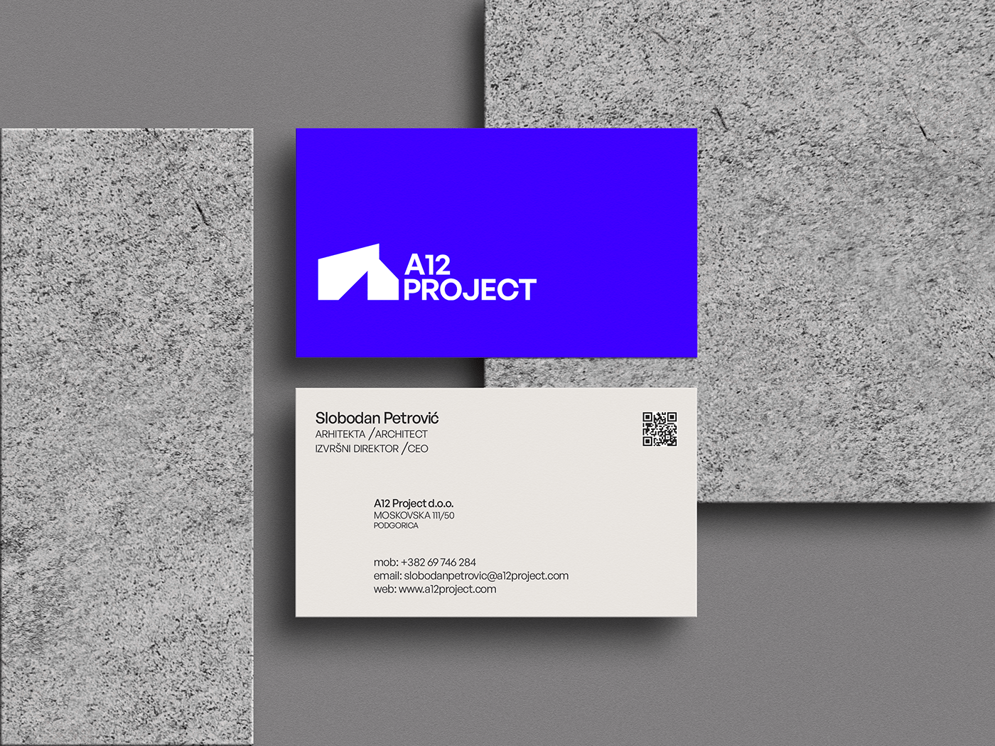
Flexible grid for business cards. Made using different positions of the logo.


As a brand, it needs to communicate these messages of understanding and empathy and how to assemble everything in living or working spaces.


Different activities of the company with naming.


Thank you for reaching the end!
I was very happy to be a part of this project and help the brand to grow, and evolve.


