


Task Summary:
Create a brand identity for your own graphic design business. The brand should reflect your personal attributes and contain specific choices for typefaces, colours, logo mark and print collateral.
Result:
A brand identity that embodies prolific use of colour, a personal brandmark and holographic foil finish on the business cards, as a hint toward neurodivergence. It is also an indicator of ally-ship and that other neuro-divergents would be well served here.
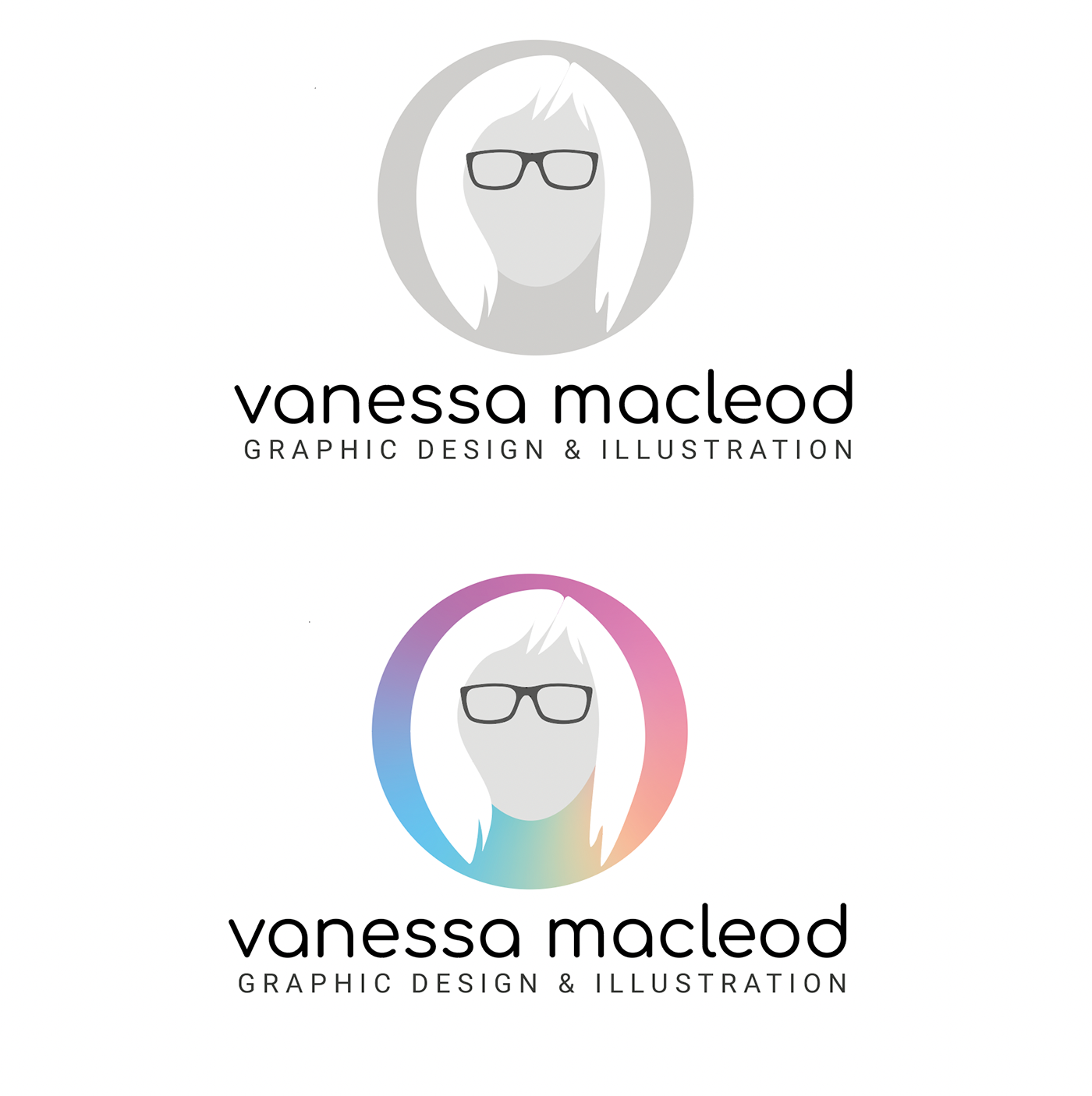
Early iterations of logo development...


The final logo - shown monochrome and full colour.
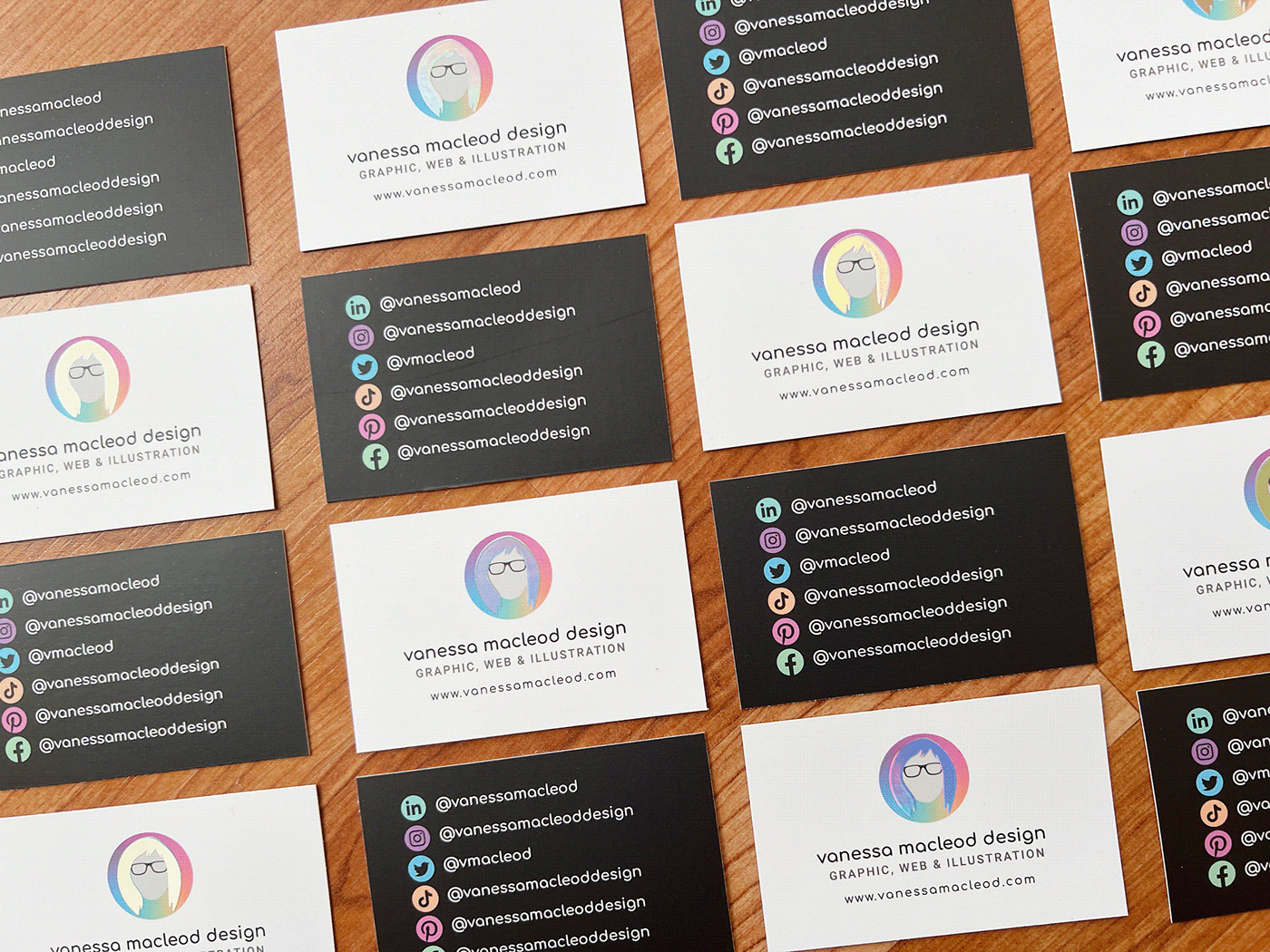
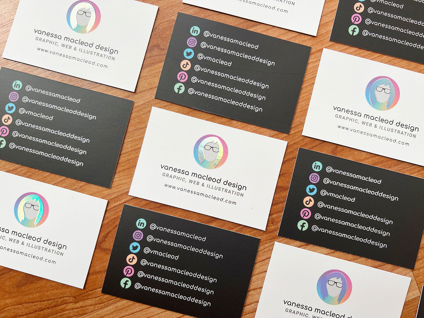
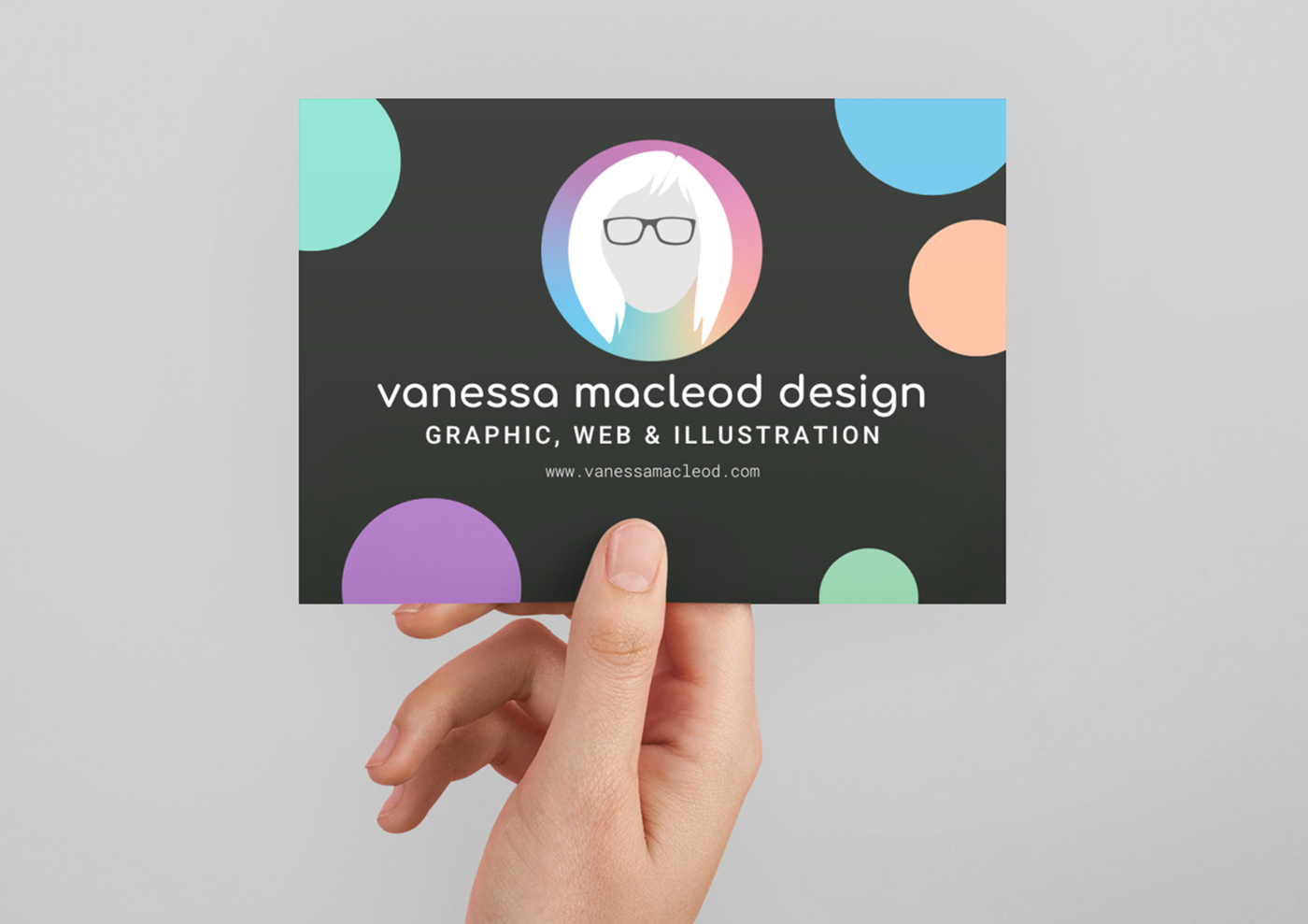
Business Card Design - with holographic foil finish
The foil finish is my favourite part of this design. Aside from the literal link to me and my constantly changing hair colour, it is also a nod to my Adhd and neurodivergence, always a million ideas bubbling around inside my head.
It is also a nod to alternative view points and using creative thinking. There is always something different to see when you look from another angle, portrayed here through the use of the foil.
It is also a nod to alternative view points and using creative thinking. There is always something different to see when you look from another angle, portrayed here through the use of the foil.
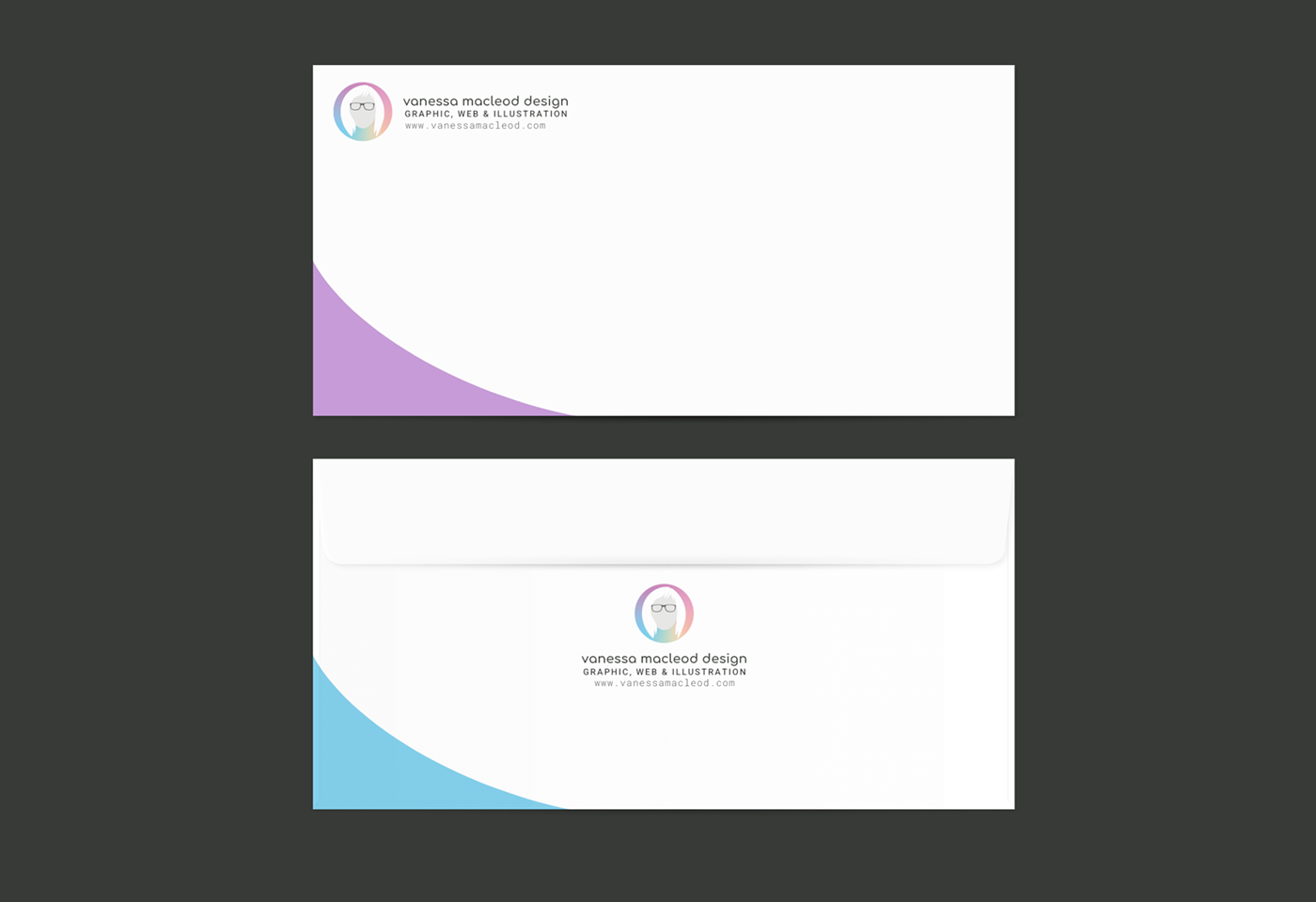
Letterhead design
The letterhead was designed with ecological sensitivity in mind, less is more. I wanted the majority white space for this, to make it easier to print the main content of the letter without overlapping the elements. The large white space echo's the rounded shape theme that runs through this entire project.

Envelope Design
For the envelope design I added the web address in the hopes that wherever the envelope travelled, it might draw my users to the web address.
Postcard design
For the postcard design I wanted to use the reverse image and a darker background, as well as make the elements more fun and personality specific. A fellow student referred them to bubbles, and to me, that fits. (Plus bubbles show a holographic effect when in sunlight!).
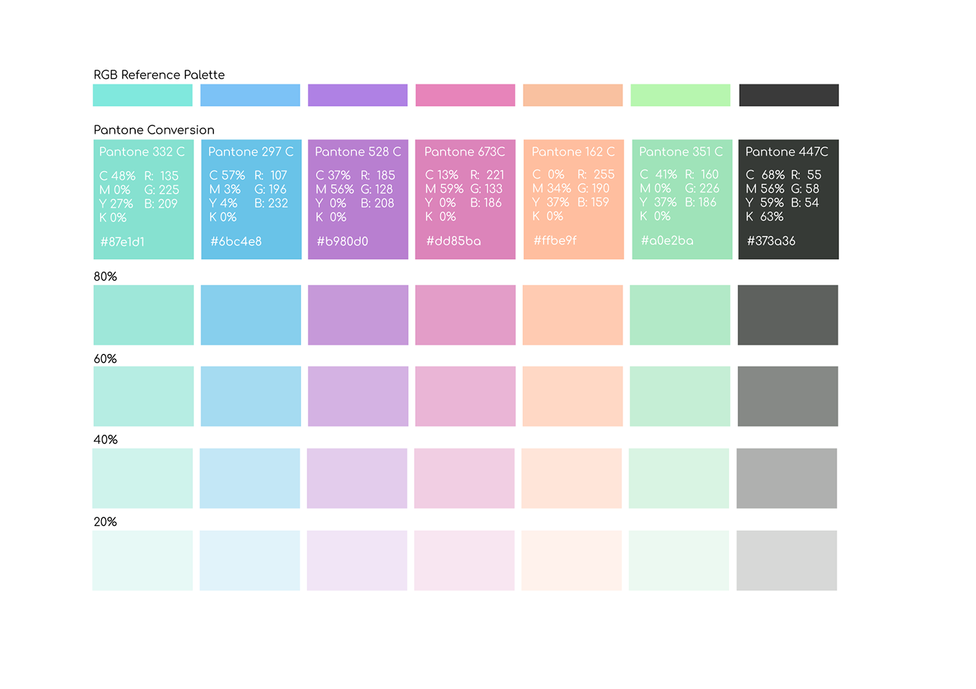
Colour Palette
This colour palette was chosen from a holographic image. When combining these colours in interesting ways, they eye can be tricked into seeing a holographic effect. (See the mood-board under this image)
Moodboard and images that sparked ideas.


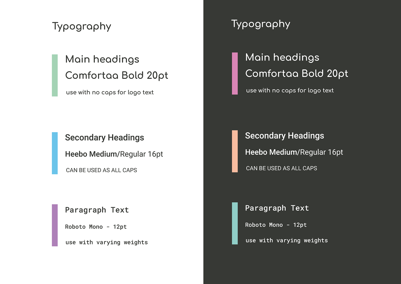
Typography
The typography was quite the journey with its selection. Comfortaa was my first idea, owing to its inviting rounded shape. Hours were spent on Fontjoy making selections, because I surely couldn't settle for my first option, only for me to come full circle when I realised that nothing spoke to me, of ME more than Comfortaa.
The subsequent secondary fonts were chosen for their viewability on websites and also as personal favourites. Heebo Medium and Roboto Mono Regular.
The subsequent secondary fonts were chosen for their viewability on websites and also as personal favourites. Heebo Medium and Roboto Mono Regular.
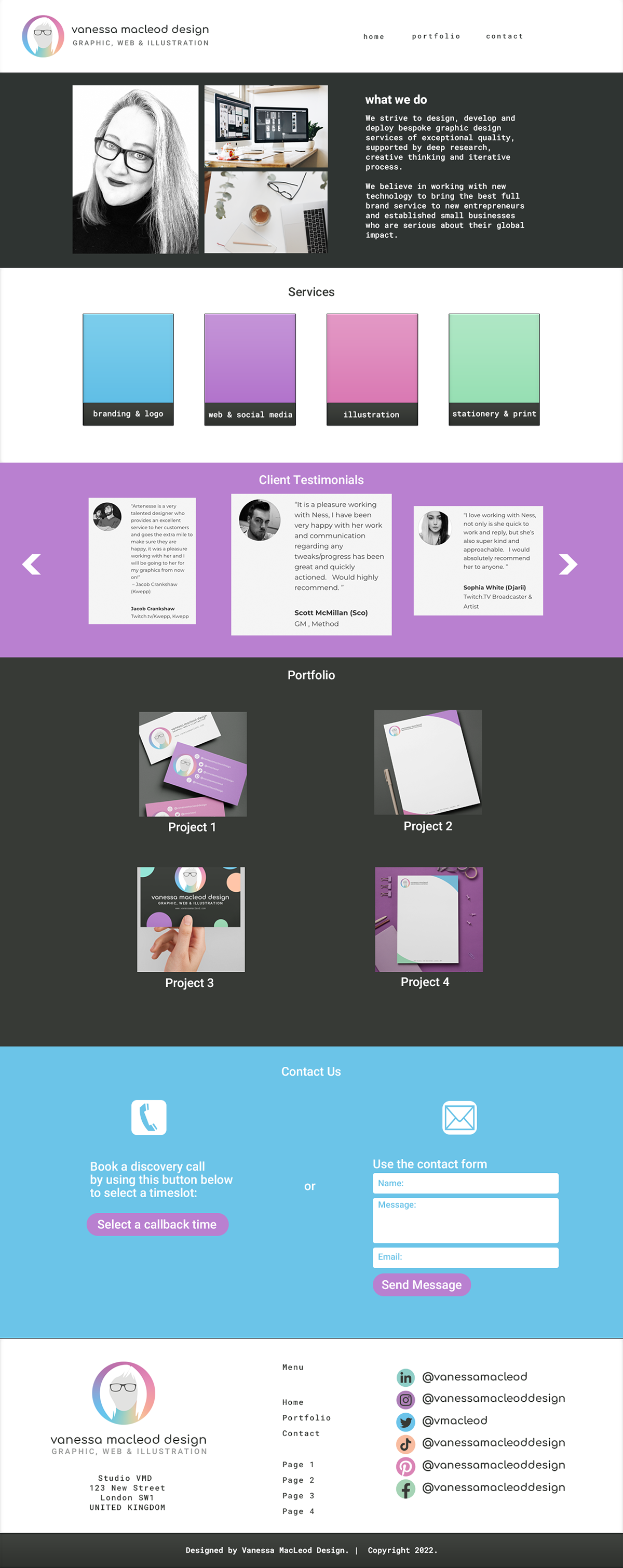
Website Mock-up
The website is in mock-up stage currently, but will be built with either Elementor or Webflow in the coming weeks once testing is complete.
My main aim was to create something both functional and colourful making sure to have the most important elements up front, i.e. services etc. With vision and mission statement alongside images, followed by services, a carousel of client testimonials (real) a link-through section to recent projects, followed by a contact form, with an option to book a discovery call directly via Calendly with a footer section rounding things off with logo & company info, a repeat of the navigation with further options and a section for linking through to social media presences. Having so many socials, really allows potential clients to see who they will be working with, as they're bound to have at least one of those listed.
When building the site, I will expand the portfolio section to show more of each project, instead of just the colour matching placeholders that are there now, with more obvious links to full page sections for each recent project.
When building the site, I will expand the portfolio section to show more of each project, instead of just the colour matching placeholders that are there now, with more obvious links to full page sections for each recent project.
A few more images from the project


