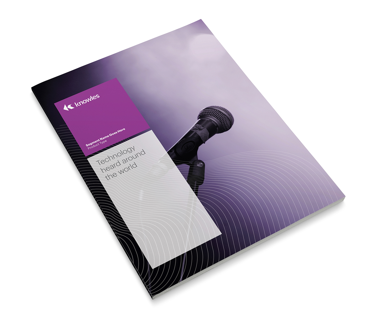
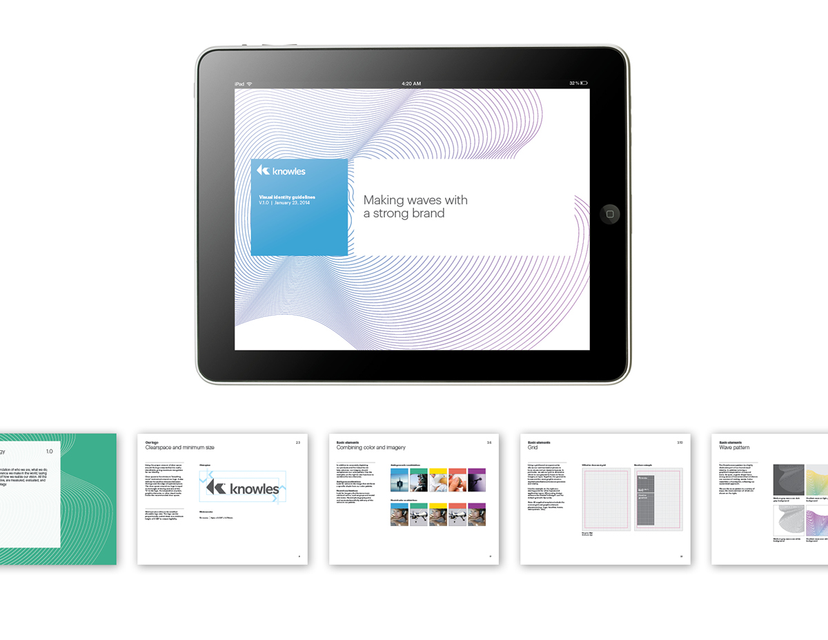
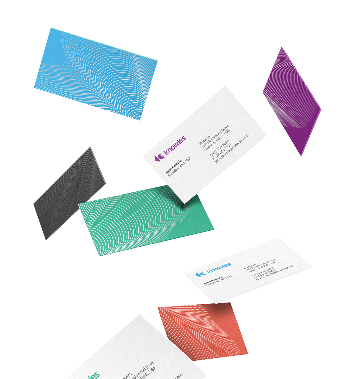
In February 2014, Knowles spun off its parent company and almost simultaneously launched its IPO. As a leader in the miniature microphone, speaker, receiver, and hearing aid industries, it needed a new look and feel that felt innovative and more intimately related to the idea of sound amplification and reception. We designed a visual system using a pattern based on a graphical interpretation of sound waves, coupled with a bright color palette and a simple, modular grid system.
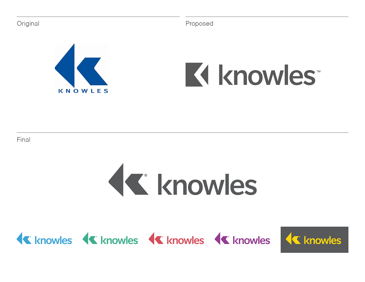
This was originally proposed as a visual system project, but we made a close-in recommendation for how to modernize and improve the legibility of the logo. In the end, they kept the original symbol for legal reasons, but the compromise is a definite improvement in terms of making the brand more memorable and flexible.
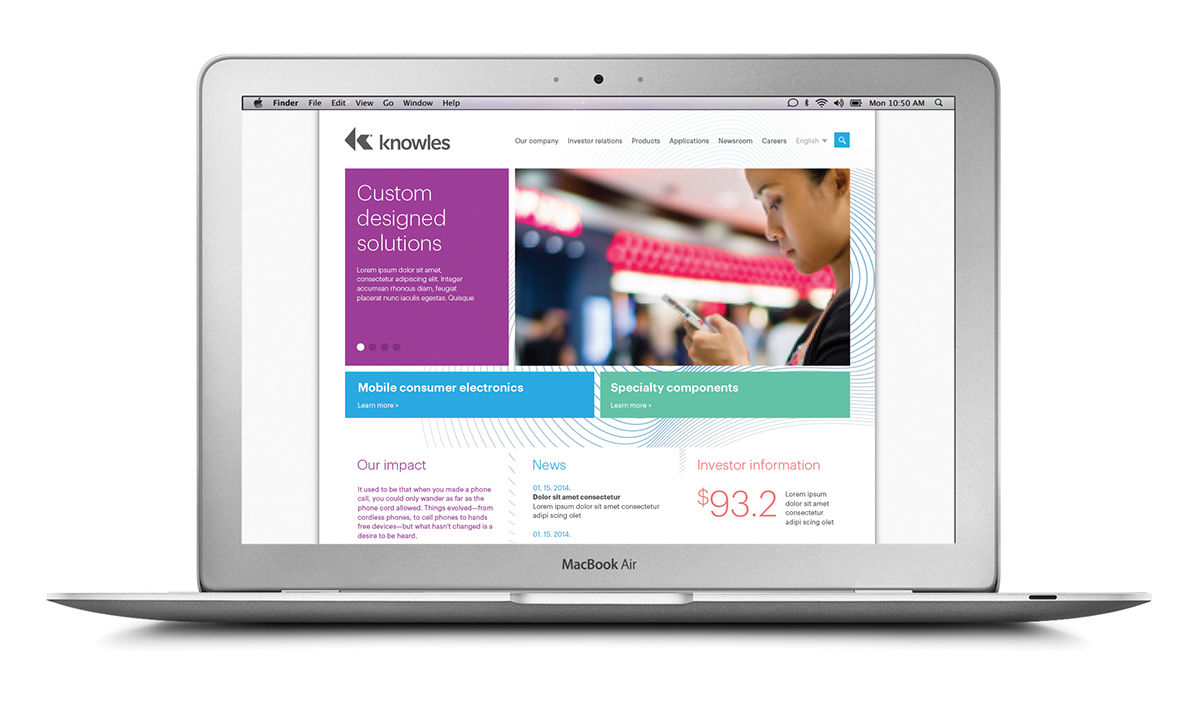
See the website here (designed by Lippincott, built by Roundarch Isobar).