Challenge
The financial crisis was a significant challenge for many businesses, The Terra Group included. The need for change instigated positive initiatives throughout the bank alliance, one of which was to revaluate their brand. The decision was taken to assert the qualities that the alliance had risen on, partnership, expertise and support for the local banks throughout Norway. Mission was assigned to carry out the rebrand.
Solution
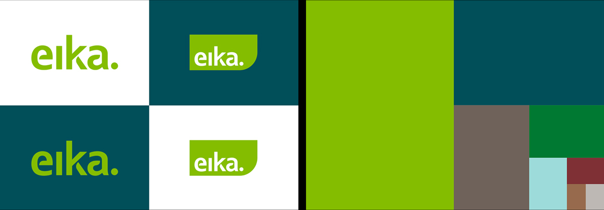
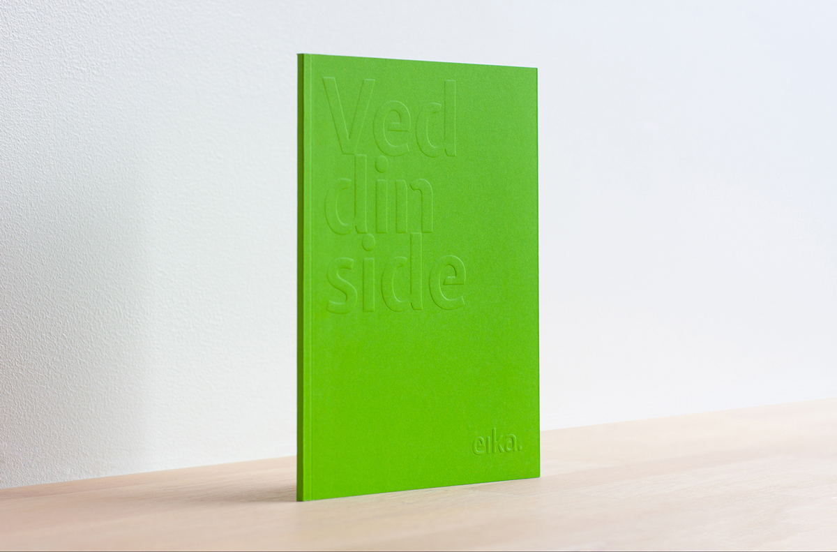
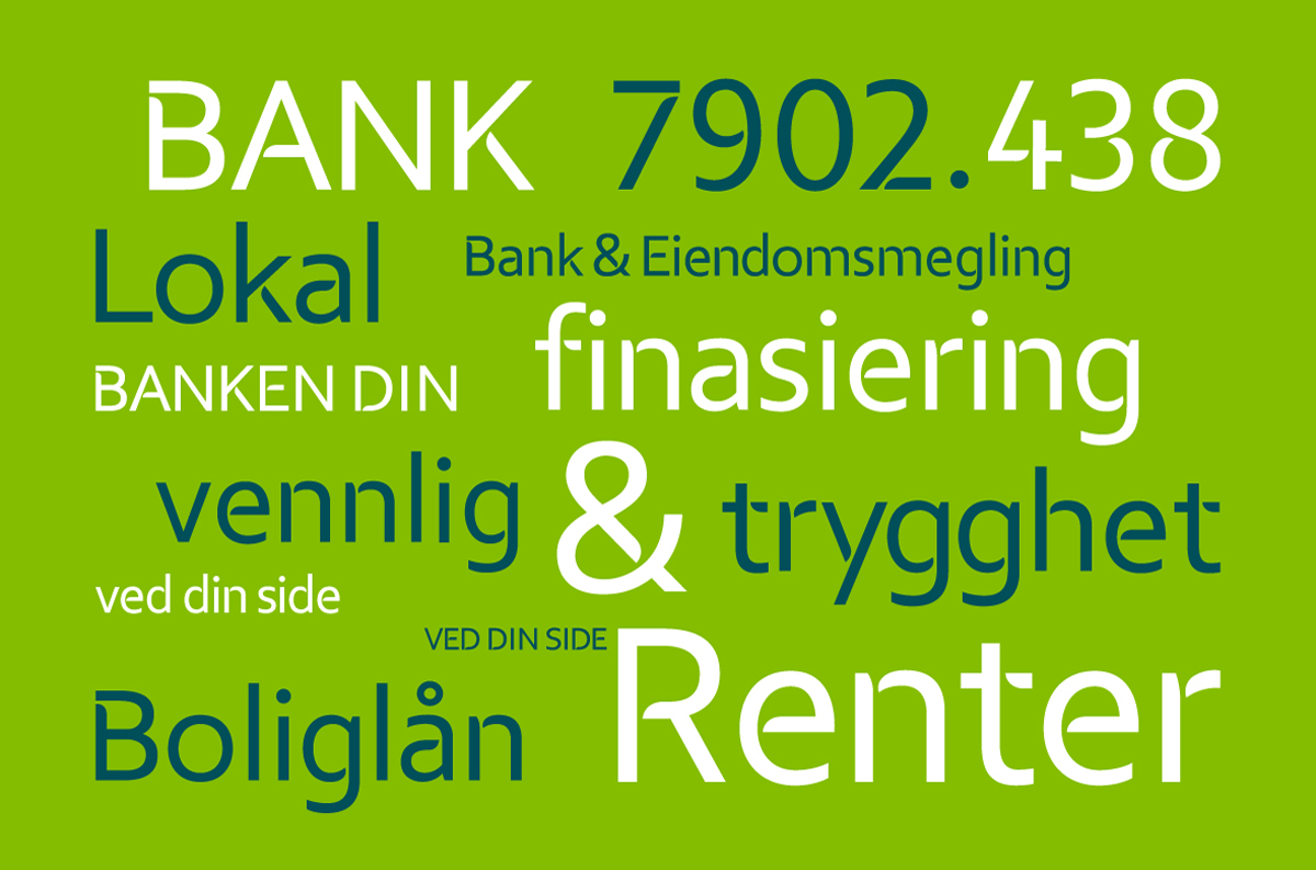
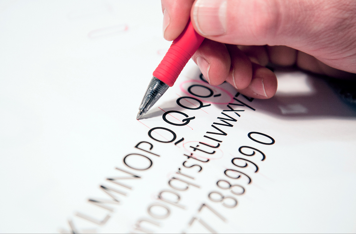
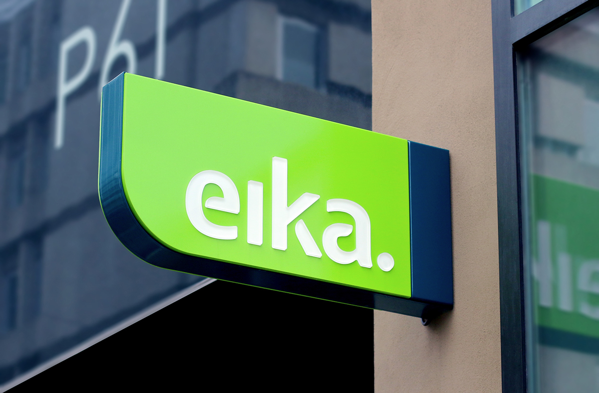
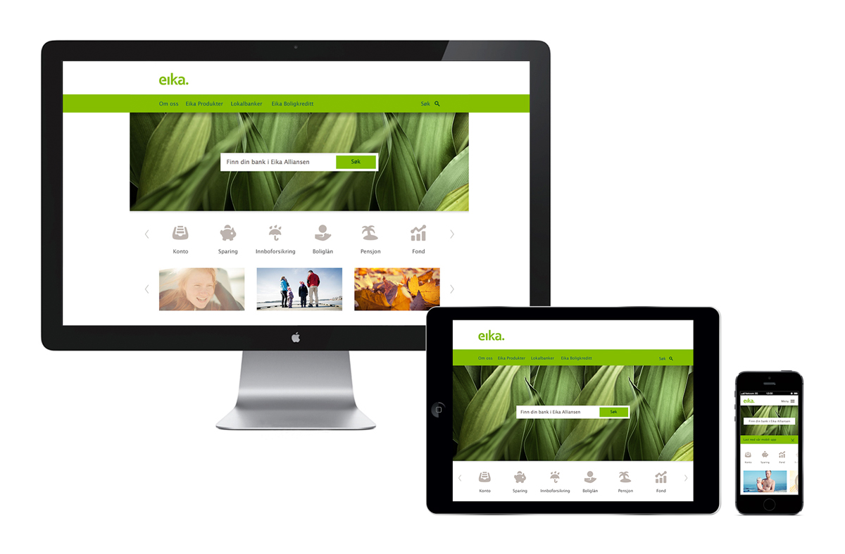
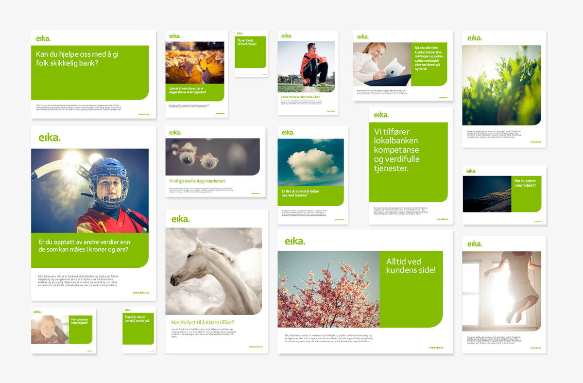
Research showed that the former name and position was associated with big banking and didn’t project the close partnership that the alliance stood for. A new name was introduced. Eika (the Oak) is a traditional icon suggesting strength and growth. Out of this a new identity program was conceived to endorse the local bank’s identity whilst creating a distinct and unified look for Eika. All key touch points were redesigned including signage, product literature, internal communications and websites, ensuring the alliance remained true both in the physical and digital world.
Result
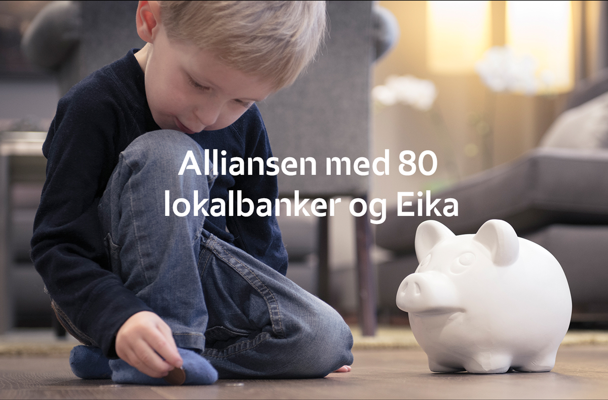
The success of the rebrand would always rest on support from the members of the alliance. The fact that almost 80 banks have adopted the brand is a testament to the professional handling of the change, and the compelling new statement the brand makes. The Eika transformation has strengthened its position in local communities and in a vote to find the top local bank in Norway, eight out of the top 10 belonged to the Eika Group.
