

Nurse for Nurse(NfN) is a Japan-based general incorporated association to help nurses connect, exchange information, and support each other in their career development. They observe the changing needs of societies, the needs and challenges of nurses, and create opportunities to discover new areas as well as themselves. I was given an opportunity by one of the founders who then happened to live in the same city as me, to create a logo for the association.
一般社団法人Nurse for Nurse(NfN)は、刻々と変化する看護職へのニーズと課題に目を向け、「Connect and Discover(つながりと発見)」を軸とした、看護職のための看護職によるキャリア開発支援事業を展開(予定)しています。世界中で様々な分野で活躍する看護職同士をつなげ、ローカルおよびグローバルな課題解決を促進し、人々の健康に寄与することを目指しています。活動内容としては、看護職同士が繋がり情報交換を可能にするシステムの構築や看護職のキャリアに関する情報発信事業等があります。今回は、偶然にも私が滞在していた街に居住されていた設立者の1人の方よりご連絡を受け、法人ロゴの制作を依頼されました。


The initial brief was to visualise the concept ‘Connecting nurses around the world' in a simple, minimalistic approach yet professional look, with multiple colours in comforting tones that represents the nursing industry(As sense of security) as well as the diverse possibility(As hopes) in the future of nurses.
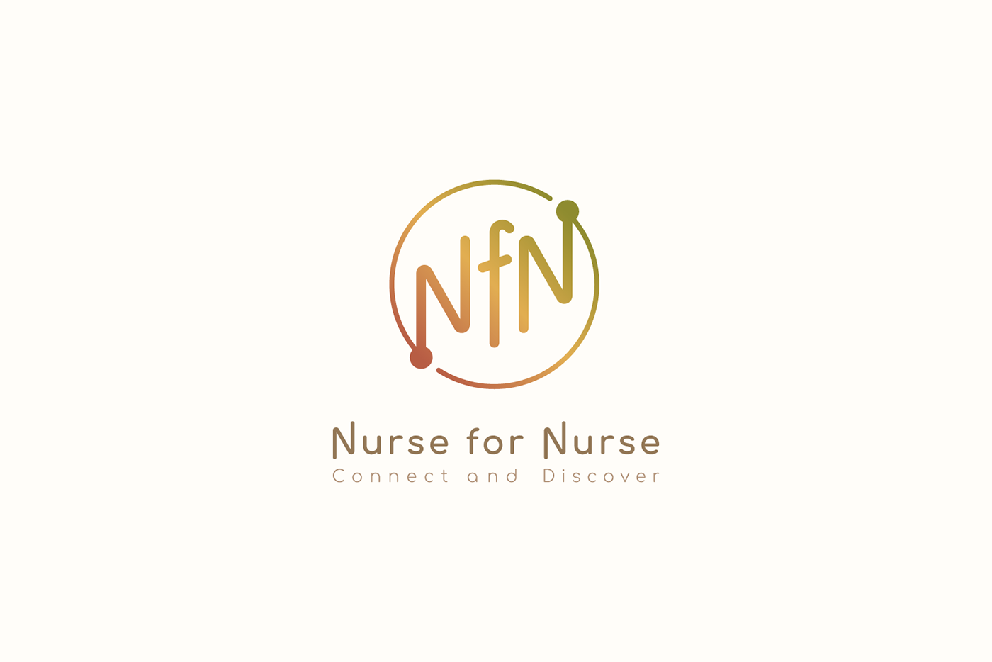
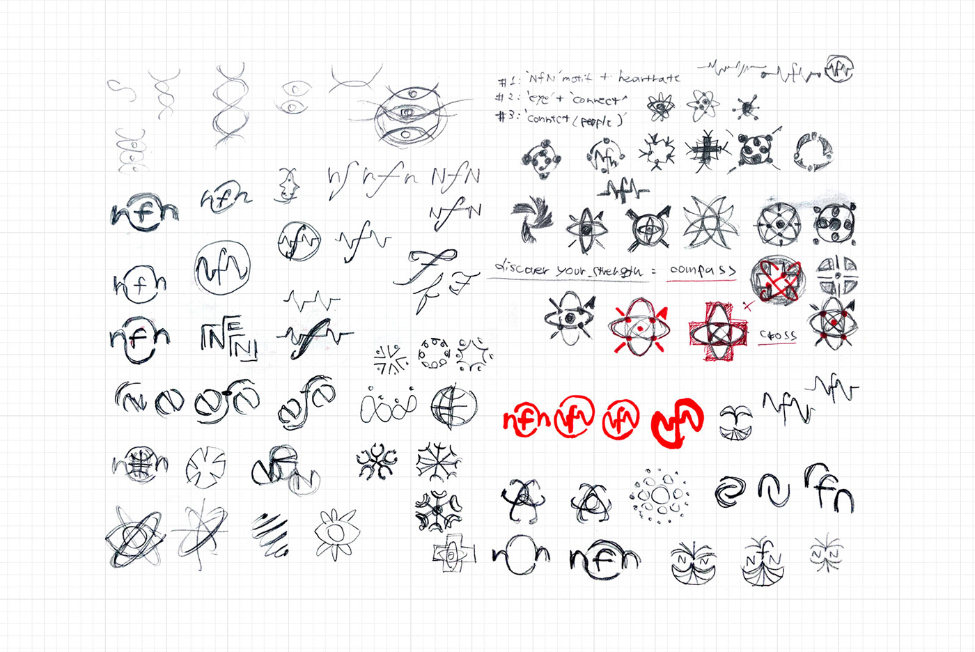
To explore ideas and seek more possibilities that might lay underneath, I created some design drafts using motifs and elements that related to the mission and concept of the association. After some discussion to narrow it down, we settled on one design sketch based on the concept of connecting nurses across the globe(circle) through the dots(nurses) in tip points of the alphabet letters 'NfN' and raising up with the whole community toward the right side.
依頼されたロゴのイメージは、団体の理念を分かりやすく視覚化したシンプルかつプロフェッショナリズムを感じられるデザインに、看護業界(安心感)と看護職の未来にある多彩な可能性(希望)を想起させる要素として、落ち着いたトーンの色を複数使用したものという内容でした。
ドラフト段階では、初期イメージに加えて様々な可能性を探るため、団体に関連するモチーフや要素を取り入れた様々なデザインスケッチを作成しました。それらの中から複数を候補案として選出し、何度か絞りにかけてブラッシュアップを重ねました。その結果、丸い地球上(円)の各地に位置する看護職(点)が、法人名「NfN」の文字を通じて点と点同士つながりあうことで、コミュニティ全体が右肩上がりに上昇していく、というコンセプトの元に制作したデザインを最終案として選出しました。


We chose a simple curvy-body font as the logotype with a visual effect of being able to connect with each corner and point of the letters flexibly, in order to represent unity and solidarity.
法人名のテキストは、点と点の繋がりにより形成される連帯感を表すため、各文字の角や終点・始点を通じてお互いが接続しあえるかのような視覚的効果が期待できる、ボディに丸みのあるカーブを帯びたシンプルなフォントを使用しました。

As for the colour, we picked up natural and comforting shades that represent what nurses contribute to our society - hopes and security, but also their professionalism, passion and dedication. The colour gradient represents one of the three core values of the association, which is "Diversity, Equity and Inclusion".
また、看護職の方が人々に提供されている安心感や希望だけでなく、彼らの専門家としての誇りや情熱、姿勢をも表現するうえで、地に足がついた印象を与える落ち着いたカラートーンの中から複数の色を選出しました。また、色のグラデーションはNfNが大事にされている看護職の様々な背景を尊重するDiversity, Equity, & Inclusionの概念も含まれています。


The final design was delivered in minimalist style on warm, earthy tone colours and gradient, with a wish for all who aspire to become a nurse, currently working as a nurse and who seeks future career oppotunity from a nurse, to be able to engage long-lasting familiarity with. I hope it works as the catalytic symbol of generating diverse future possibilities as well.
ミニマムなデザイン、そして柔らかなアーストーンのグラデーションを帯びた最終案のロゴは、現在看護職を目指されている方、現役でご活躍中の方、また看護職としてその先の可能性を模索しているすべての方にとって、長く慣れ親しんで頂けるようなものを目指して作成しました。このロゴが、未来の様々な可能性を橋渡しするシンボル的存在となればと願っています。


