UI/UX
Over the year, I became very interested in interaction design and found myself constantly thinking about ways to improve user experience. As I ran into design problems, I sought to fix them. Not only did I want to improve the design, the part facing the user, but also the whole experience, how they would move throughout and interact with it. Here I have included a selection of my favorite designs from the year that show how I was thinking critically and searching for better solutions.
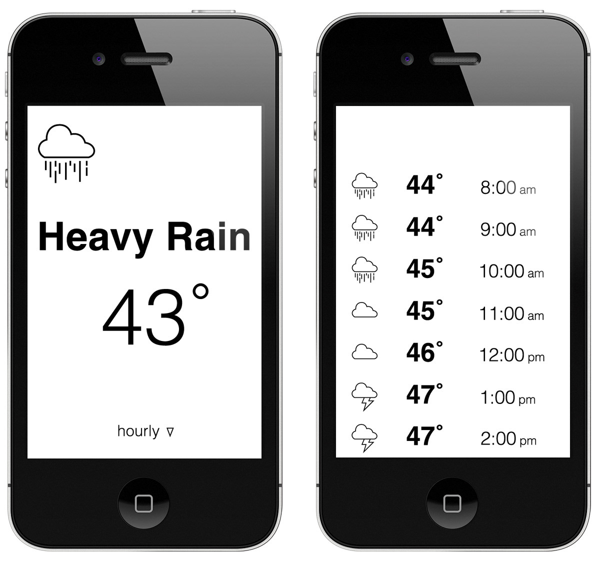
February 25: I am frustrated with The Weather Channel app because it is too cluttered with ads and unnecessary graphics, which lengthen load time and distract the user from the main goal, so I came up with this concept for a simple and clean design.
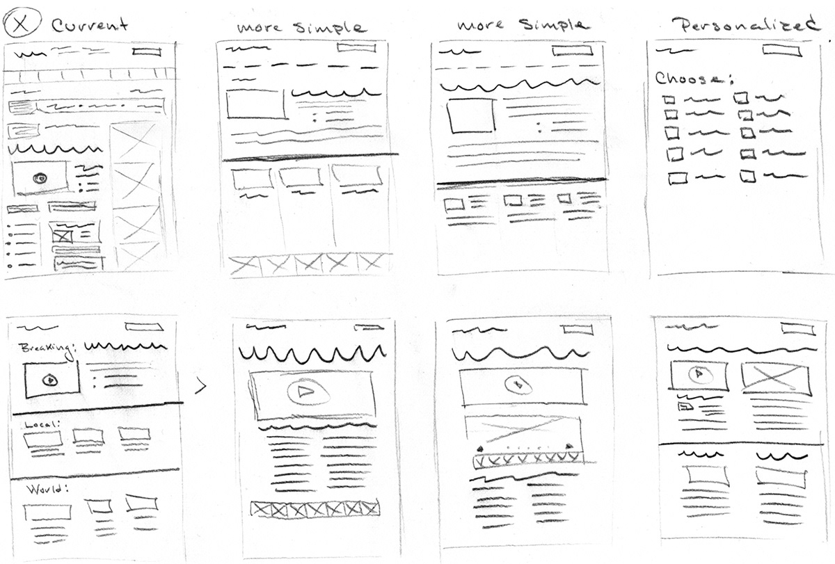
April 19: For some time now I have been frustrated with news websites which are too cluttered and difficult to navigate. Due to the recent events in Boston, I have been visiting these sites more frequently which lead me to start thinking about a solution to this frustration.

April 20: Pushing this idea of a simplified news site. Ideally, it would let you personalize to your interest, locations etc. with no advertisements.

April 21: This simple news site would allow you to select your interests, further personalizing it to your liking.
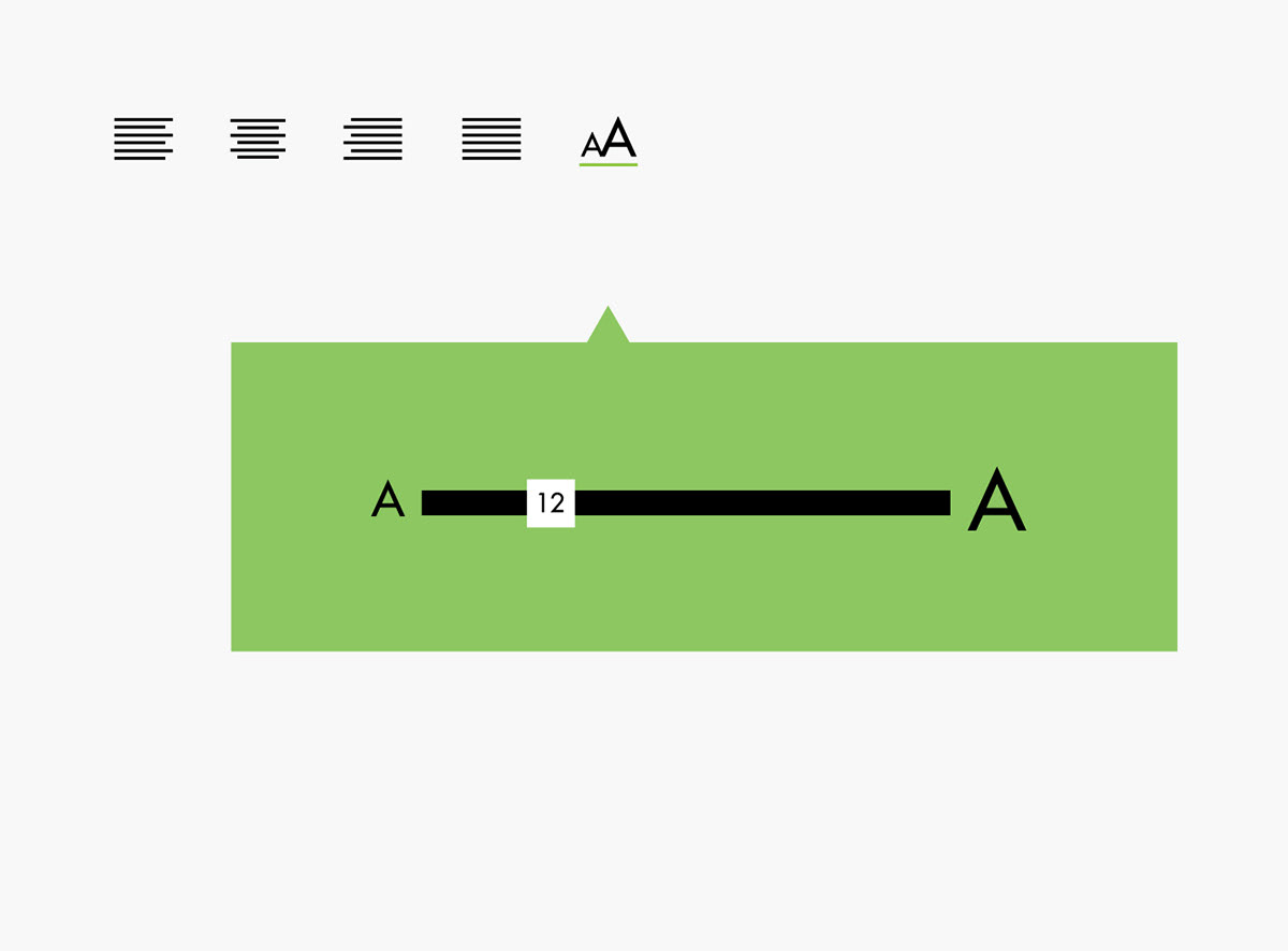
March 17: This is a Dribbble rebound (dribbble.com/chels-c-lee). A rebound is a shot in reply to another shot, which allows players to riff off an initial concept to get their takes on the same idea. This is my concept for a font size tool.
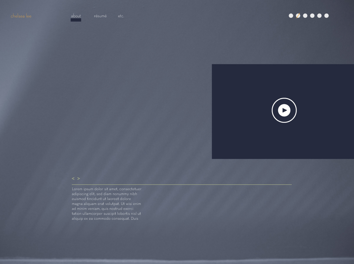
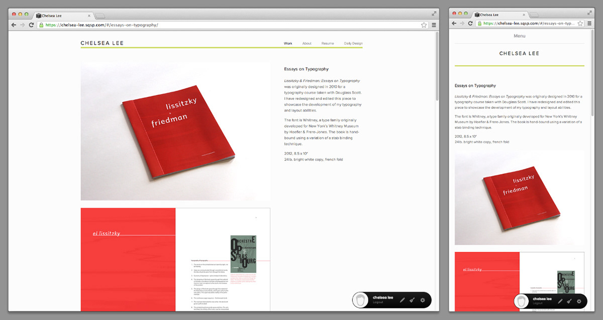
February 20: I am thinking about creating a new portfolio website, so I've been looking at what my peers are doing and getting a feel for different layouts.
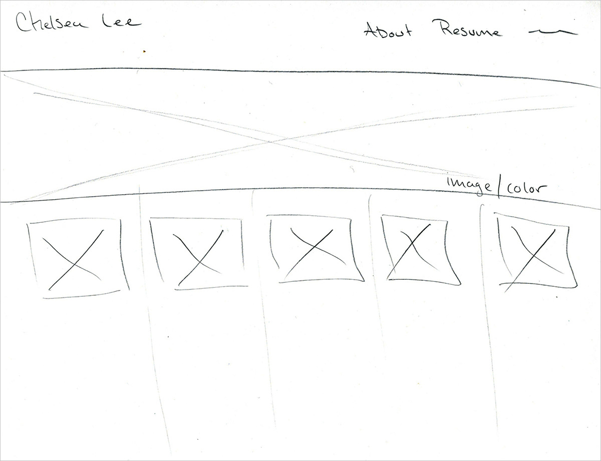
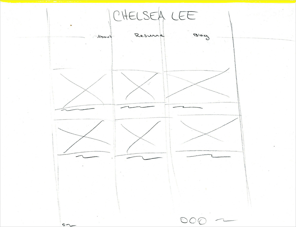
March 19: I am in the very early stages of creating an entirely new portfolio website, so I've been sketching some rough wireframes and perusing the web for ideas.
March 20: New site layout concept; getting a fell for what I want before I dive in.
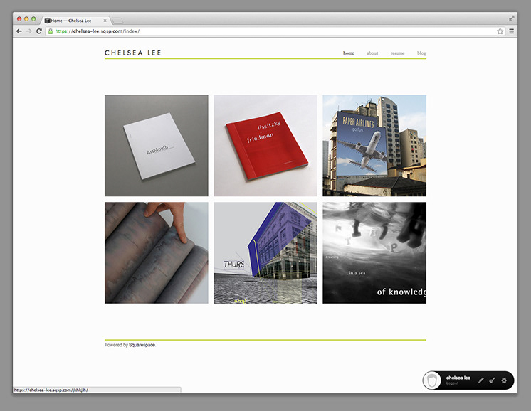
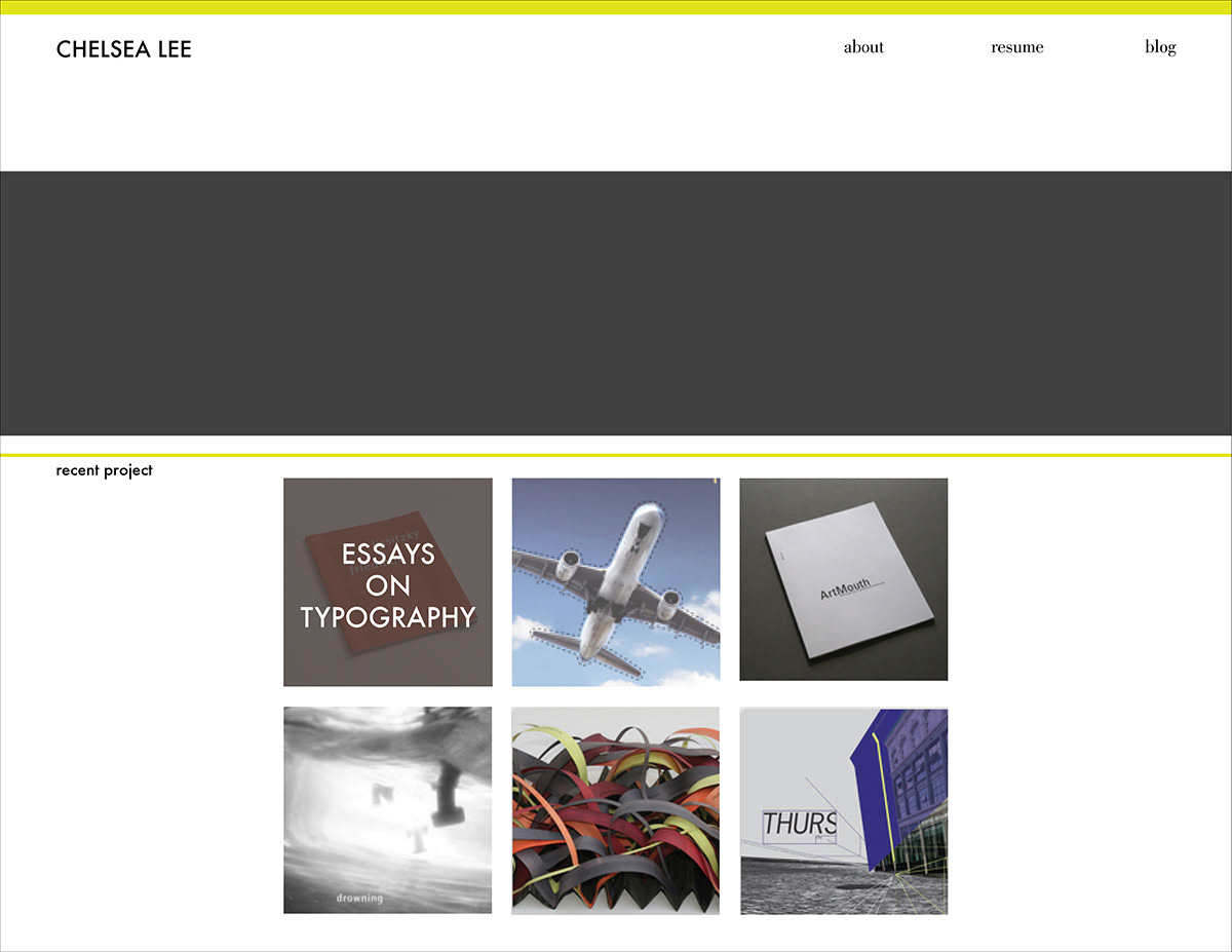
March 23: Decided to build my new site with squarespace, mainly because they seem to be at the forefront of responsive site development. Here is what I’ve got thus far. Still have a lot of exploring to do with the features and style mode.
March 24: Day two of building my squarespace site. Lovin’ the responsive design, specifically how the top nav nests under the 'menu' button when the browser window is smaller or when it is viewed on mobile devices.
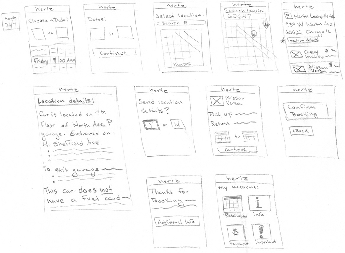
September 22: I had a terrible experience this weekend renting a car using Hertz 24/7. Crucial information was not communicated and major user experience issues were noted. When selecting a pick-up location, no details were provided, an address had been listed, but there were no notes indicating where within the parking garage one would find the car, nor was information provided about exiting garage payment. I ran into many issues while renting a car with this program, most of which could have been avoided had proper communication occurred. I have drawn out a wireframe including features I think would greatly improve this service, however after the experience I had this weekend, I can confidently say that I will not be using this program again.
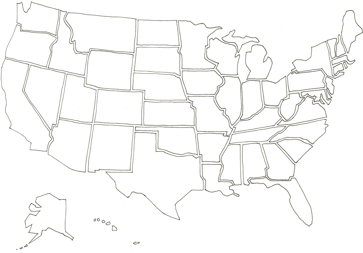
November 17: I went to SEEK Conference yesterday where I heard Aaron Draplin and Stefan Sagmeister talk. Inspired by both designer’s work, Sagmeister’s experimental approach and Draplin’s Americana roots, I decided to draw a puzzle map of sorts, which I plan to expand on tomorrow.
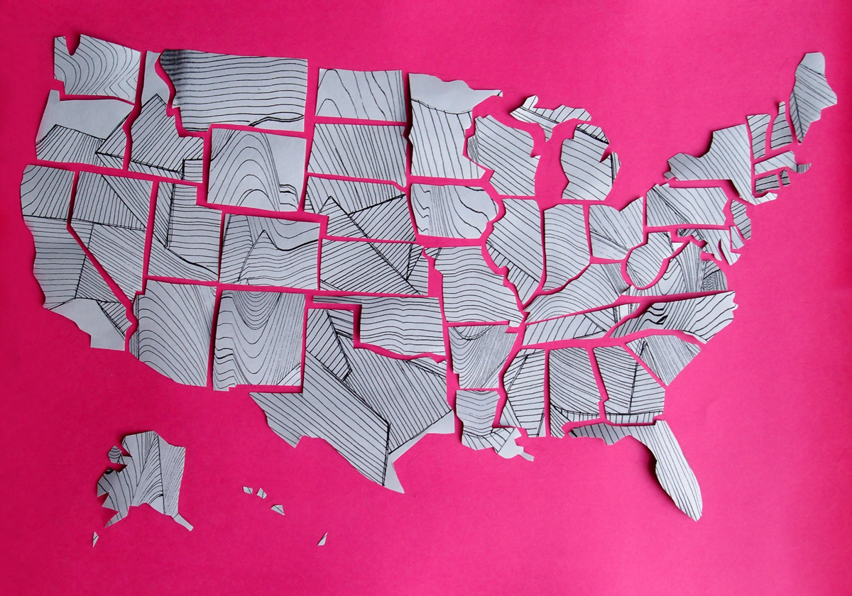
November 18: I manipulated a line drawing, which I created about month ago for a previous project, over my photocopier and then printed yesterday’s map in reverse on the back. I cut out each state from various prints and then pieced together the puzzle.

November 20: Spent some time today thinking about what I wanted to do with this map and began to envision it as an app. As I made a very rough wireframe, I began to think about informational features and plug-ins that might be useful.

November 21: Starting to think about how the app will look.

November 22: Thinking about the features of the app and how the user would interact with it. You could either tap or pinch to zoom and would get more details as you got deeper into the state. If you click on a city you would get buttons that would give you information about that specific city. Though I don’t know if this is possible, I thought it would be cool if it had a Yelp plugin that would show top rated restaurants and such in that area.


