TYPOGRAPHY
In this grouping, I have included a range of type studies that show how I was playing and experimenting with typography. Most of the work is complete nonsense: made up words, distorted letters, odd compositions, but through the nonsense, some sense emerged.
In this grouping, I have included a range of type studies that show how I was playing and experimenting with typography. Most of the work is complete nonsense: made up words, distorted letters, odd compositions, but through the nonsense, some sense emerged.
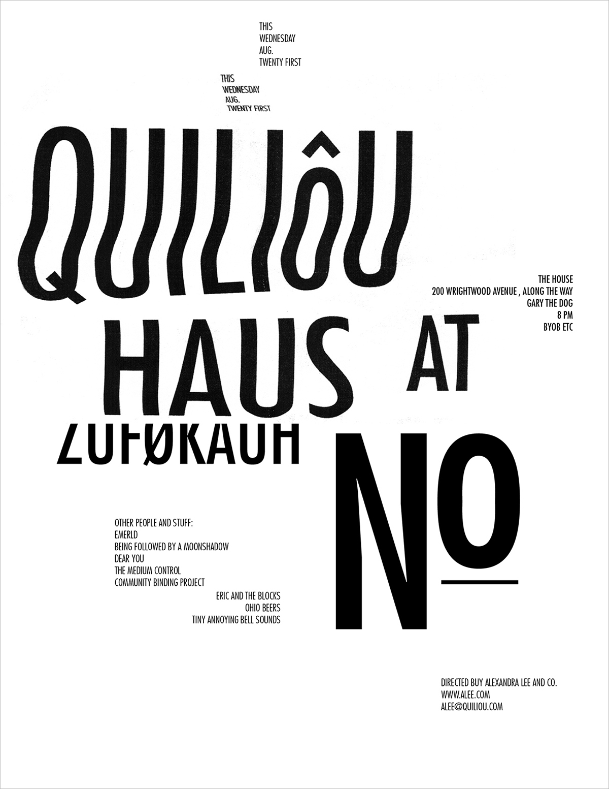
August 23: Nonsensical poster; composition drawn from something I saw while browsing tumblr. I played around with various techniques wanting to distort the text, in this version I used my photocopier/scanner.

August 24: Some business cards using elements from the poster design.

March 14: A completely made up word, but I like the way it looks.

March 15: Don’t really know what this is, but I’m diggin’ it.
March 16: Playing with design elements from the past few days and really enjoying the outcome.

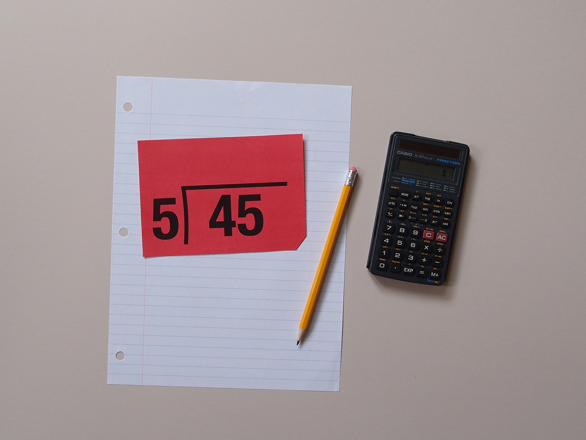
April 28: Thinking about a redesign of the coupon/ads I get in the mail. Jewel’s is almost there, but the majority are cluttered, with little to no attention to hierarchy.

June 20: Stared at a blank screen for a while tonight before this nonsense emerged. I guess it's a poster idea of sorts; doesn’t have a real purpose, but I’m diggin’ the composition.
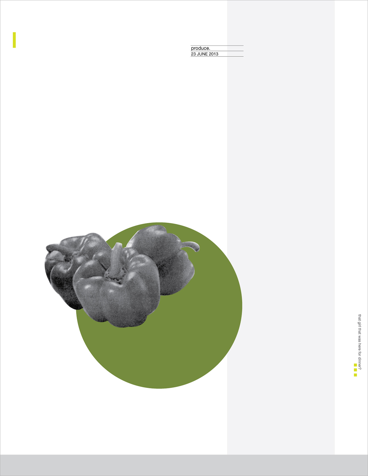
June 23: Another produce poster sketch. I used elements from the one I made Thursday, thinking about them as a series.
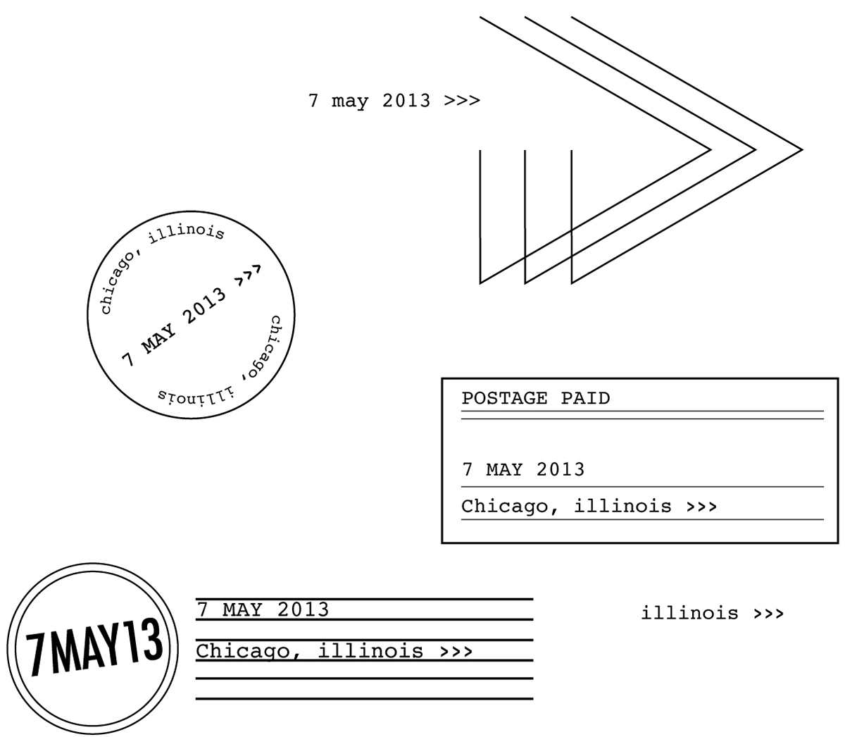
May 7: Looking at postage label designs.
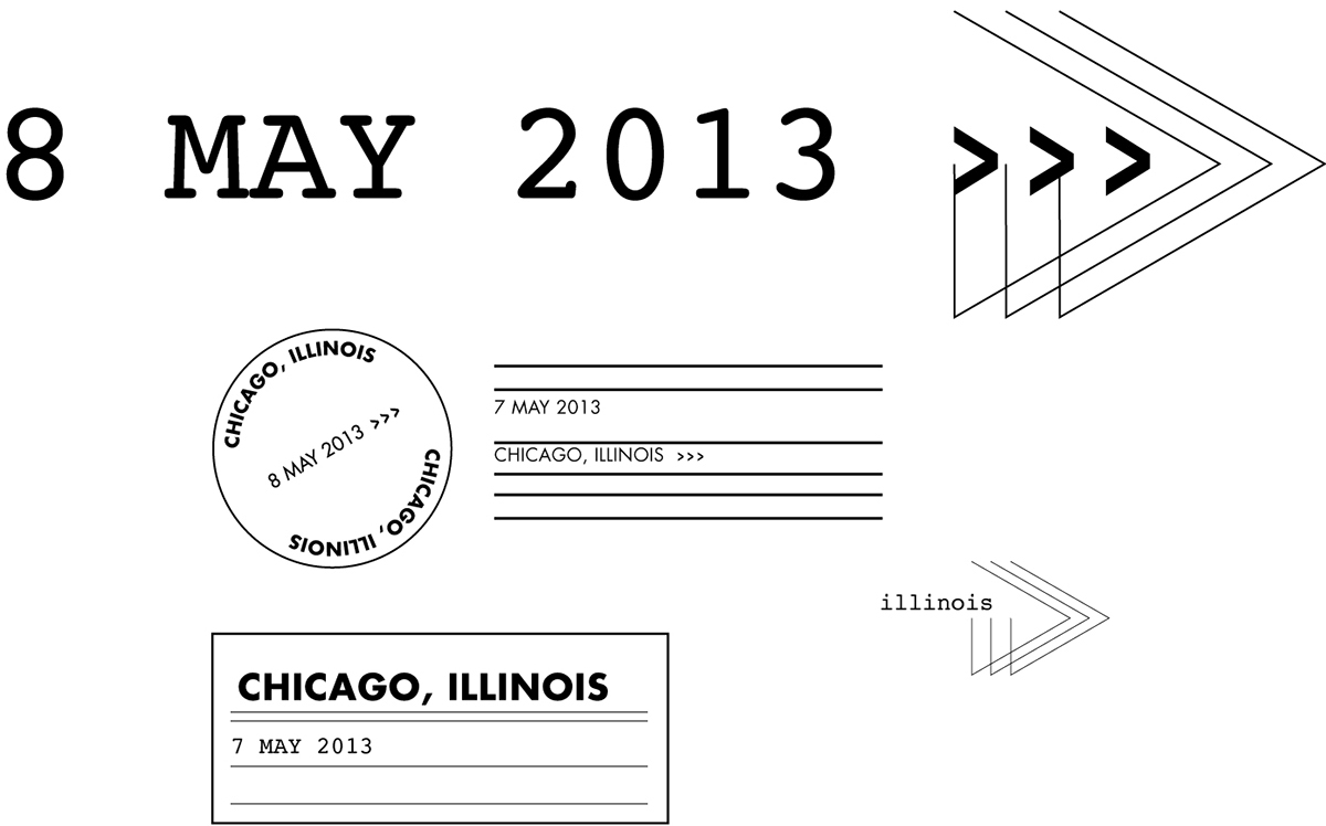
May 8: What a difference fonts and hierarchy make.
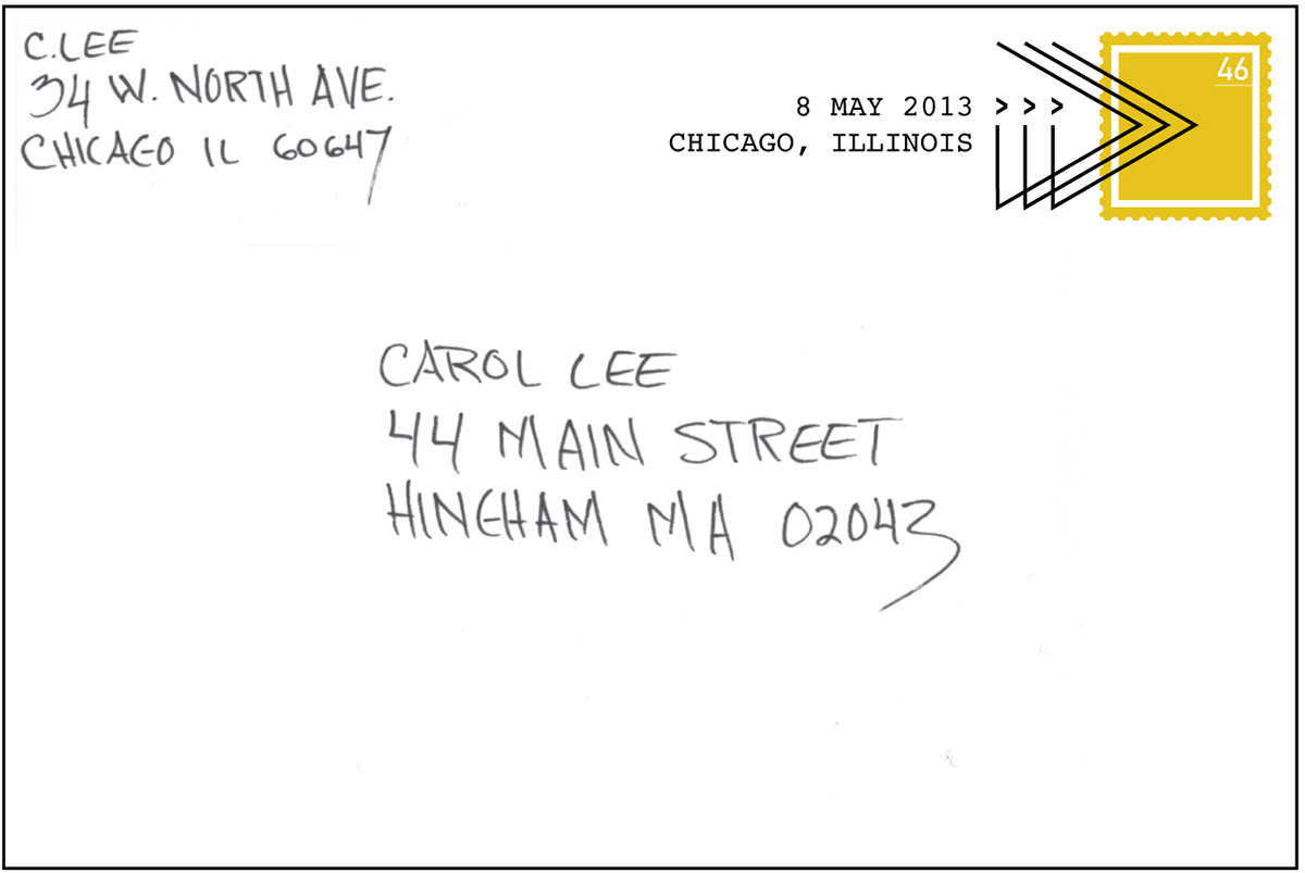
May 10: Noticed I had a sort of mail theme going on, so I thought I should finish off the week with another related post.

May 20: I’ve always had my eye on the librarian’s date stamp. Today I bought my own.
May 22: Random label sketches created using my little movable type stamp and some May design elements.

May 21: More fun with stamps.

May 11: Cleared off my bulletin board and made this A using tacks and string.
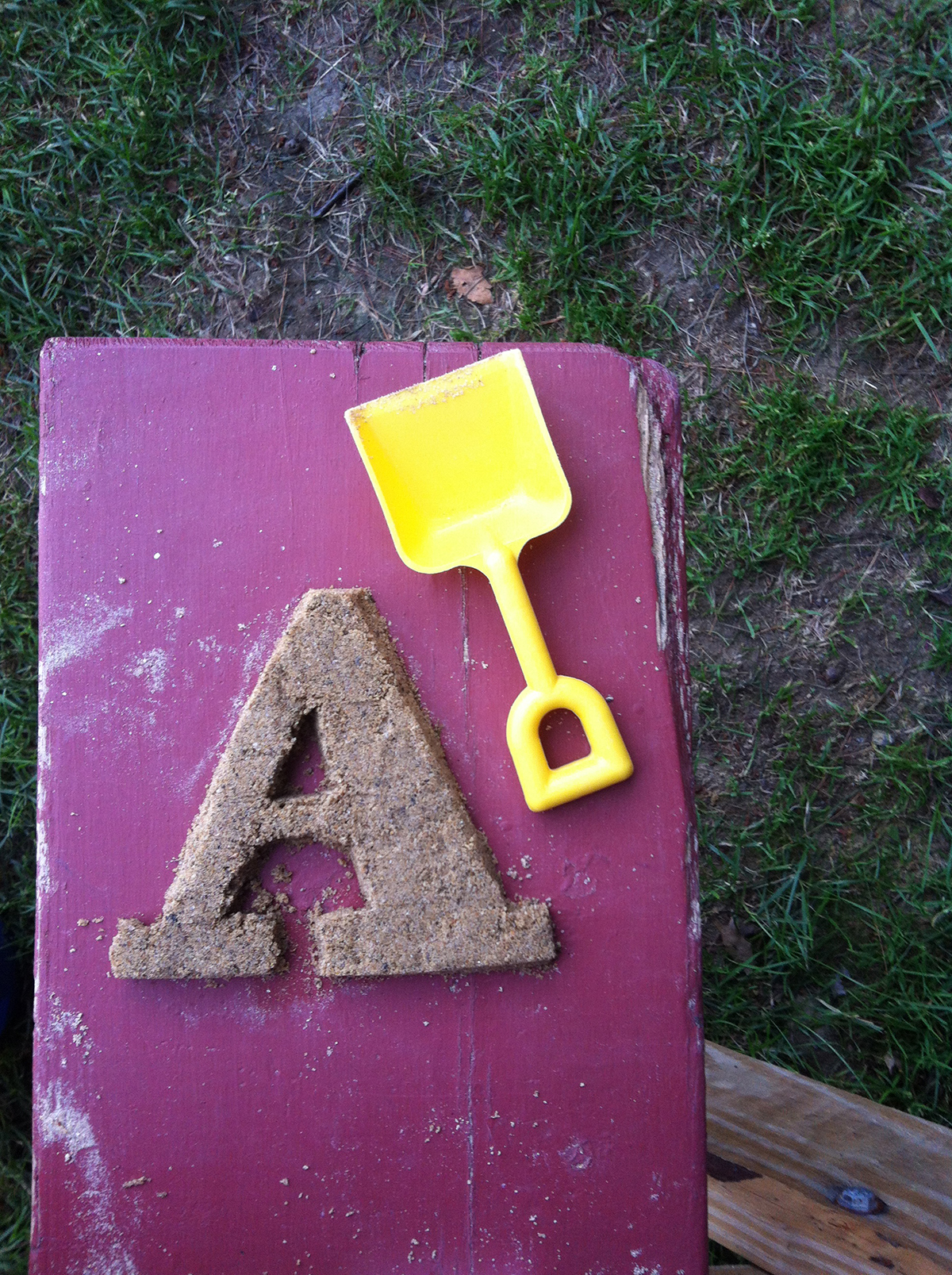
July 7: A is for Abakee. Sand art at the picnic table.


June 21: Messing around with words on the photocopier.

July 30: I found a newspaper from 1932 at the Newberry book fair, I scanned some of my favorite advertisements and am playing around with various elements to create new compositions. I really liked the original Dunlop Tyres ad, but the type hierarchy, and font choice weren’t quite working for me, so I decided to rework it.


August 7: What a difference the font makes! The bottom pairing, PF Din and Clarendon, suggest a more traditional tone while the top, Helvetica and Didot, holds a more modern (sturdy) feeling.
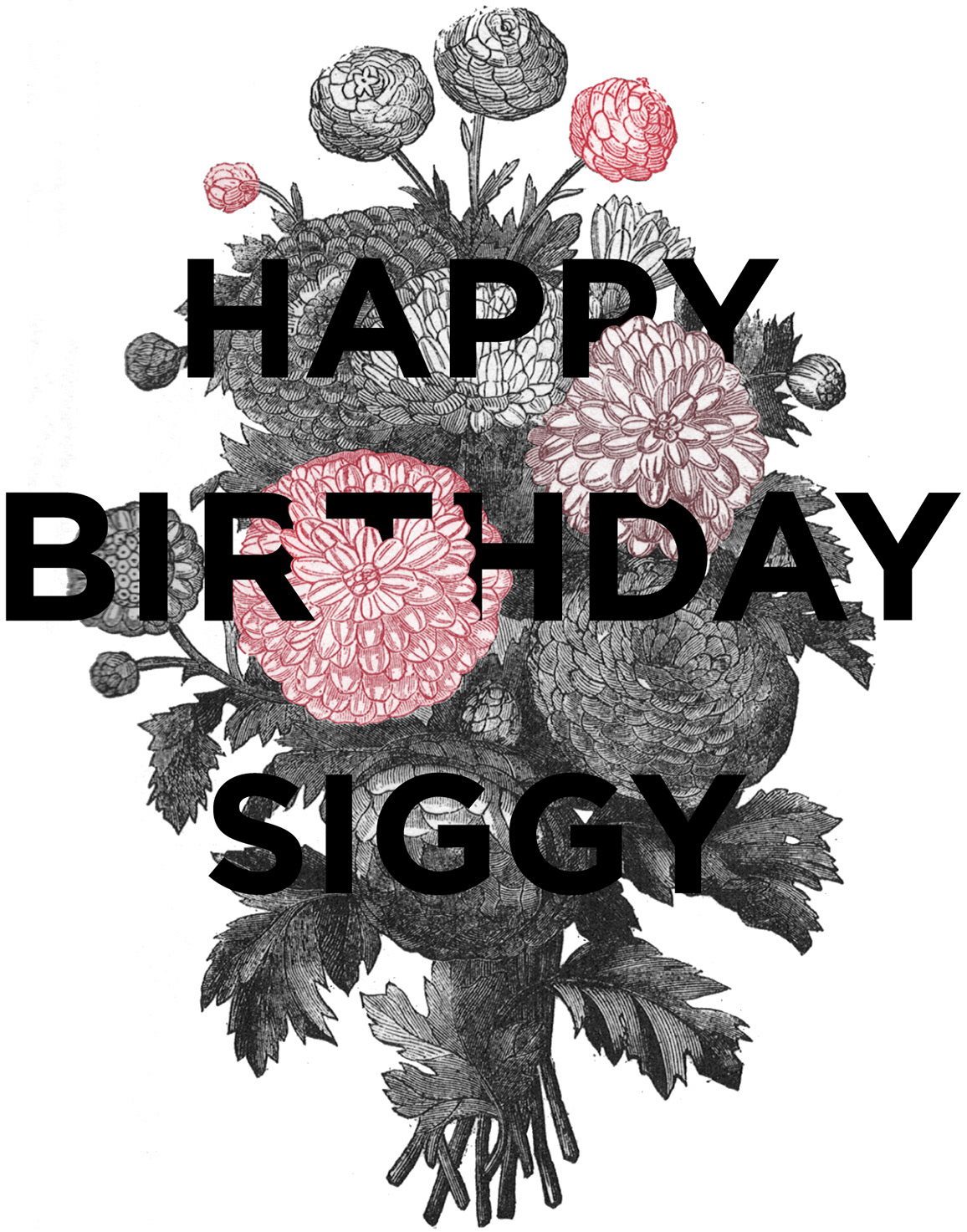
September 10: I am going to call this a Layered Typographic Illustration; I don’t know what this design aesthetic is actually called, but I have seen several images of this nature and wanted to play too. This is what I had in mind when I was searching for books at the library the other day. I thought this would be the perfect way to send my love to my pal Siggy on her birthday.

September 9: I checked out a few books on farming that had some awesome illustrations within. Playing around with some of the images I scanned and searching for a way to repurpose them. I was working with a few different font and image combos, but this one seems to be holding together best.
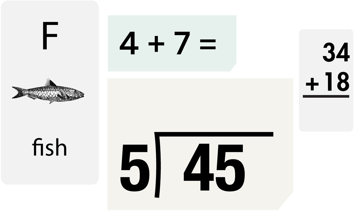
September 12: Something I saw prompted a thought about flash cards, so I made a few of my own.

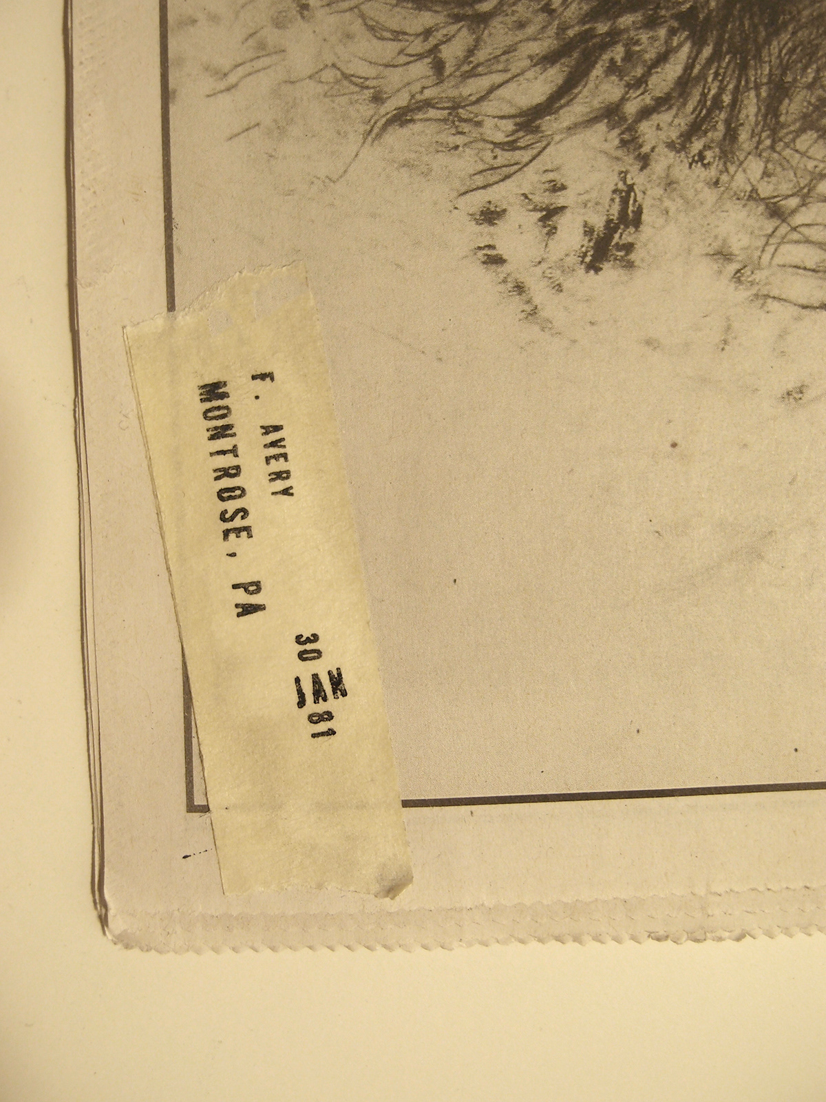
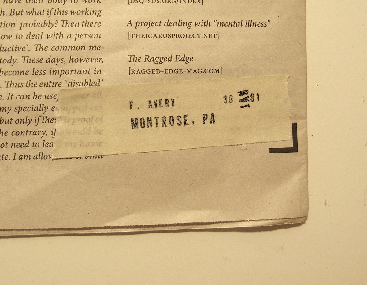
August 9: An old address stamp that was on one of my vintage magazines prompted this idea. I used my little movable type stamp to create it. I wish I had different tape, but masking tape sufficed.
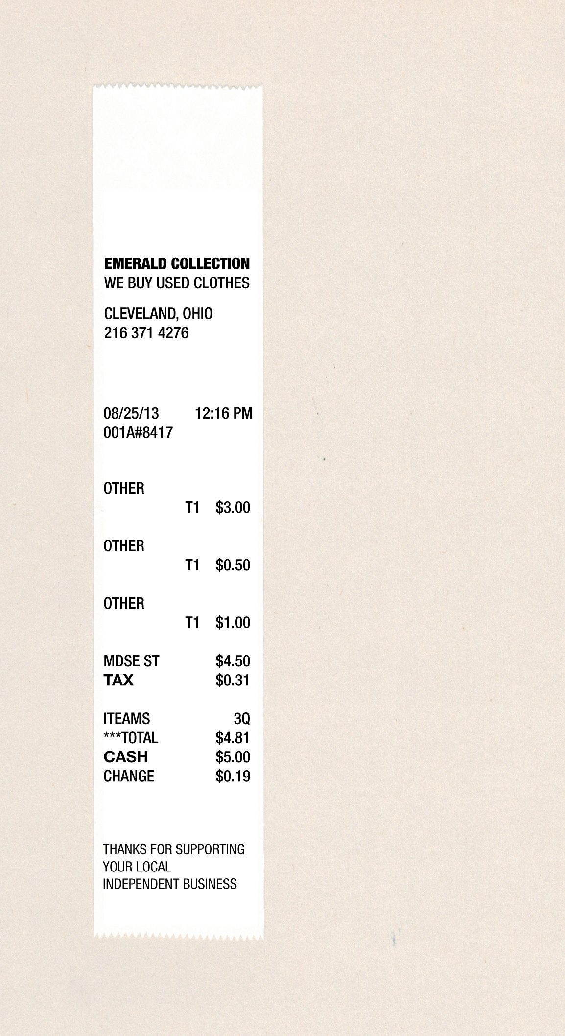
August 25: As I was cleaning out my wallet this morning, I found a narrow receipt from a shop in Cleveland. I appreciated the design, however it needed a little work. I wanted to keep the existing structure, but adjust the typography and hierarchy.
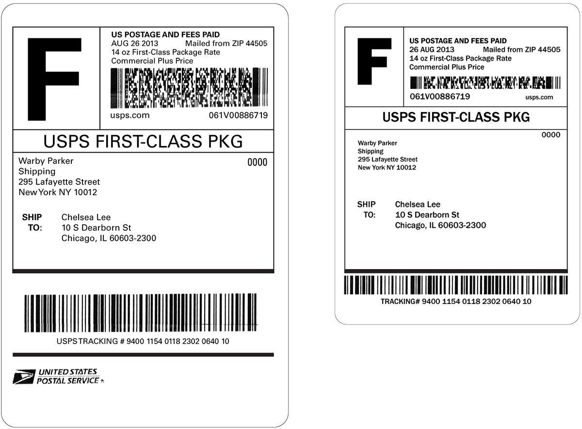
August 26: Lately, I have found myself drawn to everyday typographic materials. This particular label arrived neatly wrapped around a small box containing my glasses. The version on the left is more or less identical (I created it with Univers rather than Arial). I adjusted the version on the right with Franklin Gothic and played around with the space and sizing.
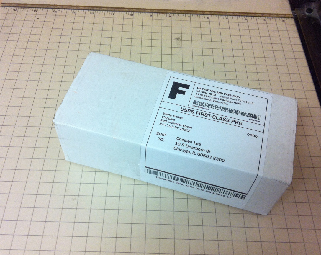
August 27: Messed around with yesterday’s postage label some more and brought it to life. Franklin Gothic seems to be doing the trick.
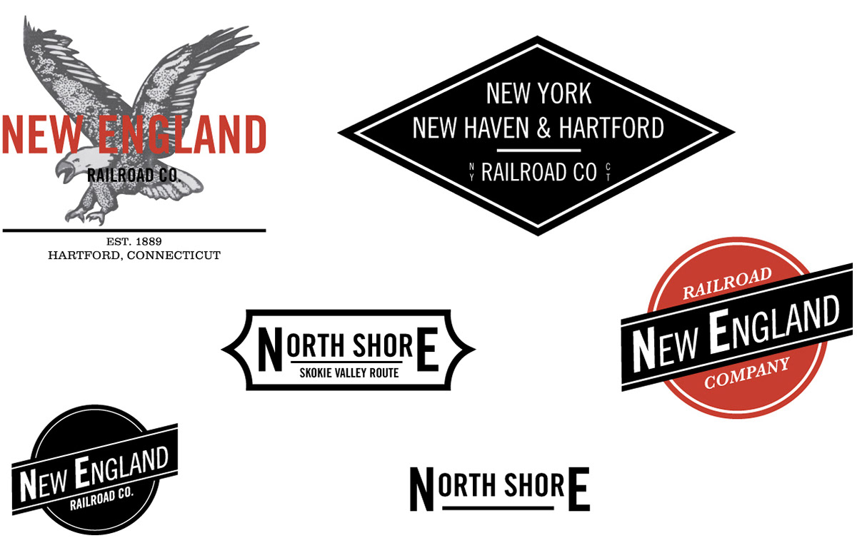
September 3: Somewhere mixed in the process yesterday, as I was searching for coffee label inspiration, I found myself fully submerged in old railroad logos. Something about that eagle didn’t quite make sense to me on espresso packaging so I think it was somewhat subconsciously looking for a new home, that said, I definitely like the simply typographic marks better.

September 4: An idea for a ticket using some of yesterday’s logos. The layout doesn’t feel fully resolved yet and I want to incorporate some sort of stamped or punched element to it.


September 6: Searched for more ticket inspiration and created a layout that seems much more suited to the railroad theme I’ve been riding the past few days. I really like how the cents are treated; I spotted this while searching for ideas and find it to be quite clever.

December 25: Paper letters made their way into the tree. Happy Holidays everyone!

December 26: Today was a great day. I drove along the south shore, visited some of my favorite spots, cooked a strange meal and had many laughs in the company of good friends.
December 29: With only a few days left until Significant Nonsense’s one year anniversary I thought I should get movin’ on a concept for the finale post.

December 31: Today I embarked on a final Significant Nonsense mission, I have done some crazy things over this last year for the blog. I’ve been cookin’ up this idea where I would write out ‘365’ in sparklers and ignite it at midnight, so I rented a Zipcar and drove to Indiana in the snow to procure the sparklers (dragging my roommate along as usual). However, when I got home I sadly discovered that most were duds. Though I was disappointed that my plan was altered, it speaks to my experiences with this project.
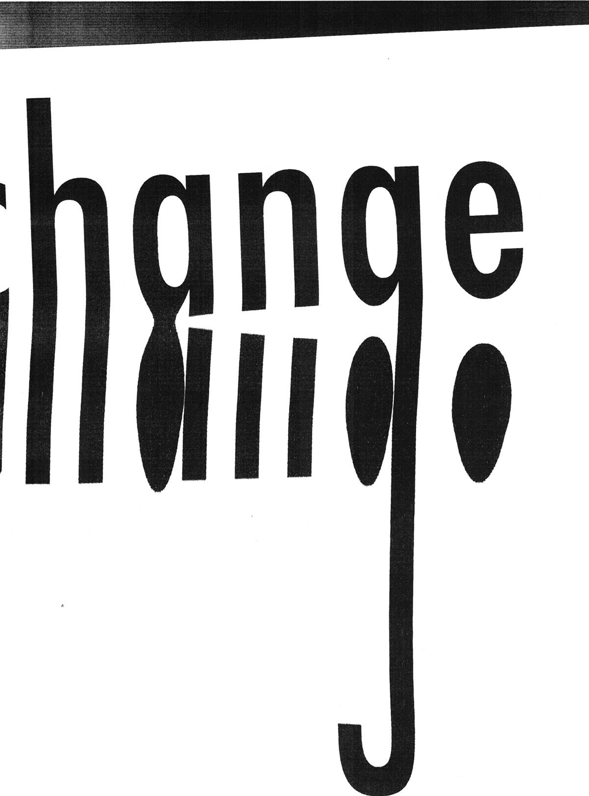
I went into each day with an open mind; some days I had an idea, others I had none. I never really knew where I was going to land by the end of the day, but I pushed myself all 365 days to create something and once posted, I was always pleased. It was a very challenging project, but I learned a lot along the way and as I look back at the body of work, I am proud. I have big plans for the year 2014; change and exciting new things lay ahead. Thank you to all who helped and supported me along this journey. Happy New Year!

