


Field: Digital Media
Service: Visual Identity | Type Design | 3D & 2D Animation
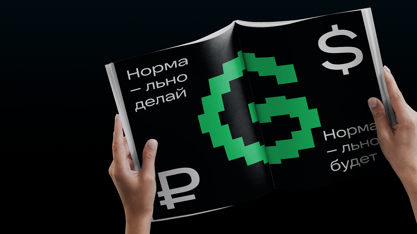
GJournal is an digital media about business, finance and a progressive lifestyle for young entrepreneurs. The journal's articles and videos help you quickly understand complex technical terms or an entire topic. For the identity, we started from the task of creating an understandable and attractive brand image for a young audience. As they grow up and develop their business, they have to sort through the chaos of accumulated information and a huge number of their interpretations — this can become a real hell of a million open browser tabs.
That's how we came up with the idea of GJournal — it's an easy guide in the world of information chaos, an infinite number of articles. G-journal summarizes them in a coherent and understandable picture to give a simple answer. This is inherent in the G-sign itself, which is composed of squares symbolizing units of information.
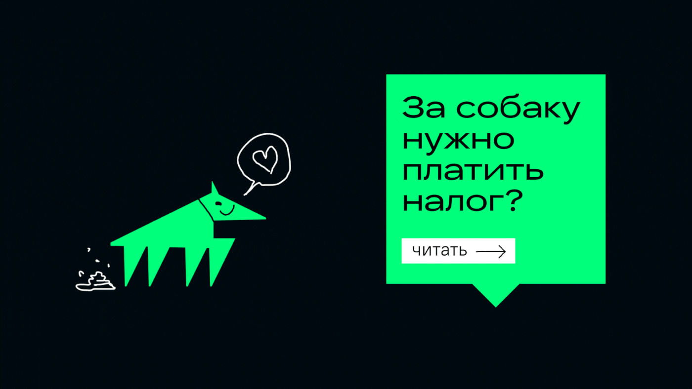

The identity of the journal is emotionally open and honest with the reader: the journal doesn't pretend to be an expert in financial or legislative matters. It solves a functional problem: it helps to sort out the chaos of information. And an emotional task: to reduce stress and not lose motivation.

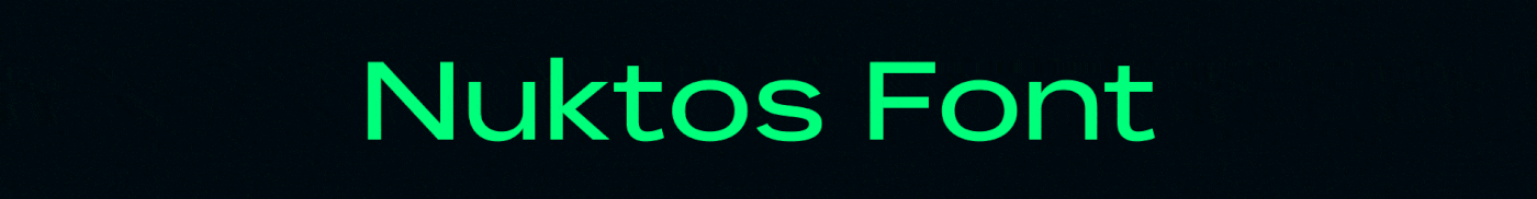
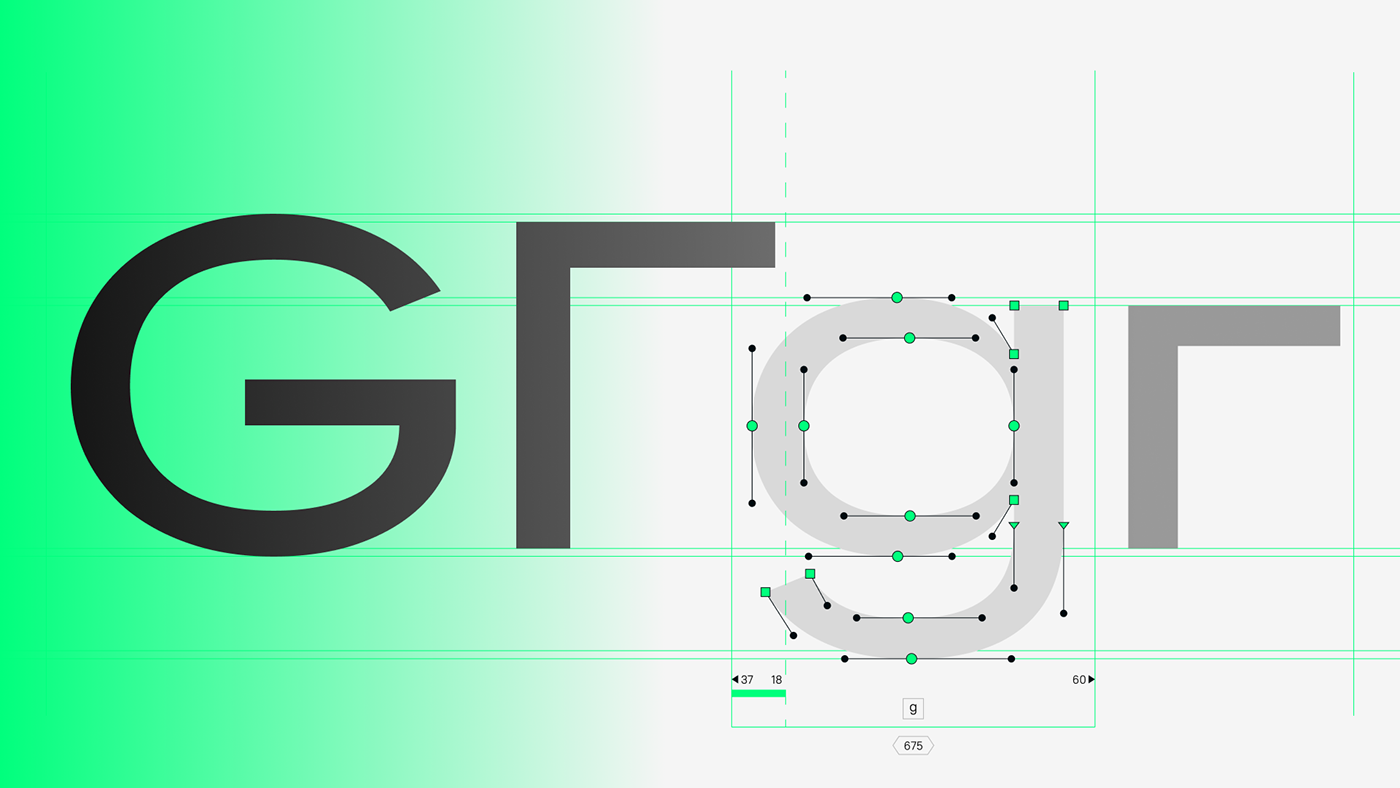
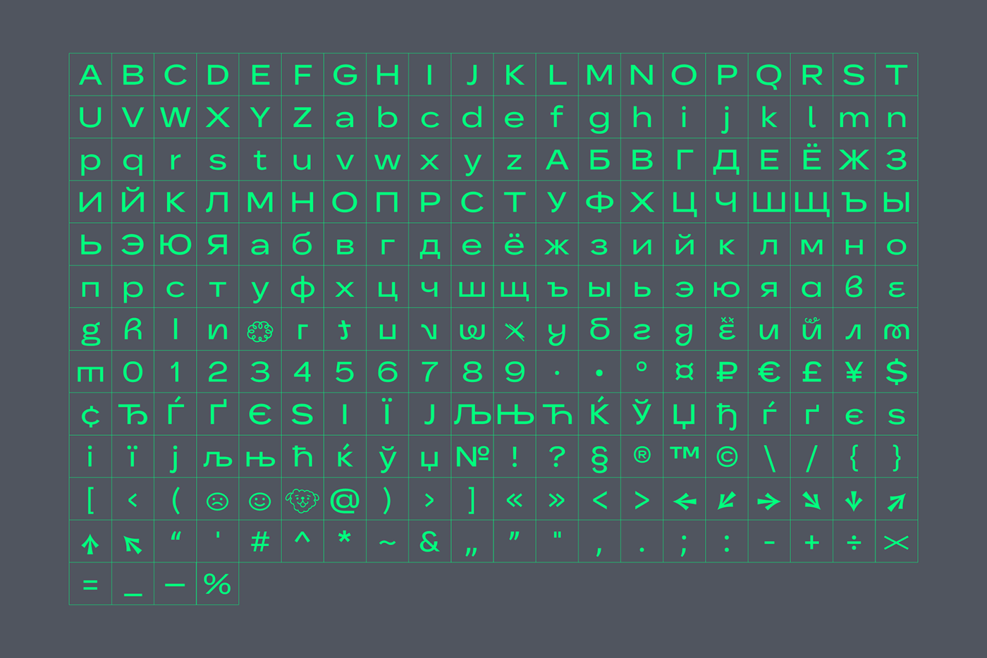
We didn't create Nuktos font specifically for this project, but it fit perfectly here and was used here for the first time. It is a wide grotesque of one font style with closed forms, slightly expanded Cyrillic + basic Latin, many alternative characters. It looks technologically advanced and youthful. Works very well in large size. Why Nuktos? This is the ancient Greek goddess of the night, her father was Chaos, and her mother was Mist. And now it's the coolest font with which GJournal will fight the chaos of information and the haze of ignorance, helping the younger generation.

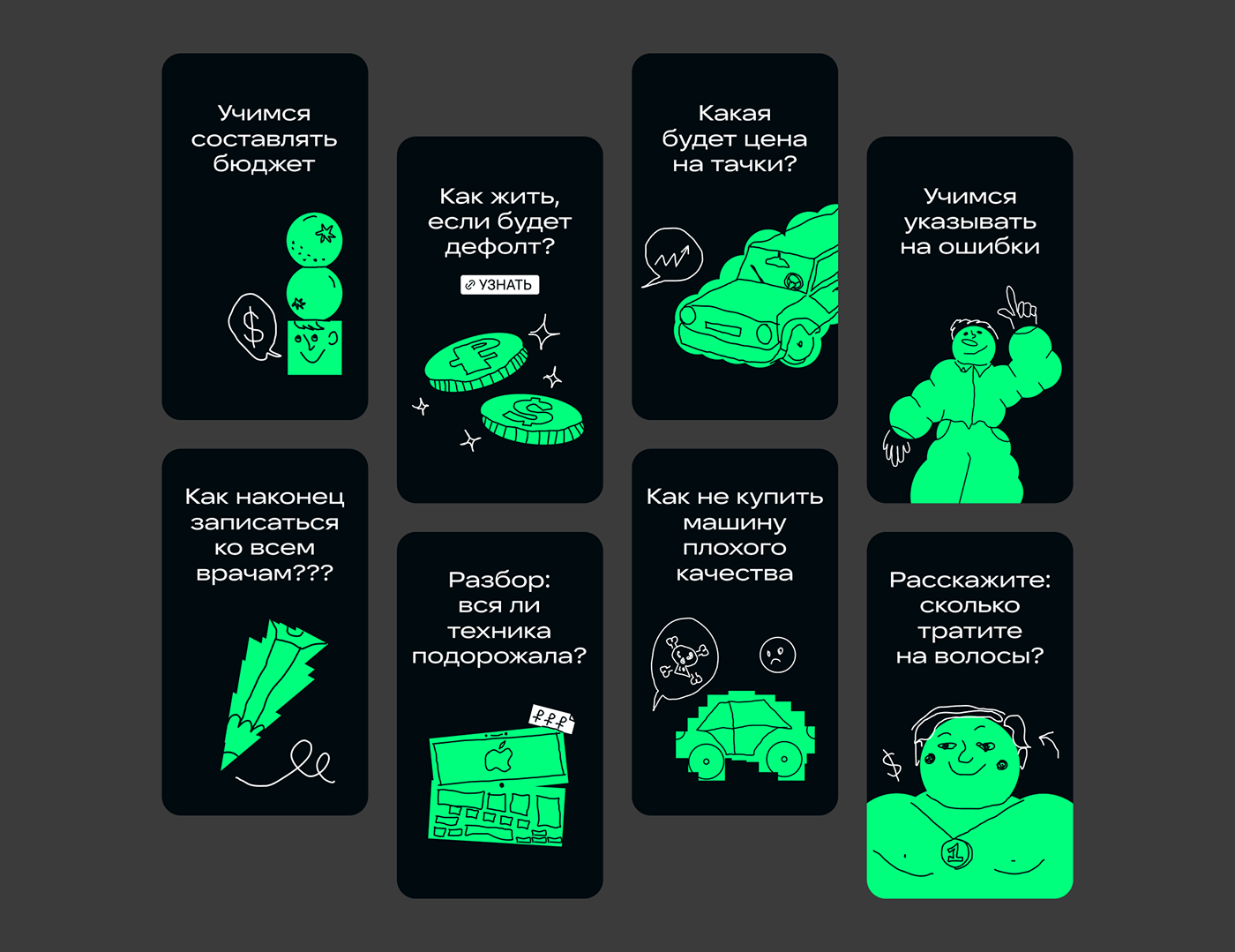
Metamodern and post-irony are the main tools for creating and enhancing the mood of the Gjournal that helps to defeat the Chaos.
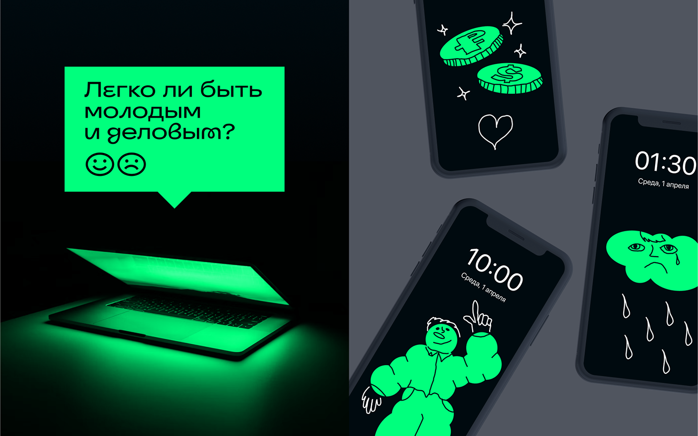
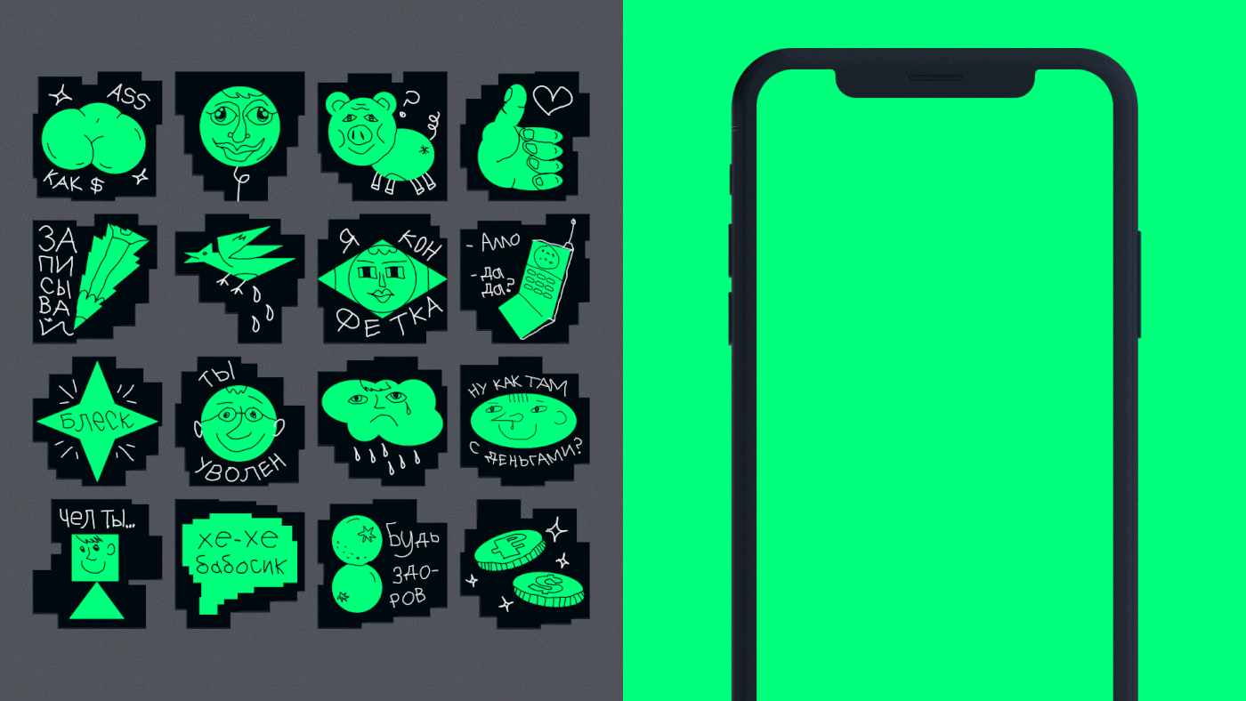
Based on the illustrations, we've created funny stickers for Telegram.
You can start using them at this link right now.

hello@prizmastudio.ru
Creative Direction: Dima Golub
Art Direction: Anya Golub
Type Design | Graphic Design | 2D Animation: Niktia Sklyarov
3D Renders | 3D Animation: Maxim Gvozdev


