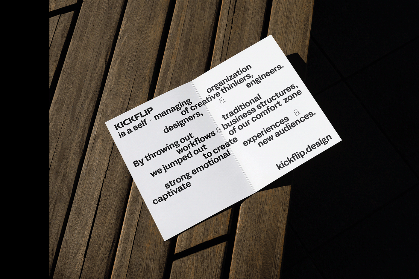


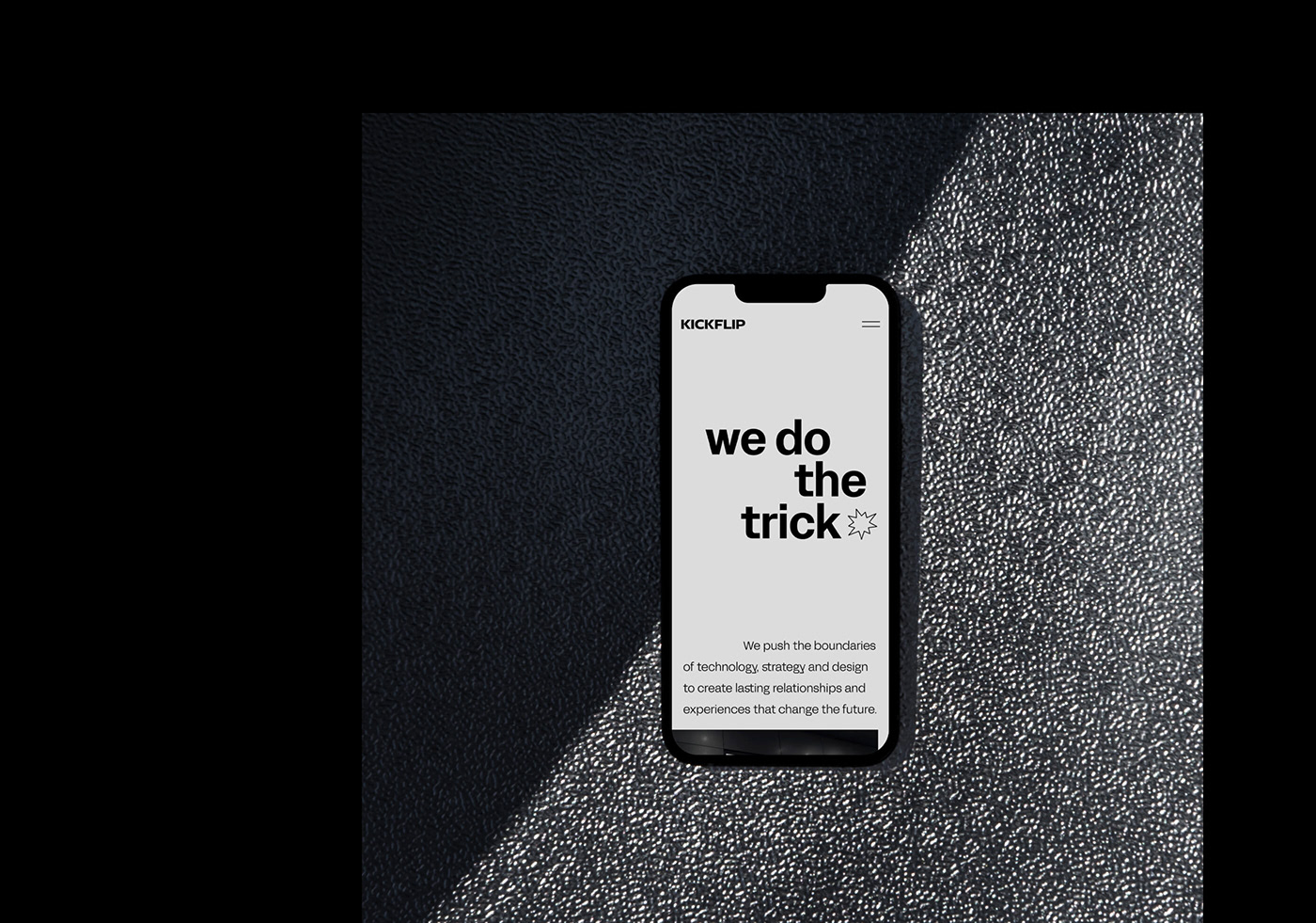
Kickflip, formerly a design agency, is now a self-managing organization of creative thinkers, designers and engineers. We push the boundaries of technology, strategy and design to create lasting relationships and experiences that change the future. By throwing out traditional workflows and business structures, we jumped outside of our comfort zone and challenge ourselves every day.
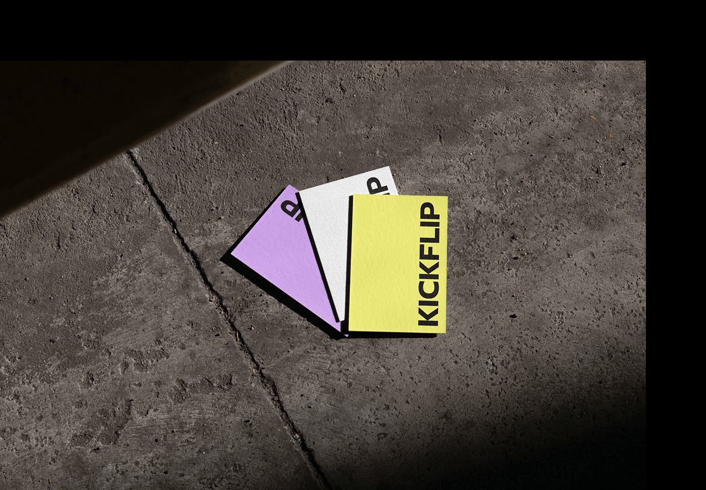
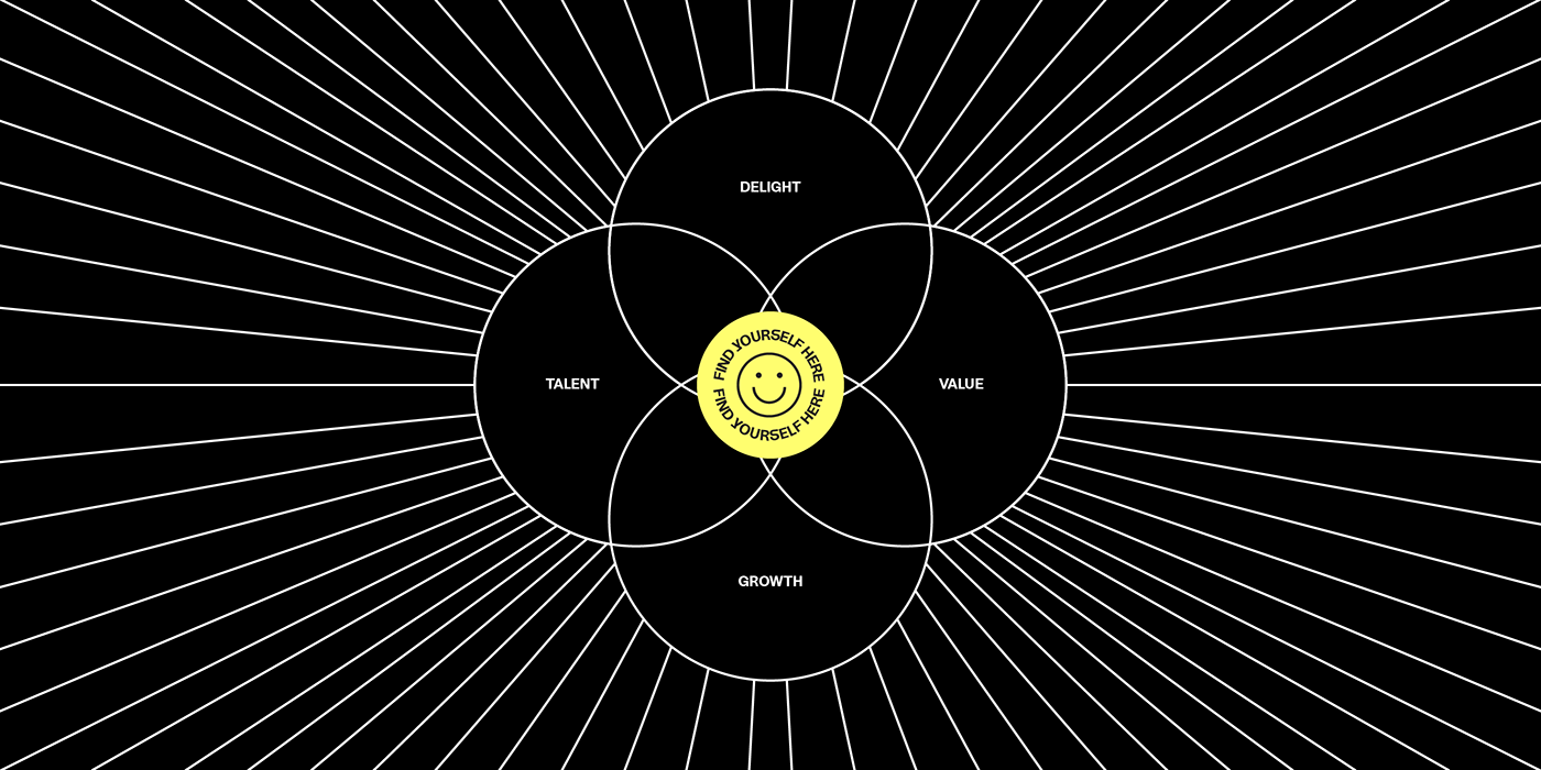
Our rebranding features bold typography with chaotic layout and iconographic mashups that rejects uniformity. The vibrant color palette is used to visualize our services and subproducts. The new brand icons are inspired by the golden circle of Simon Sinek. Our "what", "how" and "why" are represented by three symbols and used in various ways to showcase our services, values and purpose.
Driven by our purpose, the 8-pointed star (our boom) shines as our new main icon. It visualises light, magic and transformation. A moral compass and a way of finding our direction in life, reform and redefine reality.