Want to boost your business with memorable design?
Get it with 10% OFF via promo code «BeEnhanced»⬇

Trivio
Logo and corporate identity for the business trips organization service
About the client
Trivio is a service that helps companies optimize costs of organizing business trips. Here you can book tickets, a hotel and immediately send reports to the accountant.
The uniqueness of Trivio lies in the fact that the algorithm selects the best options: it takes only a few seconds to search.
The name of the service translates from Italian as "crossroads" — Trivio is located at the intersection of technology and tourism.
Task
To design a logo and corporate identity that will show the company’s technological effectiveness while maintaining continuity with the previous identity.
Solution
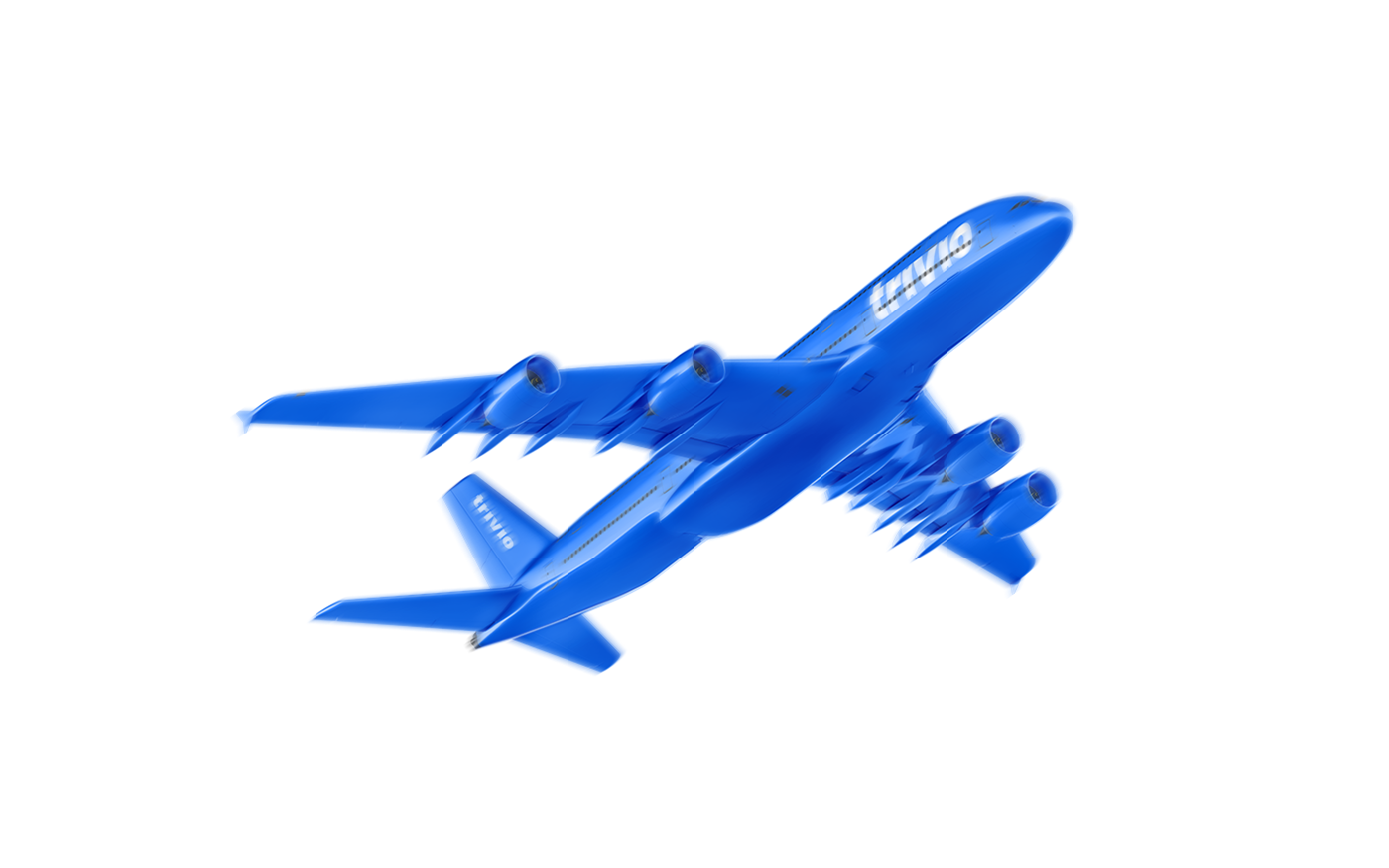
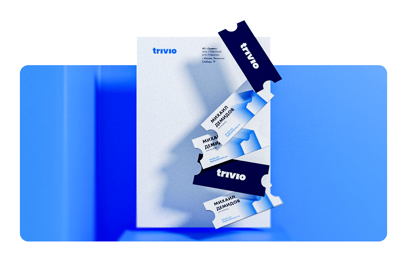
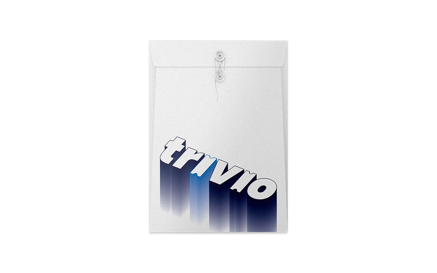
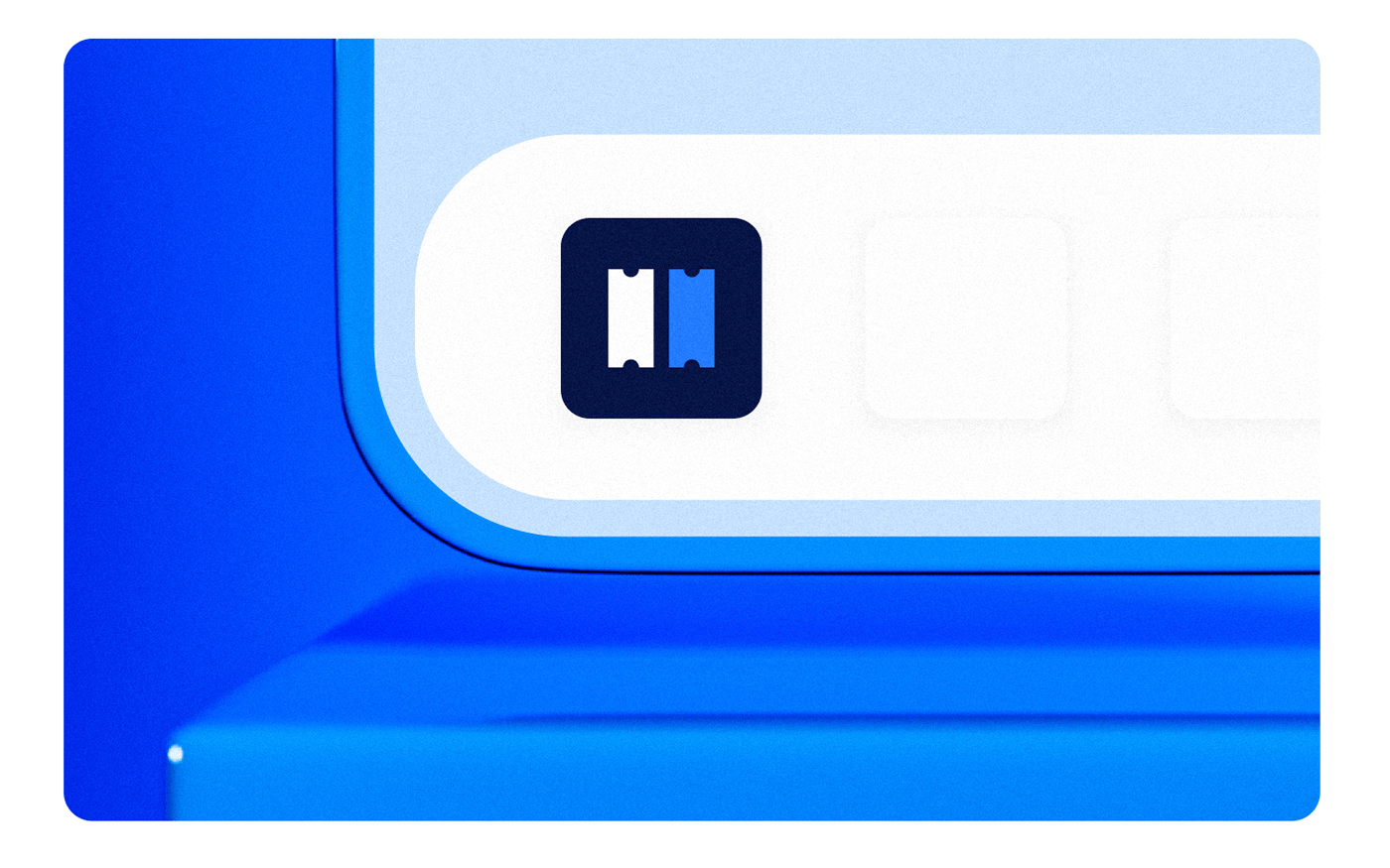
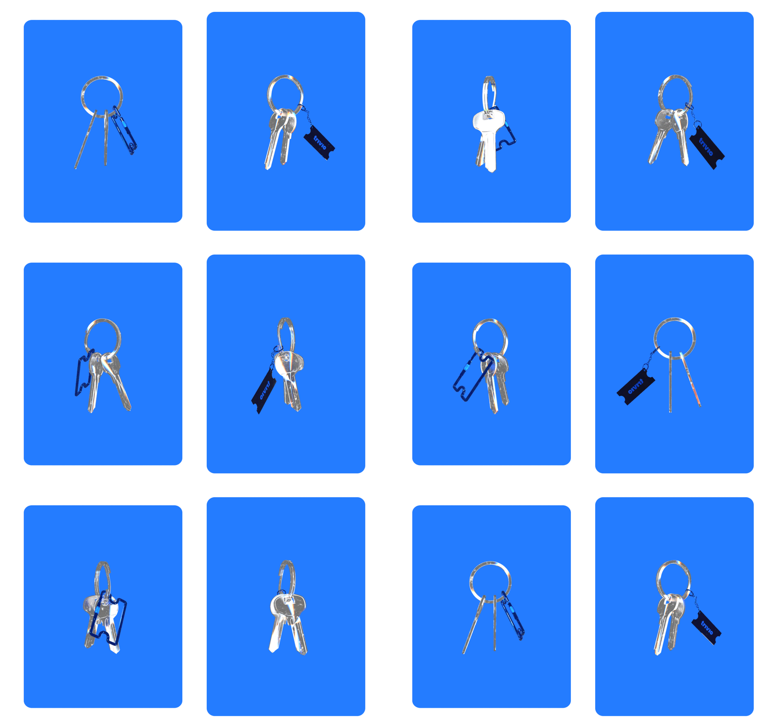
We have developed a font logo, in which we have placed a sign: the letters “i” have been replaced with tickets that are associated with travel. In addition, the signs resemble bricks: they are the basis of any buildings, as well as Trivio — profitable business trips.
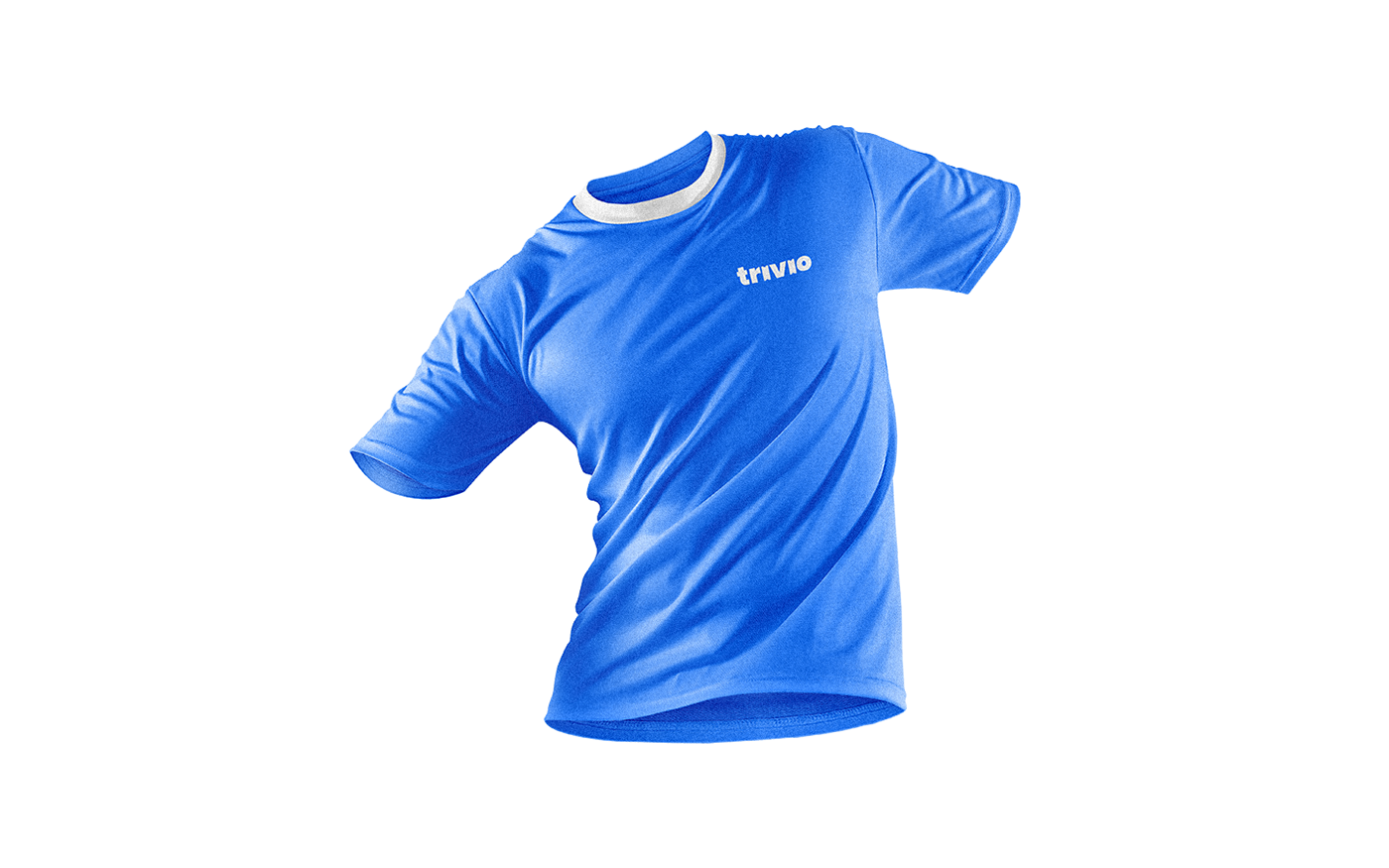
We have left the corporate colors and font almost unchanged to show continuity. The blue and light blue help to show technological effectiveness and lightness of the company. The Ubuntu font that was used on the Trivio website is smooth and futuristic. It was difficult to combine it with the grotesque font from the new logo. Futura PT has become more suitable: it is convenient for typing both titles and the main text.
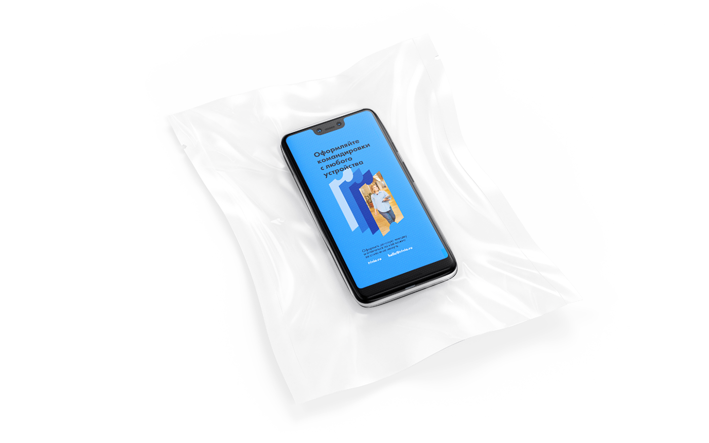
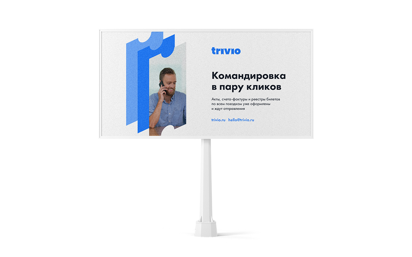
A logo sign has become a style-forming element: several tickets together give the impression of a folder with documents, which Trivio facilitates working with. The gradient is a metaphor for dynamics and growth rate.





Want a design just as cool? Logomachine will create a perfect logo for your project.
Interested? Contact us!


