Brand Identity + Roll Out
The Brief
With a new leadership team in place, this primary school are making giant strides forward and becoming an even bigger focal point of their local community.
They wanted shout about the great work they're doing so, with little available in terms of historic design/brand guidelines, it was the perfect opportunity to refresh things and help present themselves as the forward thinking, ambitious school they are.
Working with what was already in their old logo (which they liked), I adjusted each element to produce a cleaner, more versatile identity system that works in today's more 'digital' orientated world.
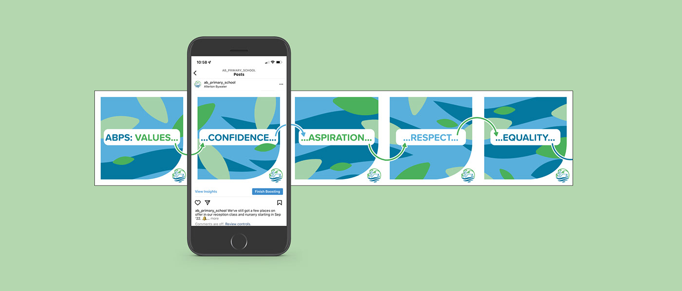
Work, so far, has included a number of variations of the logo and wordmark as well as templates for social posts, a newsletter, and internal posters.

Evolution not revolution was the order of the day - simplifying the elements within the badge and a change of typeface to help the school communicate its calm, nurturing and caring ethos.
Circles are a big thing at Allerton Bywater - they use them throughout the school (rather than lining up for example) because of their lack of hierarchy - so you'll find loads of them 'hidden' in the new logomark.
A few different variations were produced, including a wordmark, logomark and a full 'lock-up', so they have options at all sizes.


I've been able to lift elements from the logo to use as graphical assets, allowing the possibility to create 'endless' abstract backgrounds for further rollout. Perfect for Instagram's 'carousel' posts.