


Curve
Branding
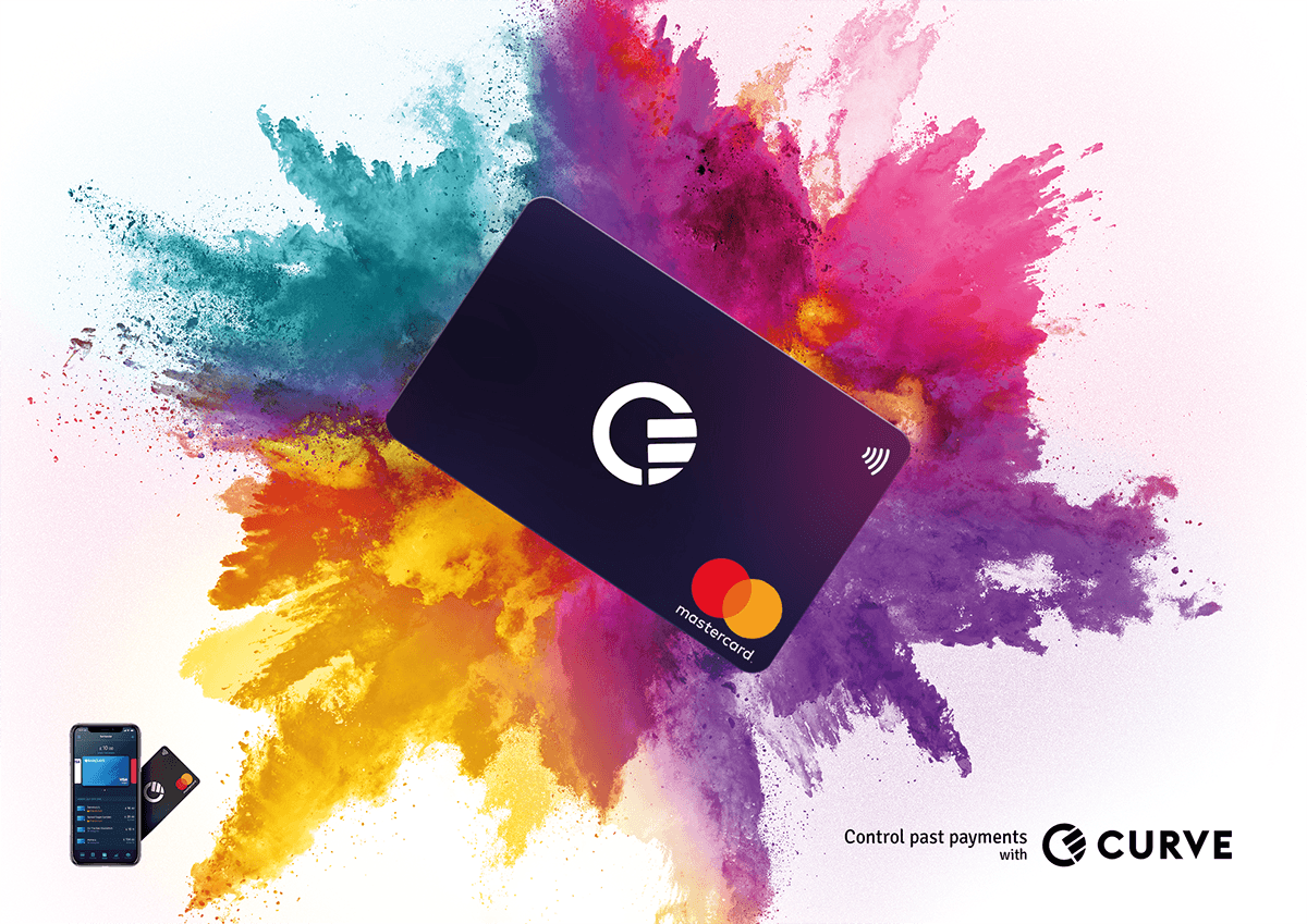
In a time when we can have everything we desire at our fingertips, from entire movie back catalogues to every restaurant in our local area, it’s outrageous that our money is so fragmented. A credit card here, a debit card there, a joint account somewhere over there. Curve changes all that, uniting a myriad of banking systems in one easy place, allowing you to see and access all your money in one go, with one simple, super slick card and app combo. Your wallet will have never been healthier, or look better.
With such a unique brand story and proposition, a product like Curve needs a visual identity that instantly brings clarity to its USP and its services. Something that says: ‘this is who we are, and this is what we do’. It also needs to be drawing in the right kind of consumer, the people for whom Curve will become a lifestyle, not just another app on the home screen and card in the pocket.
We have created a series of logos and visual identities that we think will unite the strands of the Curve experience in one simple and easy-to-understand execution, much like Curve does with your money.

Logo 1 - All in One Place
Curve is the perfect meeting of technology and finance, bringing all your cards and finances into one easy-to-use place. This logo reflects that, drawing inspiration from the visual language of technology, combined with the visual metaphor of a series of lines securely contained in an outer rim forming a ‘C’ for Curve.
Curve is the perfect meeting of technology and finance, bringing all your cards and finances into one easy-to-use place. This logo reflects that, drawing inspiration from the visual language of technology, combined with the visual metaphor of a series of lines securely contained in an outer rim forming a ‘C’ for Curve.

Logo 2 - Secure your Finances
Curve helps you secure your finances like never before. Because when you can unite all your cards and accounts in one place, you can really keep an eye on your finances, from tracking your spending to overseas payments and card management. And what better way to represent this sense of securing your financial profile, than with a lock, rolling into place to create the perfect ‘C’.
Visual Identity 1 - 'Splash the Cash'
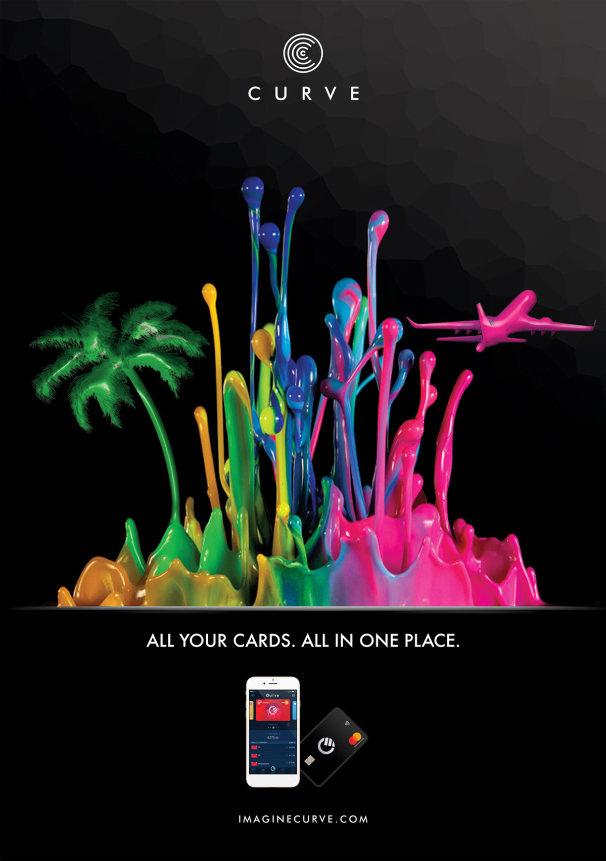
Money is guaranteed to bring colour to your life, opening doors to everything in life from the big things, like dream holidays and wild experiences, to the little things, like nights out and great entertainment. This idea is lifestyle lead, using super slick graphical representation of paint like colours, that seductively splash and form into all those incredible things you will be able to do once you have complete control of your money.


Storyboard
Visual Identity 2 - The Sound Choice

Curve consumers have their finger on the pulse, and Curve is here to make waves, so an idea inspired by sound waves seemed like the perfect combination. This idea has the colour scheme of the major banks and financial providers represented in a sound wave flowing and forming into the Curve card. This sound wave can move and change, visually representing all the great things that can be done with the card.
Visual Identity 3 - Migrate Your Money

Birds and financial services might not seem like they have a lot in common, but actually, Curve is a brand new place for you to migrate your money. And when you have all your cards securely in one place, aren’t they working in formation? This visual identity is probably the most emotive, using the visual metaphor of birds to demonstrate the awesome things you can do with Curve, and the concept of great things working together in synchronicity, just like a flock of birds.


Storyboard
Visual Identity 4 - Stay in Touch with Your Money

Curve is a premium product, that suggests a certain kind of lifestyle, with the emphasis being on the style. Simple, cool lines have long been a fixture of stylish design, but what makes this one unique, is how it also alludes to lines and ridges of a fingerprint, representing the simple truth that Curve gives you instant access to your entire financial profile at the touch of a button. It also just looks really cool.
Final Design
Key Visual


Pages from the Brand Book

Packaging


