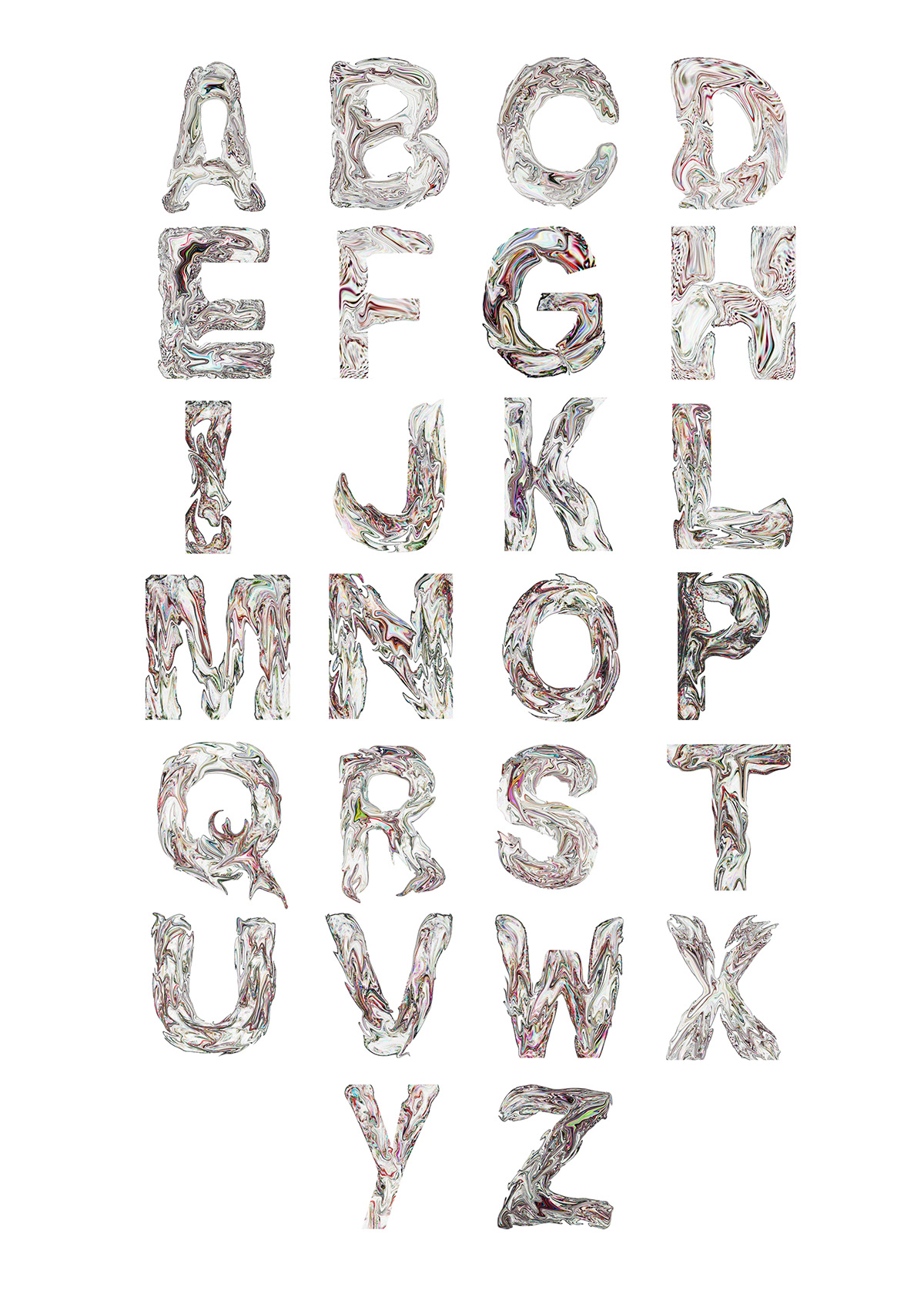
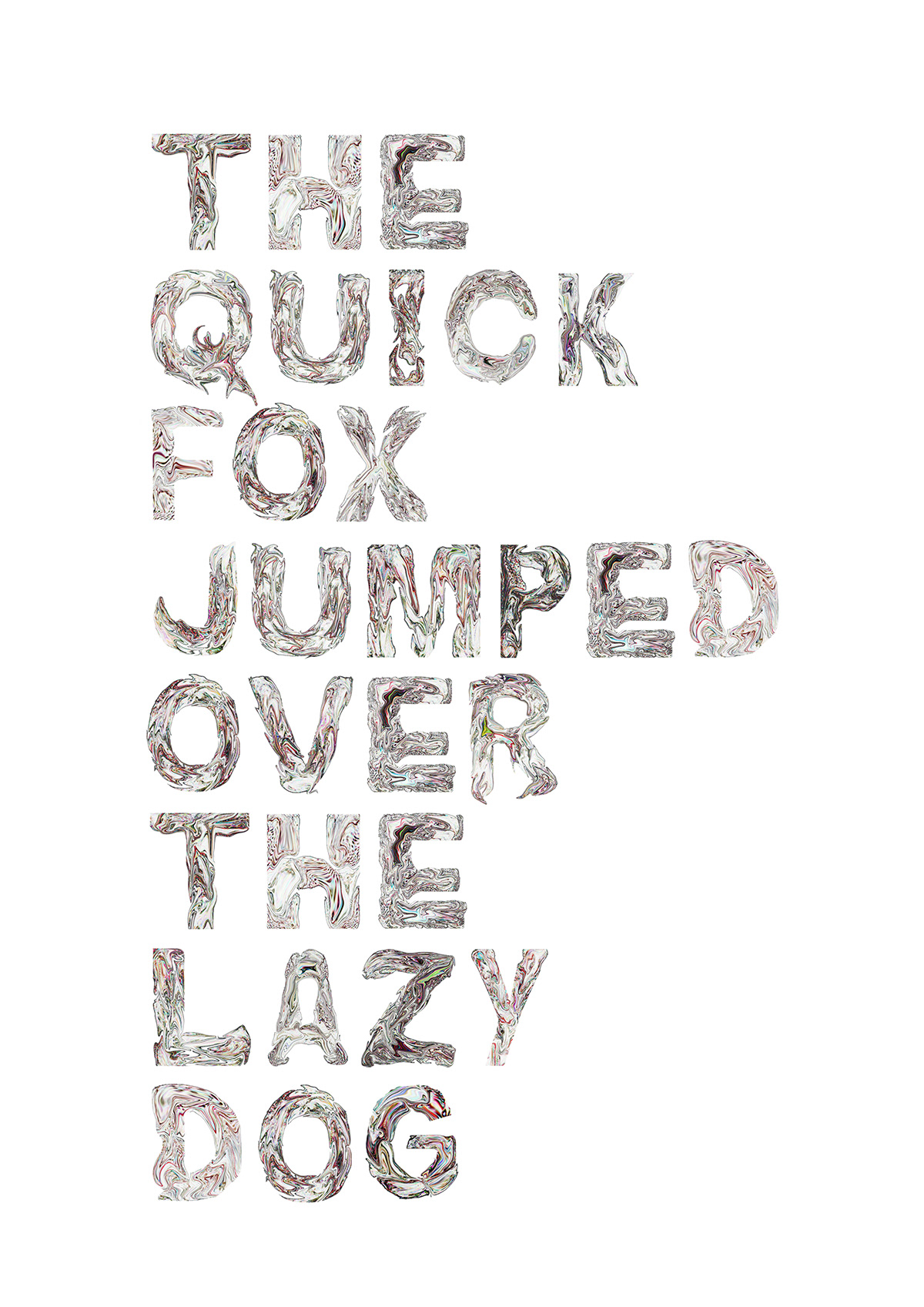
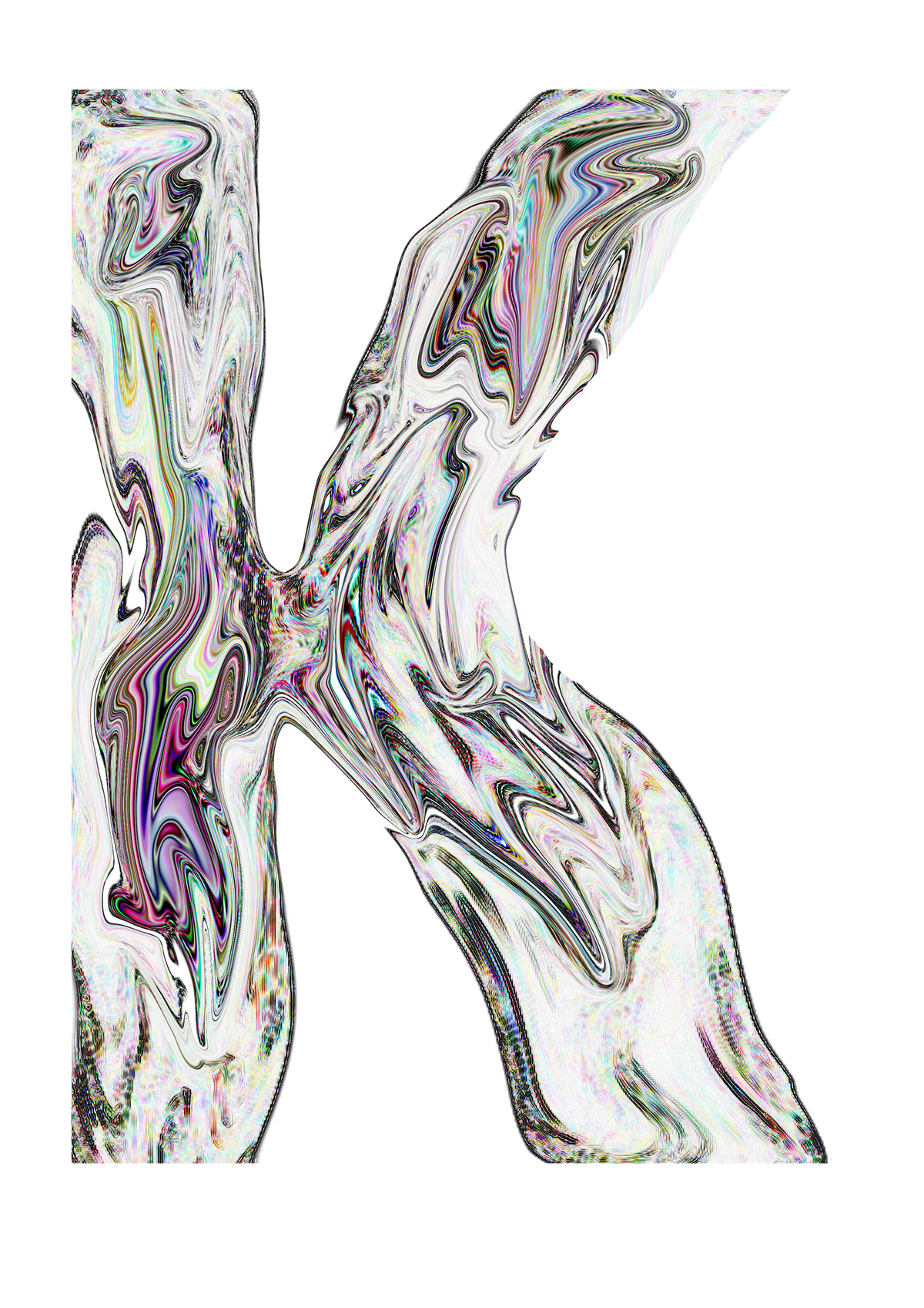

This is a project I have completed for my graphic's project at college. The theme I had chosen was "Decay", and when on my journey of inspiration I found a multitude of starting points, from urban decay, to the decay of the human body itself and so forth. For this project I thought that it would be brilliant if I could go on to produce an outcome based on the decay of fruit and vegetables. At first I thought of creating different types of letters, their shape complimenting the aspect of something rotting and becoming unrecognizable. I then had a change of mind and decided that I wanted to have a positive outlook on decay, making it look as beautiful and appealing as I possibly could. The process of making the typeface involved placing rotten fruit in a letter form, stylizing them, using the warp tool to mix in the colours and textures together before stylizing them again. Here is the finished layout.
I am really satisfied with the outcome as it is exactly what I wanted, a seemingly decayed substance being stopped from spewing out of its shape...


