


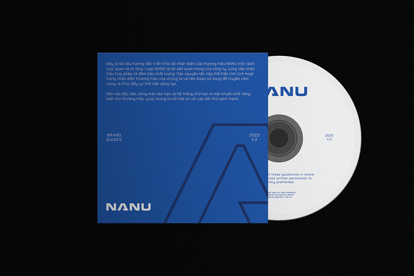
NANU - Branding & Visual Identity
—
Founded in 2015, NANU is providing the Vietnam market with youthful, durable, and convenient footwear products, suitable for everyday and everyone. The new brand identity of NANU is intended to be minimalist, active, attractive, aspiration, attentive, and adaptable. With a dynamic color palette and logomark inspired by the letter "A", expressing the desire for an A-class footwear brand with high-quality standards.


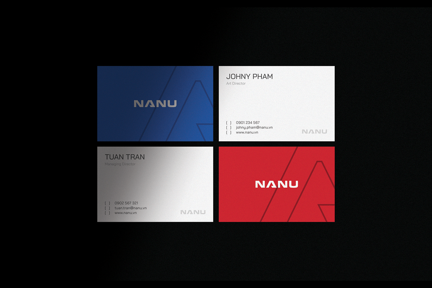
STATIONERY
Simplicity, youth, mixed with professionalism are the goals that we aim for when designing full stationery for the NANU brand. Red is also added to increase contrast to the entire collection.


ONLINE COMMUNICATION
An intuitive, accessible interface that strictly follows the brand guidelines. The photography with warm tones create sophistication, warmth, and increase contrast compared to the main identity color of the brand.


PRODUCT APPLICATIONS
The brand motif is focused on products such as boxes, product tags, keychains, t-shirts, etc.


OUTDOOR
The outdoor designs have a harmonious and balanced layout, creating a lot of negative space. With this subtlety, NANU's billboards and posters will leave a pleasant and impressive first impression on passersby.


Inspired by many factors close to life such as family, friends, emotions, physical and mental, we have created the complete brand identity of NANU. Besides the simple values, you will also find in NANU a high sense of responsibility, expect their products to be of top quality.
Follow us


