

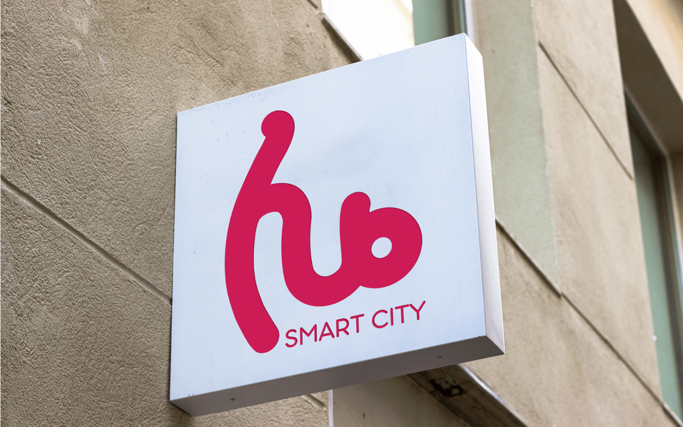
Project: Smart city hub Logo and identity
Problem: The logos of the two related projects look similar which causes a confusion.
Task: The smart city hub logo should look fundamentally different from the other logo. The new logo should include the name of the project.

Solution:
1. Reveal the essence of the project using briefing techniques and capture it in a symbol.
2. The key meanings that I identified were communication (connection) and innovation.
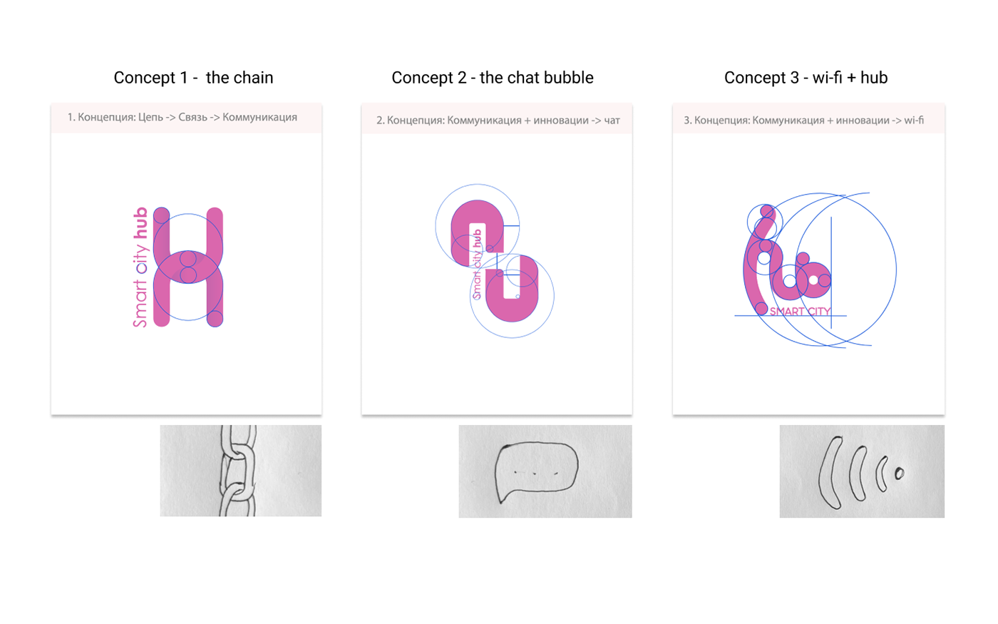
3. After going through several ideas, which combined symbols of connection and innovation I found best solution. By combining the word 'hub' and the wi-fi icon, I received a unique symbol that solves the problem of recognition.
4. The color had to be different from all the other projects of the company. And there weren't many options. To nurture the value of contact and relationships between people, it would be appropriate to choose a warmer shade. However it should have been softer than just red, so as not to subconsciously cause a feeling of danger or prohibition.

Contact for cooperation with me: kozi.helen@gmail.com


