
THE TASK
Homobono is a new boutique shop in the heart of Kaunas, Lithuania, working with sustainable brands only. They are carefully sourcing the partners, who has all the certificates, cares for the planet starting with the CO2 emission lowering finishing with the fair trade products.


PROBLEMS
This is a niche category in a competitive market, where not all the users are ready for a slow fashion change.
Our created brand, should be visually attractive to catch the users attention and portray the company’s values.
Our created brand, should be visually attractive to catch the users attention and portray the company’s values.
SOLUTIONS
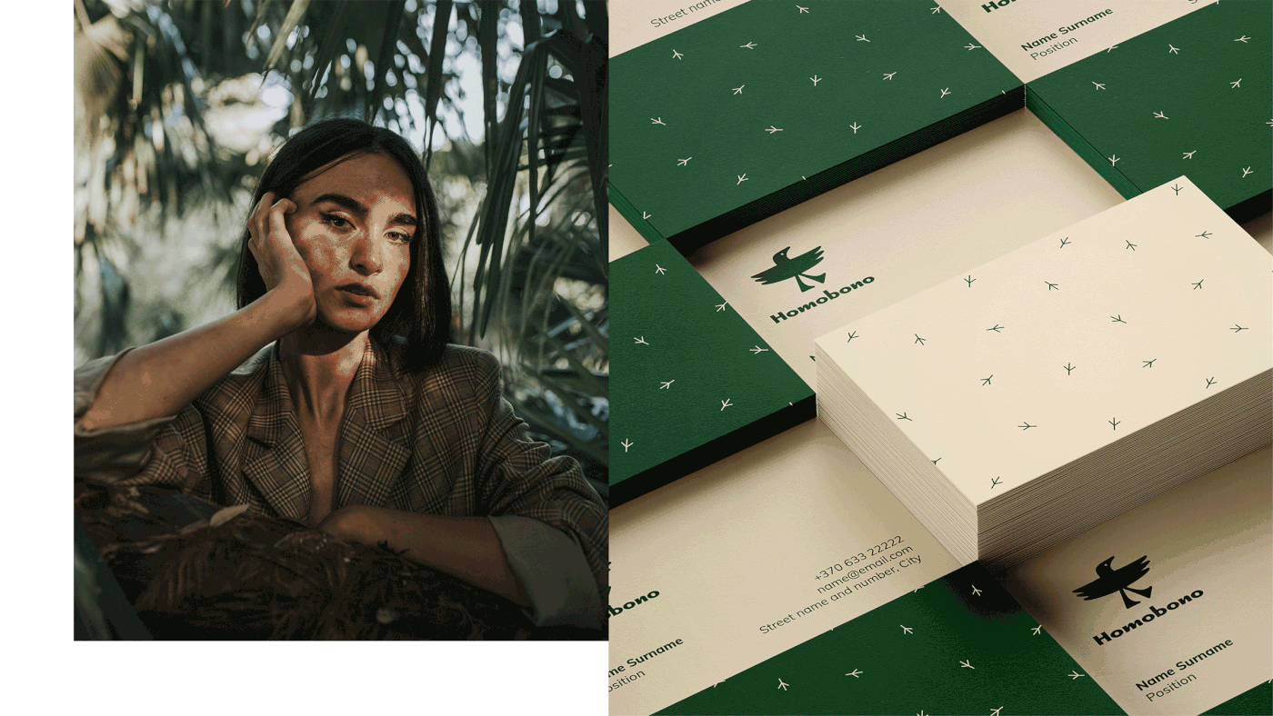
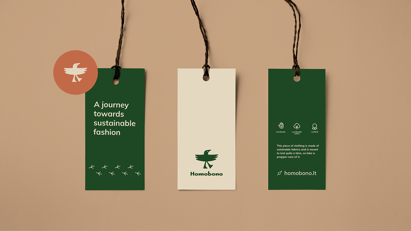
We wanted to create a personalised logotype that would have a deeper meaning. That is why we came up with the idea of a bird as a carrier of the good sustainable news. Moreover, we can educate the audience, talk about the countries of our partners and how their products are made and why it is important with this mascot.
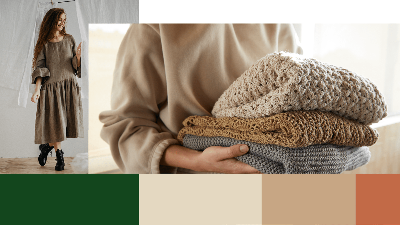
The selected colour scheme is earthy though, not interesting. We want the style to be clean and clear at the same time catching the attention. Special stylised pattern was also created to better complement the main idea.
Currently, the brand is launching in Lithuanian, though the goal is to become global and carry the good news further!

WHAT'S GOLDEN?
We interpreted the name HomoBono - a “Good Human” into a special and interesting character having the same meaning. Moreover, our created symbol and typography has the friendly approach to help company spread the slow fashion word.