

Introduction.
Malbon Golf — is a lifestyle brand inspired by the game of golf. They provide quality products, tell stories, and invite customers to take part in the community of like-minded thinkers.
Brief and Analysis.
The goal was pretty straight-forward; make sure the current type is redrawn in a way it is better readable and looks more modern, without losing its core identity. Especially the "M" needed to keep the current shape.
As a first step, it is smart to do a quick analyse on the current script. It's a great reference point, and it does provide a clear step by step path towards our end goal.

1. Keep the "M" the same but, re-create it with finer curves and better line work.
2. Increase the size of the "M" slightly.
3. Create a consistent bottom line, midline and top-line.
4. Add more counter space in the loop of the "l" or remove the loop.
5. Make the "b" more pronounced as a "b". (Can be misread as "Mallon" now.)
6. Recreate the connection loop but keep the foundation the same.
7. Weight needs to be consistent for readability.
8. More breathing room for the characters, more letter spacing.
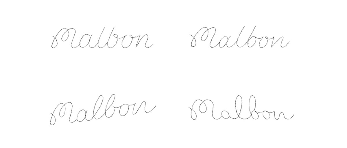
Sketching.
Free flow sketching immediately gives a great view on how the characters work together. I was especially interested in how the readability of the "b" could be improved. Below are just a few of many sketches made.
Concept Development.
I am using the pen tool to re-draw the script in Illustrator, and being thin is actually an advantage for smoothen the curves.

The "o" is used as a reference to create the consistency I am after.
Concept Refinement.
Now that the foundation is set, I am able to increase the weight. This will bring the weight on par with the old script logo. Next to adding weight, I am also adding a radius to the edges.
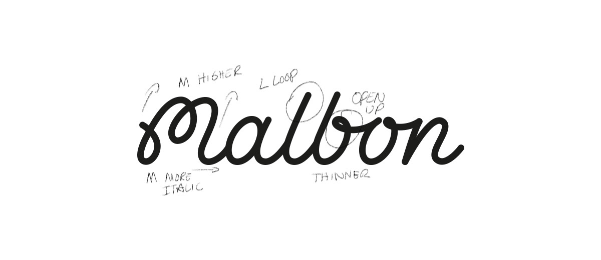
A few points of interest/feedback:
- M needs to be slightly higher and give the M a little more slant/italic.
- Loop on the "L" and open up the loop of the "B" slightly.
- Reducing the weight slightly.


Also did some final tweaks to the line work; a very tedious and time-consuming task but definitely worth it.
The M icon/symbol.
The M is very iconic and works very well as a stand-alone mark. There is no need to make extra adjustments to the M.

The M will be used for small digital occasions like the Favicon but in general; think of profile pictures, Malbon will be written in full. Print wise, the M is used as an equal alternative to the full script logo.


The Final Logo.
By crafting the letters with more spacing, reducing the weight and adding a more pronounced "b" the readability improved massively.
The final result is a beautiful script that will last a lifetime. Mission Accomplished!


