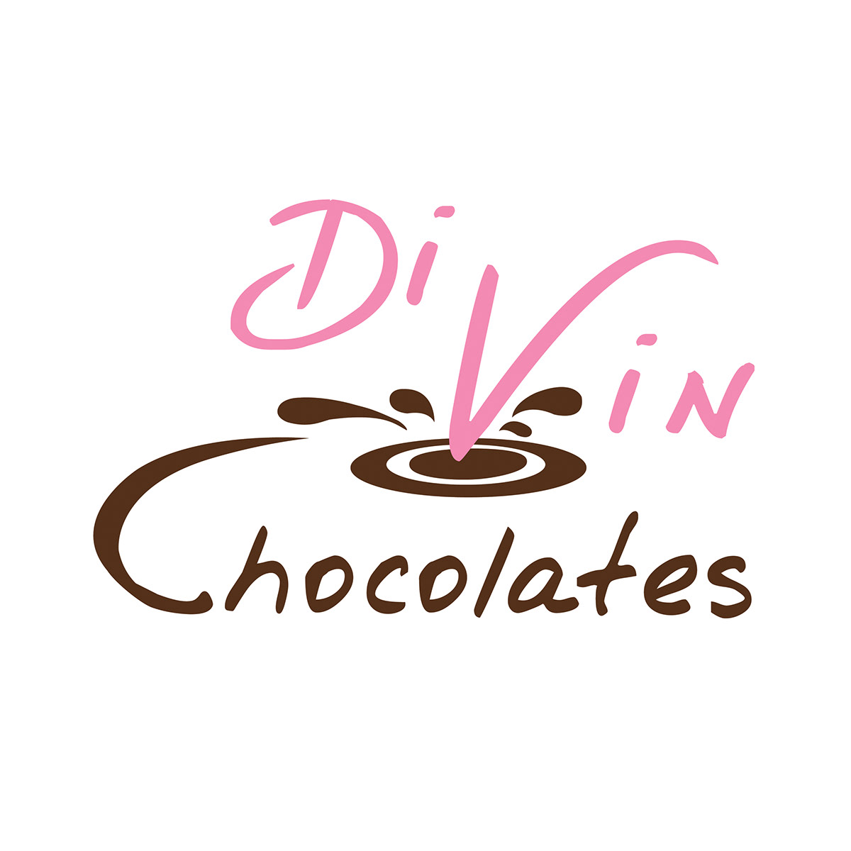
Project Description: Create a logo for a chocolate business. This is a small business that caters and sells handmade chocolates. The client specifically requested that the V in the name appear as though it was being dipped into chocolate.
Pink and brown was chosen because both colors also represent the flavorings of chocolate. In the initial samples, the font for "Di Vin" was chosen because I wanted something both bold and with a little decorative touch. In much the same way handmade chocolates are.

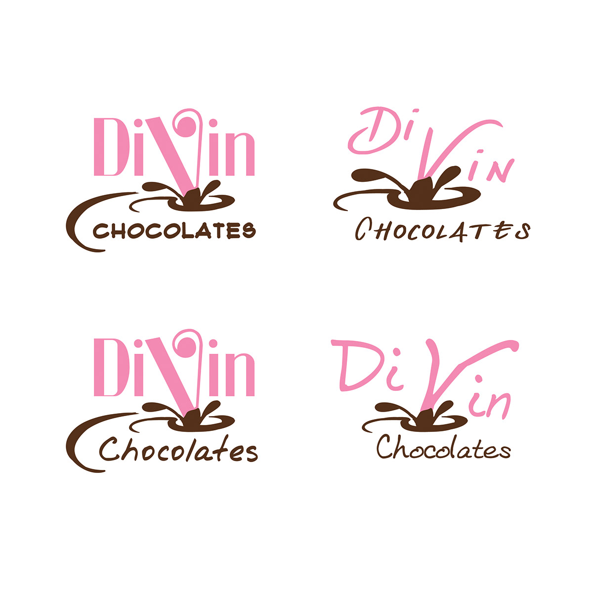
As you can see during the logo progression, the client requested a more script font to emphasis the movement of the logo and the central splash of the chocolate.