


Grace Studio
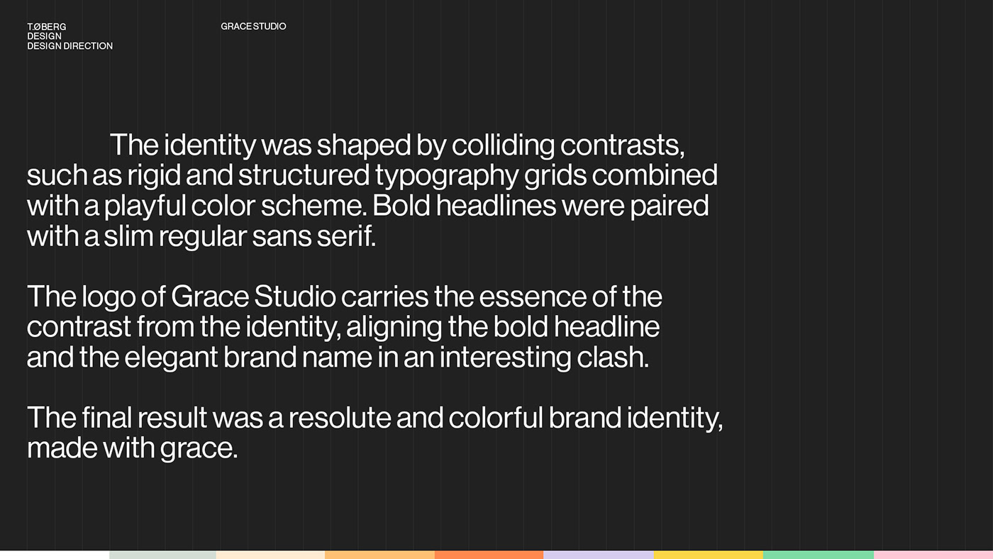
The identity was shaped by colliding contrasts, such as rigid and structured typography grids combined with a playful color scheme. Bold headlines were paired with a slim regular sans serif.
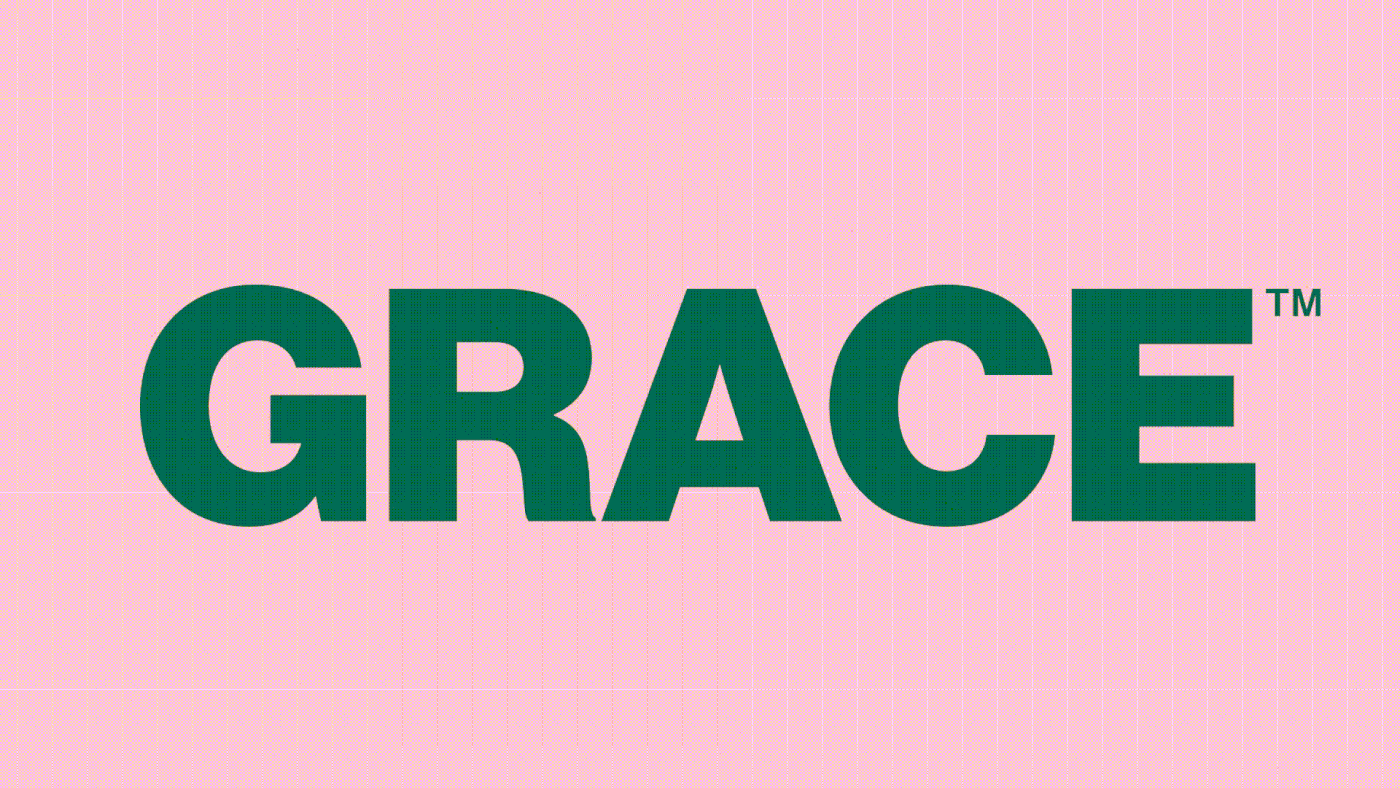
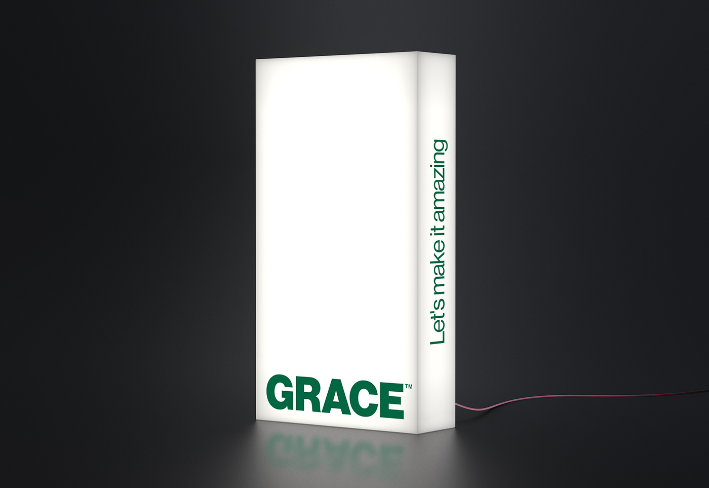
The logo of Grace Studio carries the essence of the contrast from the identity, aligning the bold headline and the elegant brand name in an interesting clash.
The final result was a resolute and colorful brand identity, made with grace.
Client: Grace Studio
Agency: Ny Studio
Design, Design direction: Tommy Øberg
3D: Clara Hertzberg, Emil Roos
Agency: Ny Studio
Design, Design direction: Tommy Øberg
3D: Clara Hertzberg, Emil Roos
Motion: Johan Claesson


