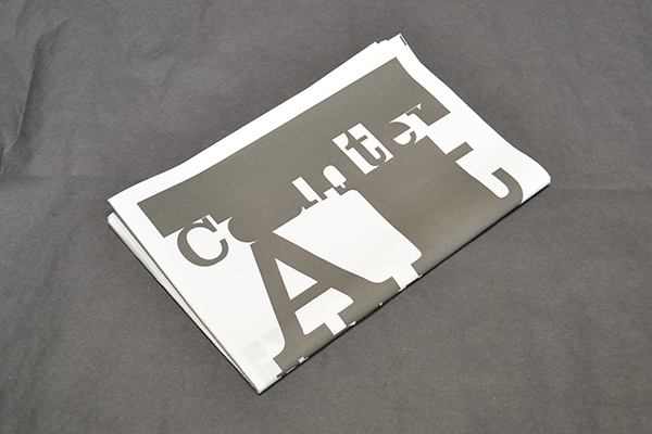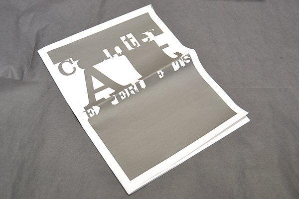
Type, Negative space, form and counter form.
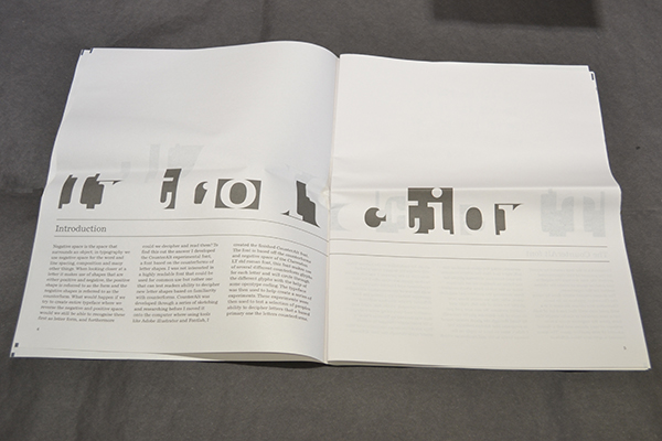
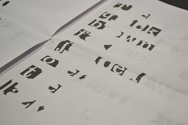
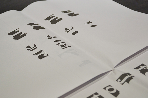
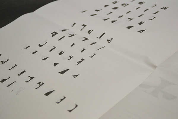
Negative space is the space that surrounds an object; in typography we use negative space for word and line spacing, composition and many other things. When looking closer at a letter it makes use of shapes that are either positive and negative, the positive shape is referred to as the form and the negative shape is referred to as the counterform.
What would happen if we try to create entire typeface where we reverse the negative and positive space, would we still be able to recognise these first as letter form, and furthermore could we decipher and read them.
My objective here was to develop an experimental typeface based on the counter forms of letter shapes. I was not interested in a highly readable typeface that could be used for common use but rather one that can test readers ability to decipher new letter shapes based on familiarity with counter-forms.
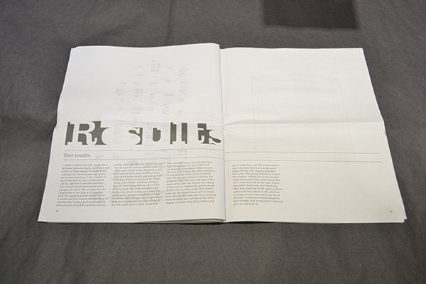
While my theories and the experiment for this project were not directly a success, the tests did give me some interesting results. While there are some familiar shapes created by the use of just negative space and counter forms for letters, even more so when they are put into a working word, sentence or paragraph structure. There is still not enough familiarity created for a person to be able to decipher what a letter or set text my be or say, even after applying various methods most people I tested still found it hard and often couldn’t decipher the tests. This along with the other information provided from the tests has made me from the opinion that the tests where not a complete failure but rather succeeded in providing me with new views and ideas. These views and ideas come from the interesting results of the methods people had used to solve the tests. One of the most interesting methods to me was one where people would try and rebuild the forms based on what they already had, kind of like filling in the gaps, the idea that by filling in the gaps would create what was missing wasn’t the best idea in the world but it was a great way forward for myself. By creating the parts around the letters, inside the letters and more I could create a set of components that could be used as parts to create letter forms, by using these components in the same way a chromatic typeface does I could create a unique or at least slightly different view on not just a chromatic typeface but how we see fonts and typefaces in general, that is what I plan on doing next.
for online issue - issuu.com/tsanalitro/docs/counteralt_experiment_1?e=4907626/6196036