21.Five
A podcast for professional pilots.

The fine folks at 21.Five approached me about redesigning their podcast cover art. After some discussion we decided that brand refresh was what they really needed to help push their enterprise to the next level.

As you can see, the old branding was not without its strengths. Rather than starting from scratch, our goal was take the brand and elevate it to be the best in the niche and truly reflect the great show that Dylan and Max and produce for their listeners.
Process
As always, the design process starts with research. Using the info provided in my design questionnaire as a starting point, I looked into the market and competition.

Above you can see the cover art from a selection the top aviation podcasts out there. There are a few that could really use some work, but there are some really nice covers as well. We want 21.Five to go toe-to-toe with best best covers while still differentiating visually.
We want to communicate that this is a professional, mature brand that is still fun, welcoming and accessible to new listeners. Not cheesy, not stuffy. The hosts are industry professionals with tons of pertinent knowledge, but they are also friends who keep things interesting and engaging.
We want to communicate that this is a professional, mature brand that is still fun, welcoming and accessible to new listeners. Not cheesy, not stuffy. The hosts are industry professionals with tons of pertinent knowledge, but they are also friends who keep things interesting and engaging.

Here is a little snapshot of the color exploration process. I wanted to introduce a darker blue that could contrast nicely the red color and stand out a little more on light backgrounds. I also wanted to nudge the color palette to be not quite so bright and saturated to lend a more refined look to the brand. A third color was introduced to serve as a background color that will help distinguish the brand and give it more character.


Above is a small snapshot of the typography exploration process. From the start, I was pretty sure that I geometric sans-serif was going to be the right fit. But I still did my due diligence, even playing with some pretty out-there options for this brand.
A lot of effort was focused on selecting the right geometric sans-serif that would provide the appropriate clean, legible style while also introducing a bit of character to the wordmark. I ultimately went with Filson Pro, which is a grotesque that works wonderfully as a display font and adds a bit of visual interest without being distracting.
A lot of effort was focused on selecting the right geometric sans-serif that would provide the appropriate clean, legible style while also introducing a bit of character to the wordmark. I ultimately went with Filson Pro, which is a grotesque that works wonderfully as a display font and adds a bit of visual interest without being distracting.

A glimpse of the process of customizing, reworking, and refining the primary wordmark for 21.Five.
Customizing the typography, implementing the color palette, adjusting size and spacing, etc. Every shape, angle, and curve is carefully considered and adjusted.
Customizing the typography, implementing the color palette, adjusting size and spacing, etc. Every shape, angle, and curve is carefully considered and adjusted.
Once the primary wordmark is created, alternate logos and single-color versions were designed to compliment it. All versions and their intended uses are shown below.

Final
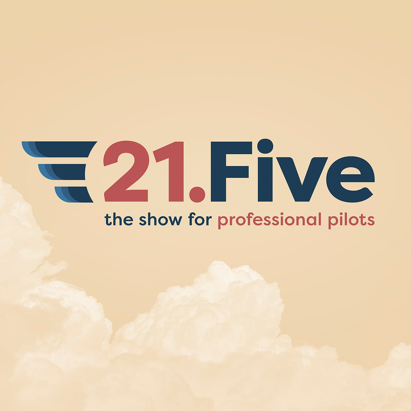
With the logo created and brand guidelines established, all that’s left is creating new cover art that fits the new visual branding direction of 21.Five.
I wanted to use imagery that would support the brand and reinforce the theme of the podcast without being overly obvious. So a colorized image of clouds was put into the background; subtle yet beautiful and effective. The combination of colors and shapes give a nod to the golden age of flight while remaining firmly grounded in the modern era.
A keen eye will notice how the clouds are intentionally placed to mirror and compliment the wing shape of the logo itself, sometimes it’s the little things that can help take cover art to the next level.