
Souper Groovy
Soup Packaging
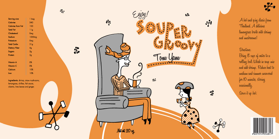
This is soup packaging for Souper Groovy, a soup line from Metropolitan Gourmet.
This soup line would be sold in stores like William Sonoma and other gourmet food shops.
When I think of soup, I think of warmth, home, and family.
When I think of soup, I think of warmth, home, and family.
I then think of the classic depiction of the happy fifties family. Because of those thoughts, I decided to create illustrations similar in style to illustrations of that era.The characters are light and quirky. They are what they eat, and they feature the ingredients of the soup on their heads. The Souper Groovy logo features handmade typography that fits the era, and the other type was carefully chosen to match.
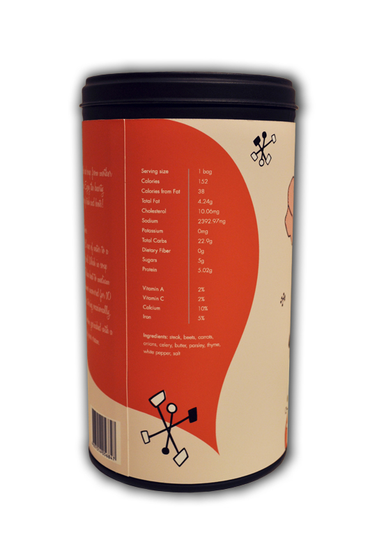
The dry soup comes in a large round tin that stands out on the shelf and brings the 50s to mind.
Each type of soup features a different illustration and color.
Illustration Studio (Fall 2010)
Oklahoma State University
Adobe Illustrator
flat files

On the tins


LogosTo view more of my logos, go to my logos project.

The 50s style handmade type compliments the design of the packaging. This logo is customizable and tailored to the type of soup it accompanies.

This logo can be seen as a both a fork top and the iconic arches of the Metropolitan Opera House
in New York City.
Extras include: stickers for the Metropolitan Gourmet logo, stickers for the bag of soup, and packaging for the can of shrimp inside Tom Yam soup.


