KEEP ESSENTIALS & HERITAGE. RE-BRANDED THE DAEGABANG
노포중식당 대가방 리브랜딩
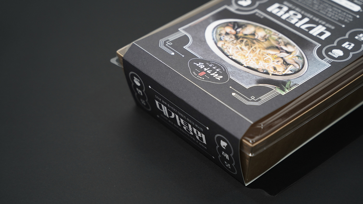
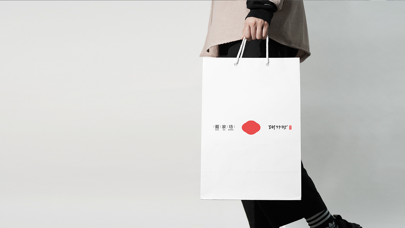
대가방은 55년 경력의 대장리 쉐프가 자신의 레시피와 노하우로 25년째 운영하는 중식당입니다. 서울 3대 탕수육이라 불리며, 수요미식회나 미슐랭에 선정될 만큼 높은 퀄리티의 음식을 제공합니다. 우리는 오랜 세월이 지나오며 모호해져 가는 대가방 브랜드의 문제 진단 및 개념설정을 통해 대가방의 개념을 재설정하고 이를 가장 효과적으로 표현할 수 있는 리브랜딩 과정을 진행하였습니다. 리브랜딩을 통해 대가방의 브랜드 개념을 명확히 정립하고, 일관된 브랜딩 경험을 전달할 수 있는 디자인 시스템을 구축하였으며, 새로운 고객 유입을 위한 전략 도출 및 포지셔닝 작업을 하였습니다.
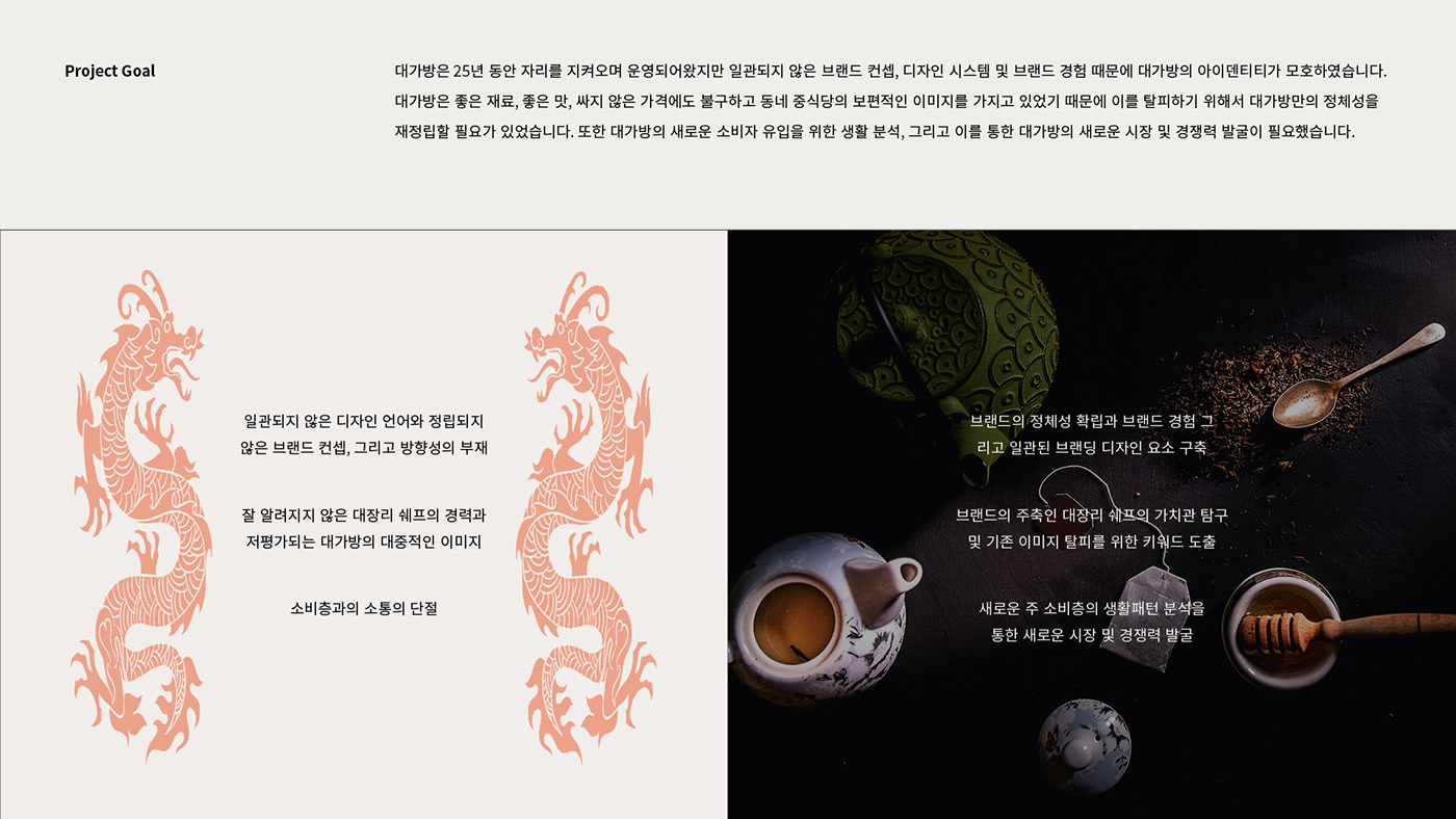
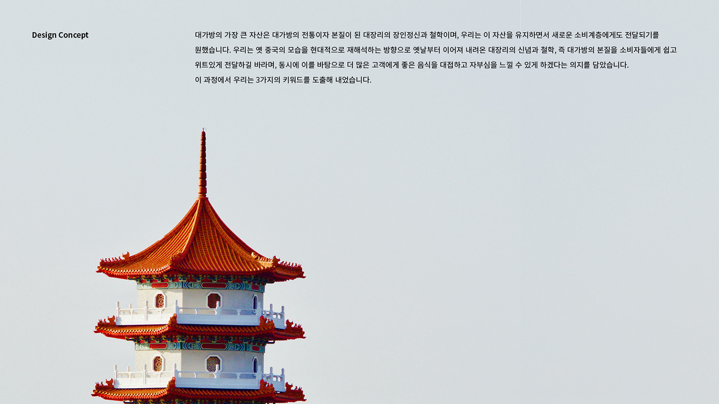
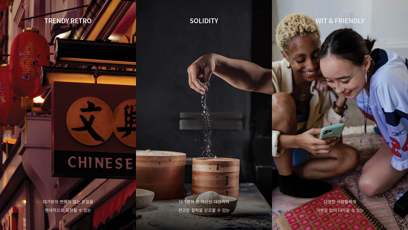
대가방은 25년 동안 자리를 지켜오며 운영되어 왔지만 일관되지 않은 브랜드 컨셉, 디자인 시스템 및 브랜드 경험 때문에 대가방의 아이덴티티가 모호하였습니다. 대가방은 좋은 재료, 좋은 맛, 싸지 않은 가격에도 불구하고 동네 중식당의 보편적인 이미지를 가지고 있었기 때문에 이를 탈피하기 위해서 대가방만의 정체성을 재정립할 필요가 있었습니다. 대가방의 가장 큰 자산은 대가방의 전통이자 본질이 된 대장리의 장인정신과 철학입니다. 우리는 이 자산을 유지하면서 새로운 소비계층에게도 전달되기를 바랐습니다. 우리는 옛 중국의 모습을 현대적으로 재해석하는 방향으로 옛날부터 이어져 내려온 대장리의 신념과 철학, 즉 대가방의 본질을 소비자들에게 쉽고 위트있게 전달하길 바랬습니다. 중국의 찻잔, 창틀의 형태, 대문, 간판의 테두리와 같이 현재까지 이어져 내려오는 전통 속에서 모티브를 찾아 대가방의 브랜드 이미지를 함축적으로 표현할 수 있는 심볼을 만들었습니다.
Daegabang is a Chinese restaurant run by 55 years experienced Chef Daejangri with his own recipe and know-how for 25 years. It is called Seoul's top three sweet and sour pork and offers high-quality food to be selected as a Michelin restaurant or introduced on a program called Wednesday gourmet.We have re-branded the Daegabang by finding problems in the previous branding plan and providing solutions through brand strategy also finding the visual solution to effectively express the philosophy of the brand. Even though Daegabang strictly managed the freshness of ingredients, taste, and reasonable price, it has the image of a cheap Chinese restaurant. So we mostly focused on redefining Daegabang's identity to break away from it.
Daegabang's biggest assets are Daejangri's craftsmanship and philosophy, which have become the tradition and essence of Daegabang. To attract Daegabang's new customer base, we hoped that this asset would be delivered easily and witty to the new target audience.We found motif of design from Chinese traditions that have continued to this day such as teacups, windows, gates, and borders of signs. We worked on conveying the brand identity easily and tactfully to consumers in the direction of reinterpreting the old China's appearance. We ended up creating a key symbol that can express the brand image of Daegabang implicitly.
#브랜딩 #로고 디자인 #패지징 디자인 #웹디자인