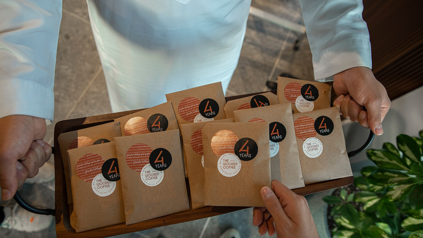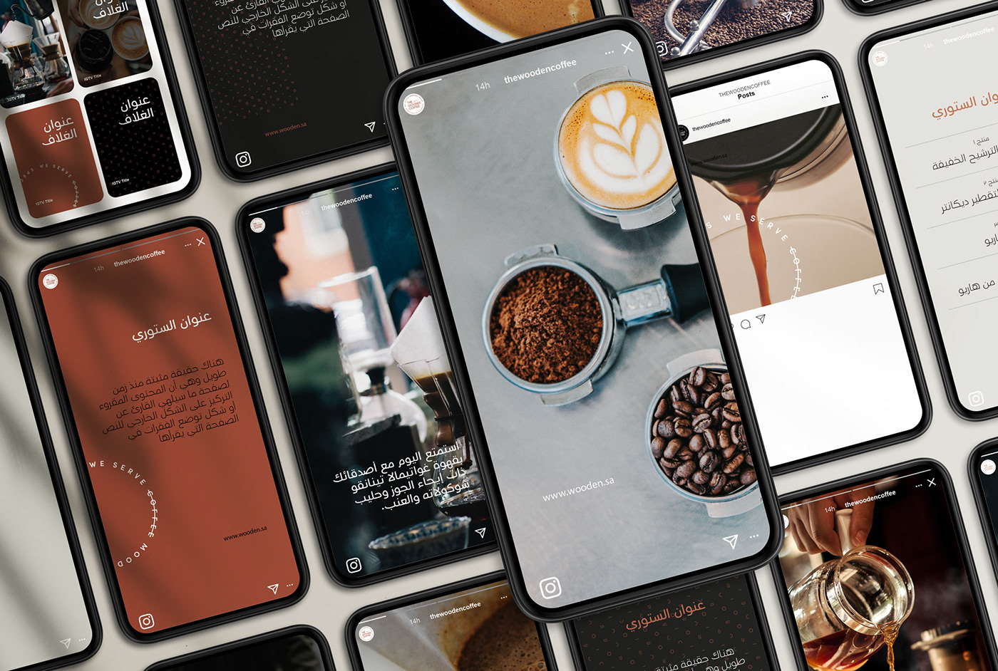

The Wooden Coffee is one of the leading projects in the world of coffee in Saudi Arabia, founded in 2017 by young Saudis who put customer service first and seek to expand in the Kingdom within the next few years.
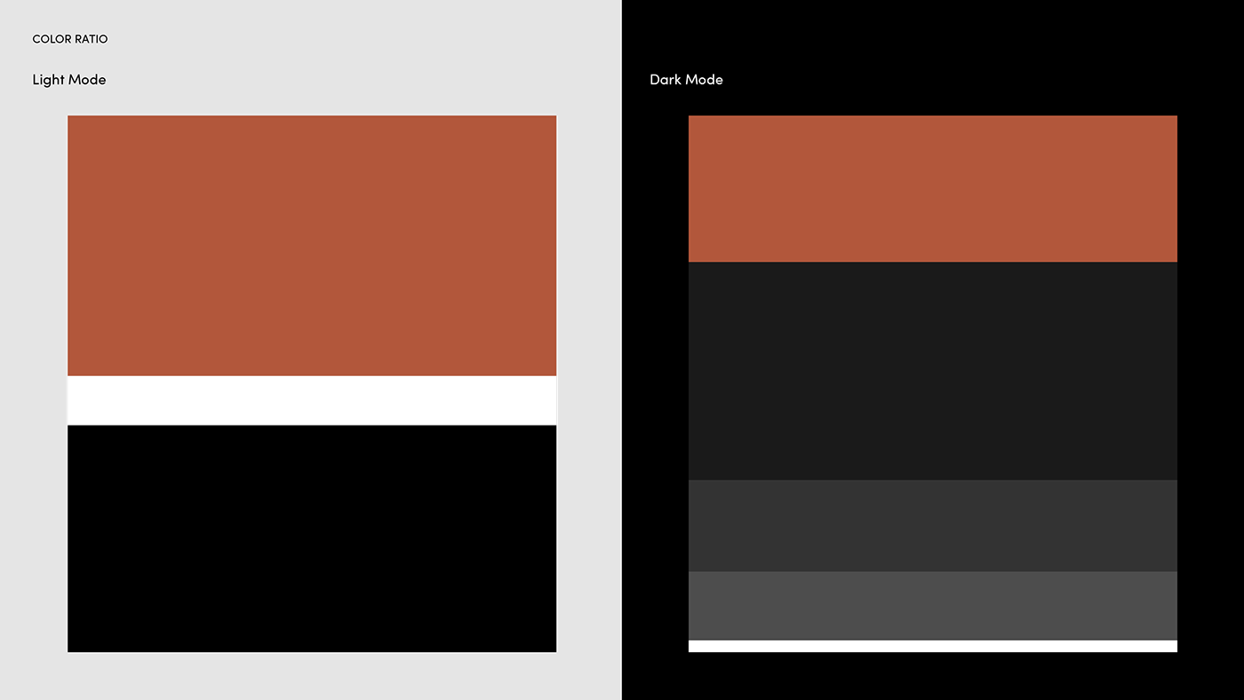
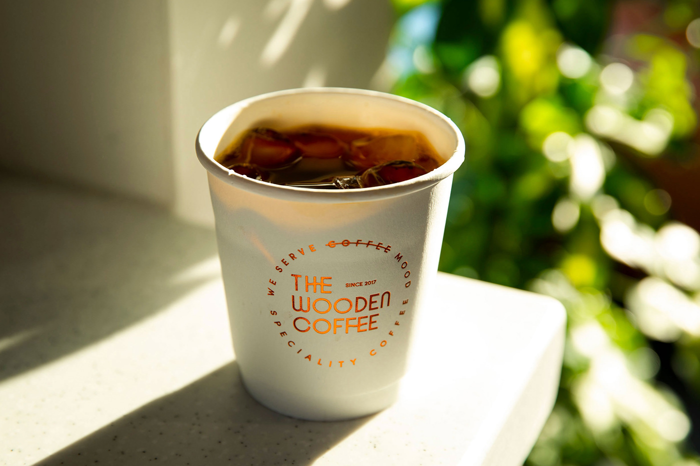
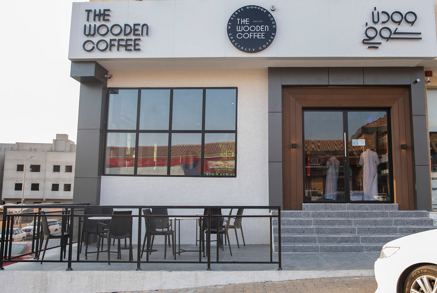
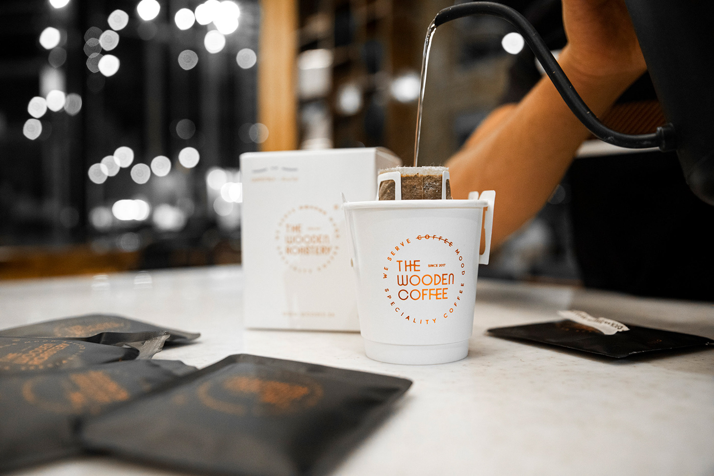
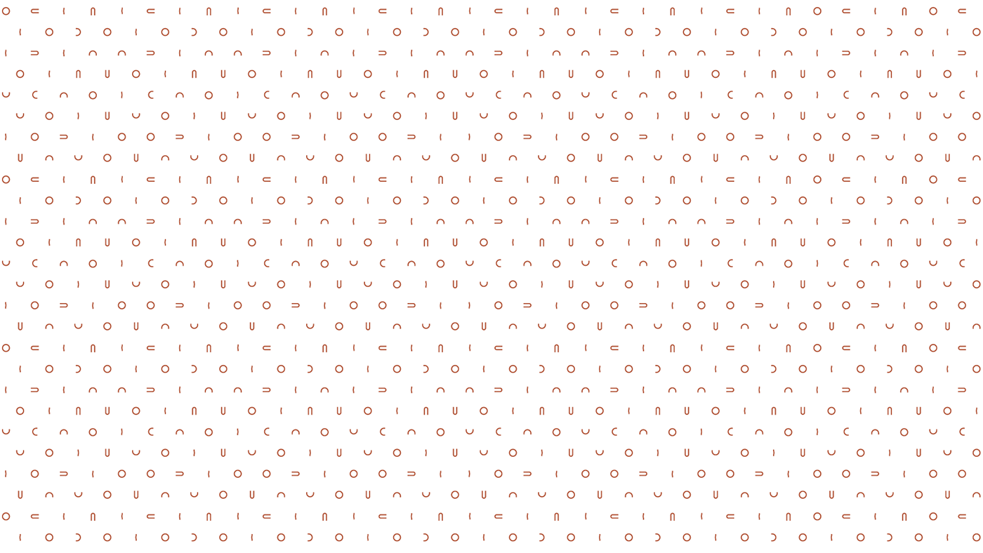
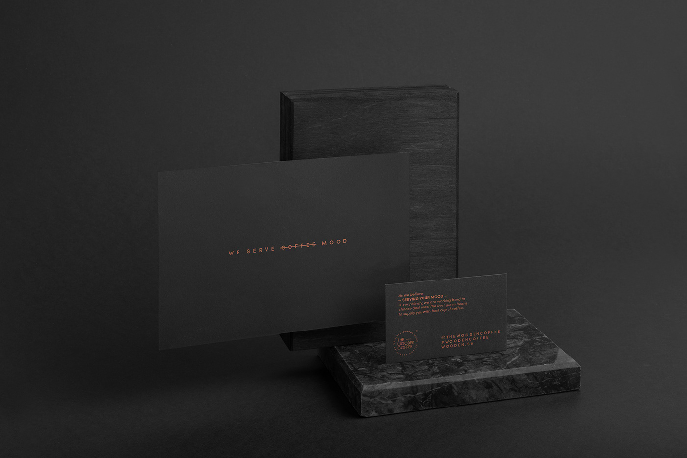
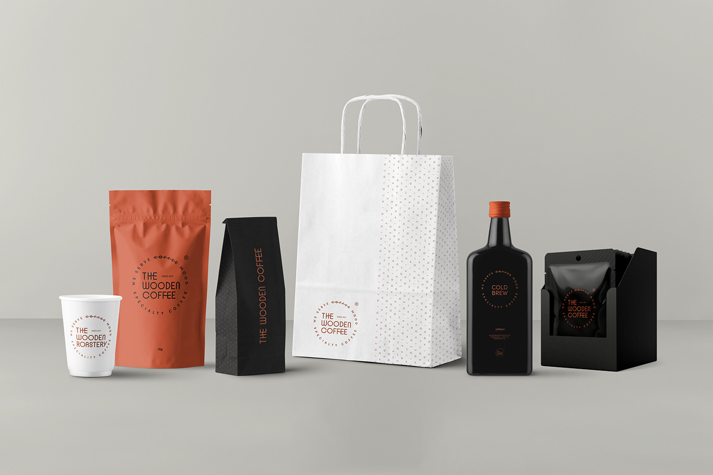
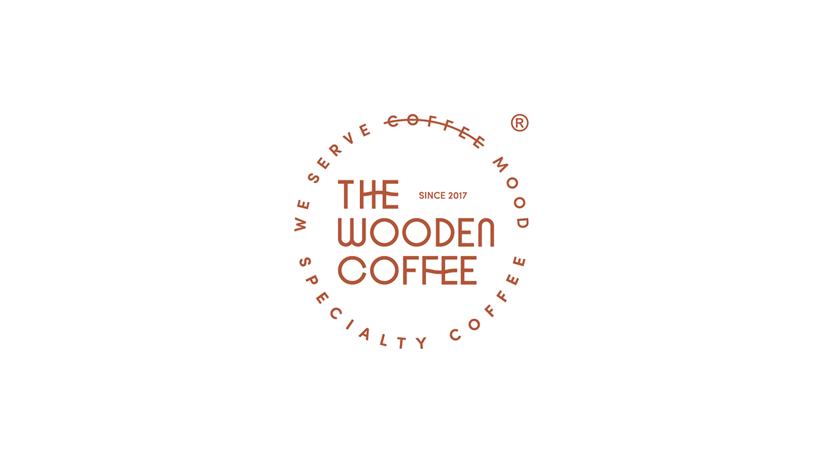
YaStudio’s rebranding approach aimed to keep the sense of the brand’s previous look & feel while also following the latest design trends. We kept the roundel (stamp) shape, but created a new, modern and elegant typeface. We decided to align it from the left instead of center, which suits the condensed typeface, followed by "since 2017" and the empty space to balance it out. After that we enclosed the primary typeface by the brand tagline. We created the Arabic logo version to harmonize with the Latin version and simulate it to appear consistent in a distinctive method that gives the brand its uniqueness. Color variation, black, rose gold, and white became trendy in the industry. In printing, we use rose gold foil or the Metallic Pantone 8925 C color in the primary brand applications, white in grand packaging, and black in small coffee packs. The logo elements inspire supergraphic in different shapes and backgrounds.

