Picking up unusual combinations of colors
is one of our favourite activities.
Some combinations look boring, some are too crazy.
As a result, in any case, we are looking for a mix:
what color scheme fits better for the most part of the target
audience of the brand + what looks fresh and cool.
As a result, in any case, we are looking for a mix:
what color scheme fits better for the most part of the target
audience of the brand + what looks fresh and cool.
This is a test scene from a storyboard:
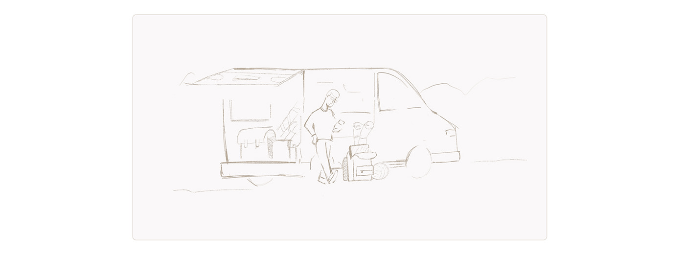
The dude is standing near his car and holding his phone in his hand, playing with filters on the Hipcamp website,
choosing the best place for his family for a future trip.
Let's see what options we have prepared:
.
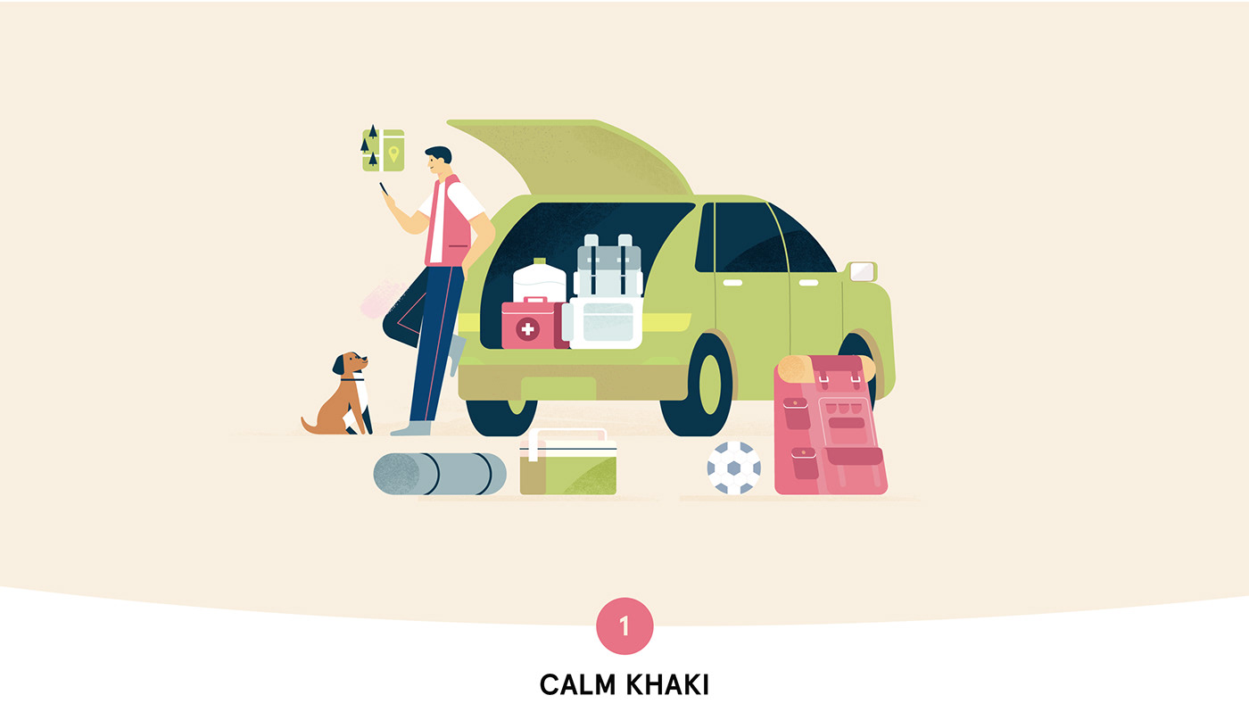
Nice combination.
A little more fun and unusual colors.
We like the way the beige skin tone looks unusually here.
Very often our clients ask us to represent diverse characters,
and to do either a variety of races or to make a character
of a neutral color — blue, purple, or as in this case, red.
We like the way the beige skin tone looks unusually here.
Very often our clients ask us to represent diverse characters,
and to do either a variety of races or to make a character
of a neutral color — blue, purple, or as in this case, red.
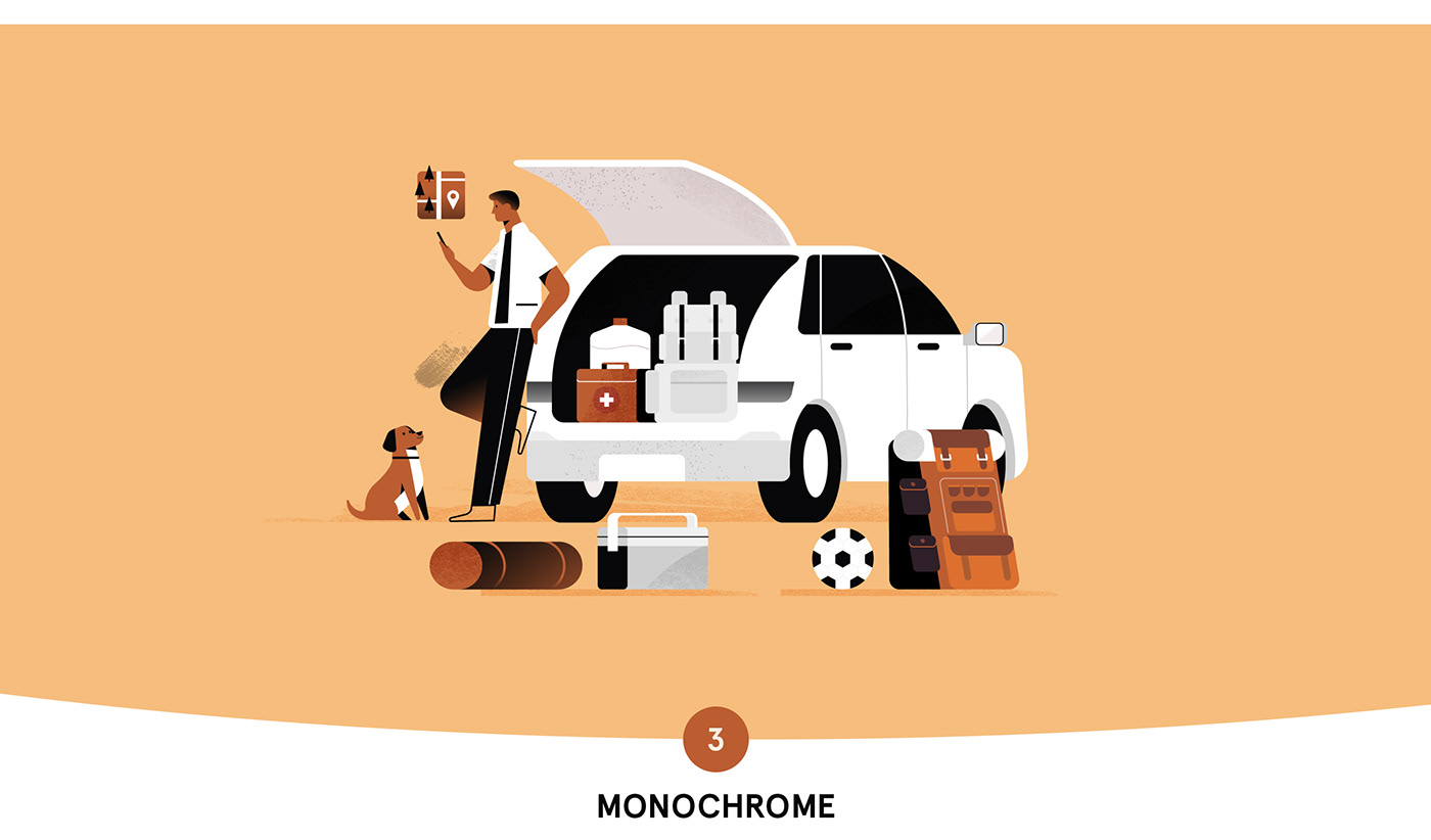
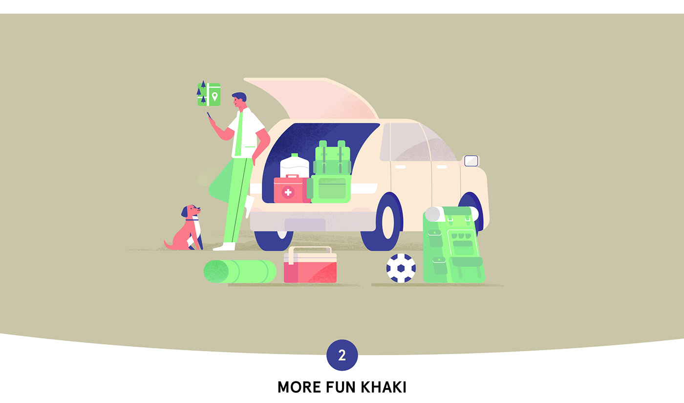
On the one hand, it's stylish.
On the other hand, we found it boring.
On the other hand, we found it boring.

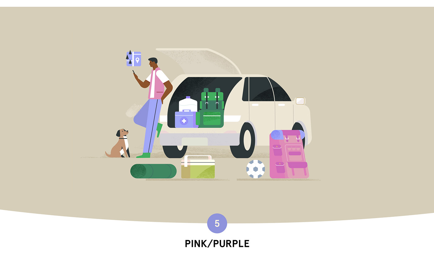
Tenderness and forest adventures — hmm, not sure.
One of our favorite options.

A bright green backpack looks especially cool.
We think it could be a cool video about the future,
new technologies, blockchain, but it doesn't really fit
into the adventure-tourism theme.
We think it could be a cool video about the future,
new technologies, blockchain, but it doesn't really fit
into the adventure-tourism theme.

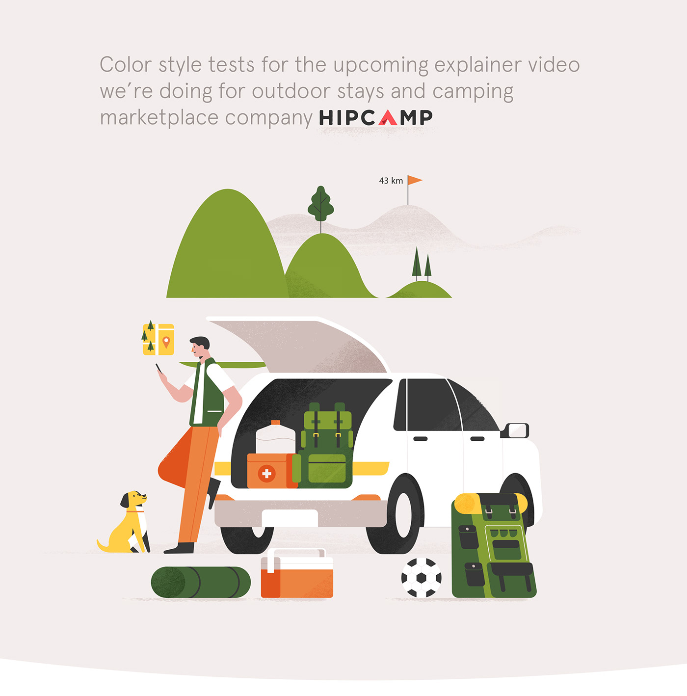
And we stopped there, after all.
The colors don't scream, but everything looks harmonious.
A lot of green is what we needed.
The colors don't scream, but everything looks harmonious.
A lot of green is what we needed.
Which one did you like the most?