DINO BURGER
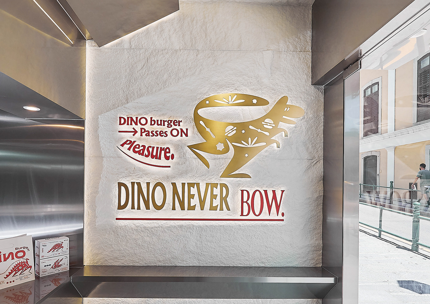
DINO NEVER BOW
-
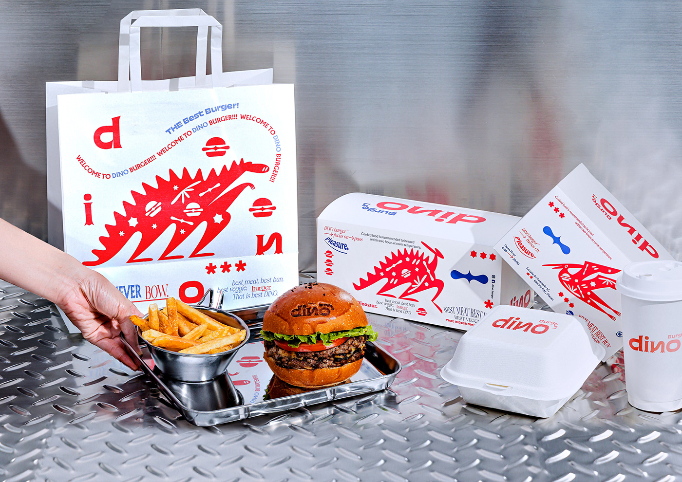
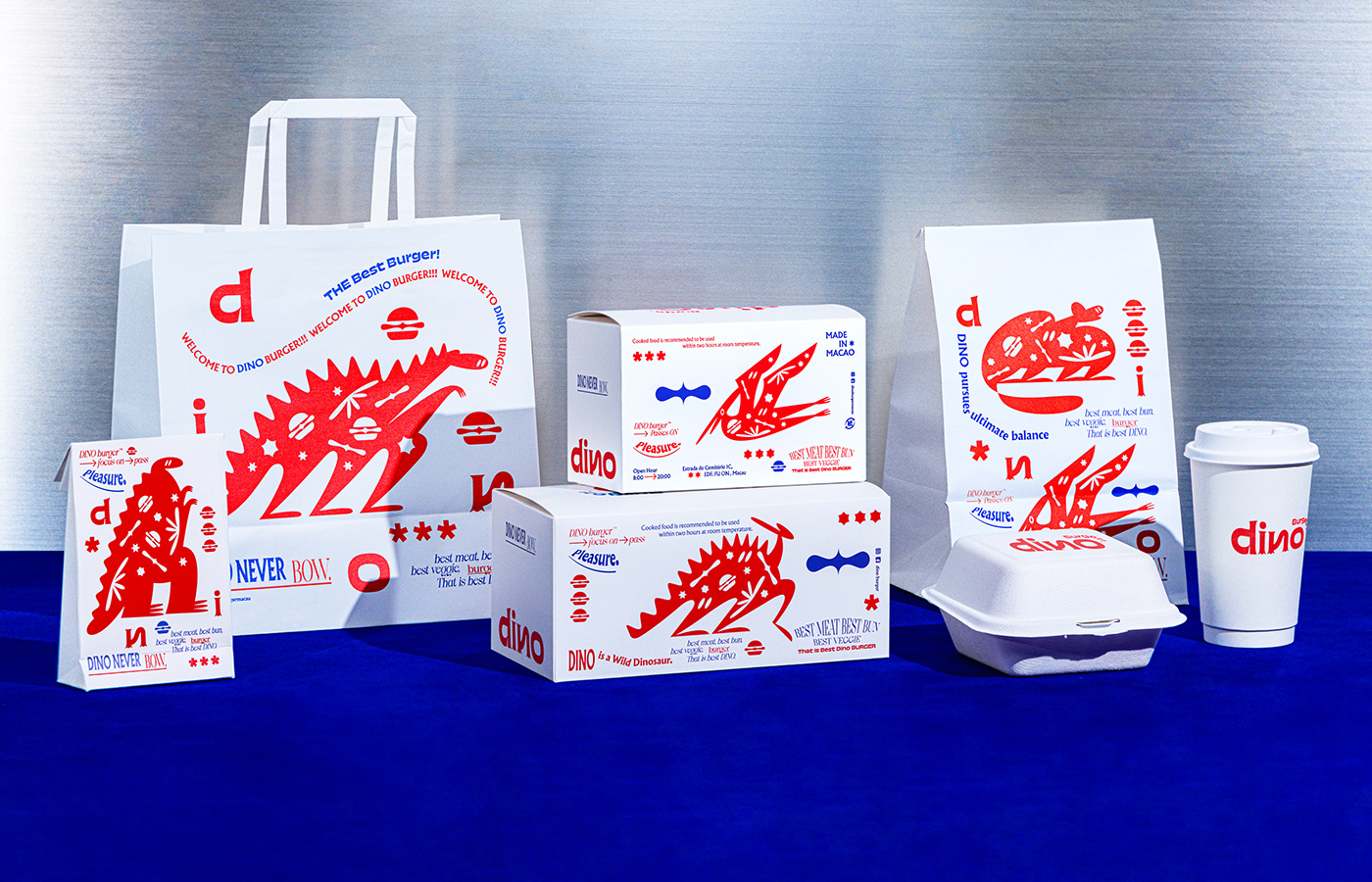
Our brand wishes to convey a kind of ‘no make do’, ‘no ordinary’, ‘no surrender’ life attitude. Whoever says burger has to be junk food consumed quickly on the street? We say burger can be like tasting a cup of coffee. From selecting, processing and cooking raw ingredients, to baking buns, packing orders and serving it to customers, every step demands high standards.
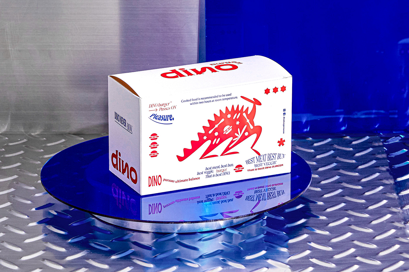
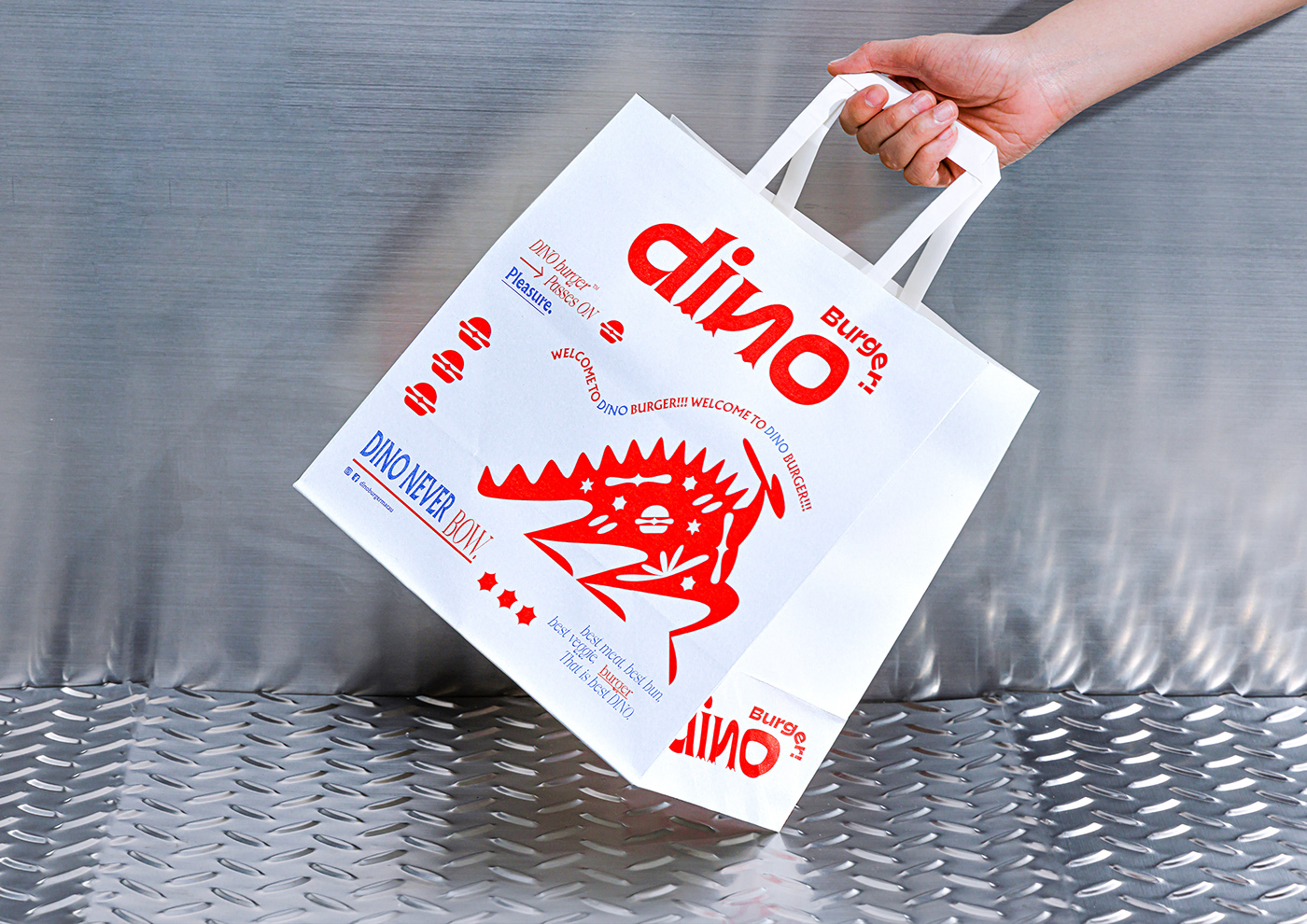
Aside from the basic satisfaction of appetite, we hope that at the moment when customers open the box of burger they can be satisfied mentally and visually. To everyone out there, we wish the consumption of Dino Burger can also offer a sense of ‘no make do’ in your life.
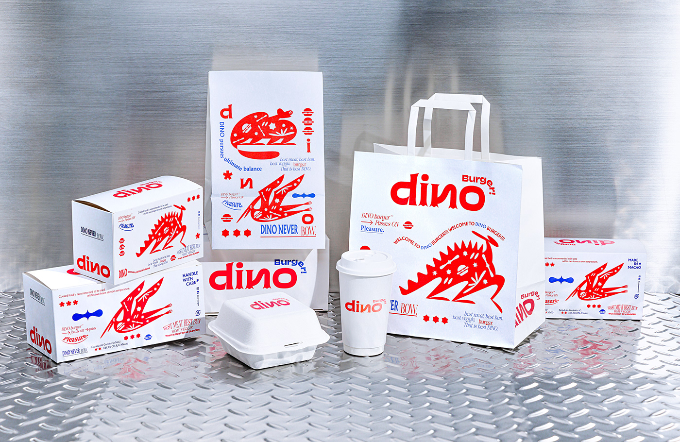
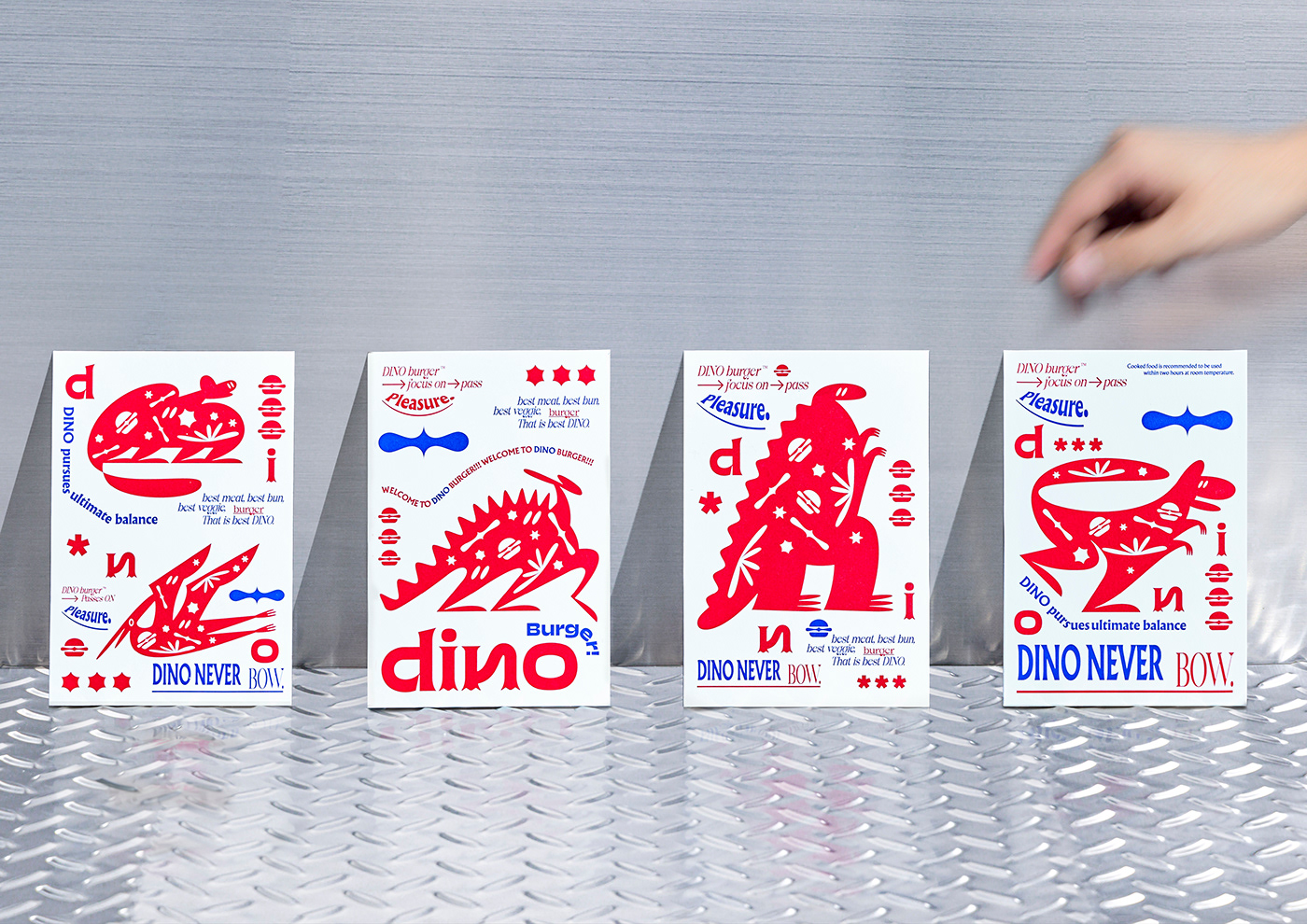
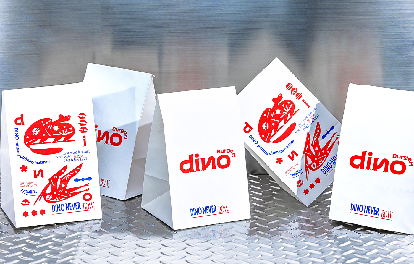
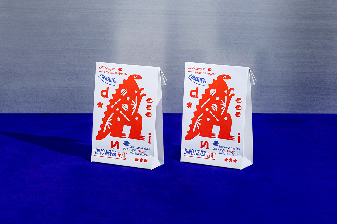
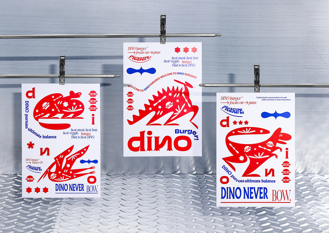
This design emphasizes on the brand’s think-out-of-the-box attitude and its innovative operating method. Therefore, we break the stereotype of average burger shop and use the peculiar yet adventurous dinosaurs as the subject, while following it onto the path of looking for delicious burgers.
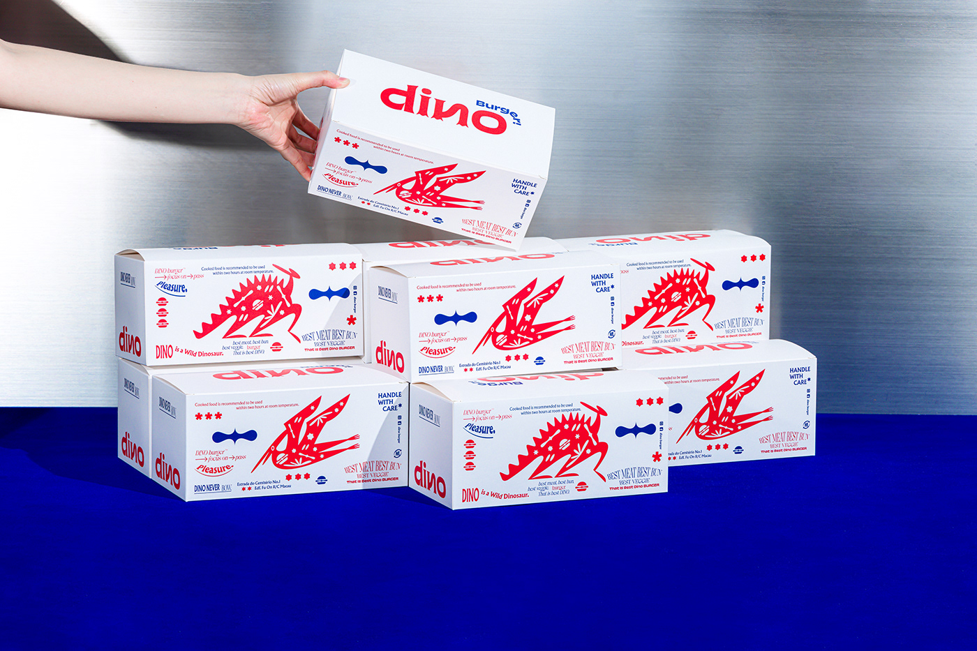
The logo design is clean and concise by combining the brand’s English name with the characteristics of dinosaur’s feet. As for extended designs, plenty of creative illustrations are used to attract customers’ attention in order to highlight the uniqueness of the brand.
-
Client by / Dino Burger, Designed by / Untitled macao ,
Photography by / Rex Chang