

Florencia is a yoga instructor from Uruguay. She is passionate about teaching yoga and its philosophy, and inspired to create a community and true connection with yoga practitioners. She learnt in international contexts various yoga styles, such as Kundalini and Iyengar, and supports her teaching with studies in physiotherapy and osteopathy.
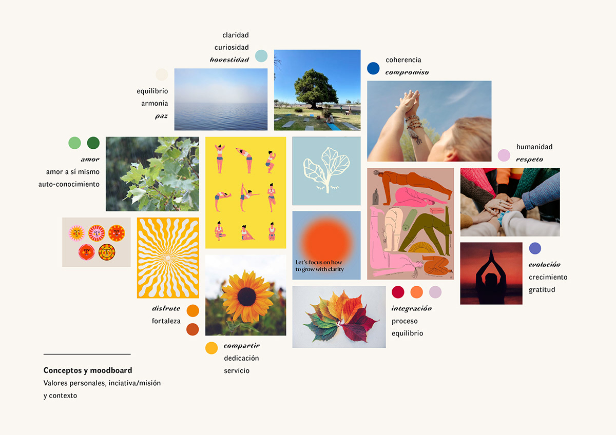
To create a visual identity that would represent her proposal, I focused on her personal values and concepts around her practice and teaching. These concepts served as an inspiration to find colours, textures, and visual resources that would reinforce her message. Themes important to her, among others, were: love, sharing, dedication, clarity, coherence, growth and gratefulness. Concepts that represent her classes were: enjoyment, strength, commitment, process, respect and humanity. And finally, some concepts that represent her understanding of yoga were: self-love, self-knowledge, equilibrium, harmony and peace.
To create a visual identity that would represent her proposal, I focused on her personal values and concepts around her practice and teaching. These concepts served as an inspiration to find colours, textures, and visual resources that would reinforce her message. Themes important to her, among others, were: love, sharing, dedication, clarity, coherence, growth and gratefulness. Concepts that represent her classes were: enjoyment, strength, commitment, process, respect and humanity. And finally, some concepts that represent her understanding of yoga were: self-love, self-knowledge, equilibrium, harmony and peace.
Moodboard (see credits below)
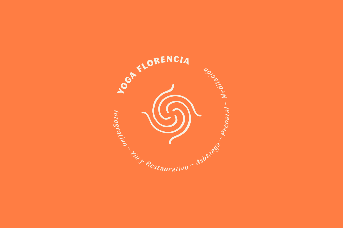
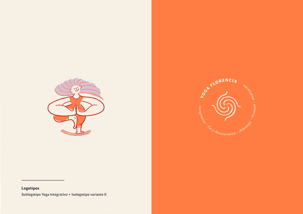
The logo is inspired on the spiral and the snake, symbols of Kundalini yoga which represents the energy flowing from the center in and out. Moreover, illustrations of figures in different poses/asanas were made to represent each yoga class she holds, each one having a different purpose. The figures were designed with body inclusivity in mind.
The colour palette was inspired in the colours of the chakras: red (muladhara), orange (svadhistana), yellow (manipura), green (anahata), light blue (vishuddha), purple (ajna) and violet/white (sahasrara). Each colour represents a chakra, and each yoga class offered focuses more on certain chakras than others. This way, chakra colours create a colour code and support the illustrations made for each yoga class.
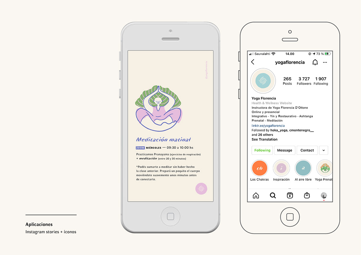
The font family used is Faune. Open source and designed by Alice Savoie, Faune is inspired in fauna and natural history illustrations. The typefaces are soft but with character, and aligned with this project for being fun, non-authoritarian, and balanced. Moreover, the italics remind of yoga's flow, without loosing structure and readability.
The colour palette was inspired in the colours of the chakras: red (muladhara), orange (svadhistana), yellow (manipura), green (anahata), light blue (vishuddha), purple (ajna) and violet/white (sahasrara). Each colour represents a chakra, and each yoga class offered focuses more on certain chakras than others. This way, chakra colours create a colour code and support the illustrations made for each yoga class.
The font family used is Faune. Open source and designed by Alice Savoie, Faune is inspired in fauna and natural history illustrations. The typefaces are soft but with character, and aligned with this project for being fun, non-authoritarian, and balanced. Moreover, the italics remind of yoga's flow, without loosing structure and readability.


Credits
Typeface: Faune, Alice Savoie / Cnap
Photos: Yoga Florencia - instagram.com/yogaflorencia
Photos: Yoga Florencia - instagram.com/yogaflorencia
Moodboard: Yoga poster concept - behance.net/gallery/62685619/Avatar-yoga-poster
Yoga app concept - behance.net/gallery/91295861/Yoga-App-Concept
Hojas de colores - Unsplash, Photo by Chris Lawton
Manos al centro - Unsplash, Photo by Hannah Busing
Yoga al atardecer - Unsplash, Photo by Raghu Nath
Figuras haciendo yoga - Subin Yang en Behance
Thanks for your visit! ♥


