
Grace’s Table is a humble, home-style restaurant intriguing locals and tourists alike. Residing on the outer banks of Napa, their quaint design features soft green walls, summery string lights, live plants on each wooden table, and a ceiling to floor open front inviting casual strollers to eat their global, yet healthy cuisine.
Although their contemporary menu harbors several tantalizing choices, their current logo doesn't do their restaurant justice. In an effort to showcase their ties to green eating, subtle leaf attributes were added to the vertically spaced letters meant to resemble the spacing of their tables.

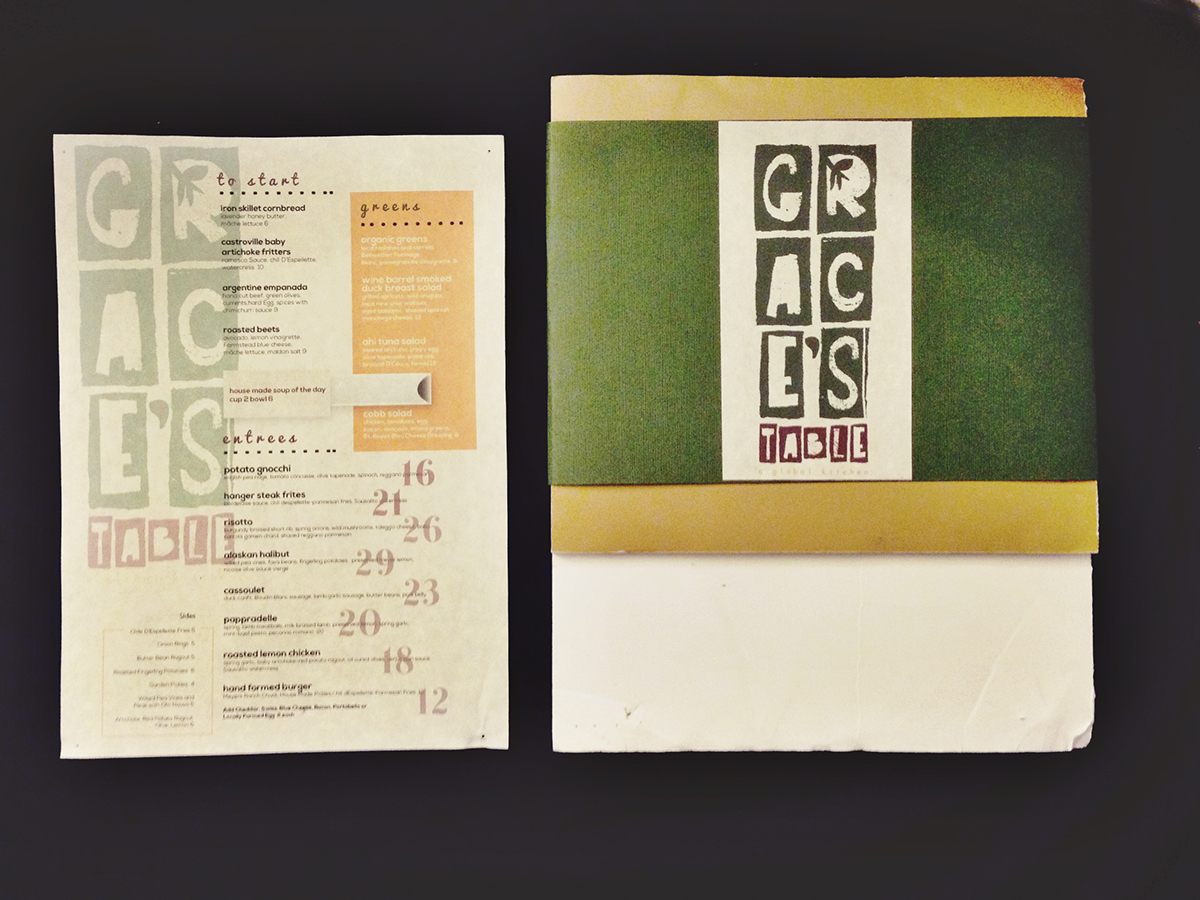
When initially creating potential logos for Grace’s Table, one of the main objectives was to feature the color green or a palette closely relating to the natural colors of Northern California [specifically Napa County i.e. burgundy of grapes, green leaves]. The ingredients included in their culturally exciting meals celebrate the natural flavors of the Earth thus relating to these color choices as well. Following this design decision, arranging the letters of the words in a vertical manner was intended to replicate the seats of a table, inviting anyone to join the family-oriented restaurant. To finalize this objective, ‘a global kitchen’ is loosely kerned to further emphasize their welcoming persona causing those who desire an aesthetically pleasing, innovative, and authentic dining experience to choose Grace’s Table.


