Client: Cairo Diagnostics
Agency: Designframe Corp
Direction: Mahmoud Arafa
Design: Bashar Shash, Heba Mahmoud
Agency: Designframe Corp
Direction: Mahmoud Arafa
Design: Bashar Shash, Heba Mahmoud
______
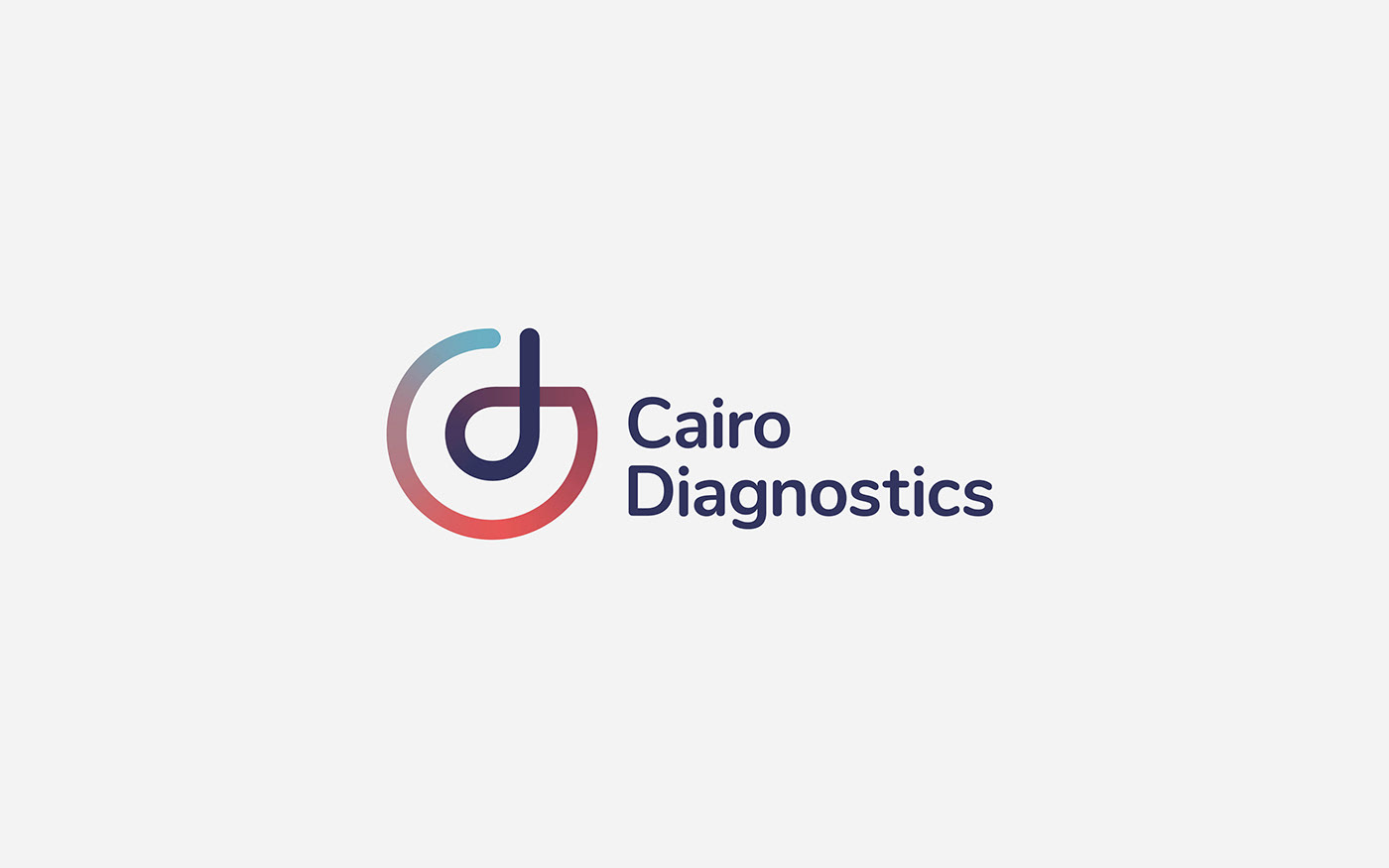
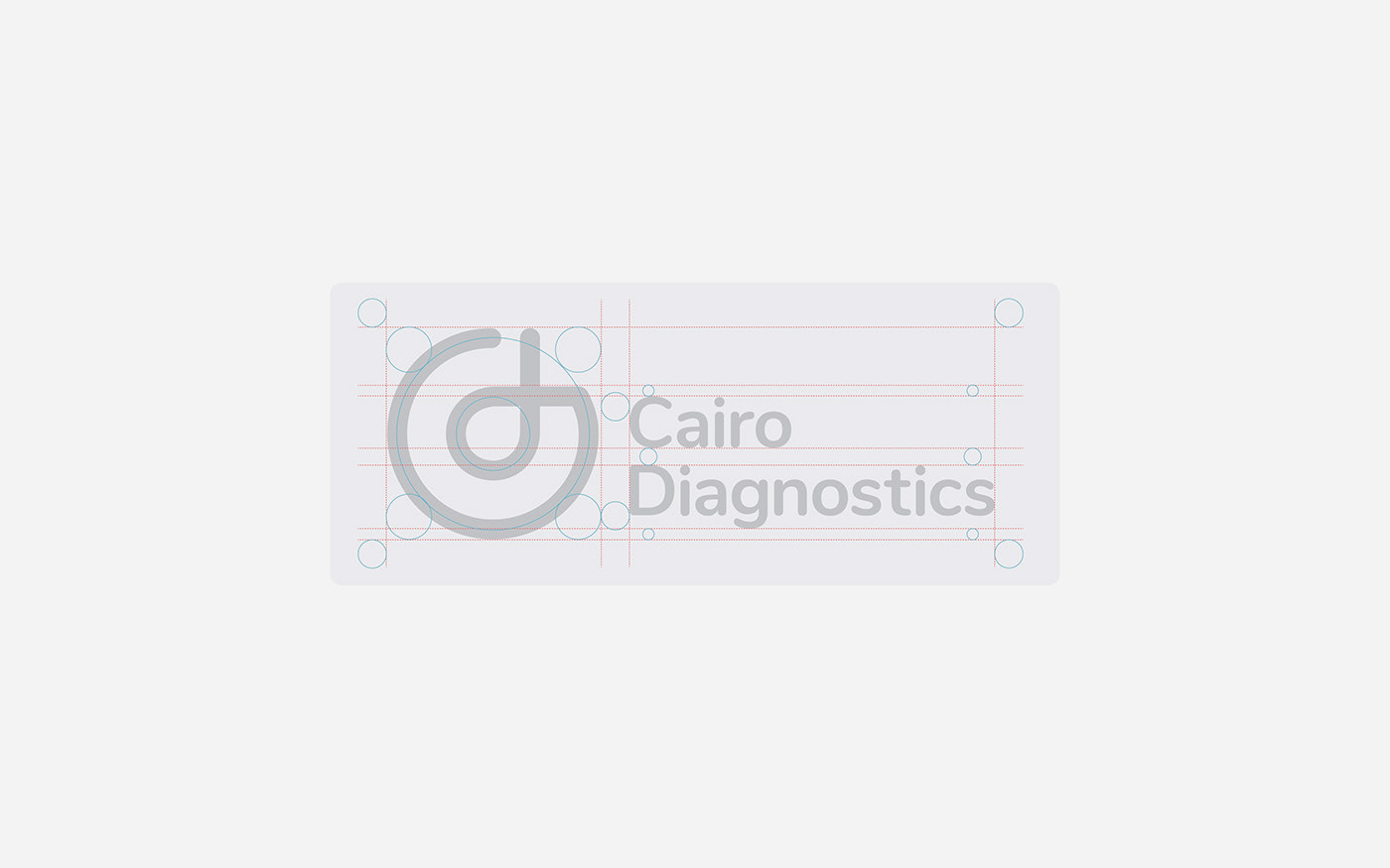
The way the logo is designed communicates what Cairo Diagnostics is all about. It’s designed to be distinctive and interactive. The straightforward design of the emblem features the CD initials enclosed within a flawless circular pattern that represents completion and harmony – which perfectly describes the uncomplicated and agile process of Cairo Diagnostics. The vibrant gradient colors are eye-catching and was inspired of the figure of a DNA. The typography has been selected to be sleek, soft, and simple to make the icon stand out and exude a clean and modern feel.
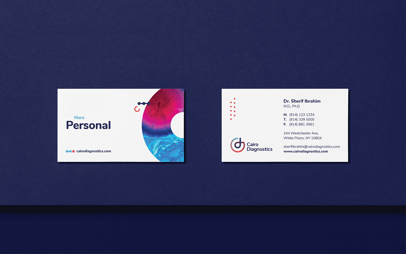
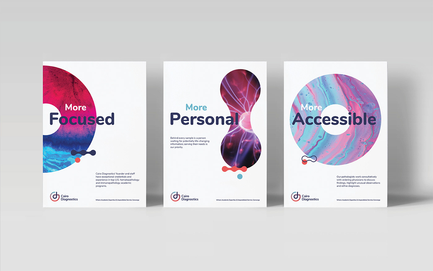
Using abstract shapes by rendering tissue cells and cytogenetics molecules in the negative space to give the impression of the tech-savvy lab, consistently delivered in every point.