

Lebre initially was my final assignment for my Corporate Idenity course to get my Associates Degree in Graphic Design from FIT, New York City.
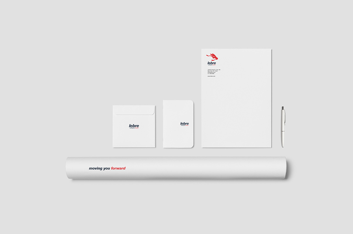
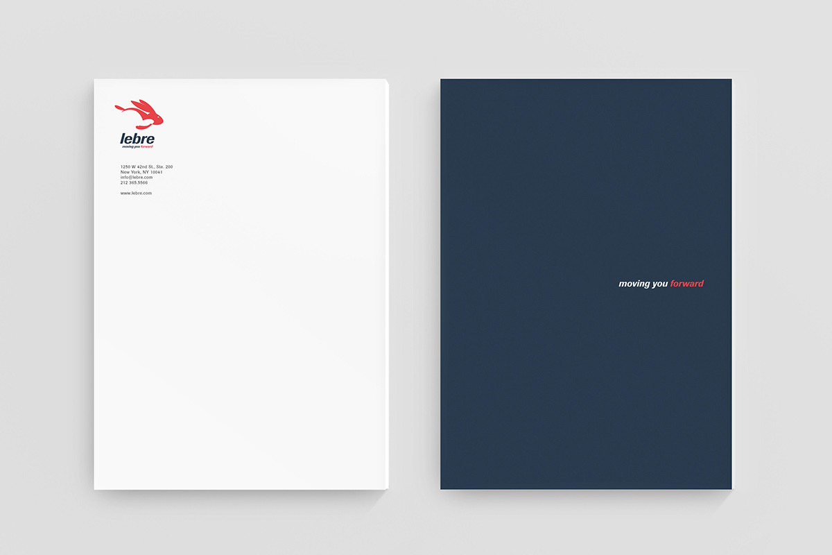
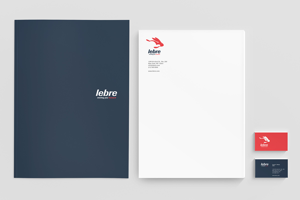
I had a very competitive group but more importantly, I was extremely passionate about the course. For this project I developed a forty-six page corporate manual with the ins-and-outs of how to use the logo, its typeface, corporate colors, proportions, tagline and all other assets. The result was a complete Corporate Package that I later on ended up selling to a real World Wide Moving Company.
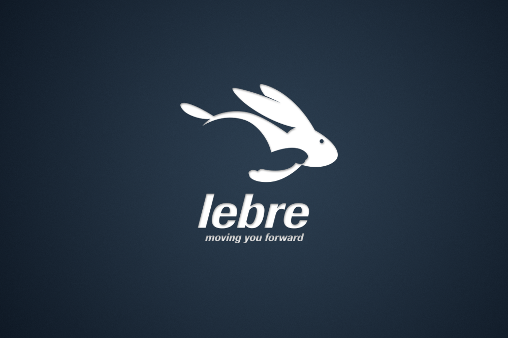
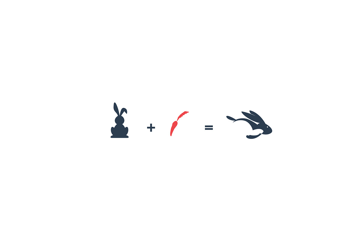
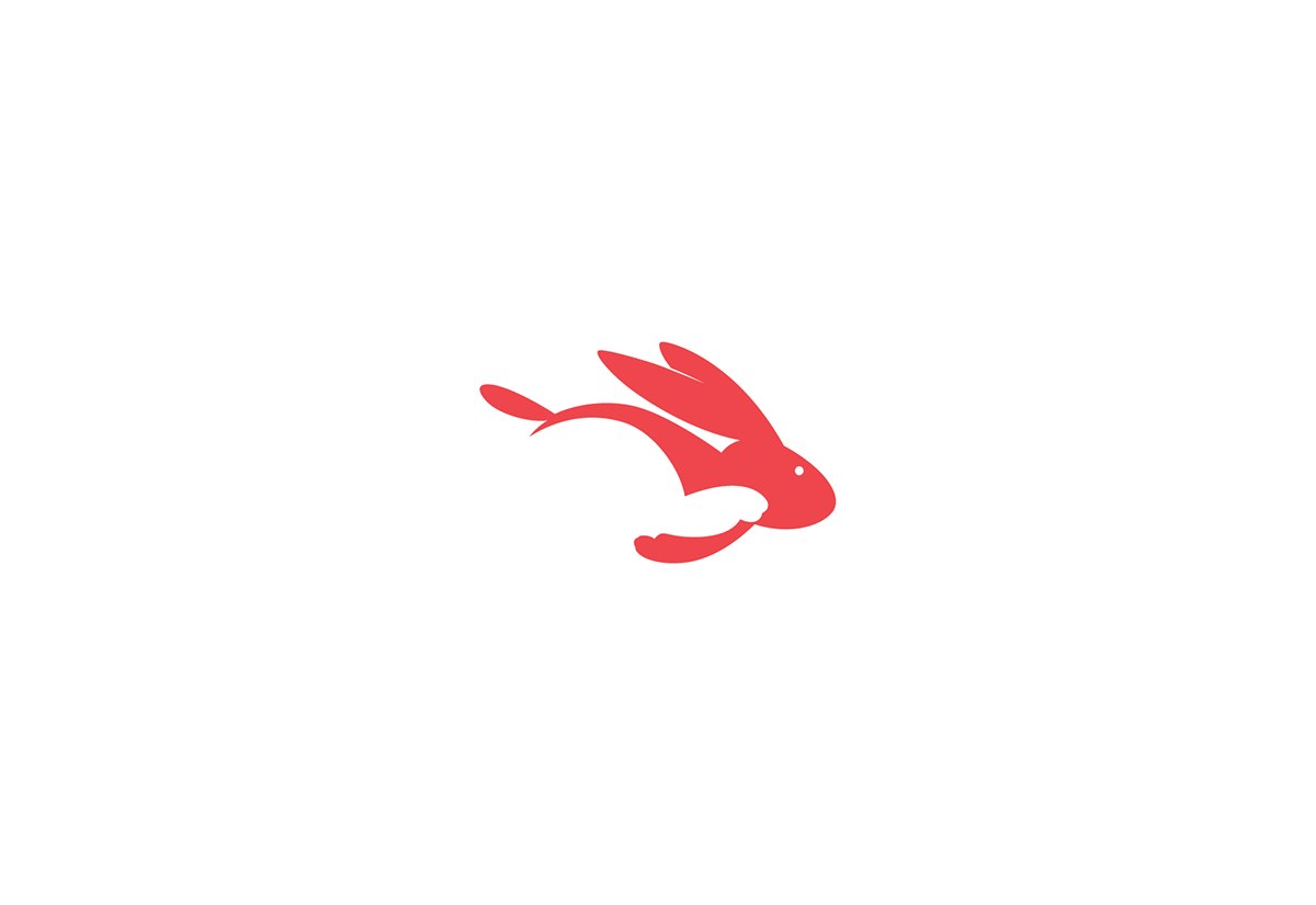
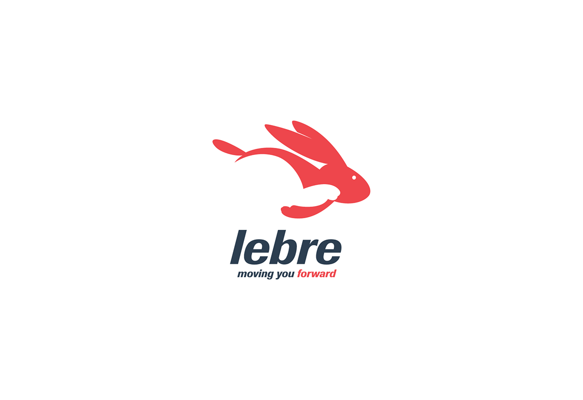
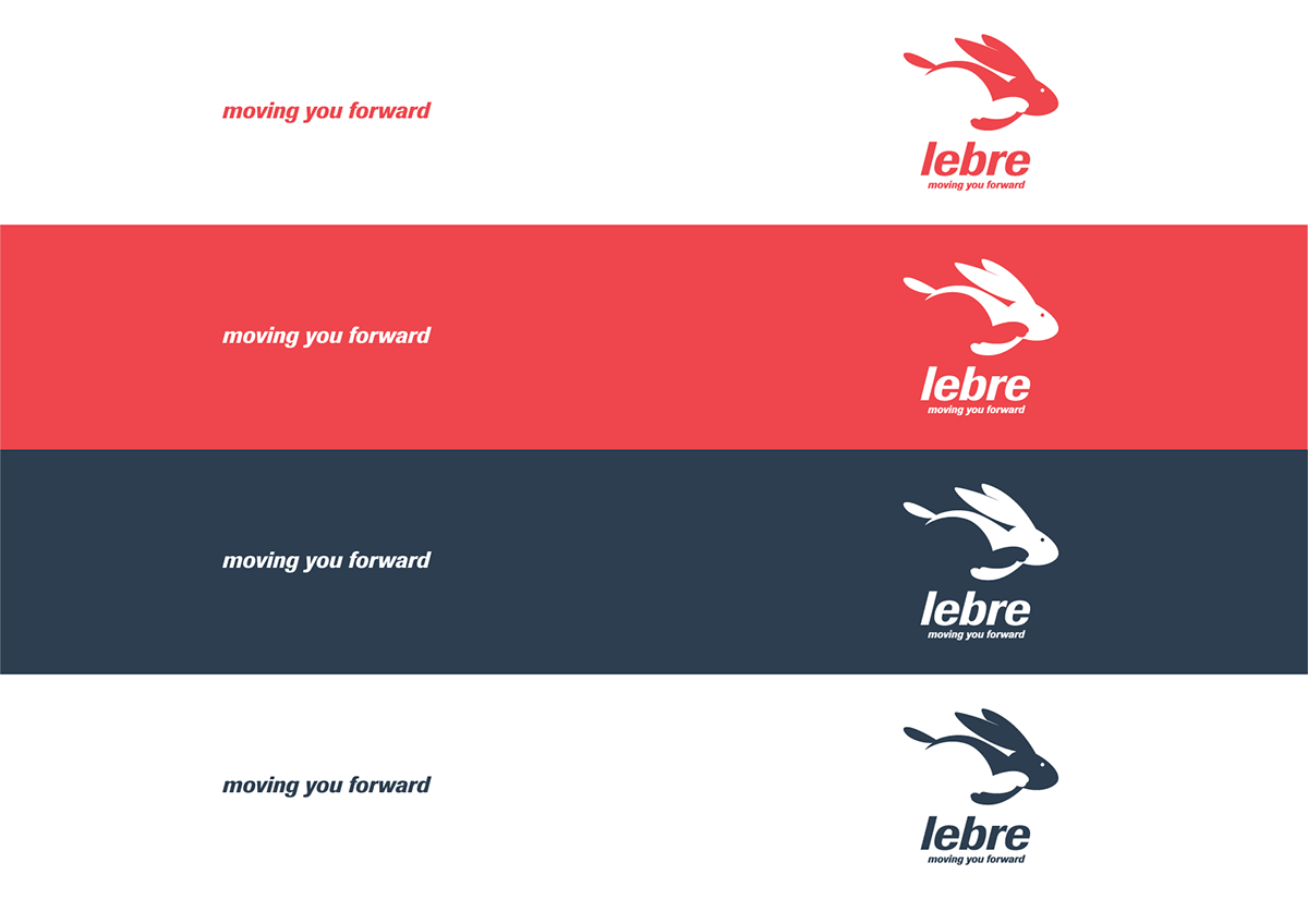
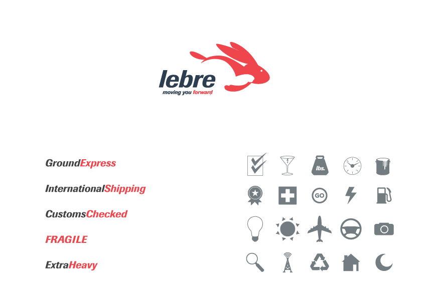
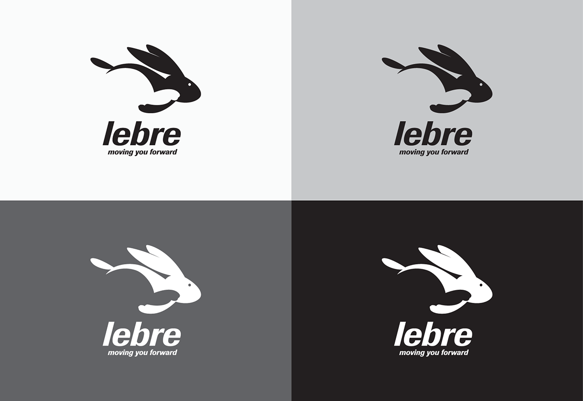
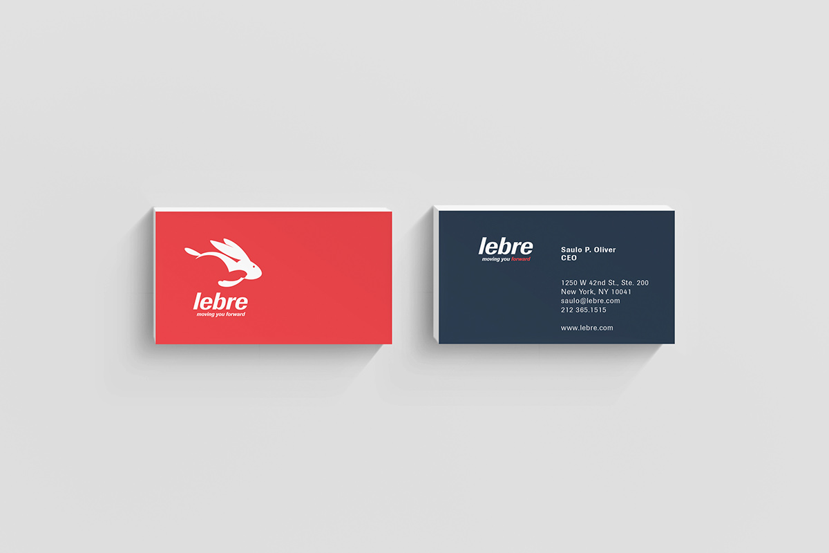
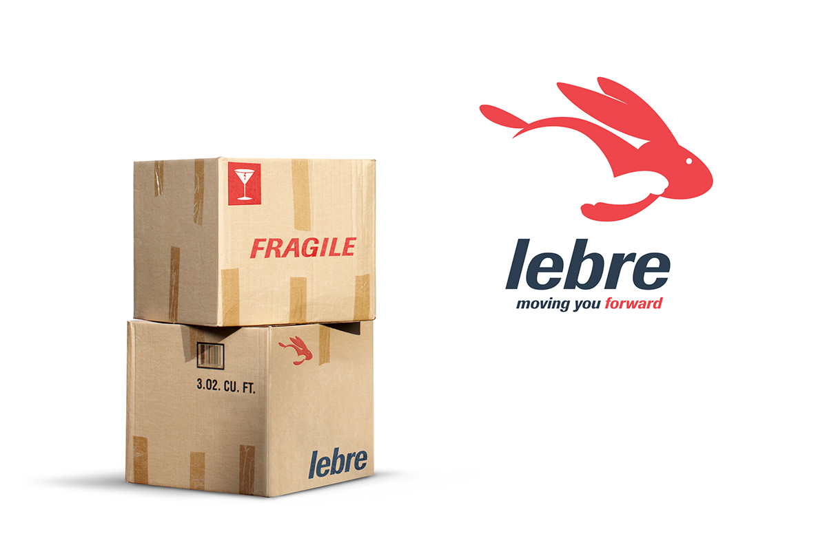
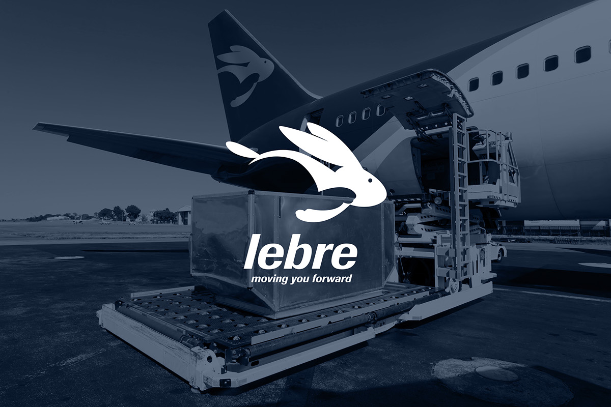
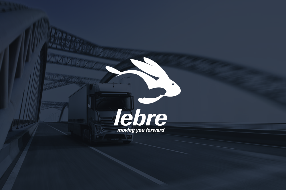
Lebre means "rabbit" in Portuguese, and because it is a moving company the logo most certainly needed to express movement and agility. The negative space created by the rear leg combined with the angle of the ears and tail express just that. There's also a hidden secret, do you see it?
• • •


Thank you for APPRECIATING this!
For additional information and projects,
please visit our site valnt79.com
or contact me at: valnt79@gmail.com
or contact me at: valnt79@gmail.com


